Editorials
Switching from Android to Windows Phone Part 1: initial impressions and missing features
This article may contain personal views and opinion from the author.
**Reminder: this is not intended to be a review of Windows Phone. This is intended as something of a running diary showing the process of an Android user getting to know and use Windows Phone.**
Making a change or choosing a new mobile platform can be a big step. Our mobile devices are more and more important in our daily lives, so the choice we make for our hardware and software dictates a lot of how we interact on a daily basis. iOS has become more closely tied with Twitter, not to mention its integration with iCloud and other Apple devices/products. Android, not surprisingly, is closely integrated with Google's products like Google+, Docs, Gmail, Maps, etc. Windows Phone is integrated with Micrsoft's Windows Live, and Bing, but also with Facebook to a larger degree. Often, we let the software we use dictate the platform we choose. However, in an effort to understand all aspects of the mobile ecosystem, it can be a useful test to try something new and give it a real workout, and not rely on just a short time or a platform's design philosophy to form an opinion.
Windows Phone is not yet exactly a major player given that it has yet to pass 2% of the market share in America, but it has made a bit of a push in some regions like Norway and France. As we talked about recently, the Windows Phone ecosystem is in a tenuous position right now. It hasn't built much traction with consumers, and frustration with carriers and manufacturers could be dangerous if Microsoft and Nokia's partnership leads to manufacturers abandoning the platform rather than upping their game to compete with Nokia. Still, Microsoft has deep pockets, Nokia makes quality handsets, and the Windows Phone platform is designed extremely well, even if it can feel incomplete for someone moving over from Android, especially Android 4.0.
With that in mind, it's time to venture into the relative newcomer of Windows Phone. This is the next step in a 4 year journey through the mobile ecosystem which began with the iPhone 3G, moved to the Nexus One, then the Galaxy Nexus and an iPad 2. Sprinkle in regular use of a BlackBerry, and that covers most of the major players in the US smartphone market. So, Windows Phone was the obvious next choice. We'll get into the transition more deeply, but the overall impression from the first weekend of the switch is that Windows Phone has a lot of potential, but still feels a work in progress.
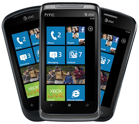
For this experiement, which should last for the next 6 weeks or so, we are switching from a Galaxy Nexus, which we have been using since December, to an HTC Radar 4G. We would have loved to use a Nokia Lumia 900, since it is the best WP device available, but the lack of T-Mobile support killed that idea. Still, aside from hardware design, screen size, camera quality, battery life, and maybe some specific apps, there shouldn't be too much difference between Windows Phone devices. It's not like the Android ecosystem where there are dozens of factors to be aware of when choosing a device. With Android, you have to understand the CPU specs, screen size, screen resolution, manufacturer, OS version, type of custom UI, radio type, camera quality, plans for OS update and more. With Windows Phone many of those choices don't exist, and that's exactly how Microsoft wants it right now.
Initial impressions on design
Obviously, the first thing you'd notice with a switch from the Galaxy Nexus or many other high end Android phones released in the past few months is the screen. The Radar screen is almost an inch smaller (3.7" compared to 4.6") and the resolution is much lower as well (480x800 compared to 720x1280). Because Microsoft has kept pretty tight control over what hardware can be used with Windows Phone, there hasn't been a lot of variation until just recently where there has been the introduction of 4"+ screens. This is a conscious effort by Microsoft in order to assure compatibility and consistent performance, so we obviously can't fault HTC for the screen, and really it was only an issue in specific situations like text on a web page while zoomed out.
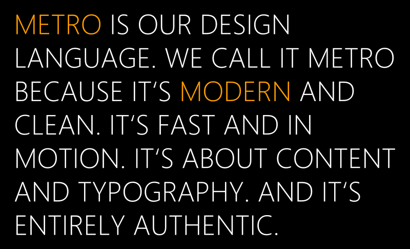
As Google learned from Matias Duarte and his work on Android 4.0 and the Holo theme, consistent gestures and continuity in UI from system to apps are important. But, Microsoft obviously already knew this because the Metro UI is built on the left-to-right swiping through pages, and the UI is consistent even within apps. Similarly, Google needed Matias Duarte to come in, explain the need for quality typography, and lead the project which created the Roboto font for Android 4.0, but the entire Metro UI in Windows Phone is driven by the typography, specifically the Segoe WP font. This means that even though Windows Phone devices are all WVGA resolution, text is almost always crisp and easy to read. The icons for Windows Phone are simple and bold, which can be a very welcome sight compared to Android or iOS where app icons are becoming increasingly complex or cartoony. The overall simplicity of WP icons helps to add a sense of cohesion that can be lacking in Android. So, not just the apps, but the WP icons also feel like they are all part of the same whole because of the design.
Windows Phone is most definitely a design oriented platform, which can be quite a nice transition for users coming from Android 2.x. It certainly doesn't look like anything else on the market, and that's a very good thing. We've never been much of a fan of iOS's static grid of icons. Android got a lot better with Ice Cream Sandwich, but there was a reason why HTC and Samsung felt the need to make Android look prettier in the days of 2.x. When done right, Live Tiles can be delightful, and the Metro UI is easy to navigate for the most part.
Inconsistency
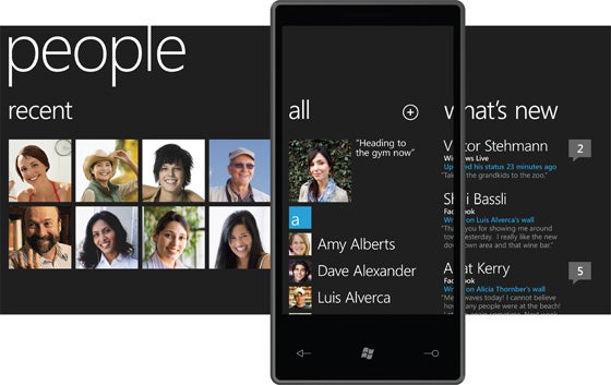
The trouble is in those qualifiers in that last sentence. Overall, Windows Phone feels inconsistent to a certain extent. When done well, like the People Tile or Xbox Live Tile, the animation adds another dimension which is exciting and lively. However, many of the third party apps don't take advantage of Live Tiles nearly as well and use bland graphics that don't change much. This is likely something that will change as developers put more time and effort into the platform, but it's not helping anything right now when the platform needs to gain traction in the market.
Similarly, while the Metro UI is generally intuitive, there are still too many times where the option you may want or some explanation of what is happening may be lacking. This is apparent right from the first time you boot up your new Windows Phone device. When you first login to your Windows Live account, the device will automatically install the base apps, so you are guaranteed to have the newest version of each right away. This is a great idea, but unless you've ready the manual or quick start guide that comes with your device (and let's face it, no one ever reads those things), you won't actually know that this is happening. All you'll see is that the phone is taking a disturbingly long time to sign in for the first time, which may lead you to think that something has gone wrong, especially if you aren't on WiFi and have to wait for slower mobile data to get everything installed. Additionally, just like how Google has been pushing the Holo theme in Ice Cream Sandwich as a way to uncover important features of an app that may be buried in menu items, Microsoft could do with bringing forward some features out of menu lists.
It's also very nice that almost all apps can be uninstalled right away. The only apps that are baked in and can't be uninstalled are the core apps from Microsoft like Phone, People (aka contacts), Messaging, Office, etc. Any manufacturer or carrier additions can be uninstalled. So, if you don't want T-Mobile TV, HTC Watch or HTC Hub, they can be easily uninstalled. Of course, not everything can be uninstalled, and even worse, some features you may expect just don't exist yet, and if they do, they can be somewhat inconsistent.
Missing features
A potentially large sticking point for an Android user moving to Windows Phone is with text input. There is voice command available for search and performing certain actions, and it works pretty well, but there is no dictation option, nor are there alternative keyboards (a mainstay for the Android user), so unless you'll have to get comfortable with touch typing very quickly. The stock keyboard on Windows Phone is quite good, although with most devices like the Radar, it would be best to make landscape orientation your default for typing, because otherwise it is a bit cramped. It seems likely that dictation is coming, but definitely the biggest switch from Android to WP is in giving up gesture keyboards, and that doesn't seem to be on the Windows Phone update roadmap. Even so, text input works well with the virtual keyboard, although autocorrect doesn't work consistently. While we've found autocorrect to work well in the Email app, it doesn't always do its job in the Messaging app.
The last major issue we found right away was in the limitation of background processes on 3G. There are obviously size limits for app downloads on mobile connections, as would be expected, but those limits aren't extended to things like podcasts. Rather, downloading a podcast over mobile data cannot be done through the Marketplace at all. There are 3rd party options for downloading podcasts, but if you're on mobile it can't be done in the background, meaning you have to plan your downloads to when you won't need to use your phone. A big addition of Windows Phone 7.5 was in allowing apps to run in the background, but we found that this was not reliable when you need an Internet connection, like for an IM app, and more often than not apps would lose connection when exited.
Conclusion
Obviously, there are nits that can be picked, especially when making as big a shift as the move from Android to Windows Phone. Android is in its 7th major version, while Windows Phone is on its 2nd, so there are bound to be features that Android has that WP doesn't. Not having as robust of a Share menu will likely turn off some users, but we can't fault Windows Phone for things like that, because for all we know, that could be a feature that is coming later on, and it isn't something that will make or break the user experience. It's simply something to get used to like transitioning into using Bing and Bing Maps more often.
Our initial impression is that Windows Phone definitely has the potential to become the third pillar of the mobile ecosystem, but it does have some growing to do. The system is incredibly well designed, and has many of the features one may want like Internet sharing (depending on your device), a unified Inbox, a quality Marketplace, and more. And, those are going to be some of the topics we hit in the next installment of this series. Today was all about overall impressions and usability. Next time we'll dive into the apps and the big question of transferring from a Google-centric life to a Microsoft-centric life.

Popular stories


![T-Mobile is down for many users across the nation right now [UPDATED]](https://m-cdn.phonearena.com/images/article/181747-wide-two_350/T-Mobile-is-down-for-many-users-across-the-nation-right-now-UPDATED.webp)
Latest News
Things that are NOT allowed:
To help keep our community safe and free from spam, we apply temporary limits to newly created accounts: