Editorials
Living with Apple’s iPhone 6: the agony and ecstasy of iOS (week 2)
This article may contain personal views and opinion from the author.
The iOS 8 interface takes pride in its smooth performance and simplicity. It's also frustratingly hard to customize and requires syncing with the tedious iTunes
The Apple iPhone 6 has set a new standard, and it has got the sales success to prove it. In fact, in the past week, we’ve seen Apple break all smartphone sales records with over 74.5 million iPhones sold in a single quarter, and the nearly-ubiquitous spread of Apple’s smartphone in the United States and huge success in China has even prompted comments from HTC top managers that it is “terribly boring”.
I have been using the iPhone off-and-on for months now, but last week, I started my own personal journey with the iPhone 6: a four-week mission to explore its heights and depths. After sharing my first-week impressions focused around the design, it’s now time to look at the bread and butter of the iPhone experience: iOS.
The world’s richest ecosystem, iOS was the first platform to build an App Store, to offer easy-to-access music purchases via iTunes, and it continues to reap the benefits, as most apps and games arrive first and sometimes exclusively to iOS. It also takes pride in being easily approachable, with no steep learning curves, and with a smooth, lag-free experience. Is all of that true, and what are its downsides in comparison with its biggest rival, Android? Let’s find out.
iTunes: necessary evil?
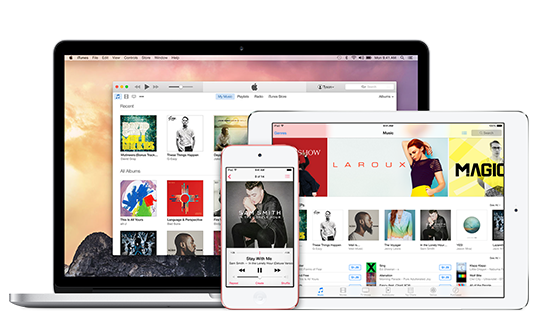
We can't talk about iOS 8 without first mentioning iTunes, the portal to all communications of your iPhone with the outside world. Is it to transfer images or to put up new music, you inevitably stumble upon iTunes. Good news is that Apple has improved it greatly in the last few versions and it is now a sleeker-looking application. Bad news is that it is still confusingly slow and complicated for first-time users.
Simple tasks like loading up new music from your computer to your phone become a tedious chore with iTunes, while on Android all it takes is a simple drag and drop. The straightforward task that is changing your ringtone on other platforms, is again so complicated on iTunes that it takes Googling it even for advanced users that are encountering this blissful world.
Don’t misunderstand me: it all works after all, and once you get the hang of it, you can enjoy the benefits of automatic file synchronization, but - call me an old timer - I prefer the simplicity and convenience of dragging and dropping files. Luckily, you can still use simple copy and paste to at least get images off the iPhone. For all else, iTunes seems like evil, but we’re not entirely certain it’s necessary.
iPhone Spotlight Search: fast and reliable
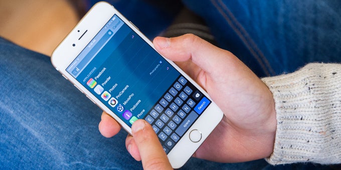
Swipe down to get into Spotlight Search
We've already done a comprehensive review of iOS 8, so I won’t be repeating it all over again here (but do take a look at our original iOS 8 review for a refresh, if you need one). A quick recap is that iOS 8 features a beautifully simple interface that just works, with some quirks that we’ll speak about later on.
There is, however, one feature of iOS that has gotten little attention yet I feel is crucial to the usability of Apple’s platform.
That one feature is the iPhone spotlight search that you bring up by swiping down anywhere on the home screen. Spotlight search is basically the mobile alternative to the Windows Start menu, a way to quickly search for apps, contacts, and more, a universal search bar of sorts.
There is a similar feature on Android with the Google search box, but I find the one on iOS to have some key advantages. First, it’s extremely fast, while Google’s search bar takes a split second to load and that lag could get irritating; secondly, Apple’s spotlight search has the right information density as it is capable of showing mulitple results. For instance, in Spotlight search you can easily type a single letter like M to get all apps that start with an M (like Mail, Messenger, etc), so you can just tap on the app you want to open it up quickly. Google’s search bar in comparison prioritizes Google search results, and while it does also search for apps, you will usually see just one result, so you need to scroll, and the whole exercise becomes too slow to be of much use.
Given that often times we have tens of apps installed and searching for them is quite the chore, iOS Spotlight search can be a huge advantage and a time saver.
It’s also worth pointing out that Apple’s Control Center is one of the niftiest recent additions to the platform. The ability to swipe up from the bottom and have quick access (and by quick we mean instant, not requiring multiple taps) to brightness, music playback, the flashlight (yes, it is surprisingly often used!) is hugely appreciated.
Customization: a sore spot
Having widgets on iOS is nice, but functionality is often half-baked
Customization as a whole remains a sore spot for the iOS platform: you don’t have true live wallpapers (you have Apple’s dynamic images, but those are hardly a full-blown alternative), you don’t have true widgets (again, iOS 8 adds widgets to the notification bar, but not to the home panel, which feels like a half-baked solution), you don’t have the option to change the appearance of icons, and - naturally - you have zero of the complete overhaul capabilities of Android launchers and custom ROMs.
Is this a real problem? Despite Apple’s community denial, fact remains that Apple has been consistently behind Android in terms of customization options, and the company is now playing catch-up: it has done so with the adoption of an Android-like notification center, it has done so by allowing custom keyboards, and it seems that Apple is slowly but surely moving towards giving more and more customization options to its users.
Dealing with distractions
Finally, no look on iOS is complete without speaking of the way the platform handles notifications. The notification center appeared on iOS many years after it was on Android, and it still feels like a work in progress: Apple just cut the tabs in the notification center from three to two, and it is still hugely annoying that in the second tab there is no ‘Clear All’ option for notifications.
There is some obscurity to the way iOS handles notifications. There are no icons to nag you in the status bar, and all notifications are put away in a stash that you can’t immediately see in the second tab in the notification center, and while this might not sound very intuitive and user-friendly, I found that it makes handling your notifications a much less stressful exercise. You don’t have a light that’s constantly blinking and distracting you for every little notification you receive, and even when you fire up the phone, non-essential notifications do not prompt you to take immediate action on them. With so many virtual distractions nowadays, this seeming flaw in the system, works out to be a benefit for a user like me.
Apple iPhone 6: tips and tricks
And this concludes my second week with the iPhone 6. Stay tuned for next week’s article where we look at the iPhone 6 camera and how it compares against rivals.

Popular stories


Latest News


Things that are NOT allowed:
To help keep our community safe and free from spam, we apply temporary limits to newly created accounts: