So, the LG G7 ThinQ is now official and it arrives with all the required bells and whistles to make for a noteworthy flagship device. Aside from donning commendable specs and unique features that make the phone a worthy pick for Android fans, the G7 ThinQ also introduces a trove of notable interface touch-ups that we should talk upon.
How does the interface of the new device stack up against its predecessor, the LG G6? Well, there's only one way to showcase all the improvements, and it's none other than a succinct visual comparison.
Have in mind that in all the images below, the LG G7 ThinQ screenshots are on the left, while the right ones are taken straight from our resident LG G6.
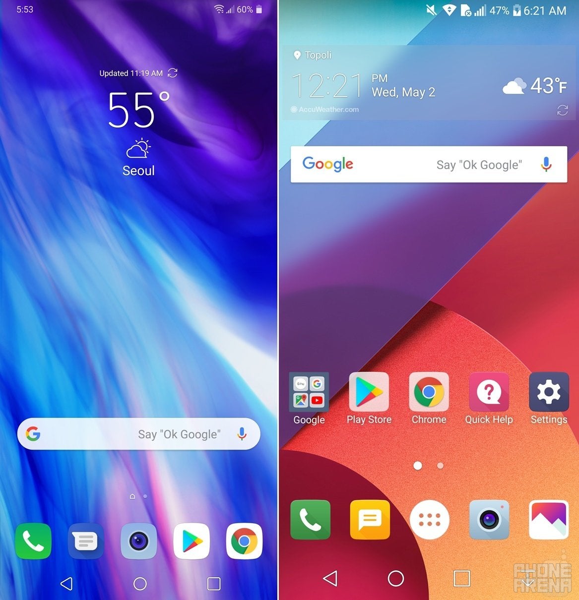
Homescreen & customization
Subtle but important changes lie here. Firstly, notice the improved, flatter, and further simplified iconography that builds upon the G6's enhanced aesthetics from last year. Less skeuomorphic and slightly flatter than before, at first sight the appearance of the G7 ThinQ leaves a pleasing impression that feels so 2018. Secondly, one of the homescreen aspects that feels especially a head of the time is the clock, which is now situated in the upper left side of the screen. That's just in line with the migration of the clock to the left side of the screen in the upcoming Android P, clearly telling that LG wants to remain relevant and up-to-date with the recent developings on the stock Android scene.
Recommended For You
Thirdly, lack of any sharp angles on the homescreen also eludes a more modern feel, which is in stark contrast with the LG G6 which had an edgier stock interface. What's more, the positioning of the Google search widget on the G7 ThinQ can't help but remind us of Samsung's flagships, which also boast a rather similar setup - five icons in the dock, no app drawer button, the Google search widget right above, and a clock/weather widget a bit higher up.
If we didn't know any better, we'd probably think that LG is straight up copying Samsung here.
LG G7 ThinQ (left) vs LG G6 (right)
LG G7 ThinQ (always left) vs LG G6 (always right)
Notifications and quick settings
LG G7 ThinQ shows off its overhauled notification shade
Now, in the notifications and quick settings shade, a ton of visual differences can be spotted. For one, text is bolder and leaves a longer-lasting impression; activated quick settings toggles now appear teal and feature revamped icons that are a tad more descriptive than their simpler counterparts found on the G6.
When expanded, the notification shows the icons for all the various radio and main phone functions to the right of the device, right beneath the settings cog, whereas the clock and date try to balance the layout by comfortably sitting on the left side.
Overall, the notification shade has received some subtle touch-ups, but we are not exactly sure if the new notification shade tickles our fancy better than the older one. As all things in life, it always falls down to personal preference.
LG G7 ThinQ (left) vs LG G6 (right)
New Second Screen a.k.a. notch customization
Now, this menu right here hasn't been around on the LG G6 due to obvious reasons. The first thing you should know is that LG is calling the unorthodox display area surrounding the notch "New Second Screen", which is a glorified homage to the ticker displays found on the LG V10 and V20.
Second, LG has decided it's imperative that users can "hide" the notch by applying a darker background surrounding the controversial screen feature. Yay!
And no, you can't customize this one in the same veins of its similarly-named predecessors which were a tad more functional, but hey, at least you get to choose your own background for the display area surrounding the notch. While we are hard-pressed to think of a valid reason why would anyone want to choose anything aside from black, but whatever floats your boat - you can have the New Second Screen in grey, a black-to-grey or black-to-red gradient, and finally, a multi-color gradient that feels a bit out of place. Note that the color changes will be applied to the home screen and all stock LG aps, but may not show up in Instagram, Facebook, or whatever gacha game is popular right now. Aside from colors, you can also customize the corners of your apps, with the choices being curved and less curved. More power to the users!
LG G7 ThinQ New Second Screen customization
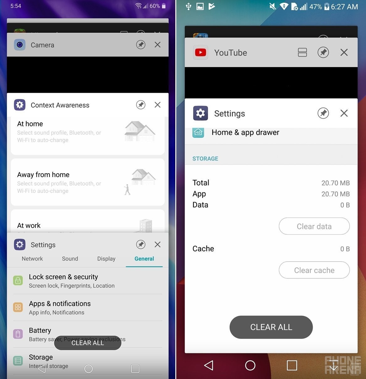
App switcher and stock apps
Not much differences in the stockish app switcher menu, which is as functional as it has been ever since the Android Lollipop days.
When it comes to stock apps, all of them share the same recurring theme - bolder text, cleaner icons, and much more modern visuals overall. The attention to detail of almost all interface aspects feel like LG has spent a lot of time into perfecting the looks while still retaining its core LG design language, which is no longer "in your face" but is still there. We dig that, we dig that a lot.
LG G7 ThinQ (left) vs LG G6 (right)
LG G7 ThinQ (left) vs LG G6 (right)
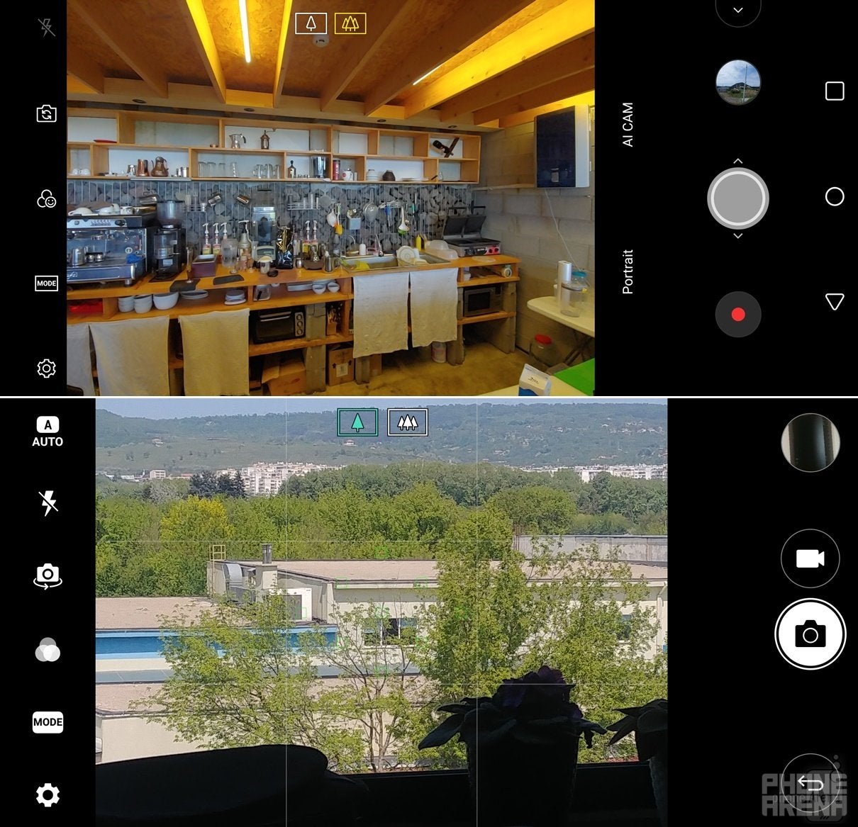
Camera
The same overall leitmotif applies to the camera app itself as well. The camera app is cleaner, features improved iconography, and a cleaner interface that reminds of the Galaxy S9/S9+ interface a bit. Sorry, LG, but facts are facts.
LG G7 ThinQ (top) vs LG G6 (bottom)
LG G7 ThinQ (top) vs LG G6 (bottom)
LG G7 ThinQ vs LG G6 interface comparison
Get Visible as low as $20/mo for 1 year. Limited time offer with code: FRESHSTART
$20
/mo
$25
$5 off (20%)
Offer Ends 6.1.2026 at 11.59pm ET. New members get $5/mo off the $25/mg Visible plan, $35/mo Visible+ plan, or $45/mo Visible+ Pro plan for the first 12 months. Promo code FRESHSTART required at checkout.
Peter is a skilled writer with over 13 years of experience at PhoneArena. He has published nearly 300 phone reviews and comparisons. This vast experience helps him navigate the mobile tech landscape with ease. He enjoys everything Android but relies on a MacBook Pro daily.
A discussion is a place, where people can voice their opinion, no matter if it
is positive, neutral or negative. However, when posting, one must stay true to the topic, and not just share some
random thoughts, which are not directly related to the matter.
Things that are NOT allowed:
Off-topic talk - you must stick to the subject of discussion
Offensive, hate speech - if you want to say something, say it politely
Spam/Advertisements - these posts are deleted
Multiple accounts - one person can have only one account
Impersonations and offensive nicknames - these accounts get banned
To help keep our community safe and free from spam, we apply temporary limits to newly created accounts:
New accounts created within the last 24 hours may experience restrictions on how frequently they can
post or comment.
These limits are in place as a precaution and will automatically lift.
Moderation is done by humans. We try to be as objective as possible and moderate with zero bias. If you think a
post should be moderated - please, report it.
Have a question about the rules or why you have been moderated/limited/banned? Please,
contact us.


Things that are NOT allowed:
To help keep our community safe and free from spam, we apply temporary limits to newly created accounts: