
Here's what our favorite apps might have looked like in an alternate, brutalist reality
As far as contemporary app design goes, we as species have much to be thankful for. The successful dodging of the "brutalism" bullet is something that's making our daily interactions with our smartphone mostly a pleasant endeavor, thanks to the minimalism of iOS and Google's Material Design looks. Both look modern, fresh, and are as appealing as they come.
Brutalist design is the polar opposite: taking cues from the raw concrete architecture style that was predominant in the post-WWII era, most notably in the Soviet Union and the countries of the Eastern Bloc, brutalism aims to establish authoritarian respect and quench the individual's optimism and light-heartedness. Often deemed "ugly", brutalist design is an enduring reminder of the Cold War period and its raw, unappealing aesthetics that have little to no place in the 21st century.
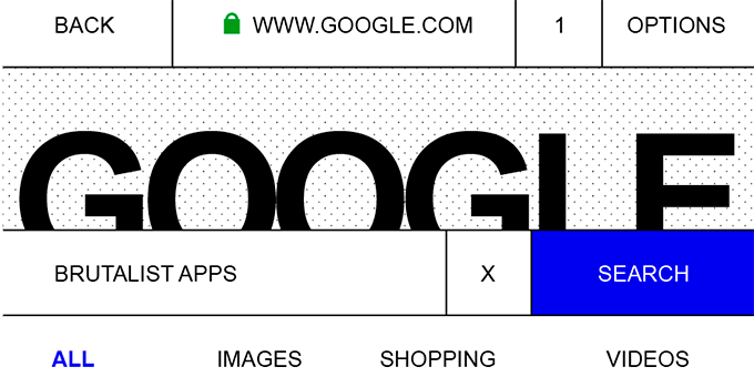
But what if brutalism endured and became the norm for the interfaces of our smartphones? What would such an alternate reality look like? Graphic Designer Pierre Buttin took it to himself to reimagine some of the most popular apps in a brutalist style.
Contemporary design versus brutalist redesign
source: Pierre Buttin via TheVerge

Popular stories
Latest News
Things that are NOT allowed:
To help keep our community safe and free from spam, we apply temporary limits to newly created accounts: