Android 5.0 Lollipop vs iOS 8 UI comparison: vote for the better interface here!
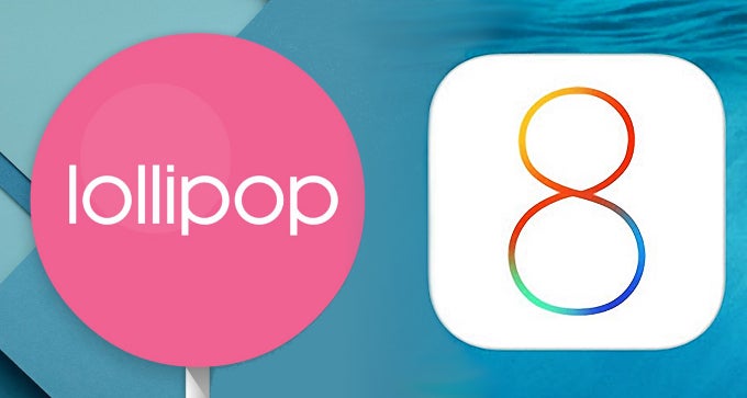
The year is almost over and both Apple and Google have already treated us to the latest renditions of their mobile platforms - iOS 8 and Android 5.0 Lollipop, respectively. We got introduced to these versions of the platforms several months ago. First was Apple, which showcased its iOS 8 at WDDC 2014 in the beginning of June. Several weeks later, Google followed suit and highlighted the spic and span novelties that Android 5.0 Lollipop was about to introduce this autumn.
Lock screen and home screen
Android 5.0 Lollipop vs iOS 8 - lock and home screens
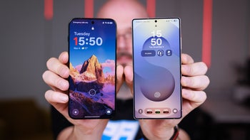
Well, here they are - one of the first things that you see when you unlock your iOS or Android device. While their appeal is subjective, Android's lock screen is undoubtedly a tad more functional and user-friendly - first of all, you can only unlock your device by swiping in any direction, whereas iOS 8 only allows you to unlock your iPhone by swiping right. What's more, you have direct access to your camera and dialer straight from Lollipop's lock screen. In the meantime, iOS 8 only gives you access to your iPhone's camera app, yet the latter launches somewhat faster than the new Android. Both platforms' lock screens allow you to quickly access your notifications and quick settings as well.
Which one is the better one though? Cast a vote right below!
Android 5.0 Lollipop vs iOS 8: which one has better lock and home screens?
Android 5.0 Lollipop
75.18%
iOS 8
24.82%
Widgets
Android 5.0 Lollipop vs iOS 8 - the different implementation of widgets
Hardly anyone can deny the fact that widgets are not among the most powerful weapons Android holds against its rivals. The utter customizability, paired with the wide range of widgets available for the platform make Android the king of the widgets, and iOS 8 can hardly hold a candle to it.
Still, to each his own, so vote below and tell us which platform's take on these interactive small applications!
Android 5.0 Lollipop vs iOS 8: which one has implemented widgets in a better fashion?
Android 5.0 Lollipop
80.93%
iOS 8
19.07%
Multi-tasking and recent apps
Android 5.0 Lollipop vs iOS 8 - Multi-tasking
Both platforms have been employing their own take on multi-tasking for a lot of time now, and while iOS 8 has not revamped Apple's take on this rather important feature for a smartphone in a substantial way, Android 5.0 Lollipop has brought a nice (and somewhat needed) overhaul, which brings Google's new Material Design directly to your recent apps. Android Lollipop shows your recent apps in an animated stack of windows and you can swipe up or down so as to select the desired one. What's more, one and the same app can be represented by different tap, provided that you have more than one active task at hand. In iOS 8's camp, the multi-tasking menu (available by double-tapping the home key), shows you recent apps side-by-side. You can easily browse them by swiping left or right. It's important to say that you have shortcuts for some of your favorite and recently-contacted contacts in iOS' multi-tasking menu, whereas Android 5.0 Lollipop has none. Closing an app, similar to previous renditions of iOS, is just a swipe-up away.
Android 5.0 Lollipop vs iOS 8: which one has a better multi-tasking (recent apps) menu?
Android 5.0 Lollipop
72.99%
iOS 8
27.01%
Contacts
Android 5.0 Lollipop vs iOS 8 - contacts
Lollipop and iOS 8 can't be any more different when it comes to comparing their default phone and contacts apps. Touched by the Material Design goodness, the contacts app in Lollipop can be summarized with two words - gorgeous and functional. It's extremely intuitive and easy to use (just as it should be), greeting you with your favorite contacts and treating you to a large contact image, which makes it rather easier to find the desired one, even while on the go.
We are not disappointed by iOS 8's contacts app, but when you put it next to Google's, it becomes apparent that is certainly less compelling and intriguing. Yes, one may argue that it's a tad more intuitive, but it's definitely not as head-turning as its animated Android counterpart.
Android 5.0 Lollipop vs iOS 8: which one has the better contacts app?
Android 5.0 Lollipop
81.74%
iOS 8
18.26%
Messaging and keyboard
Android 5.0 Lollipop vs iOS 8 - messaging and keyboard
Both platforms offer a pretty streamlined experience when a text message has to be sent. The battle in this aspect is especially fierce once we consider that iOS now supports custom, swipe-enabled keyboards, almost similar to the ones that Android users have been enjoying during the past few years. Then again, Google's stock Lollipop keyboard surpasses iOS 8's one when it comes to features, as it comes with swipe input and different themes. In the meantime, iOS 8's stock keyboard is not as feature-specc'd, yet it's noteworthy for its fast response. Both will correct your words once you begin to type; the iOS keyboard also has an "intelligent word prediction" in its not-so-deep bag of features.
Well, which one is better - Lollipop's Messenger or iOS 8's Messages?
Android 5.0 Lollipop vs iOS 8: which one provides a better text messaging experience?
Android 5.0 Lollipop
74.34%
iOS 8
25.66%
Camera interface
This is one of the aspects, in which it's rather hard to deny the supremacy of iOS 8's stock camera app. It is not only more intuitive and user-friendly, it's also more feature-packed. Meanwhile, Google's stock camera is as simple as it gets and doesn't overwhelm the Android enthusiast with numerous toggles and options from the get-go, as most of its features are hidden a tap away. Frankly said, neither does the iOS camera, despite that most of its features are visible at all times.
The camera apps of both prevalent platforms have different modes in two. For Lollipop, these are Photo Sphere, Panorama, Lens Blur, and video; the iOS camera allows you to make use of Time Lapse, Slo-Mo, Panorama, and regular video as well. The layouts are rather different - Both are streamlined and as intuitive as it gets, but which one is the better one in your opinion, both layout- and feature-wise?
Android 5.0 Lollipop vs iOS 8 - camera interface
Android 5.0 Lollipop vs iOS 8: which has a better camera app interface?
Android 5.0 Lollipop
47.12%
iOS 8
52.88%
Conlusion
What a heated battle, right? Well, both platforms have their own merits and it's virtually impossible to discern a clear winner, so regardless of which one turns out to amass more voters, it is pretty safe to say that both iOS 8 and Android 5.0 Lollipop offer the best user experience possible. The polls above will be open until Wednesday, December 17, so cast a vote while you still can. Of course, we'll come back with a brekadown of the results shortly after the voting urns get closed.
Follow us on Google News

![T-Mobile customers get confirmations for account activity they didn't authorize [UPDATED]](https://m-cdn.phonearena.com/images/article/179616-wide-two_350/T-Mobile-customers-get-confirmations-for-account-activity-they-didnt-authorize-UPDATED.webp)
Things that are NOT allowed:
To help keep our community safe and free from spam, we apply temporary limits to newly created accounts: