Android 5.0 Lollipop vs iOS 8.1: the best, compared

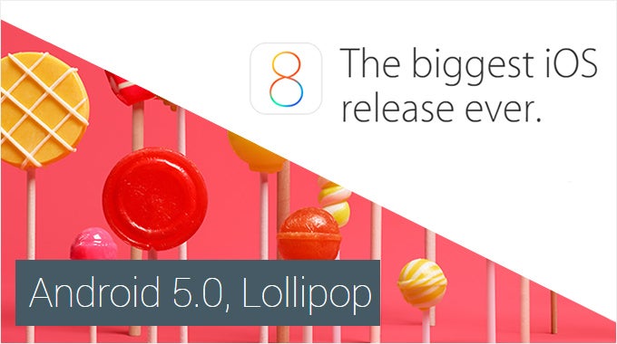
Among the multitude of things that can get a geek genuinely excited are the major updates for his or her gadgets. First comes the hype surrounding the software's announcement, then there's the excitement of exploring its new features, and after that arrives the enjoyment of actually using the features brought by the update. This is what iOS and Android users have been or are about to go through. Apple launched its iOS 8.1 update last week, and Google is about to release Android 5.0 Lollipop in a matter of days. Both software releases have been enjoying a lot of attention, and they're worthy of it given what they have to offer. This calls for a comparison between the latest and greatest Google and Apple have come up with.
Before we dive into our comparison, however, there's something we have to clarify. As far as the Android part of this article goes, our impressions are based on the stock Android 5.0 Lollipop experience – the experience delivered by Google's own Nexus and Google Play edition smartphones and tablets. That's important to note as the majority of Android users won't get to enjoy Google's platform in its pure form, the reason for that being the custom interfaces pre-loaded on a huge fraction of brand-name smartphones. These custom UIs are likely to adopt Lollipop's numerous improvements, but will differ from what Google uses as a reference as to what the software on an Android device should look and feel like. With this out of the way, let's go over the platforms' key features and their execution.
Lock and home screens
The iOS 8.1 lock screen shares a lot of similarities with the Lollipop one, both in terms of functionality and presentation, and we like it just as much. As in Android, a camera shortcut is present in the lower right-hand corner, and we find it rather easy to trigger with a thumb – just swipe up to launch the camera app. The chance of accidentally pulling up the Command Center panel, which it is activated with a similar gesture – a swipe up from the middle of the screen – is minimal to non-existent. Notifications are presented in the middle of the screen, and interacting with them is smooth and intuitive. Swiping to the side gives you various options for interaction, depending on the type of notification pending. With new texts, for example, you're given the option to send a quick reply, which is neat. Some might like that a notification causes the screen of an iOS 8 device to light up for several seconds, thus letting the user read it instantly. This won't happen on Android 5.0, but instead, a notification LED light will go off, if available.
The iOS 8 home screen can be described as minimalist and intuitive to navigate. Unlike Android, it lacks a separate drawer for all our apps, which minimizes redundancy and the chances of user confusion. The parallax effect applied to the wallpaper brings the interface to life and the translucency effects seen with certain UI elements and screens look pretty cool indeed. Yet overall, the interface has stuck to this colorful, childish look that iOS 7 introduced. While we've long grown used to iOS's visual presentation, we still find it somewhat uninspiring, especially compared to Android 5.0 and its Material Design philosophy.
Widgets and customization
Speaking of personalization, Lollipop is as flexible as we'd expect it to be. Launchers, icon packs, custom lock screens, beautiful live wallpapers, and other goodies are at your disposal for tweaking the platform's interface to your liking. In this respect, iOS 8.1 is still a bit limited, allowing us little beyond the options to rearrange items on our home screens and to change the wallpaper with a static or a dynamic one. There's a positive side to this limiting approach, however. There's less that can go wrong, while the stricter control over modifications retains the simplicity and consistency of the platform.
As we mentioned, both operating systems let us group apps in folders. But for some reason Android allows us to have no more than 16 apps per folder, while iOS folders are virtually unlimited. It's not a biggie, but it scores a point for iOS 8.1 in our book.
Notification panel, quick controls, multitasking
Apple's approach to notifications in iOS 8 is a bit different, yet no less effective. Notification bubbles appear on the icons of apps that have unread notifications, and that's a neat trick Android might want to learn from iOS one day. In addition, pulling down the panel from the top displays the Today tab, which lists whatever widgets are enabled – our daily schedule, our reminders, the weather forecast, to give a few examples. Notifications are in their own separate tab, grouped by application, and the priority by which these are listed can be changed from the settings menu.
Speaking of notifications, both platform support the so-called actionable notifications. These give you various options for interaction when they pop up – to dismiss a reminder or to shoot a quick answer to a text message, for example. Android 5.0, however, takes a better approach to incoming call notifications. Instead of occupying your entire screen, thus hiding your active app as iOS does, Lollipop displays a pop-up window with "Answer" and "Ignore" buttons at the top of the screen without sending your active app to the background.
With Lollipop comes a redesigned interface for our recent apps. On one hand, it definitely looks better than before as it now presents recent apps as a stack of cards with large snapshots of the app's recent state, not sorted in a boring column of tiny thumbnails as before. But on the other hand, switching to a particular recent app can be a bit cumbersome of a process. No more than 3 cards can fit properly on the screen, meaning that we're required to do more scrolling than usual. The recent apps list in iOS 8 is the better solution, in our opinion – it is simple, yet functional. Apps listed chronologically along with their respective icons on a separate row below, while a list of our recent and favorite contacts is placed at the top. The latter is a unique feature and can be extremely handy.
Dialer and phonebook
In comparison, the iOS 8.1 Phone app is simple to the point of being boring. It gets the job done, there's no denying that, but it lacks character. All you get is a simple black-and-white list with your contacts, and a profile photo is displayed only if the person is in your contacts list. On the bright side of things, the fact that our favorites and recent contacts are conveniently placed in the recent apps screen means we don't have to access iOS's Phone app as often. Also, thumbs up go to Apple for letting us block calls and texts from certain contacts. Android 5.0 lets us only block texts from a particular number.
Keyboard and messaging
Search and voice commands
But our guess is that most of the time, you'll be typing in whatever it is you're searching for. On Android 5.0, the Google search bar is placed permanently on the top of any home screen, just like before. While it does occupy precious screen space, it lets us search the internet, find a contact, or search for an app installed on the device. At the same time, Google Now provides us with relevant, timely updates on traffic and conditions, sports games, upcoming events, it even reminds us where we parked our car. Spotlight search in iOS 8.1, which is accessible with a swipe down gesture in the middle of any home screen, is no less versatile, if not better in some ways. It can be used to search the internet, the user's inbox, contacts, installed apps list, and will also display results from news outlets, from Wikipedia, and the iTunes store.
Web browser
Camera and photo gallery
Maps and navigation
Continuity, Family Sharing, Multi-user support
There are features in iOS 8.1 we wish we could compare to Android 5.0 alternatives, but we can't since Lollipop isn't offering any, at least not at this time. Among them is Apple's innovative Continuity solution, which is integrated into the latest versions of iOS and OS X Yosemite. Long story short, it allows Apple devices to intelligently work with one another. For example, one may start an email or a document on one device, then switch to another and be asked whether they want to pick up their work at the point where they left off. If your iPhone rings while you're on your iPad or Mac, you can pick the call right from your tablet or computer. Sending and responding to text messages works the same way. Android, on the other hand, hasn't reached this state of device interaction, but we're hoping that Google is going to take note as many people now own and switch between several smart and portable devices, such as a smartphone, a tablet, or a laptop.
Conclusion
Lollipop, in particular, shines with its visual presentation. Material Design adds the extra flare Android was missing until this point, and the results are worthy of applause. Apple's iOS 8.1, in comparison, is minimalist and with a more subtle approach to visuals. It isn't bad by any means, but it is not quite as fresh and appealing as stock Android 5.0, in our opinion. At the same time, Android remains the most customization-friendly mobile platform you can get your hands on, although as far as customization goes, iOS has come closer to Android than ever.
And so continues the race between Android and iOS for dominance across the mobile landscape – a race that's as exciting to comment on as always. To summarize, both platforms have come a long way since last year, and it will be exciting to see how they're going to progress in the time ahead. In the meantime, don't hesitate to go with either as chances are you won't be disappointed.
Popular stories

Latest News
Things that are NOT allowed:
To help keep our community safe and free from spam, we apply temporary limits to newly created accounts: