Editorials
This is the weirdest change in Android 12
This article may contain personal views and opinion from the author.
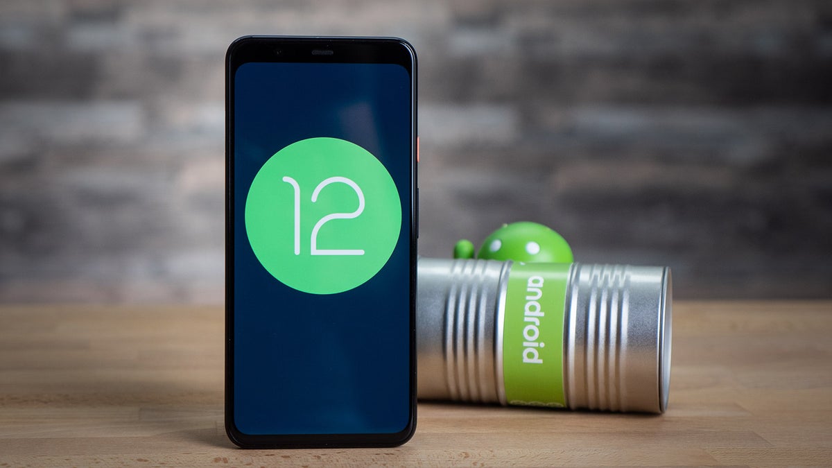
Android 12 is kind of here for a select few: you can download the very early Android 12 developer beta and get a first glimpse of what is likely the biggest redesign that the Android system has seen in years. New widgets, new looks, new style, and all of that is now known as "Material You" interface, where the "You" likely refers how you can custom fit it to your taste.

And for the most part, it's great. Bigger buttons bring oft used features to the front and make everything just a bit more user friendly and easier to find.
At the same time, this is a very raw beta. For example, one of the bigger changes is that you can now set the power button to start the Google Assistant, a shortcut that Apple has been using for years on iOS, but also available on custom Android skins on phones by Samsung and OnePlus. It turns out that if you enable this option in the beta, however, you lose access to the power menu so there is no way to turn off your phone. Yes, this will definitely be fixed in the final version, but it goes to show just how unfinished it is right now.
But there is one other feature that is now present all throughout in the Android 12 beta that is just... inexplicably weird and that might stay. Here is what it is: every single time you press a button in Android 12, be it in the settings or a toggle in the notification bar, you get a tiny little explosion of glitter.
Android 12 developer beta has a new "sparkle" ripple effect turned on by default for every button. What do you think about it? pic.twitter.com/rVmSRBLFSw
— PhoneArena (@PhoneArena) May 28, 2021
It's referred to as a "ripple effect" and was officially introduced to the world by Android Toolkit developer Romain Guy at Google I/O sessions, so it's something very intentional and not just a random inclusion.
It's present all throughout but best noticeable with darker backgrounds and... it's strange! I would understand this new look if it was part of some pink fairy tale custom theme and accompanied by a Comic Sans font on say the Samsung theme store, but it looks out of place as part of the main UI. Sparkle buttons and fairy dust are just not the first thing that comes to mind with an overall move to a cleaner look that should appeal to most people.
And here is the official introduction of the new sparkle effect:
What's strange is that Google says this new effect will be "enabled by default everywhere" and at least on my Pixel, I haven't found a way to turn it off.
Comments on the web on this new "effect" mostly circle around users being confused and thinking this was some sort of a bug, before finding out it was actually intentional.
This is not the only strange design decision in Android 12: some people are also complaining that the new bounce or stretchy scroll is also hard to get used to. An interesting fact about it is that this kind of scrolling is default on iOS ever since it launched, but it only comes to Android now because the patent on it has just expired. Previously, you would get a blue glow whenever you scroll to the end of a list to indicate it was over, but now you get a bit of a bounce and stretch, much like on iOS. However, the implementation seems to be a bit different and not quite as refined.
Google itself seems a bit unsure about the design direction it has taken and is now running a poll asking users to rate some of the new visual features such as the Quick Settings and Volume panel with possible answers ranging from "Very dissatisfied" to "Very satisfied". Unfortunately, the fairy dust sparkle is not something you can assess in that voting system yet.
So... what do you think about this and the overall direction Google has taken with Android 12?

Popular stories


Latest News

Things that are NOT allowed:
To help keep our community safe and free from spam, we apply temporary limits to newly created accounts: