The thought process behind the small changes made to the icon for the Chrome Browser
It was back in February when we told you that Google was going to change the icon for the Chrome Browser. The changes that were proposed at that juncture included eliminating the shadows between the colors. This had the effect of removing the 3D effect that made the red-colored area look as though it was "floating" above the yellow-hued part of the Chrome icon.
The Googlers behind the redesign of the Chrome icon talk about what they did
Google today printed the results of an interview with user experience interaction designer Elvin Hu and visual designer Thomas Messenger that discusses the origin of the Chrome icon and gives more details about what it originally supposed to be (a soccer ball?) and what it represents.
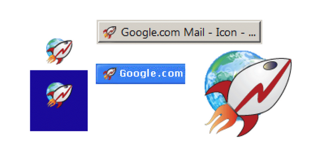
One of the original icon designs for the Chrome Browser
Messenger said that the original design was going to be a rocket ship with a red lightning bolt. This was created to represent how fast Chrome could take users from website to website. However, the rocket ship design was dropped and Messenger explained that "...our team decided to move away from a literal rocket ship in the end, and came to a design that looked approachable and clickable that still captured the spirit of Google."
The recent update was necessary, said Hu, because eight years had elapsed since the last icon change and the Chrome team wanted to give Chrome "a refreshed and modern look to reflect how Chrome has evolved as a product. We also noticed that the visual design of modern operating systems was becoming more stylistically diverse, so it was important that the Chrome icon felt more adaptable, native and fresh no matter what device you used."
Hu added "We simplified the main brand icon by removing the shadows, refining the proportions and brightening the colors, to align with Google's current brand design. We also found that placing certain shades of green and red next to each other created an unpleasant “glow” between the two colors, so we introduced a very subtle gradient to the main icon to make the icon easier to the eyes compared to using flat colors."
Google stress-tested color changes to the Chrome icon to make sure it wouldn't get lost among other icons
While the changes made by Google to the Chrome icon wouldn't stand out to the average user, Messenger noted that Google considered a more complex change to the Chrome icon. "In the exploratory phase, we tried all kinds of ideas; softening corners, different geometries, whether or not to separate the colors with white. We also tried options that further departed from the overall shape we’ve been using for the past 12 years. But we knew how well the four Google colors and circular composition are recognized, so we decided not to deviate too much from that."
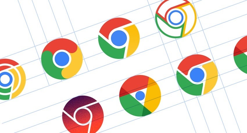
Some changes to the Chrome icon considered by Hu and Messenger
The process was "fun" according to Hu and he noted that the brainstorming sessions led to multiple possibilities for a new Chrome icon. Google stress tested many of the colors to make sure that any changes wouldn't result in the Chrome icon getting lost. The change also allowed the icon to be more easily viewed even when small.
The Chrome Browser is the default browser on many Android phones (this writer prefers the Samsung Internet Browser on his Pixel 6 Pro, and the Opera Browser on iOS). It can be downloaded from the Google Play Store and the Apple App Store. Chrome does come with Google Search and Google Translate built-in. Since it is the default browser on Android, many with Android-powered devices never bother to consider using other options which is why the app has been installed over 10 billion times according to the data found in the Google Play Store.

Popular stories


Latest News


Things that are NOT allowed:
To help keep our community safe and free from spam, we apply temporary limits to newly created accounts: