Google is making changes to the Chrome icon for the first time since 2014
A tweet from Google Chrome designer Elvin Hu reveals that for the first time in eight years, Google is changing Chrome's icon. The new-look debuted with the update to the Chrome Canary app which is an experimental and unstable version of the browser used by developers and early adopters. Other versions of Chrome that Android users can install are the stable, beta, and Dev versions.
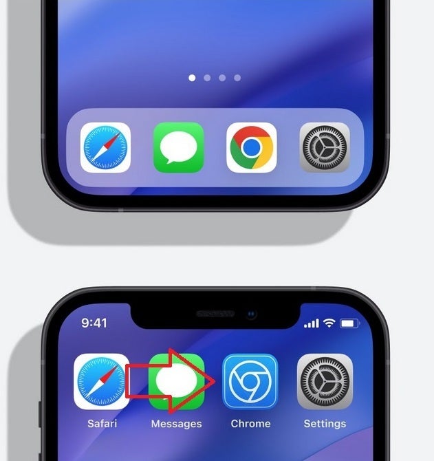
Google makes changes to the Chrome icon depending on the operating system being employed
And not that it has anything to do with the new icon, you still might want to know the difference between each one. As we noted, Chrome Canary offers an untested build of Chrome which might not run at times. Google recommends that only developers and advanced users install it on their handsets since most Canary updates won't proceed any further.
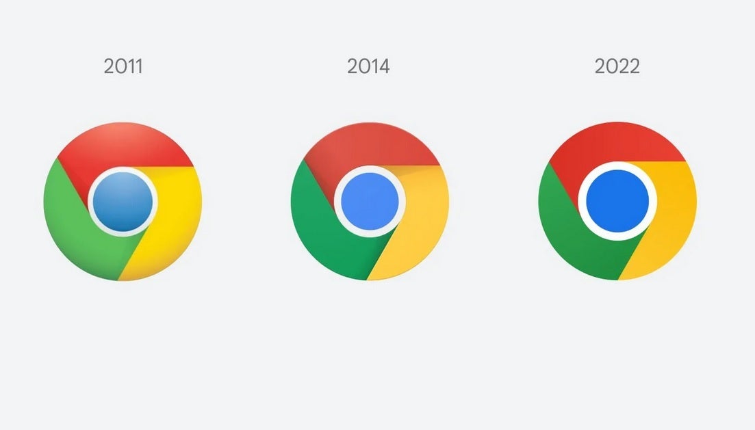
Changes to the Chrome icon since 2008
Installing the Chrome Dev version of the browser allows you to test out the latest features of the Chrome browser even though, as Google says, they will be "rough around the edges." Google is hoping that Android users will provide them with early feedback when testing out new features that may never make it to the Beta or stable versions of the app.
And there is also the Chrome Beta app which is the last step for a new feature before it is added to the stable version. It is not as unstable as the Dev version and features receive their final tweaks on the Chrome Beta app before millions of people use them on the stable version of Chrome.
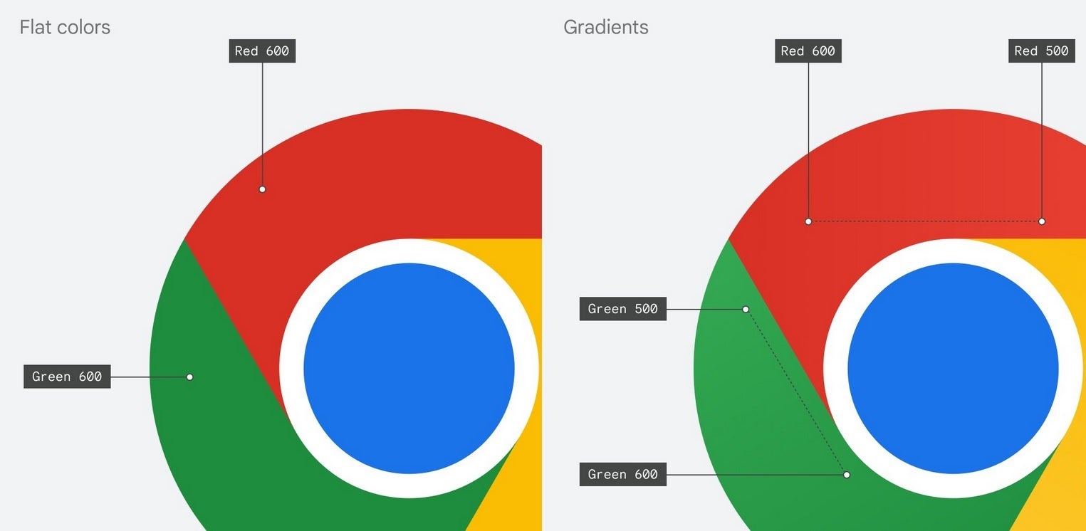
Gradients of colors are used to prevent annoying color vibrations
Lastly, the stable Chrome app is the safest version of the browser and is the one that you'll see in the Play Store if you search for Google Chrome. Most of you shouldn't install Canary or Dev while some of you might have an interest in downloading the Beta version of Chrome on your phone.
As for the main branding of the Chrome logo, the shadows between the colors (which are easily seen between the red and yellow colors) are being removed. This removes the slight 3D effect that made it appear as though the red area was raised above the yellow. Removing that small shadowy area makes the colors on the newly updated main icon appear flat.
Chrome's Hu also noted that "We simplified the main brand icon by removing the shadows, refining the proportions and brightening the colors, to align with Google's more modern brand expression." Google found that placing certain shades of Green and Red next to each other created what Hu called "an unpleasant color vibration." To combat this, Google used a more subtle gradient (so subtle that you might not notice it) in order to prevent the unpleasant vibration from bothering the viewer.
The new Chrome icons will appear on your devices shortly
Interestingly, Google created different variants of the Chrome icon for each operating system. As Elvin said, "We want the icons to feel recognizably Chrome, but also well crafted for each OS. For example, on Windows, the icons take on an obviously gradated look, appearing at home on Windows 10 & 11."
The Chrome Beta app on iOS will use a blueprint-style background
On ChromeOS, brighter colors will be used without gradients so that the icon can match the rest of the system icons. On MacOS, a small shadow will soon be employed to give the icon a 3D appearance. On iOS, the Chrome Beta will show the logo in a blueprint-style background to show that it is a developer-focused app.
The new Chrome icons are expected to hit your devices soon. Google has been shrinking the size of the Chrome icon going back to 2008 when it had the appearance of a 3D ball. There really is a lot of thought that comes into play even when trying to design a simple app icon.

Popular stories


Latest News


Things that are NOT allowed:
To help keep our community safe and free from spam, we apply temporary limits to newly created accounts: