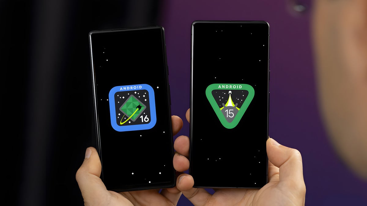
Android 16 vs Android 15: Is the Material 3 Expressive glow-up worth the hype?
The most popular OS in the world has never looked better thanks to Material 3 Expressive. Here's how it stacks up against Android 15.
The latest evolution of Android's Material Design is here.


More than four years after the most recent Material You redesign, Google's latest Material 3 Expressive is here to shake up the design language of the wildly popular operating system once again.
As Google beautifully puts it, Material 3 Expressive is all about "vibrant colors, intuitive motion, adaptive components, flexible typography, and contrasting shapes", and that's pretty much the gist of the upcoming restyling.
The latest Android 16 QPR1 beta introduces Material 3 Expressive to any eligible Pixel phones, allowing any adventurous user with a Pixel phone lying around to try it out for a spin. In case you would rather not do that, it's fine: this is where we come in!
Led by the mantra that a phone that's NOT running a beta version of something is a boring one (and who even wants to use a boring phone?), we quickly installed Android 16 on a trusty old Pixel and went on to detail the changes against Android 15. Spoiler alert, there are many changes that will definitely make your Pixel phones that much more customizable, but the included personalization options aren't that expansive just yet.
Material 3 Expressive vs Material You: A design showdown
One thing that's immediately noticeable once you spin Android 16 for a round is the much more expressive and colorful appearance of most interface elements. Just opening the main settings page or swiping down on the quick settings pane immediately reveals the nature of the new update from a visual standpoint, which isn't something that can be said about most previous Android updates.
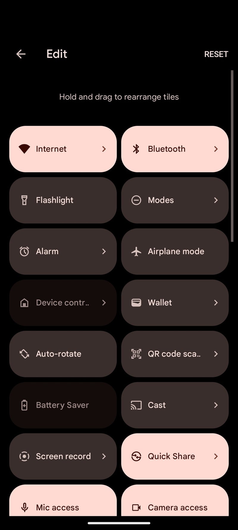
Quick Settings tiles
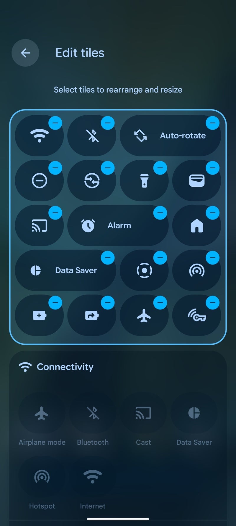
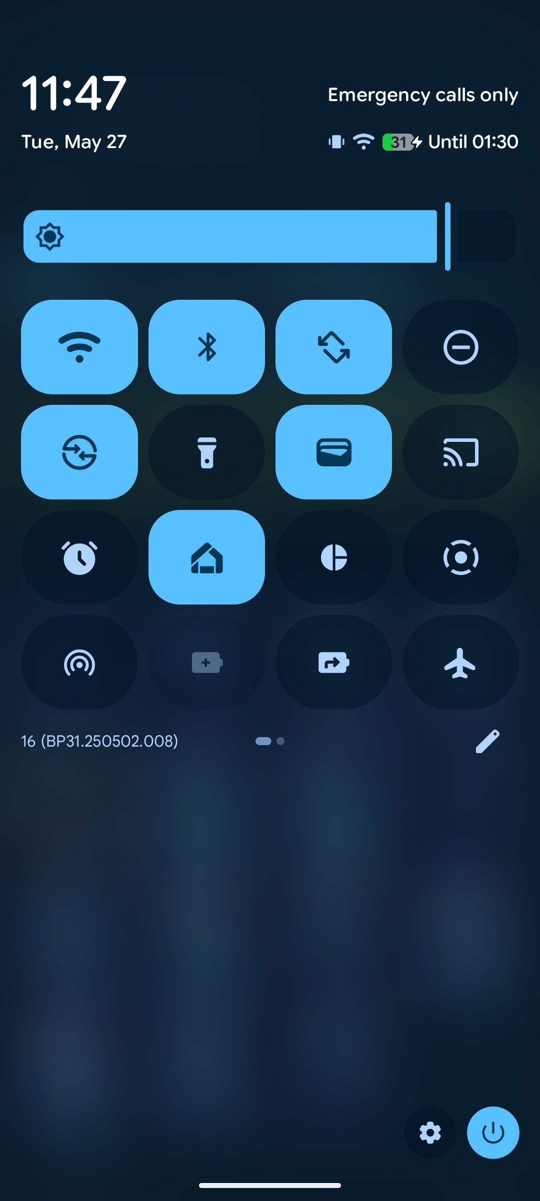
The most major new change with Android 16 is arguably the major redesign of the quick settings/notification shade. It's not totally revolutionary, but it introduces many important changes.
For one, you can now change the general shape and size of the existing tiles, which was previously unavailable on "stock" Android 15. By default, the older quick settings tiles all used the same elongated squircle shape, which displays a lot of useful info but also takes up a lot of precious space.
With Android 16, any tile can be changed from the default long squircle to a way more compact one. That's now more in line with the vast amount of custom Android skins out there, which have always focused on smaller and more compact toggles and buttons, though many are now also experimenting with customizable interfaces, sliders, and others.
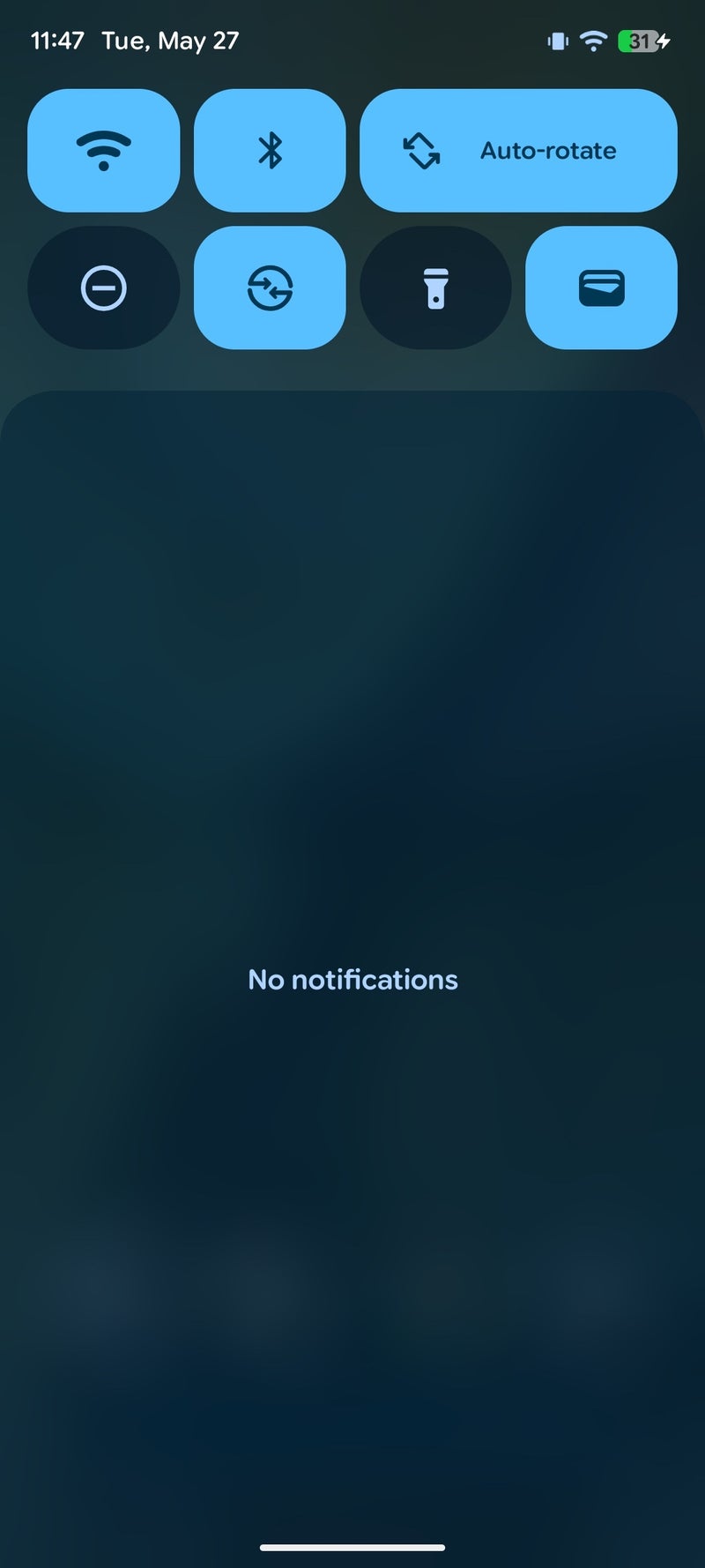
Android 16
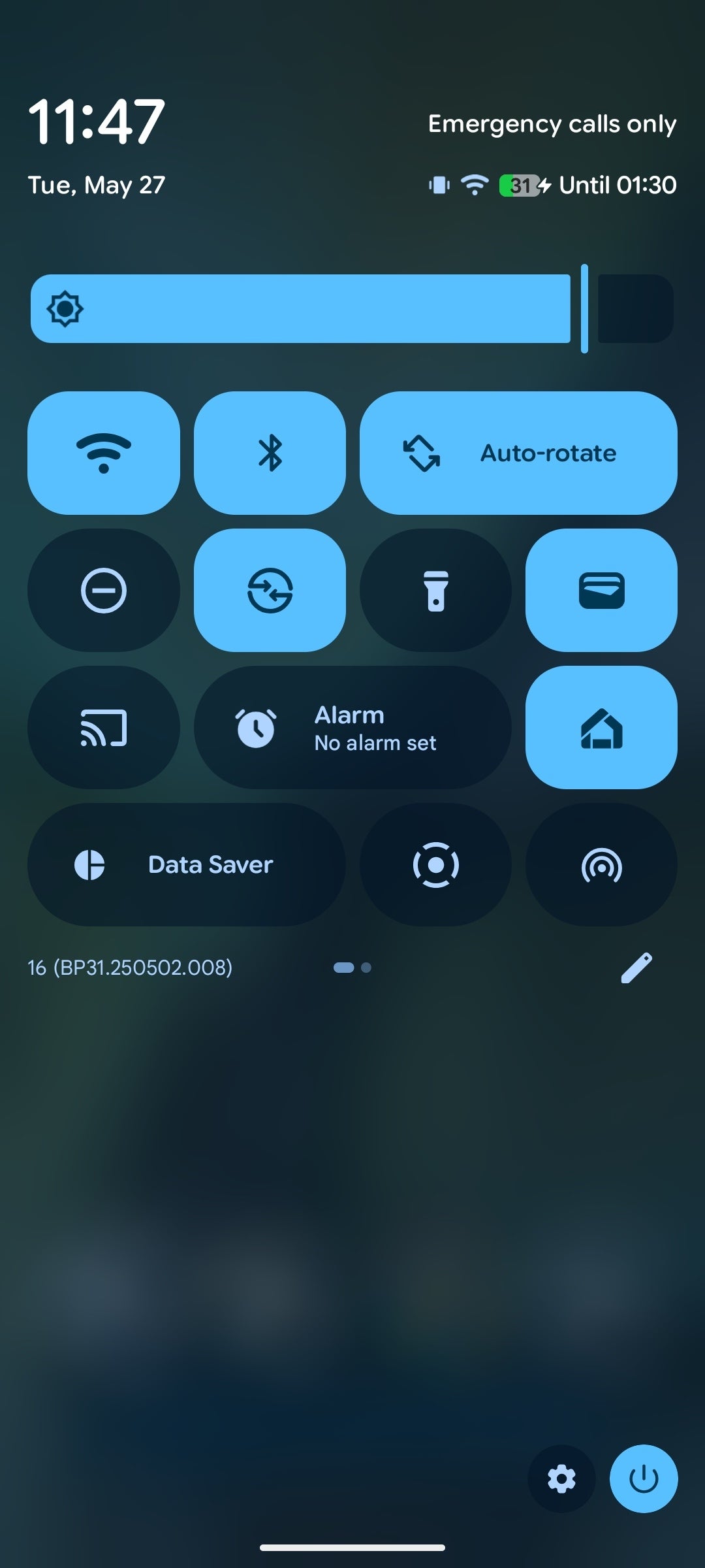


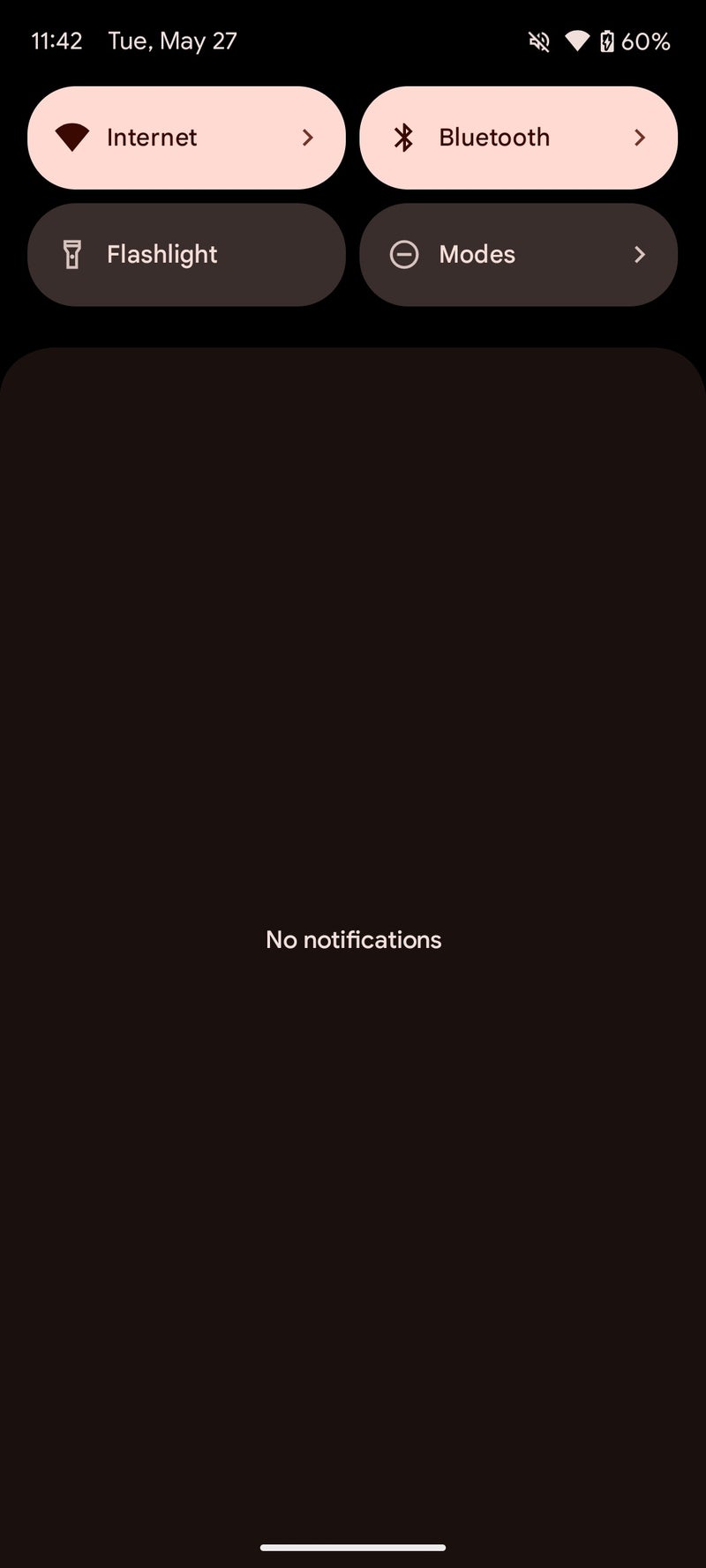
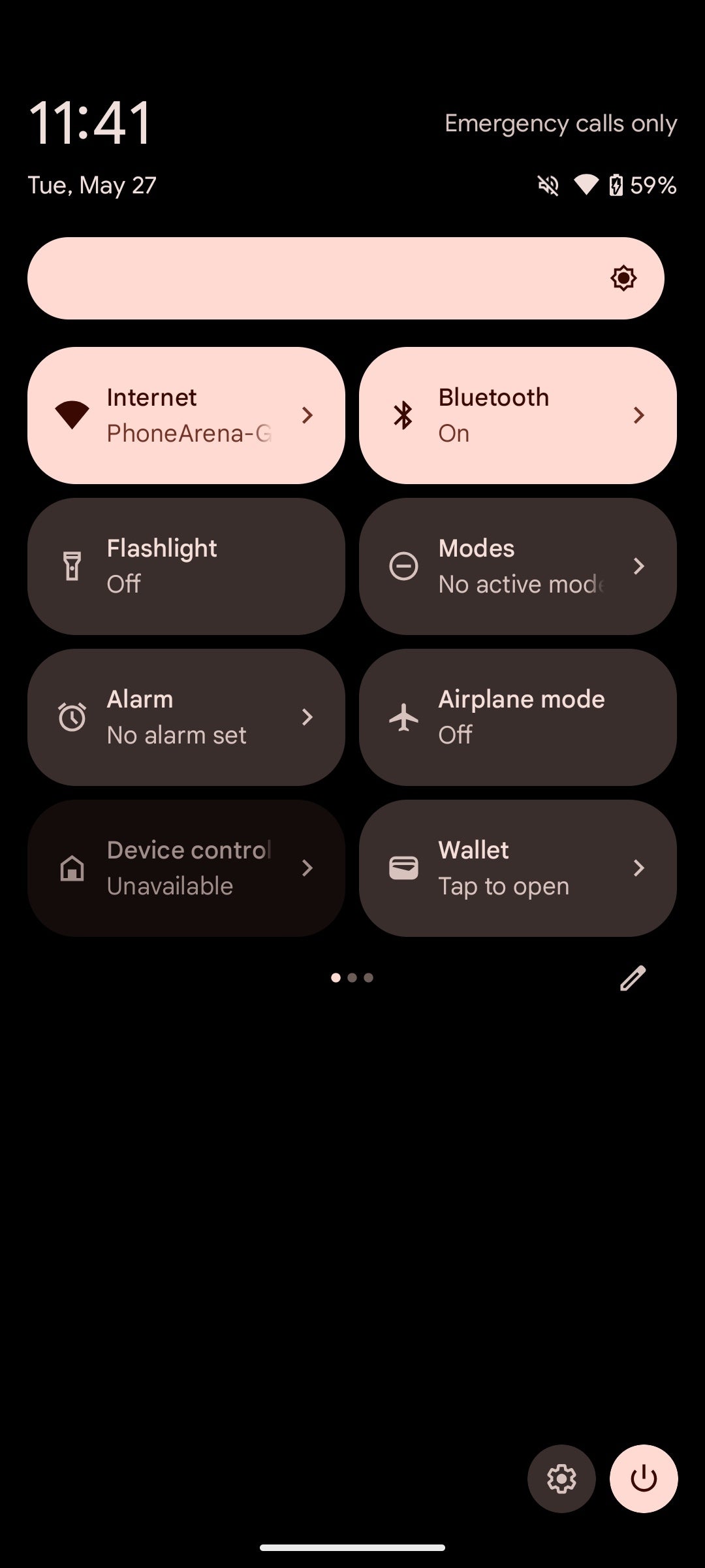
And this space-saving change definitely works, and it's not subjective at all. On Android 15, you get four quick tiles when you swipe down, or up to eight if you fully expand the shade. That's not very efficient.
Android 15
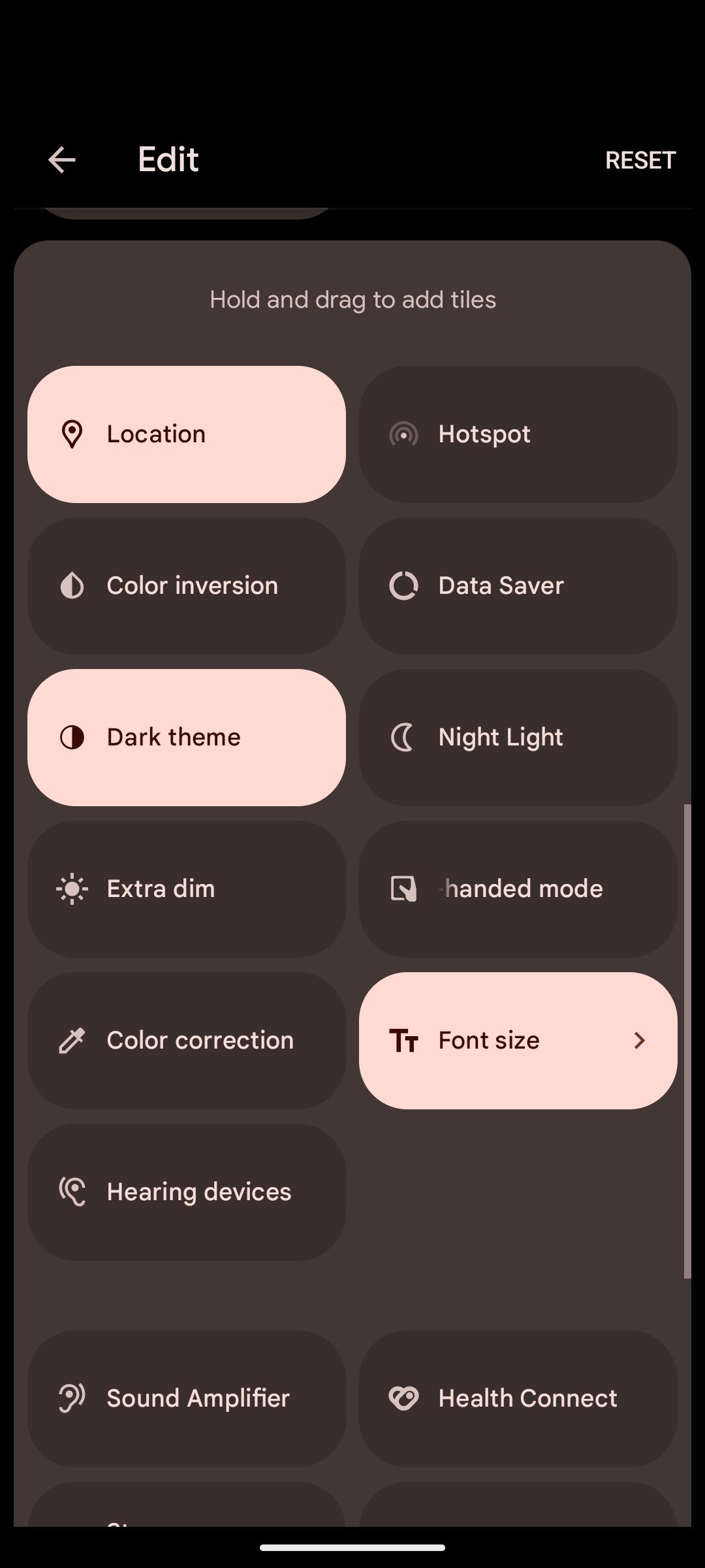
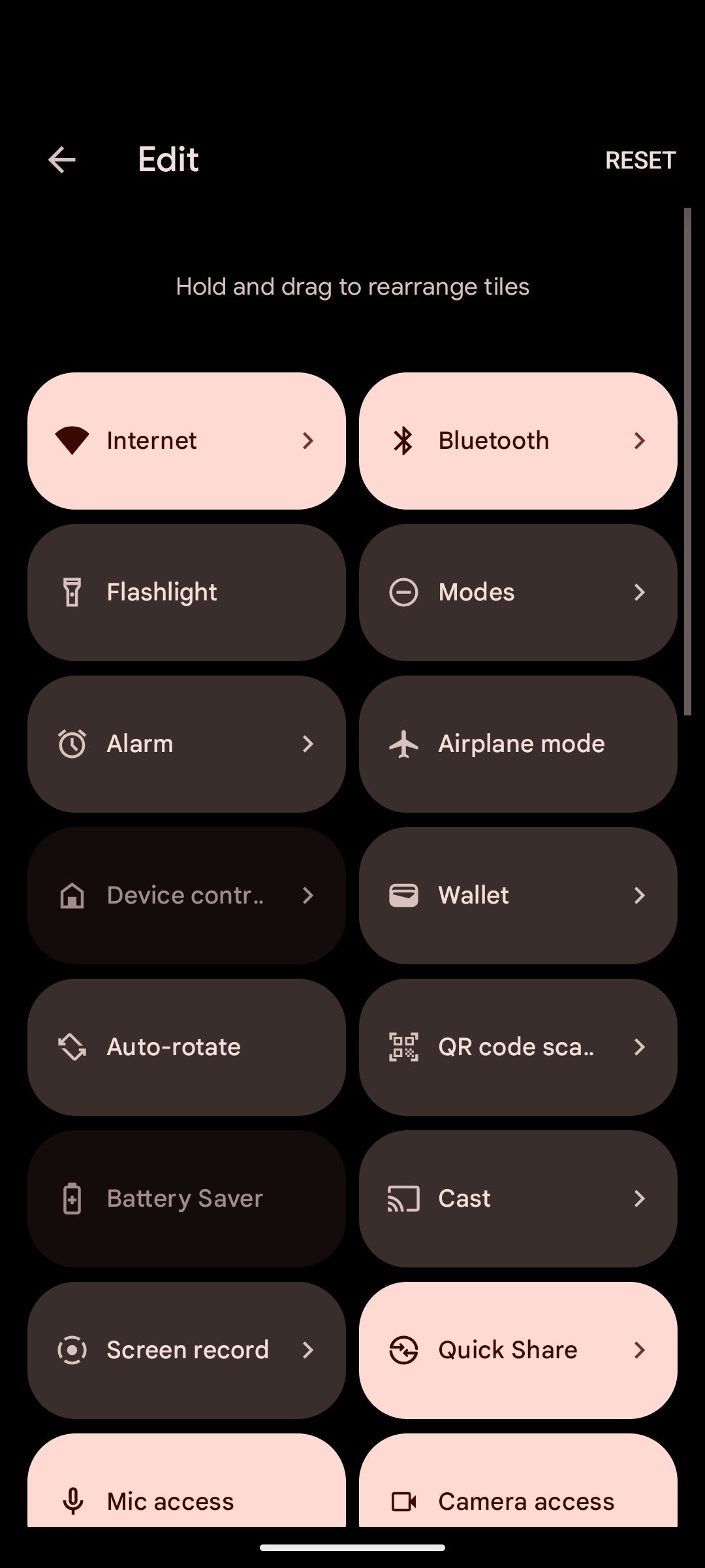
With Android 16's mix-and-match approach, you can have up to 16 small squircle buttons per page, which will display no text but an easily recognizable icon with the feature you're about to turn off or on. Long-pressing works in this mode, so the only thing you're losing is the superfluous text.
What's more, interacting with any of the buttons in Android 16 introduces a slight jiggly motion that affects the other buttons around, which is neat.
That's shaping up to be a very beneficial change for Pixel users.
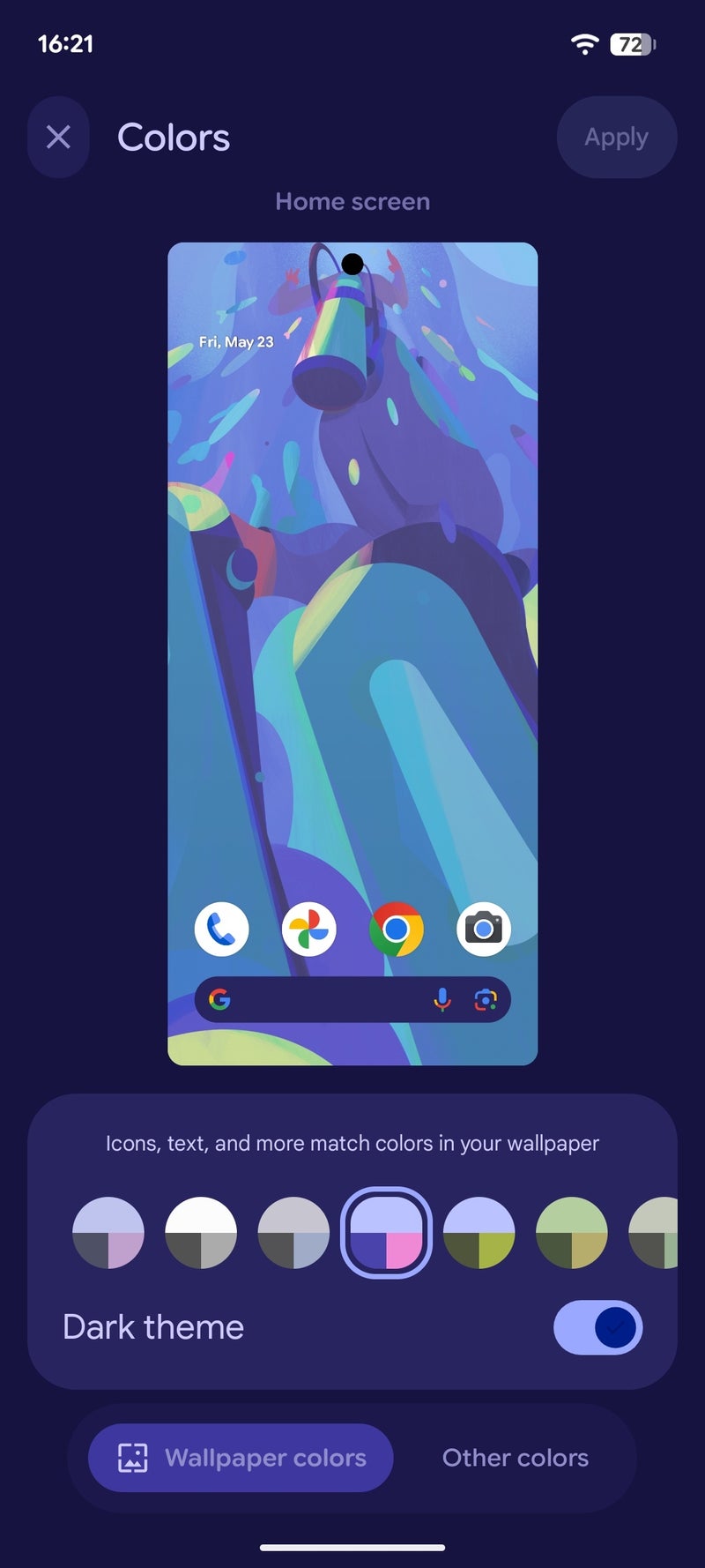
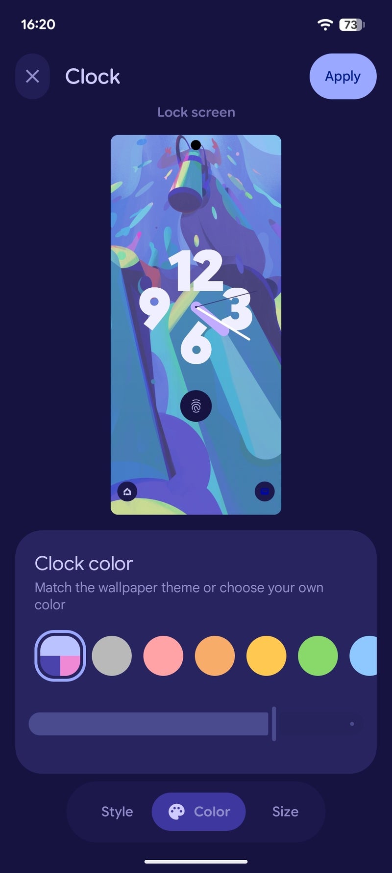
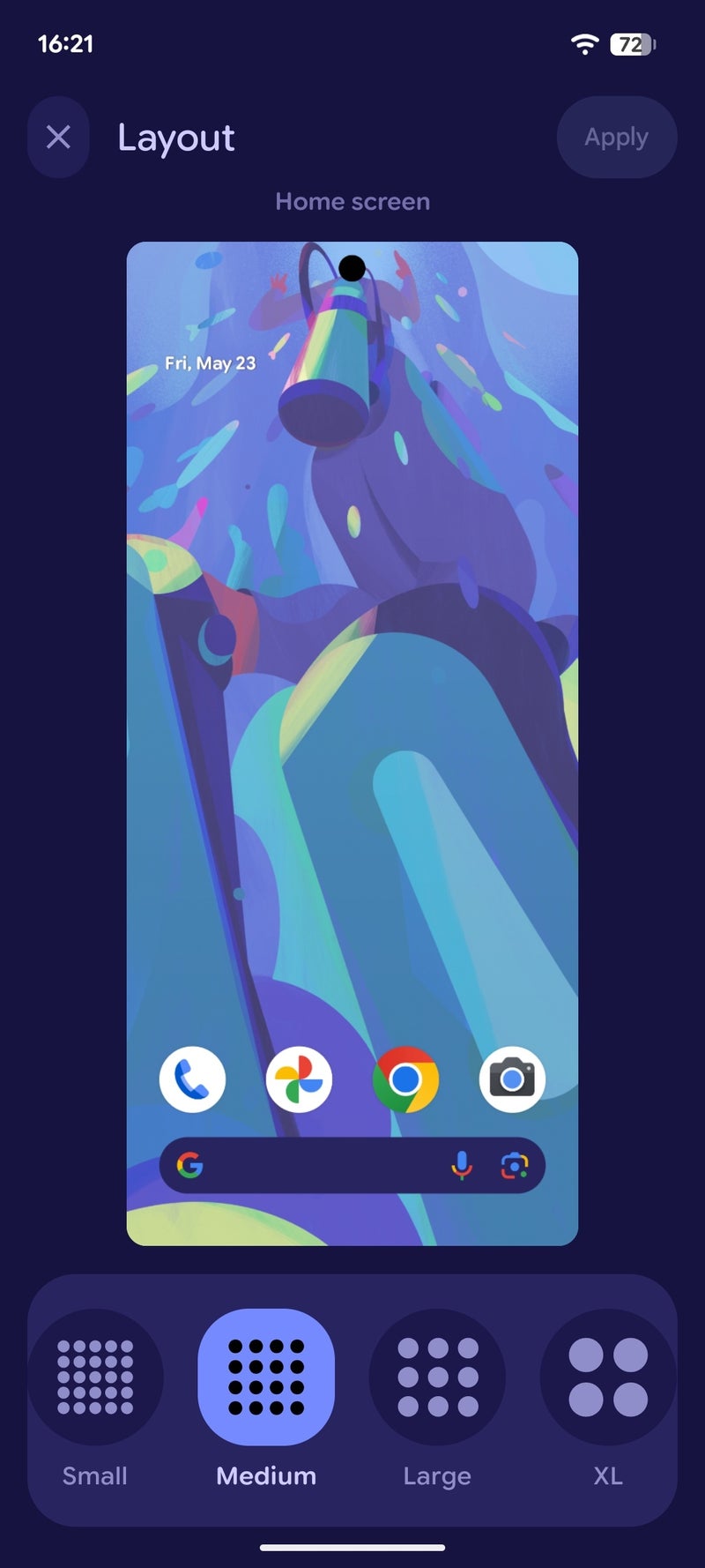
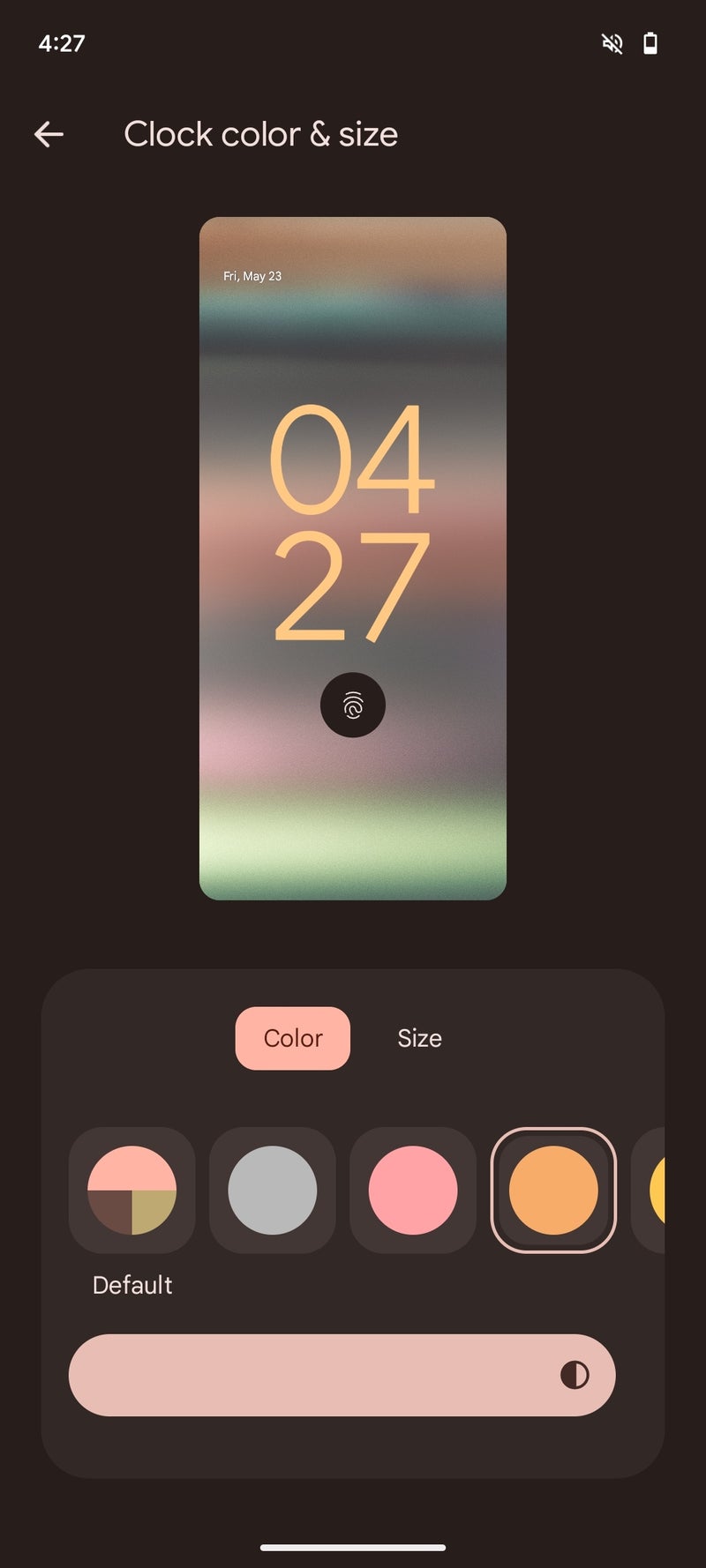
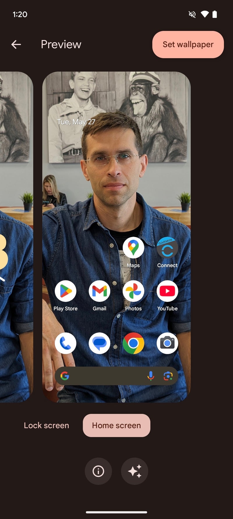
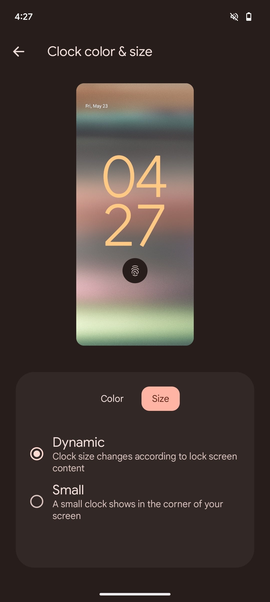
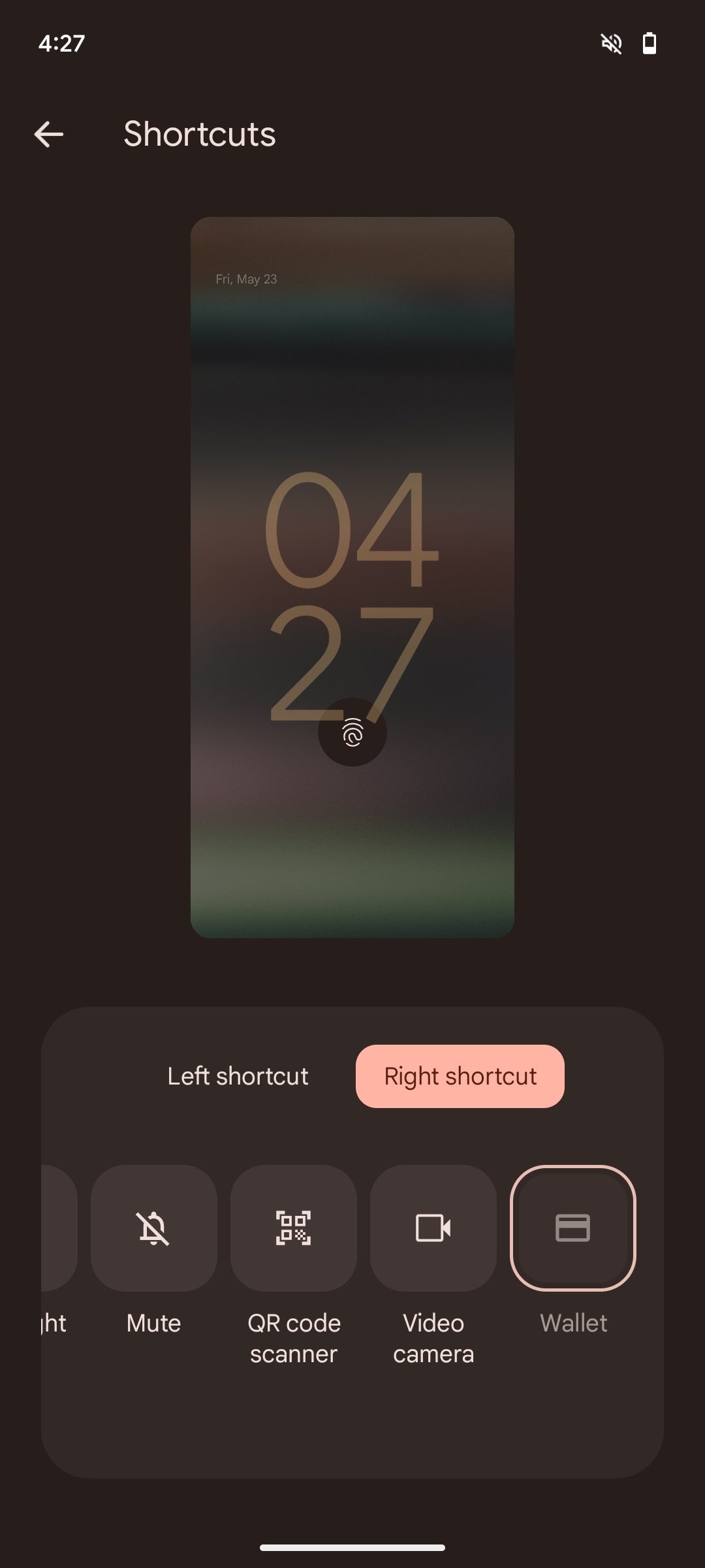
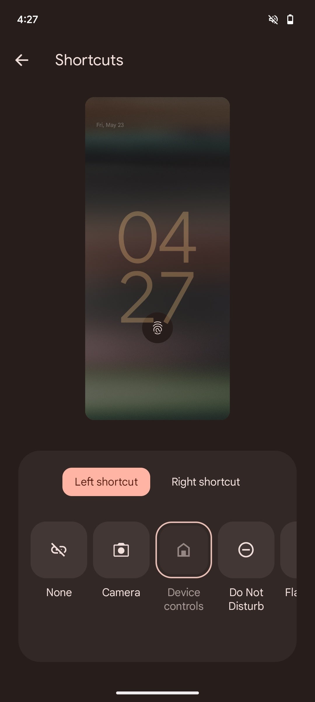
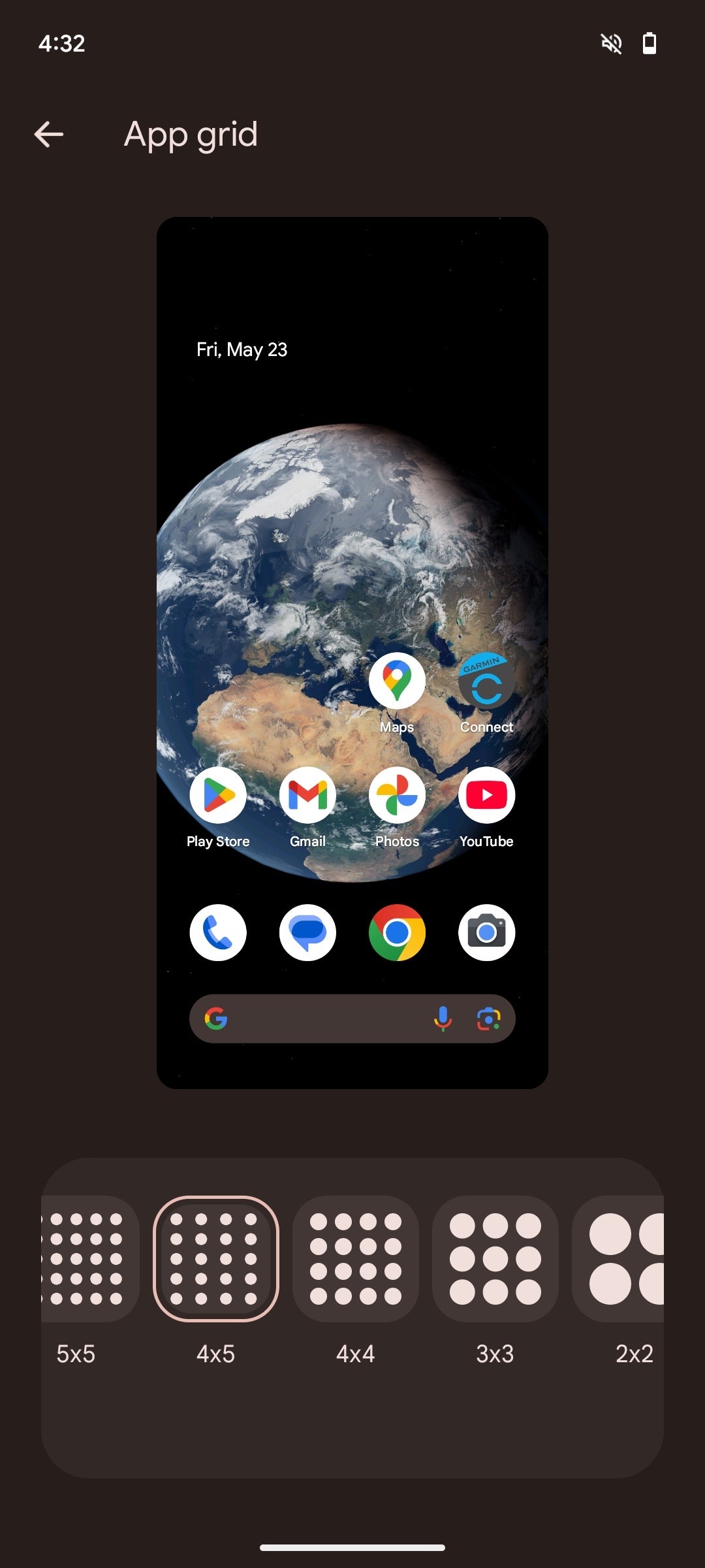
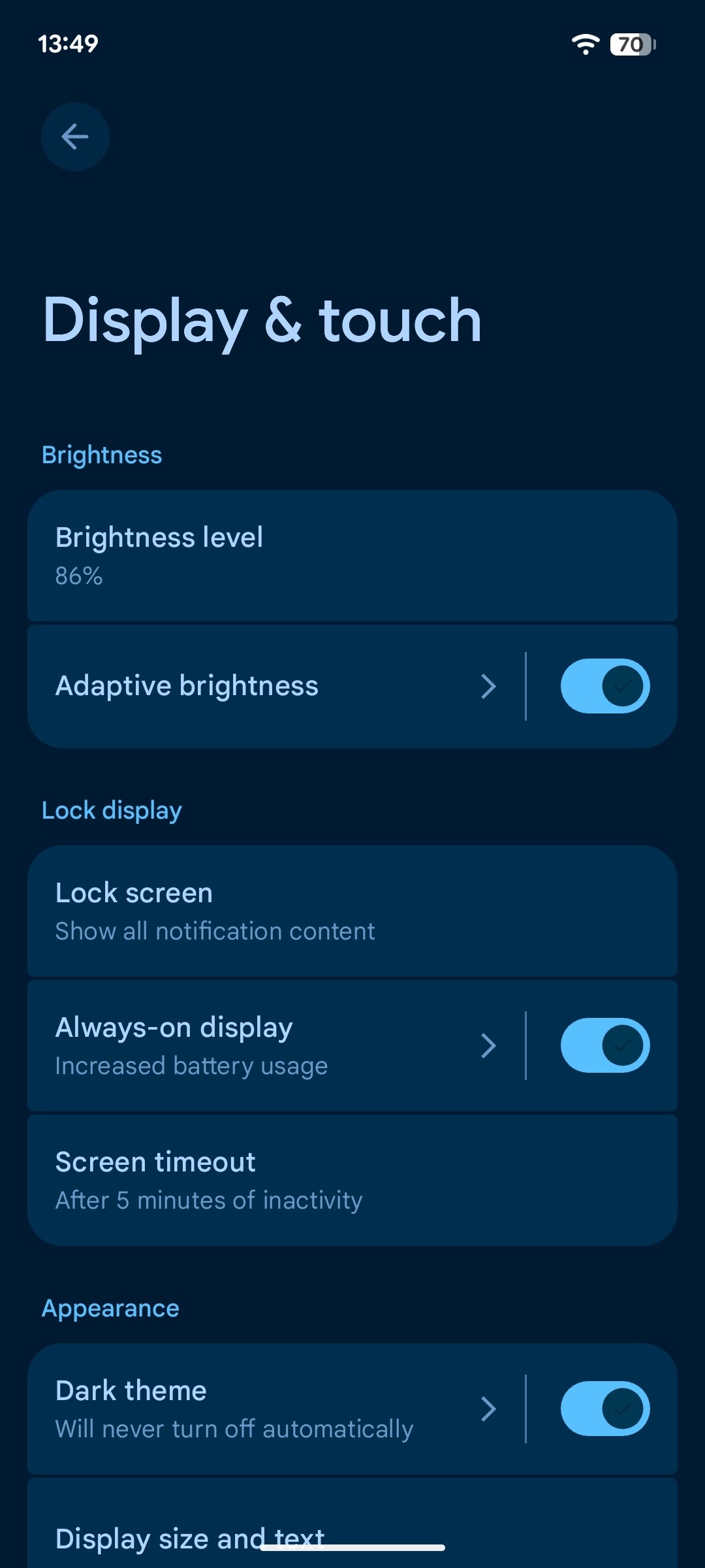
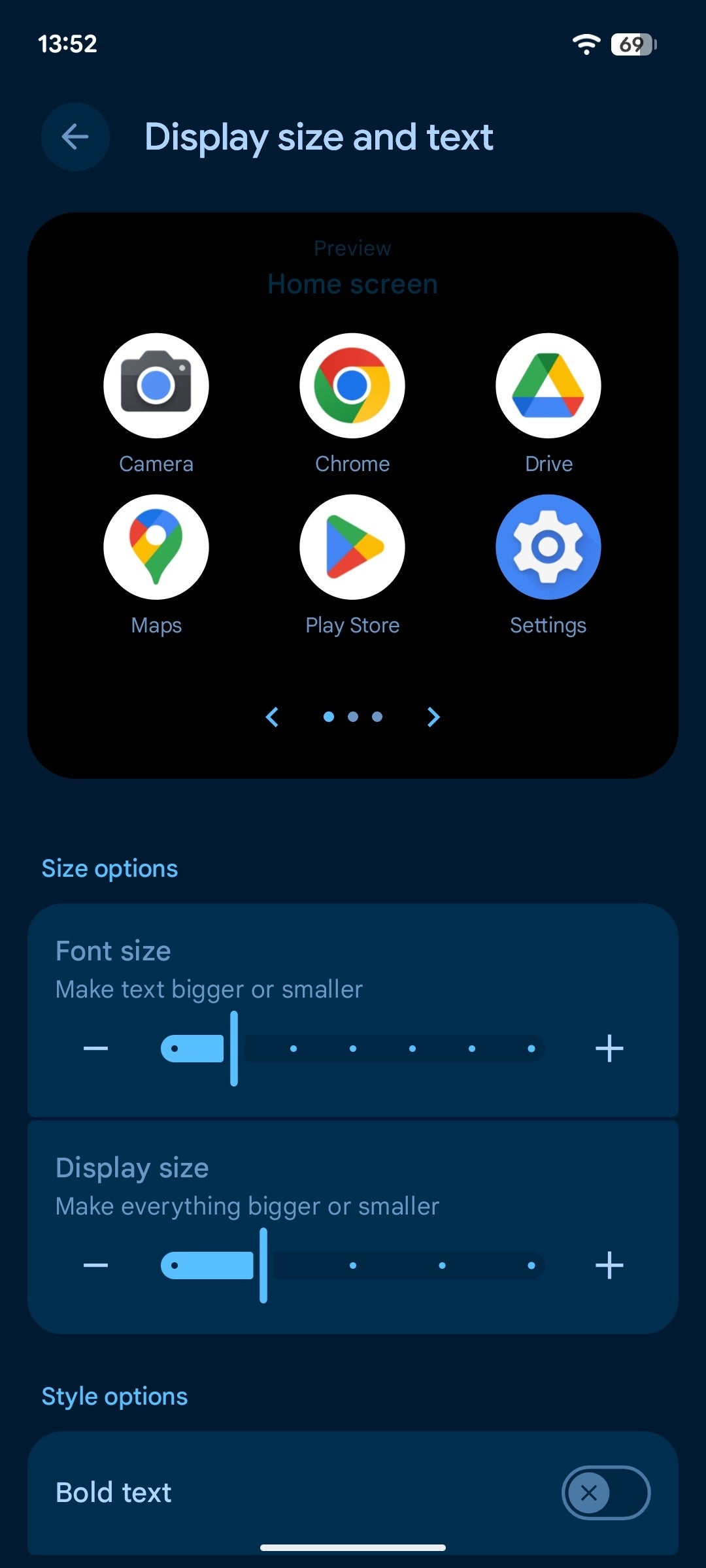
Lock screen and home screen customization
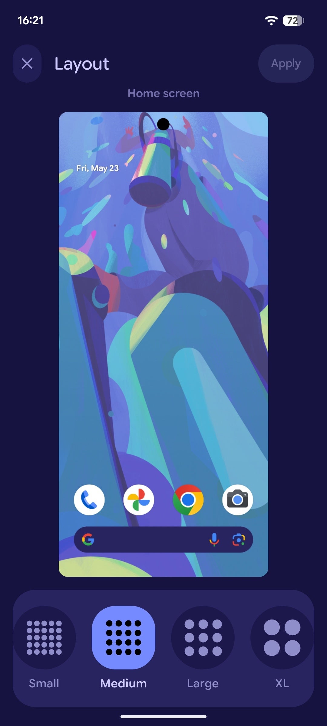
With the stockish Android that's available on Pixel phones, the lock and home screen customization is bundled together in the same "Wallpaper and style" menu, accessible either by pressing the home screen or from the respective option in the main settings page.
The changes here are mostly in the presentation. The interface is slightly flashier, but the overall theme here is that the magical ergonomic essence achieved by Android 15's customization menu is missing here––while the options are there, they're tucked away in dedicated menus and not immediately available, making personalization a few extra swipes or taps away. While the new menu feels a bit cleaner and more polished, it removes some of that user friendliness that we had with the previous Android.
Android 16
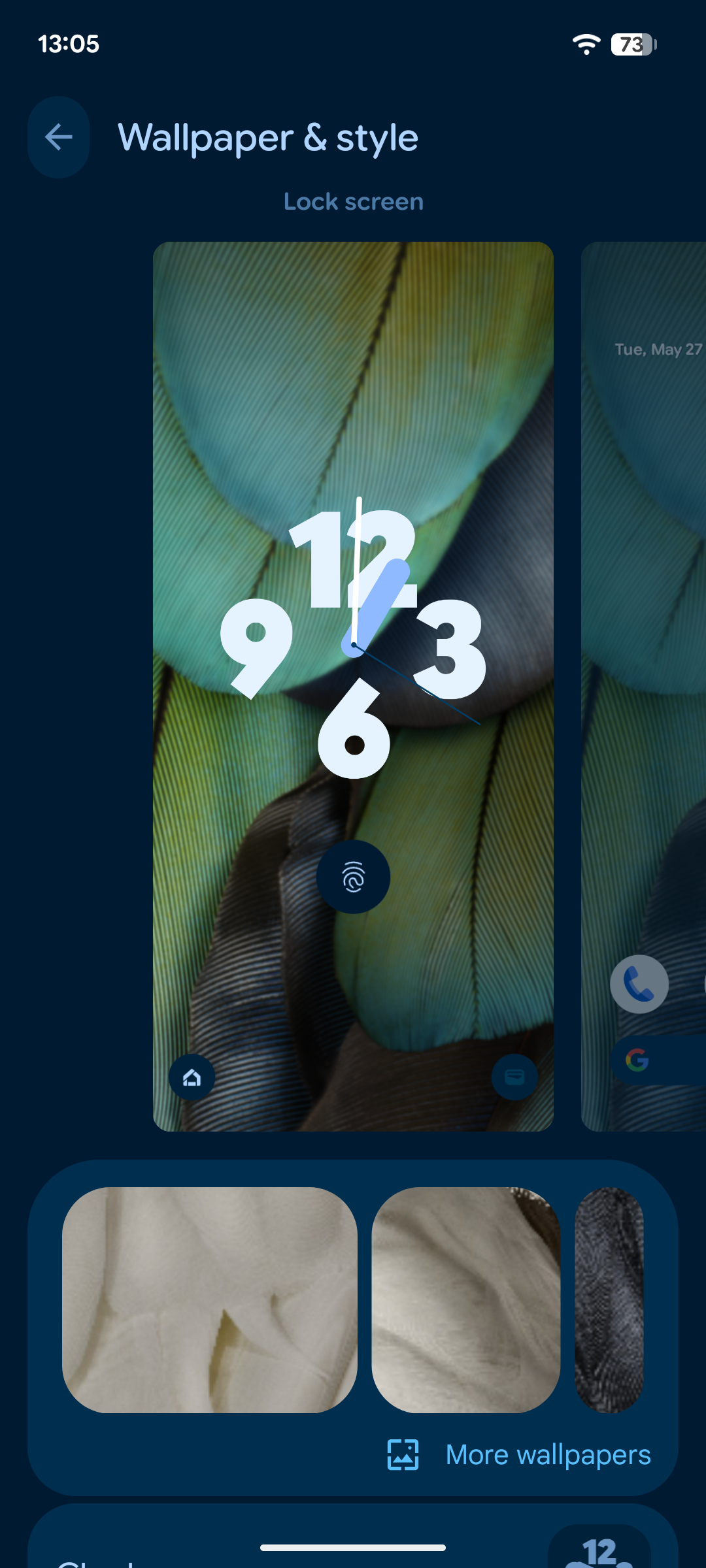
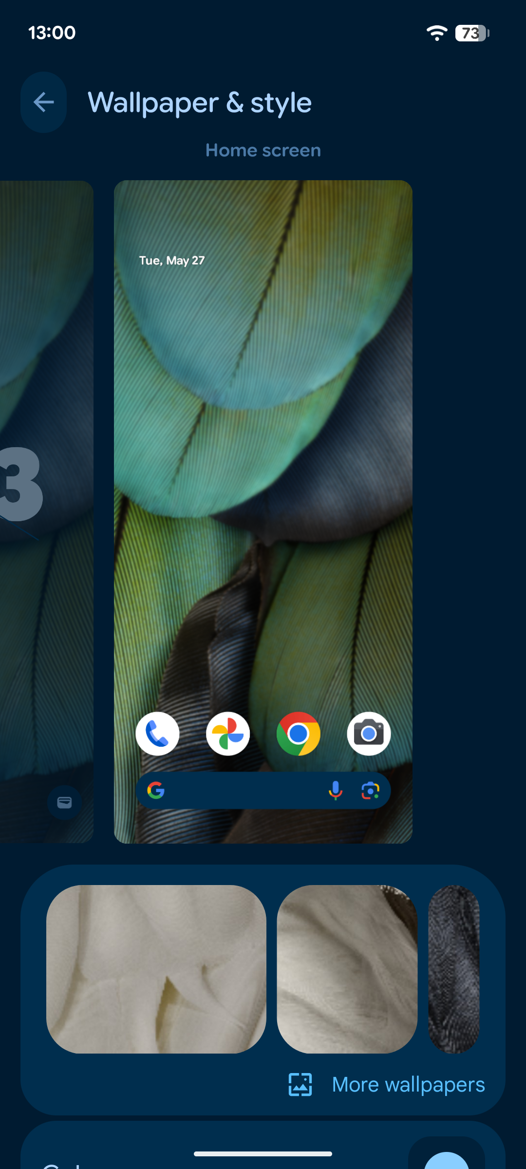


With Android 16, the interface has been juggled up a bit, with some essential features like the lock screen clock style and theme colors getting nested inside other menus. While their changed places are logical and intuitive to get to, you now have to take one extra swipe or tap, which isn't beneficial to the overall usability and somewhat hurts the user-friendliness as well as the ergonomics.
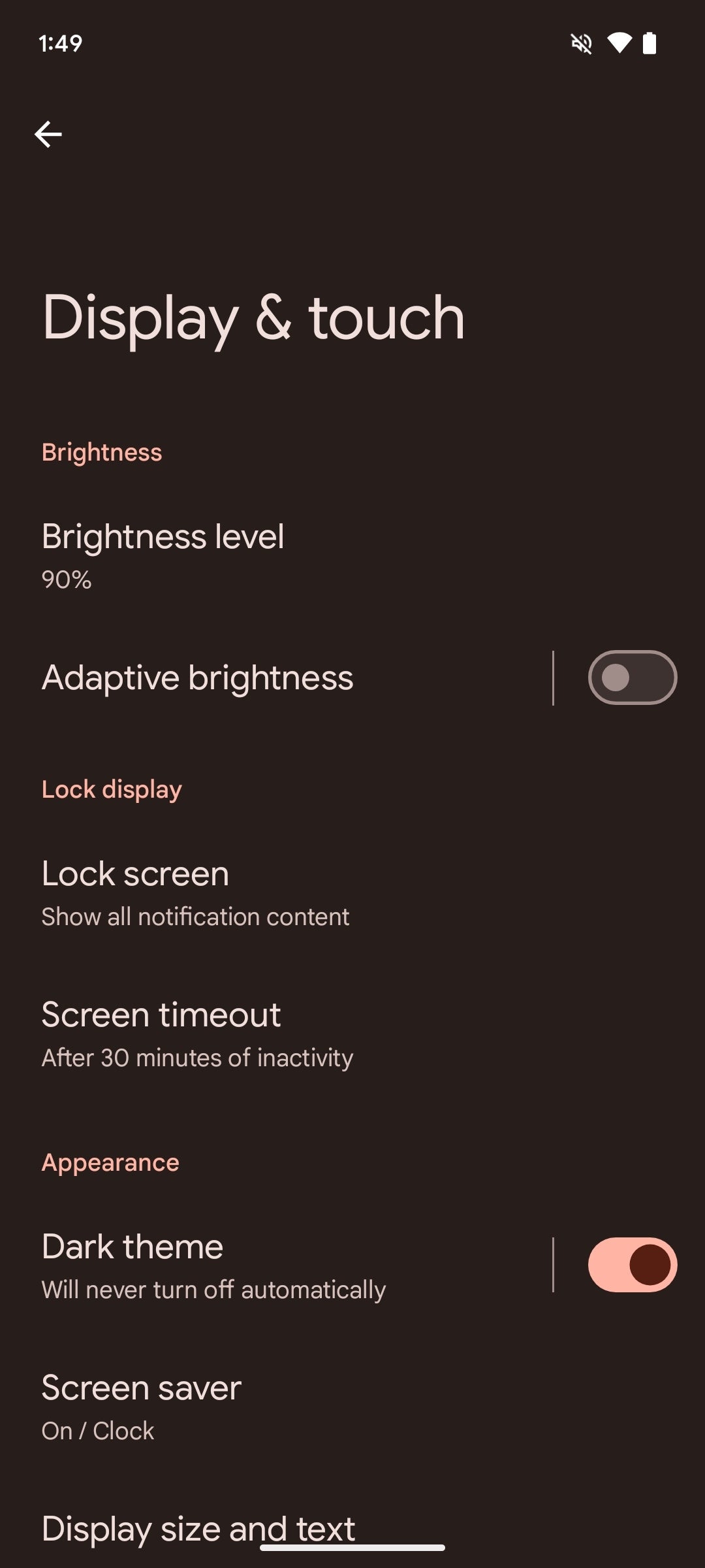
Android 15

The older Android 15 isn't drastically different, as the feature set is largely the same. What's more, the use of space here is a bit more efficient, though, as pretty much all essential options are available as soon as you open the customization menu. You can change the clock style, main theme colors, and the wallpaper straightaway. Definitely a more efficient use of space here.
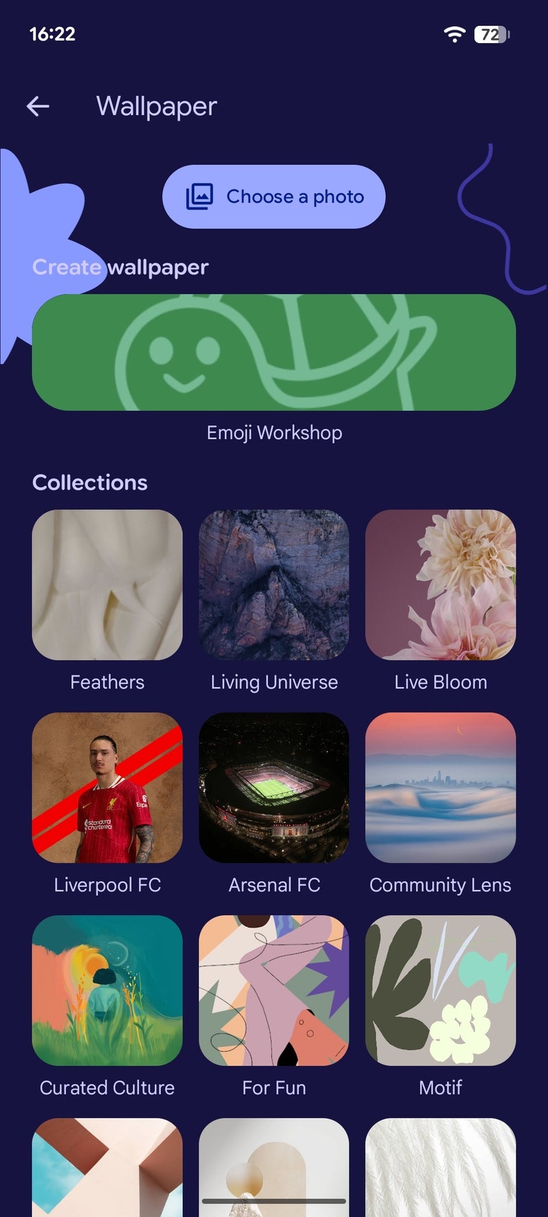
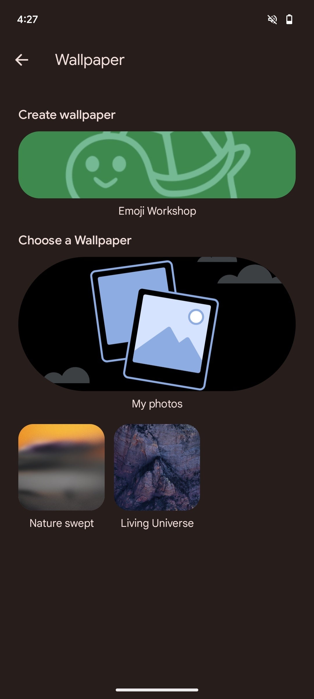
Wallpapers
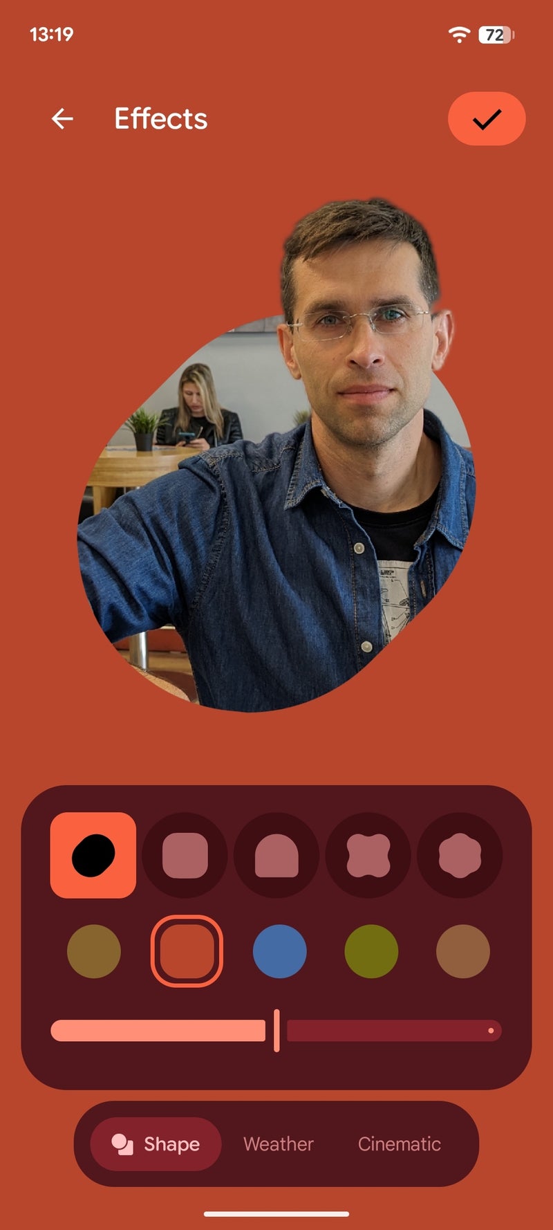
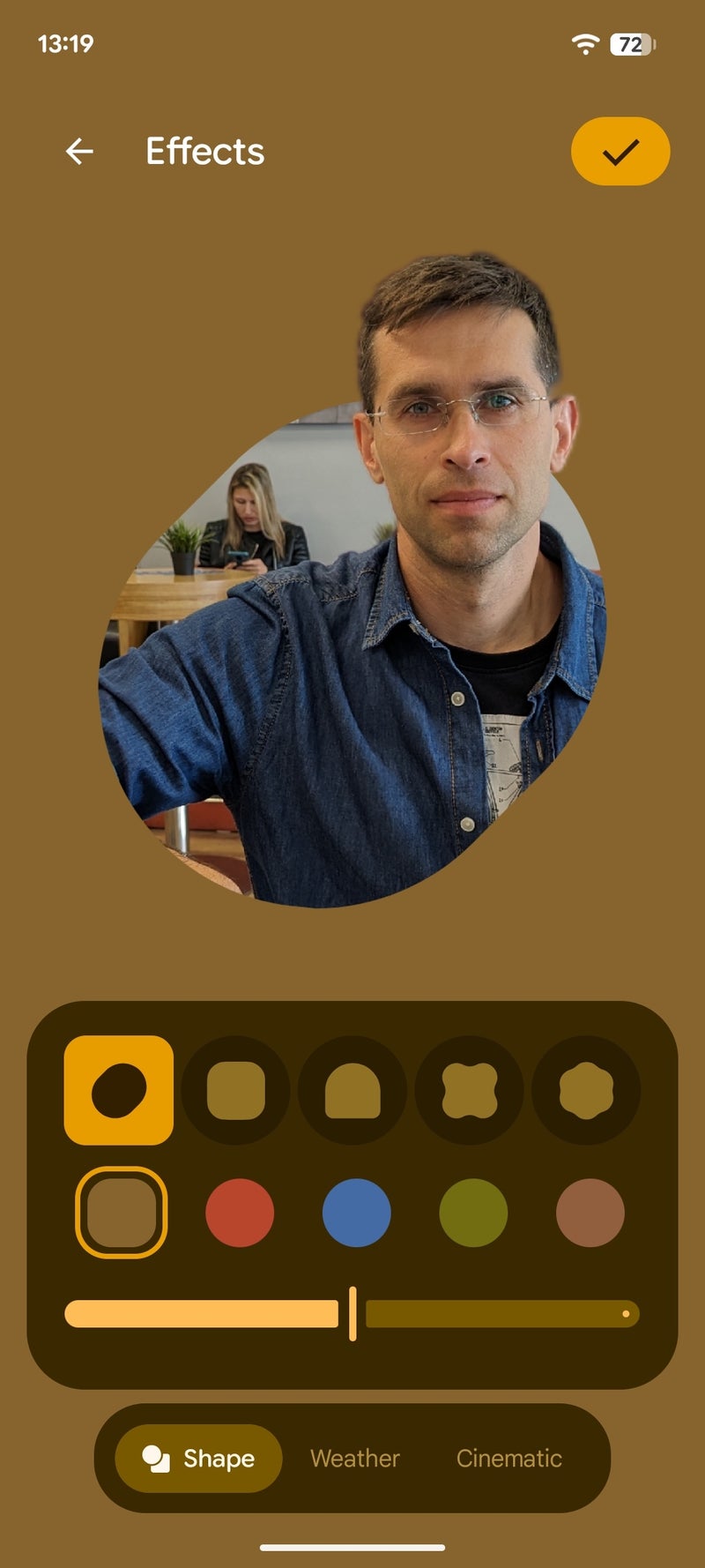
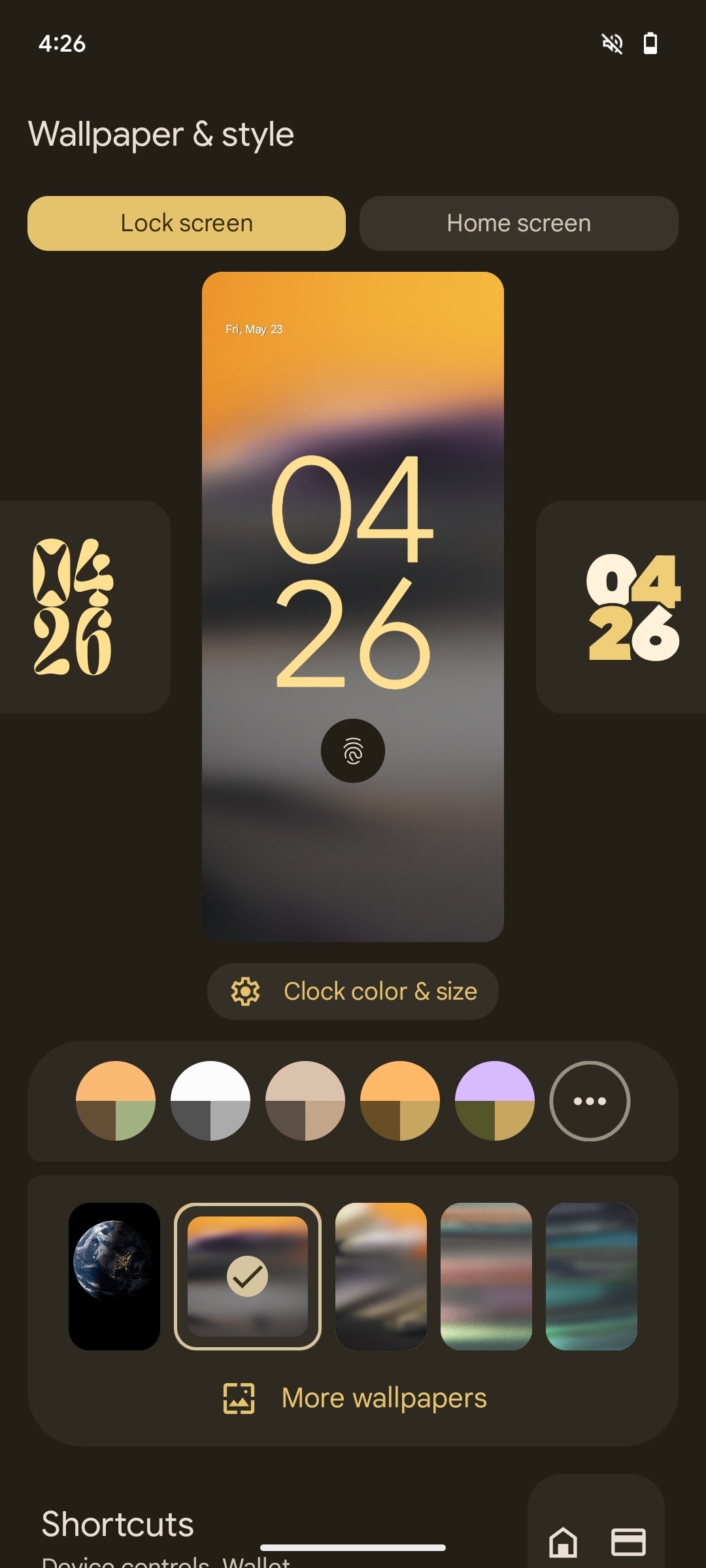
New with Android 16 are Google's cool new Magic Wallpaper options available when you use any of your photos as a backdrop.
Android 16 new wallpaper options
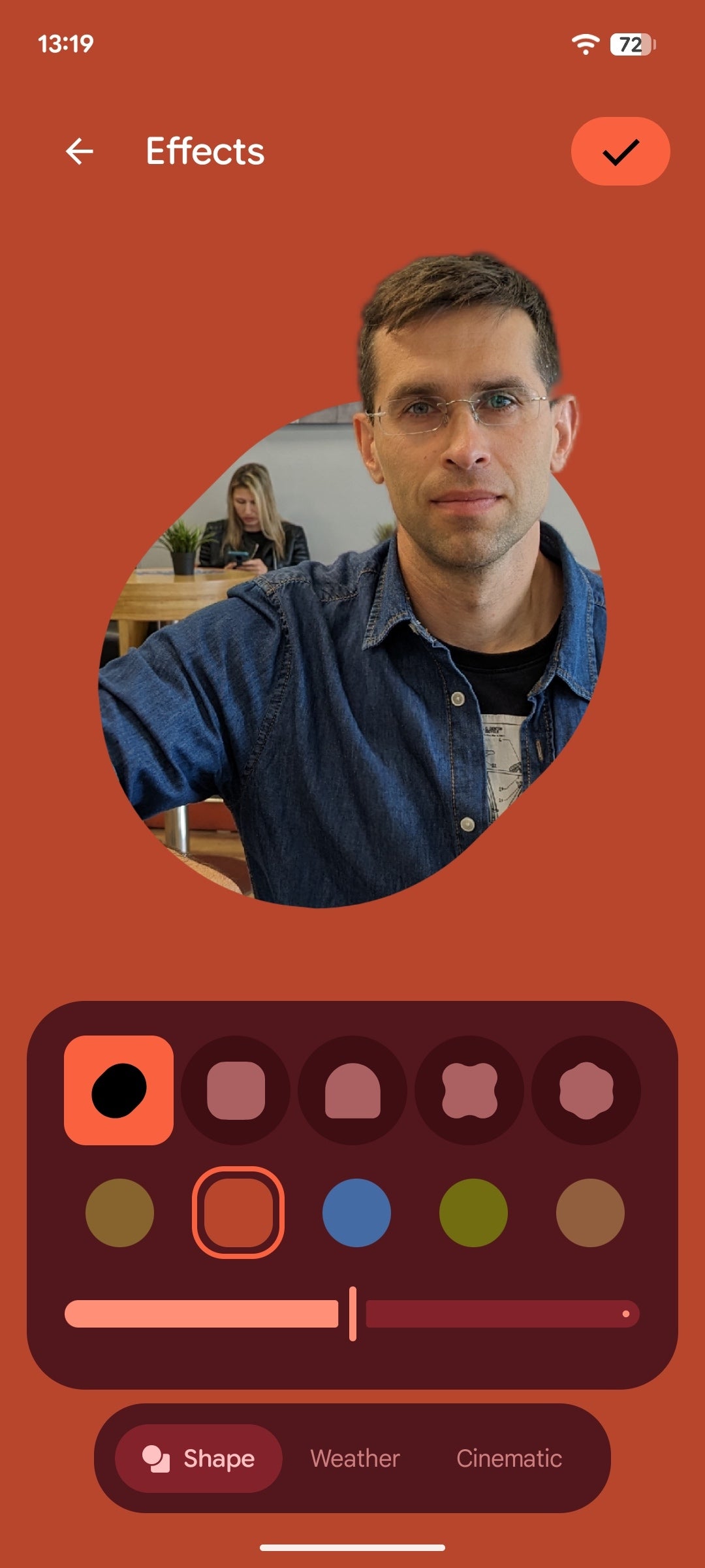

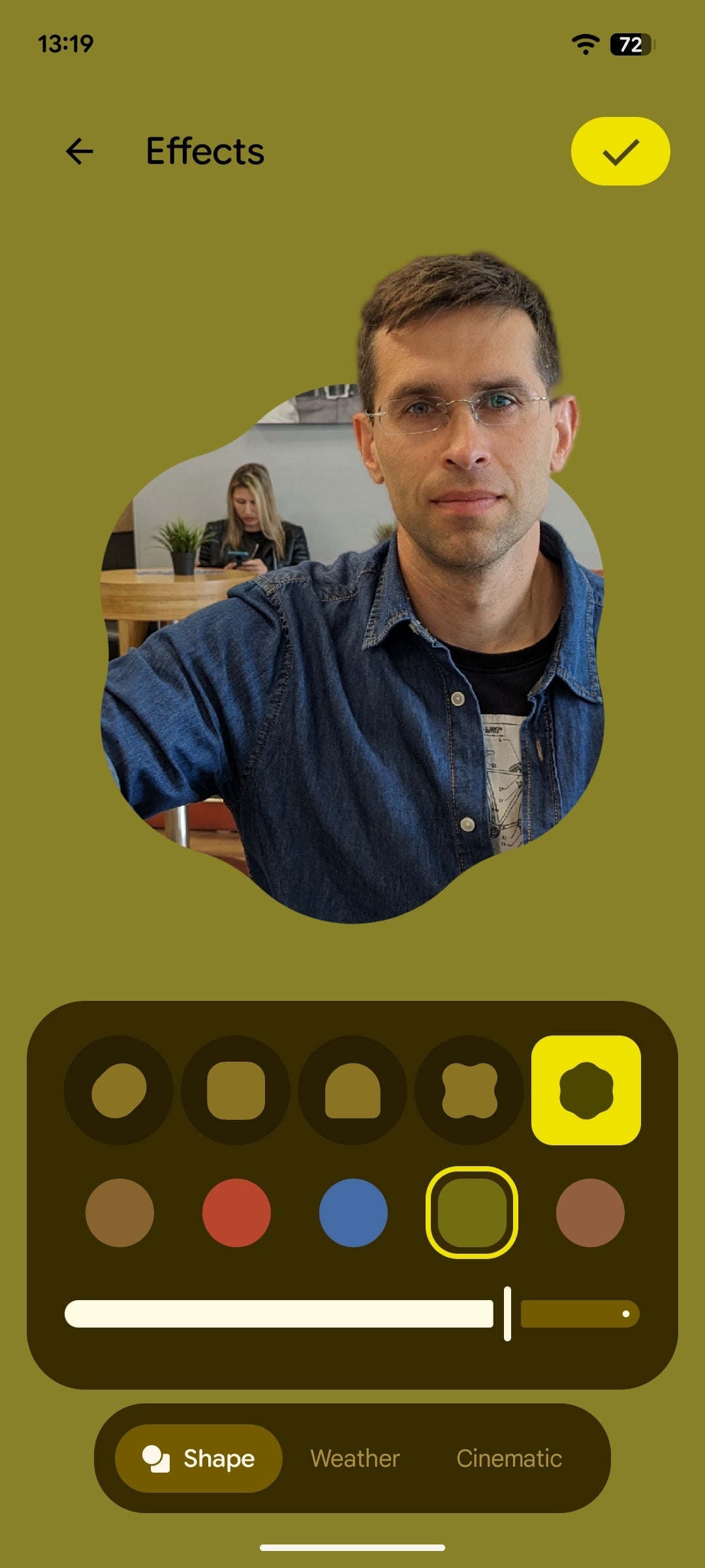
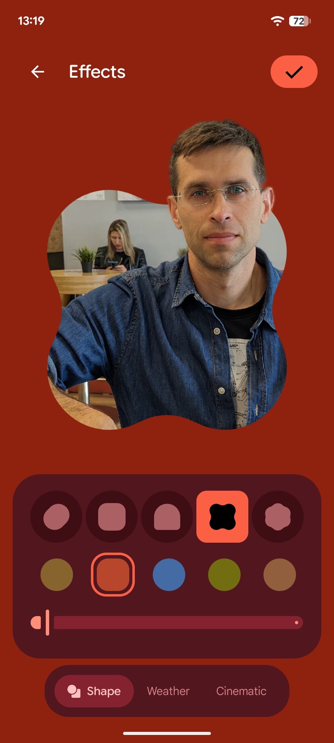
When you select a photo as your wallpaper, it will be searched for any depth information, allowing you to highlight the subject in one of the few wacky cutout shapes. You get to pick the shape, as well as the color and intensity of the background color. This effect works best with portraits.
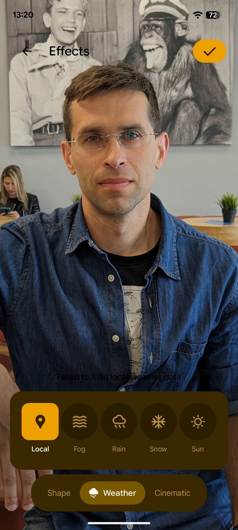
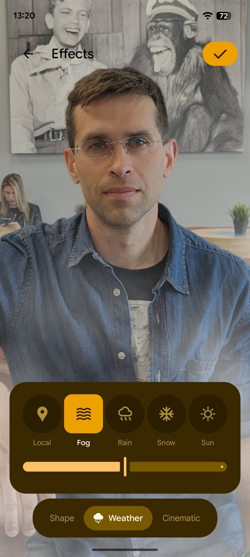
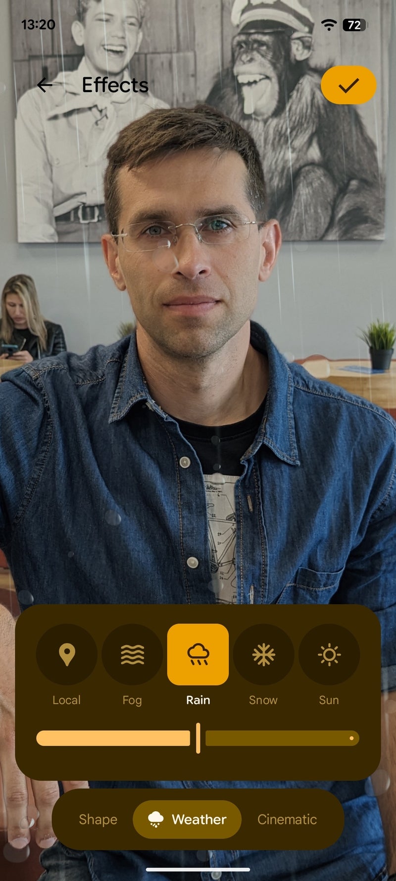
Android 16 new weather wallpaper effects

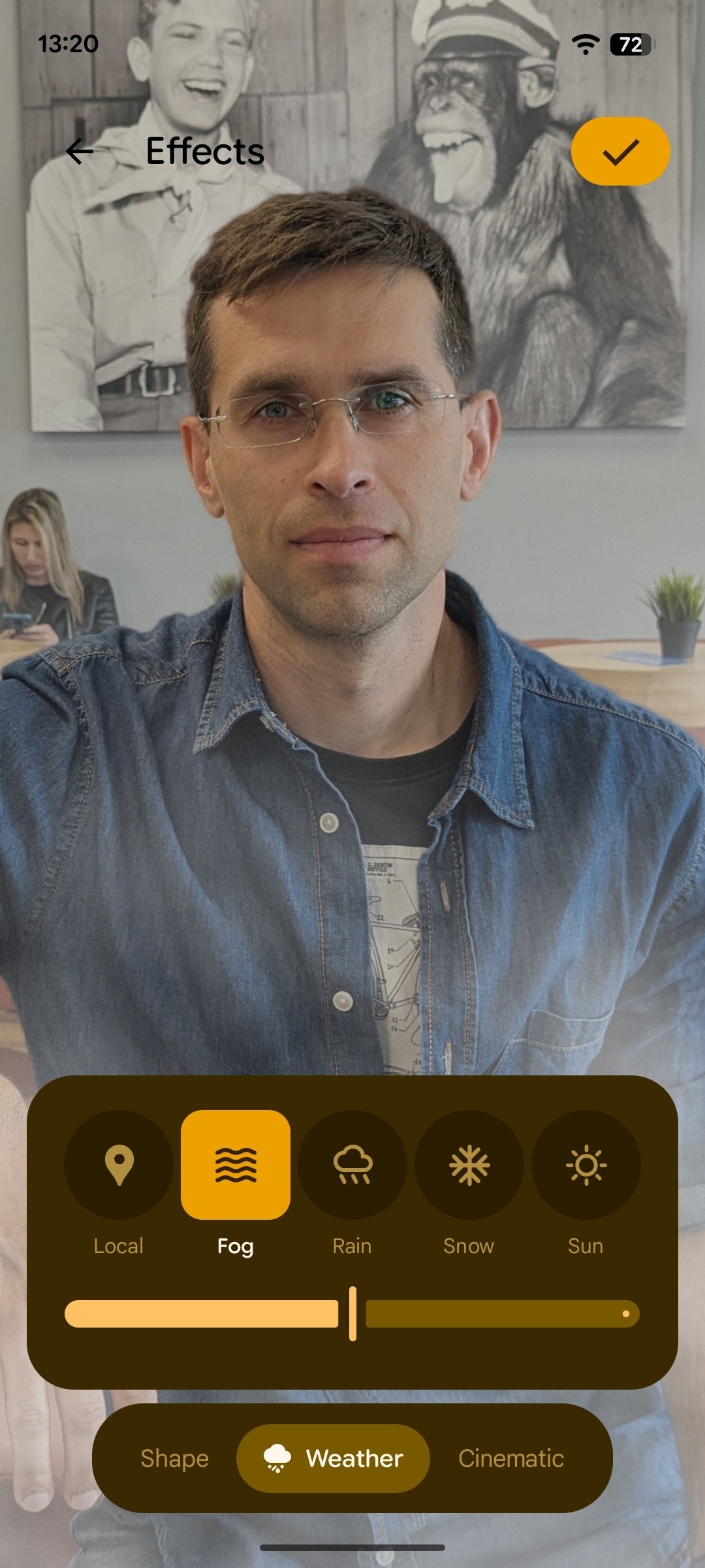

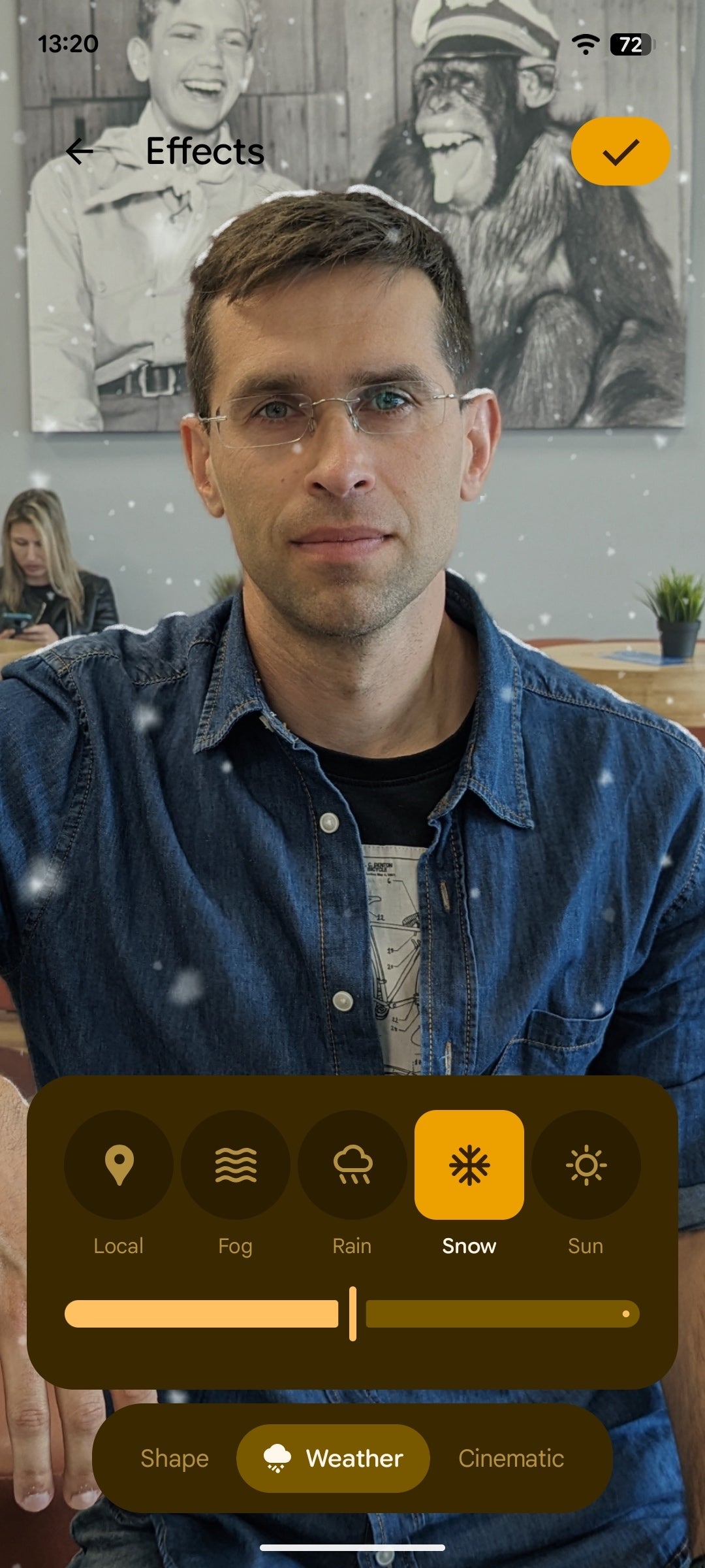
Another new feature here are the live weather effects, which can apply an effect to your photos in accordance to the local weather conditions, like rain, snow, fog, or sun rays. It's a fun feature that works best with landscape photos, though seeing snow pile up on your portrait wallpaper is also fun!
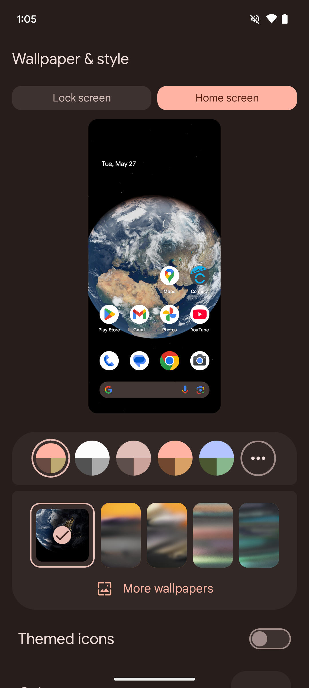
Android 15 wallpaper customization

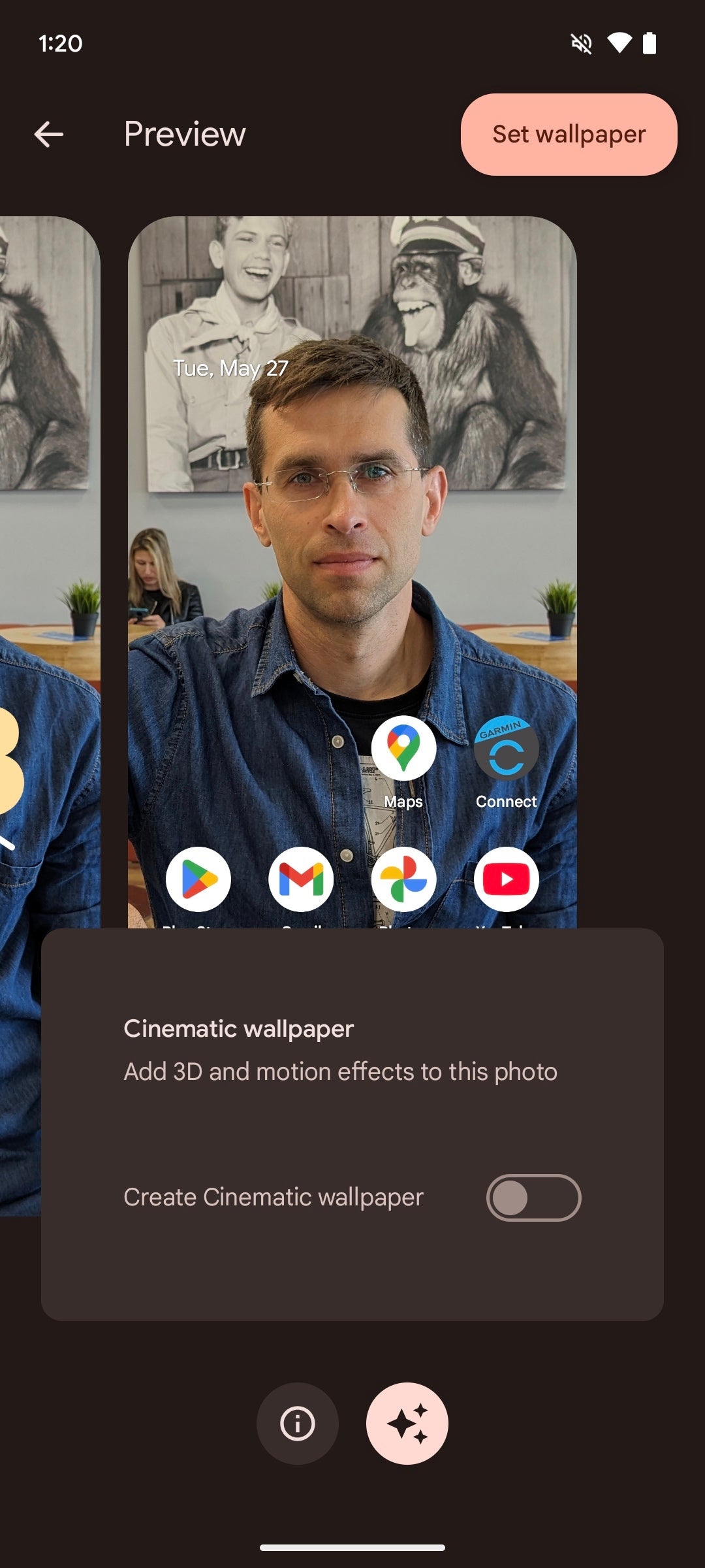
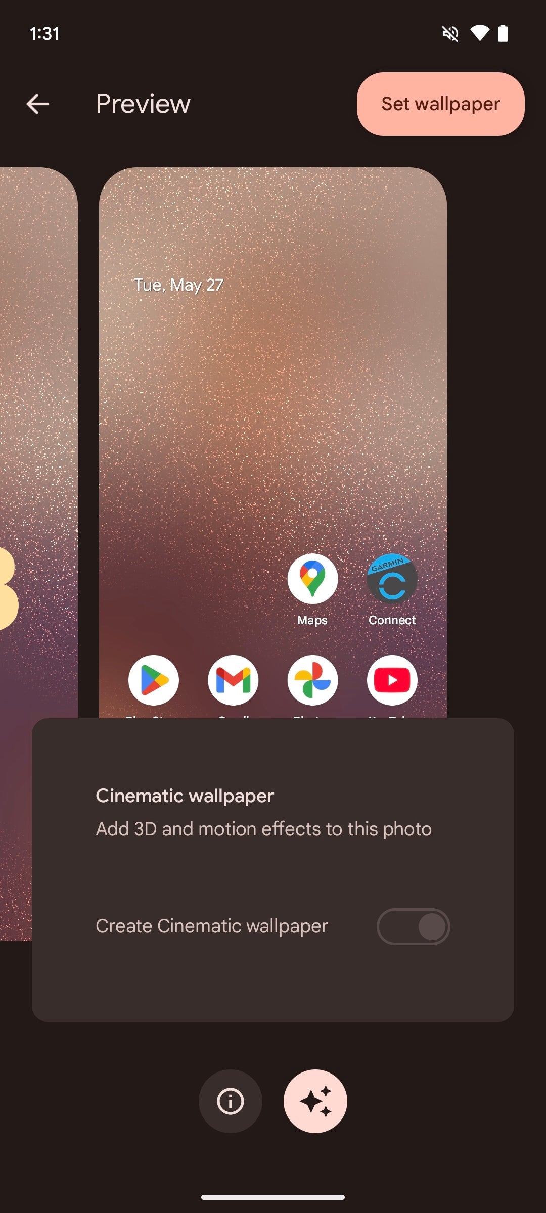
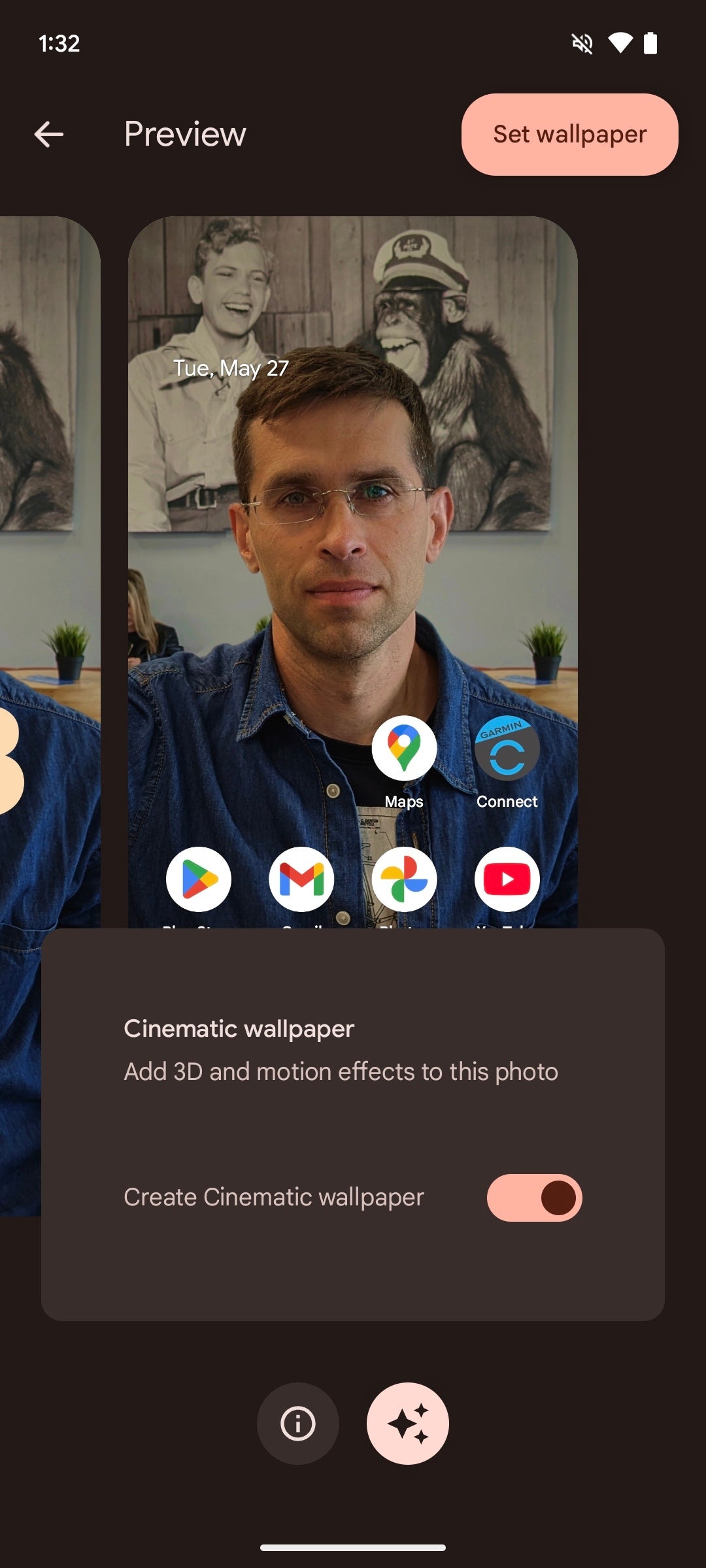
On the other hand, Android 15 is lighter in terms of features: it only has the Cinematic wallpapers option available, which applies a subtle 3D effect to your photos. Pretty humble.
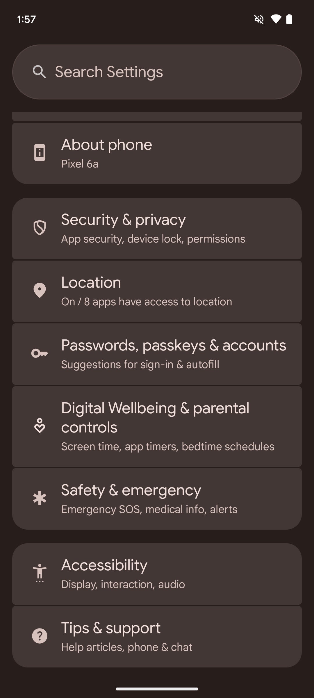
Settings menu
The main settings page hasn't gone through major changes. Sure, some secondary menus have been shuffled around and others have moved, but just about anything is right where you'd expect it to be.
New are the backdrops on the menu icons, which add a much-needed splash of color to an otherwise drab-looking menu.
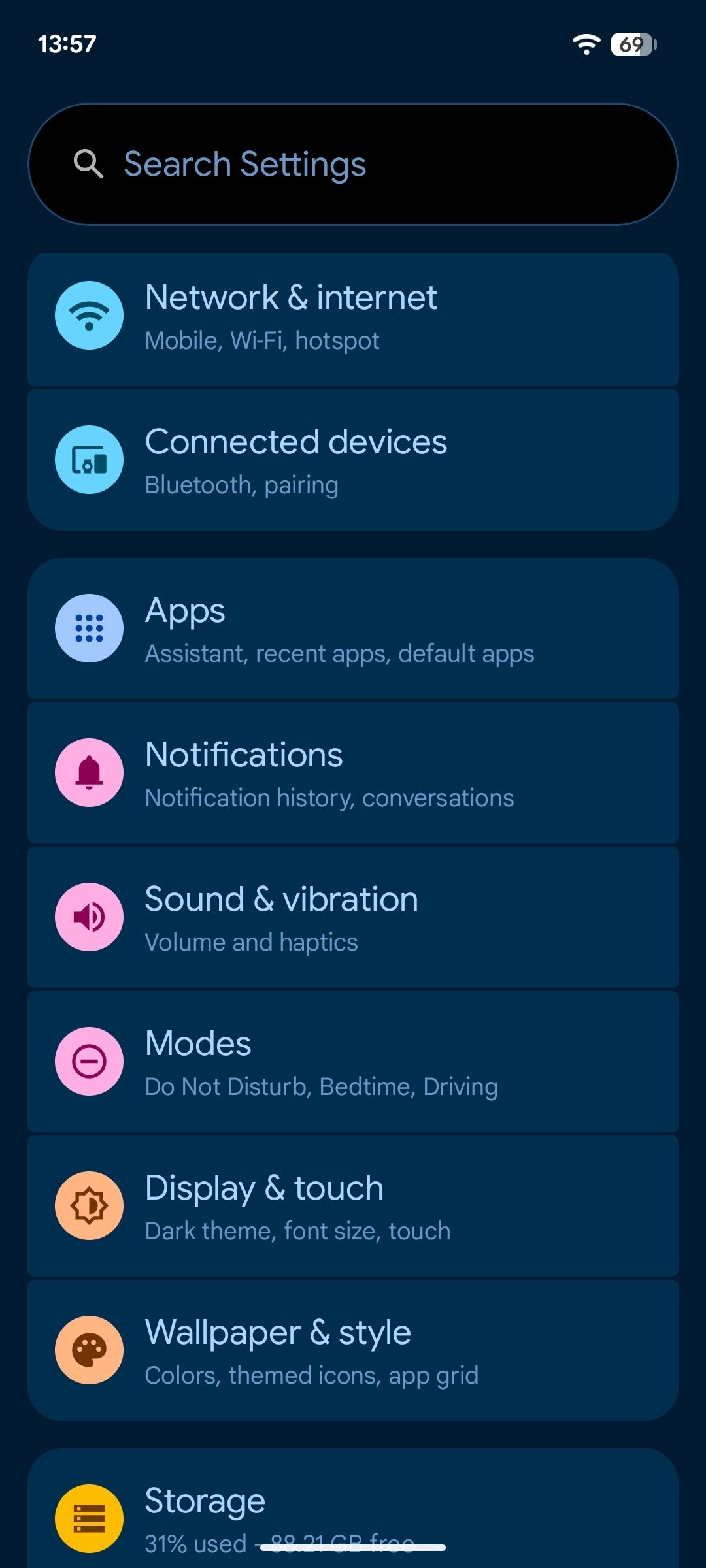
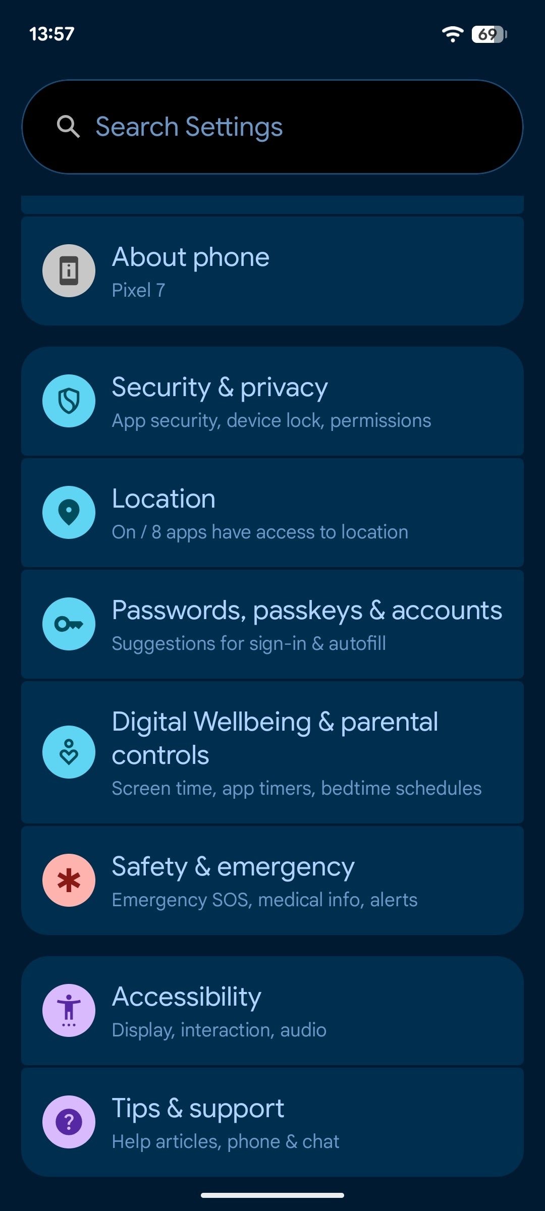
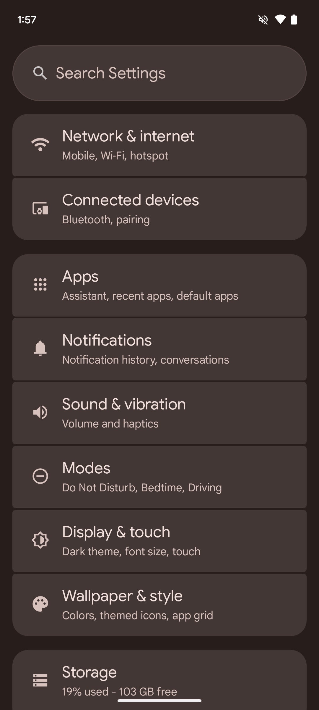
One of the few changes is inside the different settings pages. Previously, each one of these got a uniform color wallpaper at the rear, which didn't help much in the way of differentiating between the separate sections.
Android 16 revises that and adds a secondary, slightly lighter coat of paint as a backdrop of the different sections, which definitely aids the legibility of the different menus.
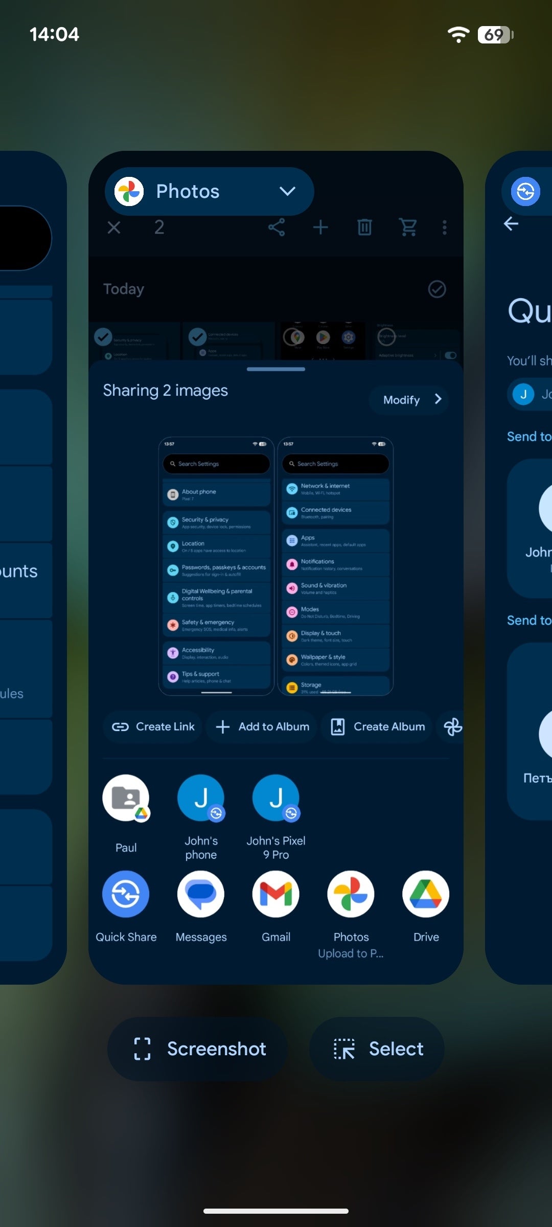
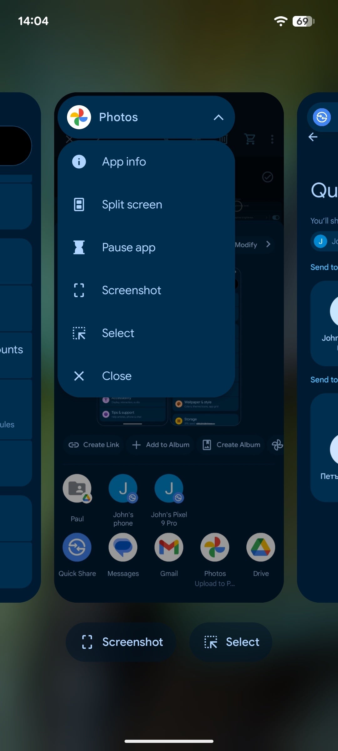
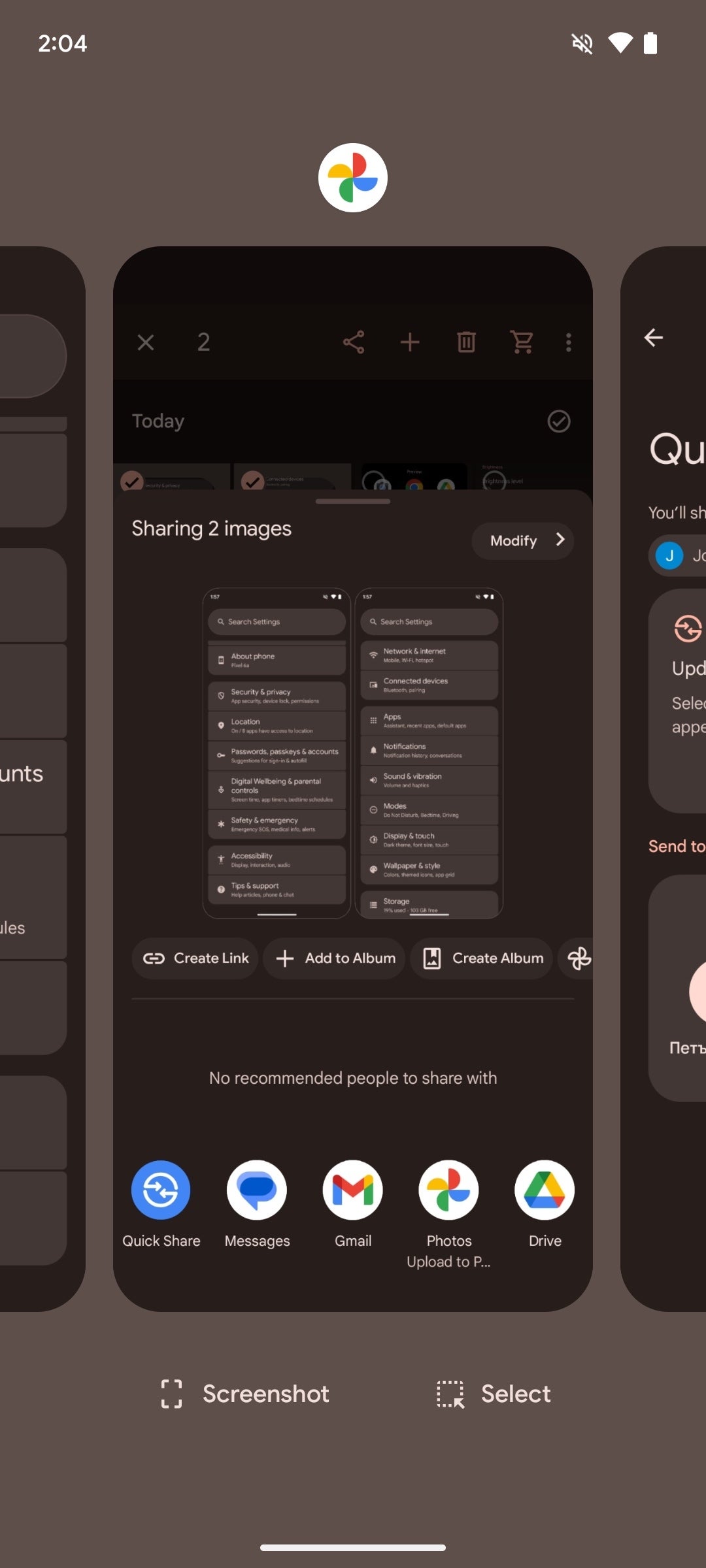
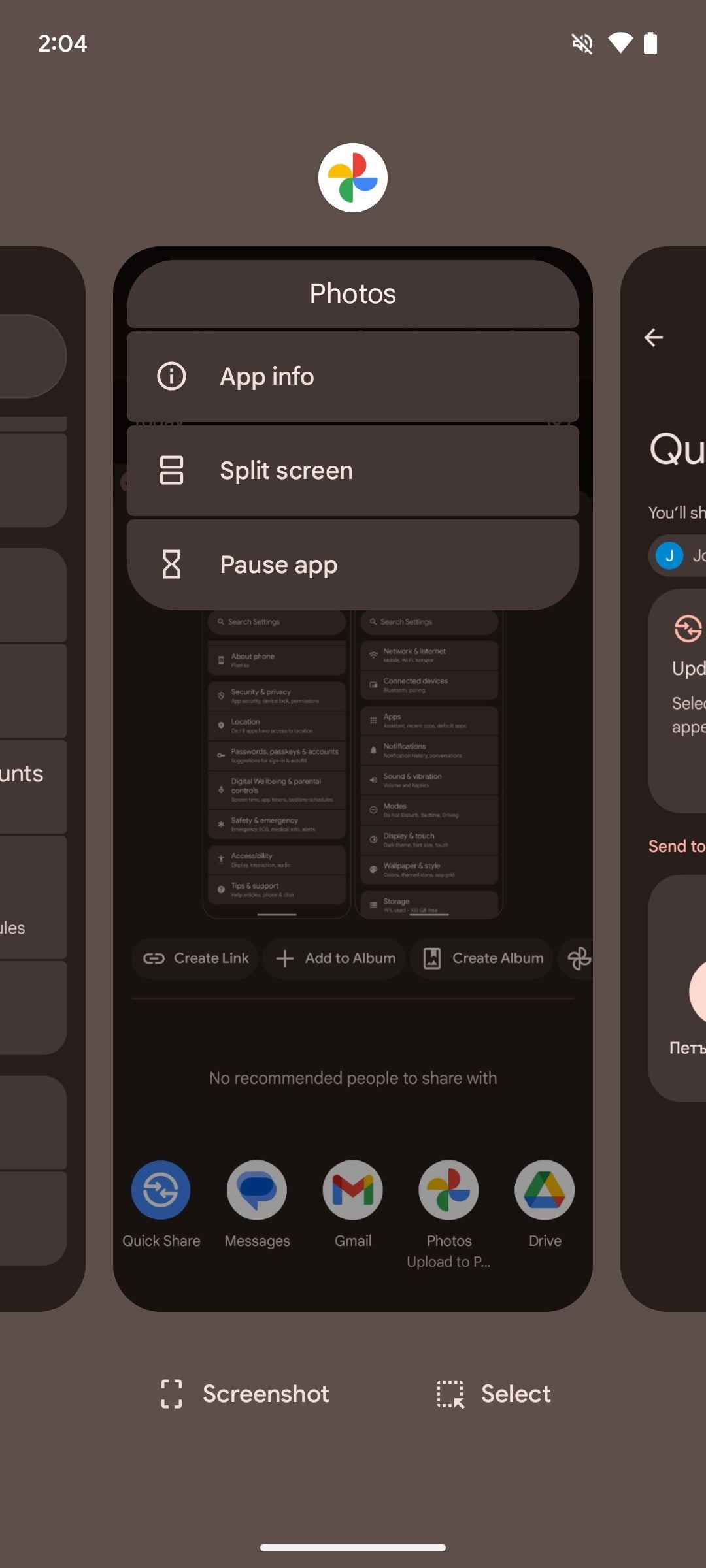
Recent apps
A subtle change can be found in the recent apps. Aside from an updated physics model that bounces an app when you swipe-to-dismiss it, Google has also introduced a small dropdown menu that collates all available options, like app info, split screen, pause app, screenshot, select, and more.
In Android 15, many of these were available by tapping the icon of the app itself at the top, but that wasn't a very intuitive option at all. Thankfully, Android 16 revises that.
Summary
From what the current beta hints at, it appears that Android 16 will be all about the presentation aspect of it all. As Google's operating system has peaked long ago and doesn't lack any particular major feature, it's all about the aesthetics of it right now, and the new Material 3 Expressive is definitely where it's at in terms of overall appeal and added functionality.
However, this might turn out to be the case for Pixel phones only. As we don't know just how much of Android 16's aesthetics and novel features will get adopted by the custom skins of all other Android manufacturers, there's a chance that many Android users will never experience a semblance of the Material 3 Expressive aesthetics.
Still, Pixel users can rest easy as Android 16 is shaping up to be one of the better Android updates in years.

Popular stories

Latest News


Things that are NOT allowed:
To help keep our community safe and free from spam, we apply temporary limits to newly created accounts: