Pebble SmartWatch Redux
This article may contain personal views and opinion from the author.
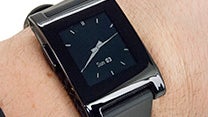
Back in March I reviewed the Pebble SmartWatch and came away fairly impressed, but I was waiting for content to follow the promises. At that point the watch had only just started shipping to the almost 69,000 Kickstarter backers, not to mention the tens of thousands who had pre-ordered the device after the Kickstarter campaign ended. The Pebble team had gotten the basics right, and at that point you could forgive the lack of an ecosystem for an indie project that had just launched.
It is no secret that smartwatches are on the verge of becoming the next big thing; Samsung have announced their entrance into the smartwatch game (again) and devices from heavyweights Google and Apple are expected in the not too distant future. Pebble’s team should be commended for getting ahead of the curve, and for frankly getting a lot of things right, but with impending overshadowing by the big boys we wanted to take a fresh look at how the ecosystem is doing.
The Pebble I reviewed back in March was my personal watch that I had backed on Kickstarter. It has been on my wrist almost exclusively since I received it, and to my surprise it has been complemented by many co-workers and casual observers who had no idea that it was anything more than a digital watch. Design was one of the first obstacles Pebble faced, and instead of making something that looked futuristic or stood out, they decided to make a watch that looked like a watch. I was initially worried that it would be big and unwieldy, but instead it has fit comfortably into my wardrobe. I went simple with a black unit, but if you are looking to stand out more Pebble is available in more noticeable hues.
The app ecosystem for Pebble is not terribly robust, but at the same time the device is meant to simplify your life, not to do everything. Where it could initially just display the time and date, developers have figured out how to make it call the internet for real-time information. My current watch face is still pretty simple, but gives me the weather at a glance. I prefer my design minimal and clean, but if you’re the type who wants everything together there are watch faces that can act as a full phone dashboard with things like missed alert counts and battery status. There are watch face designs that range from classic to crazy, and everywhere inbetween.
Watch faces are just part of the equation though, and functional apps are beginning to show up. There are simple apps, like those that let you control your phone ringer or let Pebble receive alerts from any app. There are more complex apps that can control your camera shutter, reply to texts with pre-set messages and even ones that let you control your home automation setup. Pebble support is also beginning to show up in apps, such as RunKeeper and a few golf GPS apps. One of my “wow” moments was glancing at my wrist on the golf course and getting an exact yardage to the pin. It was a huge geek moment from me, but a geek moment that actually made my life easier rather than just being cool.
In our review we note that Pebble’s simplicity is it’s genius, and 6 months on that continues to be true. Previous smartwatch makers have failed because they try to do too much with the watch, turning it into a mini-computer when you don’t need a microphone, camera or an HD display on your wrist. The only knock we have on Pebble’s e-paper display is that we’d like to see a higher resolution, but otherwise the low power, black and white scheme is just about perfect. It is easy to read in the most blinding light and it allows the battery to last for 5 days. For me, the Pebble has truly been a device where I put it on and forget about it until I check the time or get a notification. In my book that is exactly how a smartwatch should be.
My experience with Pebble has been entirely on Android, so I realize that everything I’ve been through may not apply to iOS users. The Pebble team should be commended on their frequent updates, and I long ago lost track of how many firmware upgrades they have released. The app has been refined and features have been added as a direct result of user feedback, the most noticeable being the ability to view multiple notifications when they come in close to each other. The disconnection problem we experienced has largely disappeared, although sometimes it will lose connection when the device is paired to another Bluetooth item (like our car or speakers), then disconnected. Thankfully a Bluetooth toggle fixes this issue, whereas originally we had to restart the device.
As much as I love my Pebble, I really look forward to what their next generation smartwatch will offer. The developer community has stepped up nicely to enhance the product, and I feel we will see more connected features in the future. I also look forward to slimmed down hardware, and a higher resolution e-paper display; really just a refinement of the current generation rather than an overhaul. More than anything, I think the Pebble team would benefit greatly from a unified, streamlined landing area for their apps. As it stands things are a bit disorganized, with most of the development going on in their forums and a few sites like mypebblefaces.com.
I worry a bit that Pebble will be overshadowed once Google, Apple,Samsung and other players with name recognition and huge marketing budgets enter the market, and that would be a real shame. What Pebble has done in a market space where everyone else has failed thus far has been nothing short of fantastic. Pebble isn’t perfect, but it has been a true convenience for me and really earned its spot on my wrist.
The app ecosystem for Pebble is not terribly robust, but at the same time the device is meant to simplify your life, not to do everything. Where it could initially just display the time and date, developers have figured out how to make it call the internet for real-time information. My current watch face is still pretty simple, but gives me the weather at a glance. I prefer my design minimal and clean, but if you’re the type who wants everything together there are watch faces that can act as a full phone dashboard with things like missed alert counts and battery status. There are watch face designs that range from classic to crazy, and everywhere inbetween.
Watch faces are just part of the equation though, and functional apps are beginning to show up. There are simple apps, like those that let you control your phone ringer or let Pebble receive alerts from any app. There are more complex apps that can control your camera shutter, reply to texts with pre-set messages and even ones that let you control your home automation setup. Pebble support is also beginning to show up in apps, such as RunKeeper and a few golf GPS apps. One of my “wow” moments was glancing at my wrist on the golf course and getting an exact yardage to the pin. It was a huge geek moment from me, but a geek moment that actually made my life easier rather than just being cool.
There are watch face designs that range from classic to crazy, and everywhere inbetween.
In our review we note that Pebble’s simplicity is it’s genius, and 6 months on that continues to be true. Previous smartwatch makers have failed because they try to do too much with the watch, turning it into a mini-computer when you don’t need a microphone, camera or an HD display on your wrist. The only knock we have on Pebble’s e-paper display is that we’d like to see a higher resolution, but otherwise the low power, black and white scheme is just about perfect. It is easy to read in the most blinding light and it allows the battery to last for 5 days. For me, the Pebble has truly been a device where I put it on and forget about it until I check the time or get a notification. In my book that is exactly how a smartwatch should be.
As much as I love my Pebble, I really look forward to what their next generation smartwatch will offer. The developer community has stepped up nicely to enhance the product, and I feel we will see more connected features in the future. I also look forward to slimmed down hardware, and a higher resolution e-paper display; really just a refinement of the current generation rather than an overhaul. More than anything, I think the Pebble team would benefit greatly from a unified, streamlined landing area for their apps. As it stands things are a bit disorganized, with most of the development going on in their forums and a few sites like mypebblefaces.com.
I worry a bit that Pebble will be overshadowed once Google, Apple,Samsung and other players with name recognition and huge marketing budgets enter the market, and that would be a real shame. What Pebble has done in a market space where everyone else has failed thus far has been nothing short of fantastic. Pebble isn’t perfect, but it has been a true convenience for me and really earned its spot on my wrist.



Things that are NOT allowed:
To help keep our community safe and free from spam, we apply temporary limits to newly created accounts: