Notification center comparison: Android vs iPhone vs Windows Phone vs BlackBerry (poll results)
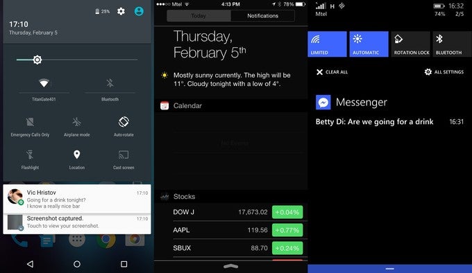
A week has passed and it's time to take a look at the results. Not surprisingly, one platform jumps ahead of all else with an impressive lead: it's Android 5.0 Lollipop with the completely overhauled approach it has to the notification center. Nearly 32% of all voters agree that Lollipop has the most user-friendly and useful notification hub.
All others remain fairly distant runner-ups, but it's still worth mentioning the very good score of the new Windows Phone 8.1 notification center that ranked second with nearly 16% of the votes, while Samsung's TouchWiz notification center that mixes in more color and contrasty visuals ended up on the third place with some 14%.
Apple's iOS 8.1 notification center with its two tabs finished - somewhat surprisingly - on the fourth place. iOS 8.1 uses a two-tab notification system that is different from all others, but this approach does not seem to have won it much approval from you, our readers.
All the remaining contestants get single-digit percentage scores, and you can see how they all rank right below.
What's your favorite notification center?
Stock Android 5.0 (Nexus)
32.65%
Apple iOS 8.1 (iPhone)
10.05%
Windows Phone 8.1 (Lumia)
16.13%
BlackBerry OS
5.56%
Samsung TouchWiz (Galaxy series)
13.88%
LG Optimus UI (LG G series)
6.02%
HTC Sense (HTC One series)
5.7%
Motorola Moto UI
2.05%
Sony Xperia UI
5.7%
Huawei EMUI (Ascend Mate series)
1.87%
Lenovo Vibe UI
0.4%
Notification center comparison

Popular stories


Latest News


Things that are NOT allowed:
To help keep our community safe and free from spam, we apply temporary limits to newly created accounts: