Taking_ pride in producing a myriad of memorable looking smartphones and _continuing to set the bar high for itself, there’s no kidding that HTC’s_ brand recognition is esteemed highly throughout the industry. Some _would tend to agree that they’re regarded as being a top-notch _manufacturer in producing beautiful looking handsets, while others argue_ that they’re actually making more waves with their customized mobile _experiences. From their humble beginnings with their TouchFLO interface _running on top of Windows Mobile 6.1 to their latest Sense UI iteration,_ we’ve witnessed the evolution of their recognizable interface, but now _it seems to come around full circle with their tablet experience on the HTC Flyer. With that in mind, let’s place our attention on how HTC attacks the new product medium with its Sense UI for tablets.
Recommended For You
Home screen, main menu and visuals:
At_ its core, Sense for tablets adopts most of the fundamental _characteristics and functionality that we’ve seen in use with previous _iterations of the customized experience – meaning, it’s distinguishably _Sense from the onset. However, there are plenty of eye-catching visuals,_ transitions, and 3D effects employed throughout it that truly highlight_ its polished form. In reality, the resemblance is undeniably familiar _to any other Sense device we’ve checked out, but the evolutionary _improvements help its presentation look and feel as though it’s _refreshingly new.
Recommended For You
Luckily, the homescreen is_ well established to work in either portrait or landscape, but it _doesn’t look too different on the surface when it’s primarily used in _portrait. Meanwhile, landscape mode allows you to view some of the other_ nearby homescreen panels – with other panels appearing to be _translucent in the background. Furthermore, the 7 available homescreens _are positioned in a circular carousel, which is evident when you quickly_ execute a swipe gesture that makes the entire thing spin aggressively. _Adding more eye candy, most of the HTC widgets boast_ this layered 3D look as you swipe a panel towards the main one. _Naturally, these subtle graphical elements add a lot to the polished _form of the interface.
Executing a pinch gesture on the homescreen, we’re instantly presented with helicopter view that_ displays all the homescreen panels simultaneously – thus allowing you _to instantly jump into a particular one or rearrange them to your _liking. At the bottom edge of the interface is the dock that_ houses things like the app panel and personalization buttons, which _also surrounds three others that can be modified to your specification.
The 7 available homescreens _are positioned in a circular carousel
Getting into the app panel,_ icons are laid out in their general grid-like formation, but _highlighting a specific tab at the bottom left of the panel categorizes _items to things that are used most frequent and ones that are _downloaded.
The app panel
Frankly, one of the other special highlights about the interface is the fact we’re treated to a modified lock screen that_ does more than what you’d expect. Specifically, the weather animation _commences and ultimately shows us some pertinent information like _temperature and condition. Also, you can instantly jump into any of the _four preset applications by essentially dragging and dropping them into _the ring.
The modified lock screen
Personalization has_ always been a core strength of Android as a whole, especially when _widgets seemingly beautify the interface, but Sense kicks it up a notch _by implementing various services to its set of widgets. Relying on the _ones offered by HTC, they now encompass the full area of a homescreen _page as opposed to taking up a finite amount of space. Obviously, the _beauty in it all is that they still offer the usefulness of any widget, _but in addition to that, there is a uniform approach to their design _that makes everything seem so consistent with one another.
Personalizing
? Widgets:
Undoubtedly the most prominent thing with Sense, the all too familiar digital clock widget continues to display the location and temperature, but clicking on the widget runs the dedicated clock app. With the app, we have access to other complementary functions like the desk clock, world clock, alarms, stopwatch, and timer. Interestingly enough, its presentation is fitting for a tablet since it relies on a two-panel layout that’s informative.
Clicking on the digital clock widget runs the dedicated clock app
With three different options for the People widget, it’ll display only specific ones associated to the group that you select. Of course, images of each contact will appear within the widget, while selecting one will get you right into your address book itself.
The HTC Watch widget allows you to preview some popular titles available for rental or purchase with HTC’s video streaming service. Moreover, it’ll display any videos that have been downloaded and placed into your library.
Similarly, the My Shelf widget works in conjunction with the Reader app, which is basically like any ebook reader app out there. Thumbnails of stored ebooks are displayed within the widget, thus allowing you to scroll through the selection, but selecting one will switch things to a portrait only view that allows you to read the ebook.
The My Shelf widget works in conjunction with the Reader app
Although the photo album and photo frame widgets are fairly standard with Sense, the third selection in the Photo Grid widget adds a hint of snazziness as it displays photos in a grid view. Actually, performing either a swipe up or down gesture in portrait initiates a cool looking animation that will cycle through images. In landscape, the gestures will simply execute the same animation, but only refreshes the grid of photos.
HTC has always placed its attention with the weather, and rightfully so, the weather widget continues that trend. Not only do we find various weather animations in play when swiping between locations, but pressing on it will launch the dedicated app that’s powered by AccuWeather.com.
The weather widget will launch the dedicated app
Showing how useful they are in giving relevant information all from the homescreen, there are three HTC mail widget options that vary in the amount of detail they display. Much appreciated, we get a small sampling since the widget chronologically displays the sender and subject – with a preview of the actual email with one of the layouts.
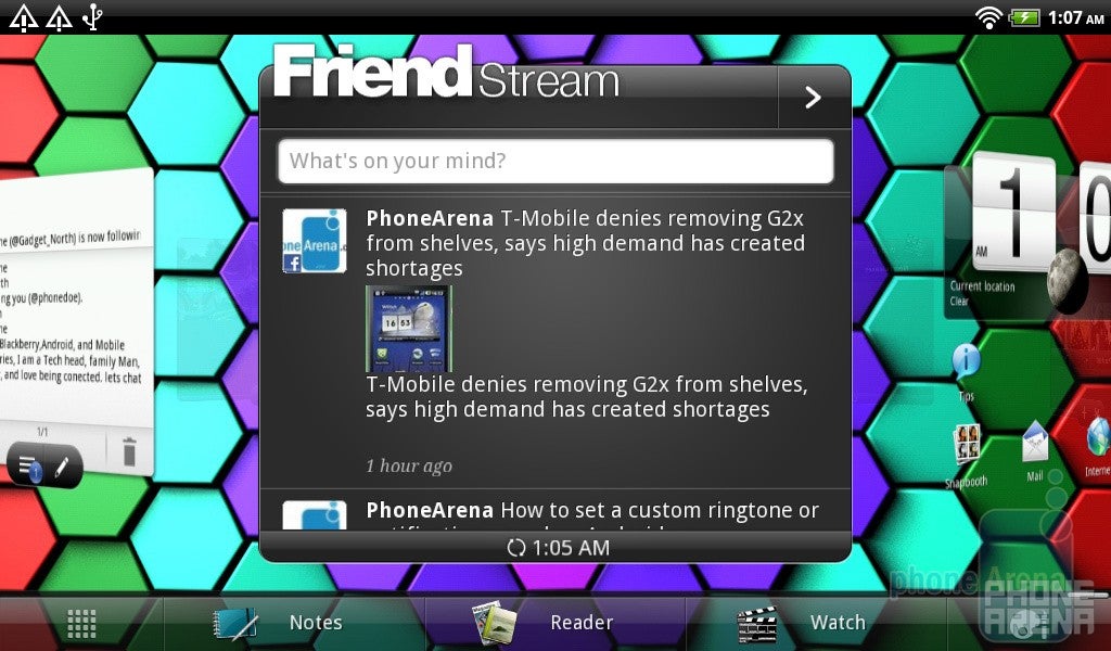
Even though the FriendStream widget doesn’t gravitate away from its usual presentation in aggregating social networking content, we’re still nonetheless given the ability to post status messages to specific services, include our location, and the option to upload pictures. Running the dedicated app, we find the same usual two-panel layout that’s user friendly in displaying content.
FriendStream widget
People App:
Of course, the People app is the place where you want to be if you’re searching for specific contacts since it makes use of the familiar two-panel view that’s in use with most things. In the left panel, you have the scrollable listing of contacts, while the right one perfectly shows all the information associated with the selection. For a tablet, this is unequivocally the type of presentation you’d want to see with a tablet since it makes use of the added real estate.
The People app
Messaging and Email:
Sure there are no optimizations evident with the Sense keyboard for tablet, but it’s more than usable at its core thanks to its ability to quickly and easily input alternative characters, like numbers and punctuations, without the need to get out of the main keyboard layout. Albeit, typing is still a challenge in landscape since keys aren’t all that large to accommodate the usual keyboard stance with our hands. Regardless of that, we’re more favorable to using the portrait one mainly because it emulates the feel of typing on a smartphone – meaning, our thumbs do all the work. Combining its responsiveness and ease, speed typing is no issue at all with this one.
Strange as it may be, the Gmail experience is untouched and basically presents us with the usual experience found on any Android smartphone. Despite the lack of any customization with it, we’re still given all the depth of features and control that the Gmail app has to offer. However, it still would’ve been nice to see it modified even slightly.
Thinking about it more, that’s probably why HTC’s mail app is probably the better one to use since it’s optimized to take advantage of the tablet’s roomy confines. Not only can you display accounts separately, but you also have a universal inbox that color codes emails so you’ll know where they’re from. Needless to say that the presentation is ideal again, mainly due to its intricate two-panel view, but you can filter messages according to attachments, meeting invitations, marked messages, unread, favorites, and conversations.
Organizer:
Being organized is one thing that the calendar app highly prizes because it’s organized in a manner that’s straightforward, while remaining tablet friendly with its presentation. Able to switch between day, week, month, and agenda views, the all too familiar two-panel layout displays your specific calendar in the left pane, while appointments are at full view on the right. Showcasing its implementation with other services, we’re also presented with a small breath of weather information in the right panel that allows you to plan ahead on what to wear on a particular day.
The Calendar app
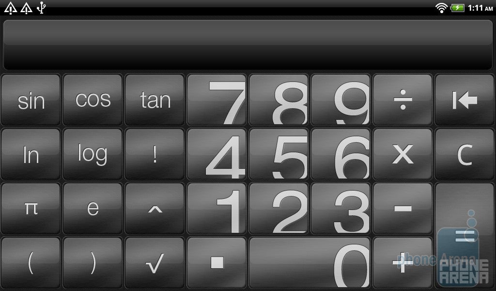
Combining the basic and advanced panels with the calculator, it would’ve been nice to see even more scientific functions along for the ride. Instead, the calculator is essentially stretched out to encompass the extra space – thus, boasting some extraordinary sized buttons.
Calculator
As we mentioned already with the clock widget, the actual clock app is very informative with its offering due to the fact that it combines a bunch of items. Refining it for tablet viewing, other clock functions are laid out in the distinguishable two-panel layout that takes advantage of every nook and cranny of the display. For example, not only does the desk clock show you the actual time, but it’s location aware as it displays the accompanying weather information as well – plus, it incorporates the calendar too!
The Clock app
Browser:
Thanks to its Flash support, the web browsing experience is more than satisfactory since its performance isn’t tainted in any way with slowdown or lag. Obviously, it features things like double tap to automatically resize text, pinch gestures to zoom in/out, buttery fluid kinetic scrolling, and the ability to open up links in new windows. Clicking on the bookmarks icon, it displays all of them in a grid view – with an associating thumbnail of each respective site. Whether you surf the web in portrait or landscape, you can rest easy knowing that it’s going to be a fantastic experience either way.
The web browsing experience is more than satisfactory thanks to its Flash support
Camera:
The camera interface is also one of the few things left untouched by HTC since it’s the same exact one found with most of their smartphones. Besides relying on the on-screen shutter key to initiate auto-focus, it offers the added benefit of touch focus to perfectly hone in on a specific area. On the left edge of the interface, you have your digital zoom controls, while the right side houses some buttons that allow you to select the mode, switch to the front facing cameras, apply an effect, and get access to the gallery.
The camera interface
At this point, the two-panel layout is the foundational support for almost all of the apps on board with the HTC Flyer, and of course, it’s also in use with the Gallery app. Although we’re still given the same features, like the ability to scroll through images, share content with certain services, and the ability to apply an effect or edit a photo, its look and presentation is rather ordinary. Obviously, the left panel presents you with all the albums, while the right one aggregates content in the usual grid-like view.
The Gallery app
Music + Video:
Offering a ton of ways to access the music player, you can either control your tunes via the main app, the mini player within the notifications panel, or use the one found in the unlock screen – all of which accomplish the same functions. As for the actual music player, it’s undeniably pretty looking since songs are displayed in a listing view on one panel, while the on-screen controls and album cover are shown on the other. Aside from using the on-screen controls to browse through the selection of songs, you can do the same thing by swiping the album cover right or left. Moreover, there are quite a few equalizer setting that you can activate to better accommodate the specific genre of music you’re playing.
Music player
High-definition videos play like they normally would with plenty of nice looking visuals, but the player itself is your standard fanfare with its basic set of features. Naturally, the on-screen controls are there at your disposal to pause or play, but you can move the timeline slider to jump into a specific portion of the video. Also, there is a button that cycles between full screen and best fit views, while another one activates the SRS enhancement audio.
Conclusion:
Now that Android 3.0 Honeycomb tablets are in full effect, some might scratch their head and wonder why anyone in their right mind would want to side with the HTC Flyer’s Android 2.3 Gingerbread experience. Well, it’s mostly due to the wonderful job that HTC has done with its Sense UI seeing that it perfectly presents us with an experience that’s uplifting, ideal, and functional for a tablet. In fact, it’s not simply a cursory looking skin running on top of Android, but rather, it’s a totally equipped and refined experience that’s adept to incorporating a host of services. Now that we think about it more, that’s why we see such a heavy focus on optimization with various core functions and apps, mainly because it’s sensing our surroundings and interactions – thus literally sensing what we’re doing.
HTC Sense UI for tablets Walktrough:
$5/mo off for 5 years on Visible premium plans
$30
/mo
$35
$5 off (14%)
New members get $5/mo off the $35/mo Visible+ plan or $5/mo off the $45/mo Visible+ Pro plan for the first 60 months when they port-in from an eligible carrier. Use code 5OFF5 at checkout to save up to $300.
A discussion is a place, where people can voice their opinion, no matter if it
is positive, neutral or negative. However, when posting, one must stay true to the topic, and not just share some
random thoughts, which are not directly related to the matter.
Things that are NOT allowed:
Off-topic talk - you must stick to the subject of discussion
Offensive, hate speech - if you want to say something, say it politely
Spam/Advertisements - these posts are deleted
Multiple accounts - one person can have only one account
Impersonations and offensive nicknames - these accounts get banned
To help keep our community safe and free from spam, we apply temporary limits to newly created accounts:
New accounts created within the last 24 hours may experience restrictions on how frequently they can
post or comment.
These limits are in place as a precaution and will automatically lift.
Moderation is done by humans. We try to be as objective as possible and moderate with zero bias. If you think a
post should be moderated - please, report it.
Have a question about the rules or why you have been moderated/limited/banned? Please,
contact us.


Things that are NOT allowed:
To help keep our community safe and free from spam, we apply temporary limits to newly created accounts: