Did you notice that Android may have a new logo?
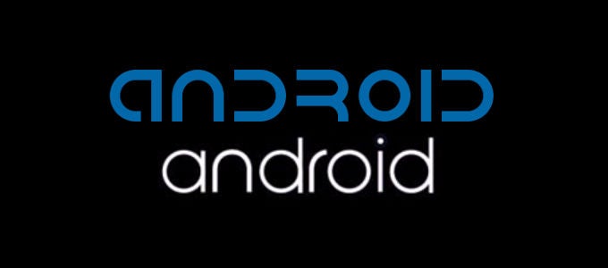
Assuming the boot animation is final and official, it looks like Android may have a new logo, which is to say a new typeface for the Android logo, because the bugdroid is still going strong. In the image above you can see the original Android logo on top, which has been used for the past five and a half years of Android's commercial existence; and, below that is the Android logo shown in the LG G Watch boot animation (sorry for the quality of the image, the original video topped out at 144p).
The new typeface is much simpler, and less futuristic than the original. Certainly it is easier to read. We're still trying to find out if it is real or not. But, if it is real, what do you guys think? Is it an improvement?


Popular stories


Latest News

Things that are NOT allowed:
To help keep our community safe and free from spam, we apply temporary limits to newly created accounts: