Android 8.0 Oreo review: Oh, you'll love it!

Android 8.0 is now official, aaaaaaaaaaaaaaaaaaaaaaaaaaaaaaaaaaaaaaaaaaaand... it's called Oreo! Google couldn't bamboozle us this time around - just as it was largely expected, the 8th major version of Android is named after the ever-so popular sweet snack and not Orelette, Octopus, or Oatmeal Cookie.
The majority of changes you will spot are definitely on the evolutionary side of the spectrum and not that revolutionary at all, and that's great, though we can easily see why some might ultimately deem Android Oreo as being quite a boring update. There aren't many flashy new features that will greatly overhaul the way you interact with your device as this year's major software overhaul is focusing on under-the-hood improvements and refinements that aim to make yo
Here follow our impressions.
System improvements and battery tweaks
Android Oreo is really bringing a slew of new features to almost any area that you might think of, but the most important bunch are the system and under-the-hood ones as these will affect your experience the most are the performance and battery-saving enhancements Google has thrown inside. It won't be an overstatement to proclaim Android O as the most iOS-like Android ever because it now employs one of the most appealing features of Apple's mobile OS - outstanding battery life in standby. Sort of.

Building upon the foundation laid by Doze and Doze on the Go, Android 8.0 brings forth Background execution limits, which will immediately release the wakelocks a given app is holding once it enters its cached state. In layman speak, this means that rogue apps are unlikely to drain your battery in the background. Additionally, apps running in the background are now pretty limited as to what services they can access while they're running in the background, which is another user-friendly hurdle for juice-wasters.
Aside from that, apps will be receiving location updates less frequently in the Oreo release. Thankfully, Google says that this applies to all apps, including Google Play Services, which is a well-known offender in abusing location services.
Both of these key improvements might seem like a minor touch-up to some, but rest assured that these could easily become Android Oreo's most important new features.
Quick settings & status bar
This one has also received some love. Now, whenever you swipe your quick settings/notifications shade down, a bunch of vital status icon will remain displayed at the top, giving you a quick heads-up about your Wi-Fi & cellular status, as well as the battery's current level.
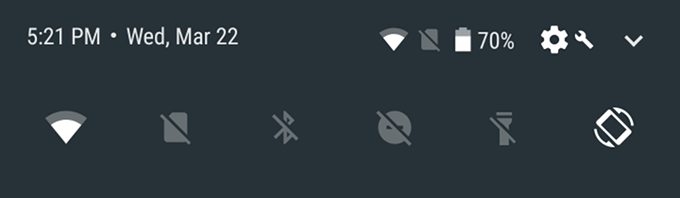
Additionally, quick settings tiles that double as menus—like Wi-Fi and Bluetooth—indicate that by displaying a line just below the tile, like this:
Improved iconography
Sadly, the one feature that I was most excited to try, namely Adaptive icons, can't be experienced just yet. Simply put, this feature will wave goodbye to the static old-school icons we're used to and will usher in a new breed of dynamic icons that will be able to utilize neat visual effects as parallax and pulsing.
Wave static icons goodbye
Additionally, it will be able to display different icons on different devices - for example, an app's icon will appear as a squircle on one phone, a square with slightly rounded angles on another, and as a circle on a third device thanks to a variety of masks that developers will have to throw in. In the end of the day, users will end up with more coherent sets of icons on their devices, which is good news!
Squircle, square, or circle, icons in Android O will adapt to any interface
Aside from the fancy new wallpaper, one of the first things that you might notice immediately after you flash Android 8.0 on your eligible device could very well be the fancier app shortcuts. Officially introduced with Nougat, these added a new way of interacting with apps by long-pressing the respective icon, similar to what Apple does with its 3D Touch shortcuts.
Supercharged notifications
Credit where credit is due - Google is never fully content with the way Android notifications work and always strives to improve the experience. For example, last year we got bundled notifications, a great addition to Android. With Android Oreo, users now have way more control over what types of notifications should pop up in their notification shade.
The big new thing in Android 9.0 Oreo is notification channels, which are nothing but content filters that you can enable or disable at will. Here's how this one works: let's say that you receive a notification that you're running low on storage.
Introducing Notification channels, soon on an Android near you
When you press and hold the notification, which will quickly inform you that the app that's sending it is System UI and it can show notifications in five different categories - Alerts, General Messages, Miscellaneous, Screenshots, and Storage. There are other categories, too. If you no longer wish to receive notifications telling you that you're running low on storage, you simply have to flick the corresponding switch and you're good to go. Same applies to screenshot notifications - always clearing these is nothing short of a nuisance.
What's even cooler is that you can define how you should be alerted for any apps' different notification channels. For example, if you tinker with the System UI app, you can easily stop screenshot-related notifications from appearing at all on your device, while you can make alerts always ring a sound and vibrate.
Fine-grained control over the different notification channels
This fine notification control is a great addition to the operating system without becoming way too overwhelming. Naturally, aside from a bunch of Google ones, few other apps support notification channels at this point. At the moment, most apps only have the Miscellaneous category and nothing else.
You can also snooze notifications, which seems like a handy thing to have. By slowly swiping a notification to the left or right you can access a new clock icon that lets you snooze the app for 15, 30, 60 minutes, or undo the snoozing at all.
Snoozing notifications
New settings menu... again
Remember that weird auxiliary hamburger menu that popped up in Settings on Android Nougat? Turns out this one will most likely remain a one-off thing, as the developer preview of Android O does not come with such a hamburger menu inside Settings. We say "Good riddance!" with joy in our voice, as that one was not adding a whole lot to the user experience; on the contrary, it made the Settings menu of Nougat a bit overwhelming.
Well, the new one is overwhelming in a new way!
Aside from simply changing the layout for the good, Google has also further streamlined things by bundling similar items in one and the same menu, which has saved lots of clutter. To put things into perspective, opening the Settings menu on your stock Android Nougat device will treat you to at least 24-25 menu items, while Android Oreo has just a dozen of these. As you might imagine, this is making the Settings menu times more streamlined, but more difficult to find the menu option you're looking for. Thank goodness for that search function!
Android O's Settings menu is clean and simple
Additional improvements
One of the more intriguing small features we stumbled upon can be found in our favorite SystemUI Tuner menu and allows you to change the default lock screen shortcuts for an app or even an activity of your choice. That's rather cool since lots of folks out there might not care for the default Google Assistant and Camera shortcuts.
You can also customize the software navigation bar of the device to a certain extent as well thanks to another menu found in SystemUI Tuner. Aside from making it compact or either left- or right-leaning, users can add two extra buttons. At the moment, this last feature doesn't work since you're required to input a specific keycode, but at least we are given a hint that Google is exploring a feature of that kind.
The navigation bar is getting some customization love with Android O

Android O screenshot

Popular stories


Latest News


Things that are NOT allowed:
To help keep our community safe and free from spam, we apply temporary limits to newly created accounts: