This article may contain personal views and opinion from the author.
For quite a long time now, I've been fighting back against the term "fragmentation". I have never argued that problems don't exist, just that the term "fragmentation" has such a broad meaning as to be essentially meaningless. These days, rather than just give up on using the flawed term in favor of more accurate descriptors, it has become more popular to turn the word "fragmentation" back on its original creator, Apple, (I have even done this myself) but this just further muddies the water.
Here's the TL;DR recap of my argument against the word: it misdirects the blame for multiple issues, which each have multiple causes and multiple possible solutions. For example, Android updates are slow to push out mostly because of manufacturer custom software and skins (as the Nexus program and Motorola have proven), not because of a flaw in how Google created Android, and we really can't even blame carriers that much anymore after the Moto X update hit Verizon so quickly. Similarly, compatibility issues are a byproduct of an ecosystem built on such huge variety in choice, not a problem that can be thrown in under a blanket term, because the solutions to that range from better developer tools, more access to hardware, more open manufacturers, etc.
Recommended For You
Inevitably, when a new platform version distribution chart is released, there will be a rush to compare Android and iOS to see where each stands in terms of "fragmentation", but really it's an exercise in comparing which platform has an easier path to upgrades, and showing which software versions developers should target when creating a new app. That is honestly the only salient information that can be drawn from these charts, but that doesn't stop pundits from trying anyway.
Playing with the data
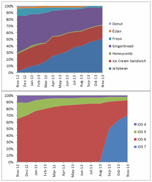
Yesterday, Forbes used two different platform distribution charts to attempt to compare Android and iOS in terms of "fragmentation". Writer Philip Elmer-Dewitt chose the Android distribution chart that can be found on the Android Wikipedia page (based on Google-supplied data, which is fairly reliable), and the latest Chitika stats for iOS, which show that iOS 7 has been installed on about 74% of North American iOS devices so far. We have to be careful with Chitika stats because they are generated through ad impression data, and have a tendency to vary anywhere from 5-15% from Apple's official numbers. These were the charts shown:
Right off the bat, you may notice that the two charts don't use the same date range, which adds in quite a bit of color to Android's chart because that chart goes all the way back to 2009. Even without thinking too much about the charts, the initial impression that a viewer is to take away is that "fewer colors = better". So, the iOS chart looks great, because it has the big swath of iOS 6, and the sharp penetration of iOS 7. Android looks like a mess; but, if the Android distribution chart were to be remade to only cover the same dates as the iOS chart, it would look quite a bit different. Luckily, a reader did just that and submitted this to Forbes, which even Elmer-Dewitt admits gives a more "apple-to-apple" comparison:
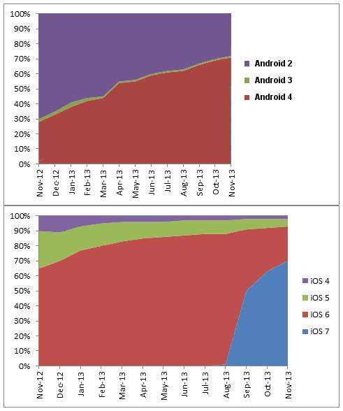
Once you get rid of all those superfluous version changes from the past, the visual impact alone of Android's distribution chart changes quite a bit. It still doesn't have the fast adoption rates of iOS, but fewer colors means things are better, right? With the new layout, there are essentially three main versions dominating the chart, and two of them (Ice Cream Sandwich and Jelly Bean) share more similarities than differences, since they are both incremental updates on Android 4.x. Which gives me another idea: why don't we go one step further and show the Android chart the same way as the iOS chart with all of the incremental updates removed and only the full number versions shown.
The visual impact on this chart is huge. Obviously though, this last chart isn't all that useful, because it doesn't show how Google handles version numbering, but it does show how easy it is to manipulate data to give off the impression that you want, even if it means obscuring the entire point of Android platform charts, which is to show developers where to focus their efforts. Unlike iOS, each incremental update for Android moves up the platform's SDK level, so this last chart hides information that is extremely useful to developers.
Of course, each of these charts is incomplete in its own way. For example, even the versions of the Android platform distribution that show each nickname version are hiding the incremental updates within each of those levels. Jelly Bean alone spanned Android 4.1, 4.2, and 4.3, each of which brought a new SDK level for developers, and features to users. If you're worried about the security implications of not updating, neither the iOS nor the Android charts give you the incremental update data to consider that problem properly.
The simple truth is that distribution charts don't tell the whole story anymore.
Platform version distribution is an incomplete metric
Just like the word "fragmentation" is constantly misused, now the charts used to illustrate the supposed problem don't even provide the data that is often claimed. As has been covered plenty of times by now, just because an iOS device gets the latest version of the software doesn't guarantee all of the latest features. No matter what software updates come, the iPhone 4 and iPad 2 will never have Siri; similarly, despite the newest software, the iPhone 4 & 4S and iPad 2 & 3 will not get AirDrop or Camera Filters. These are consumer-facing features that do really matter to users who may want access to Siri, but don't want an iPad mini and don't have the extra cash to drop another $500 on a new iPad Air, which is the only full-size iPad available from Apple that supports Siri since the iPad 2 is still inexplicably holding the lower price point.
Of course, the other side of that argument is that even if those devices aren't getting all of the features, they are still getting all of the bug fixes and security updates. So, is iOS "fragmented"? Well, it depends on 1) your definition of fragmentation, 2) the metrics you use to define fragmentation, and 3) the tools you use to measure those metrics. You could claim that iOS is fragmented because not all users get all features, but we would say that is just the business of progress, and eventually something gets left behind. Or, you could claim that iOS isn't fragmented, because all users get security updates (assuming they install the various updates that hit their device). But, even that argument ignores the work that developers have to do to build assets for the various iOS display sizes and resolutions, because the system doesn't employ responsive design. You can already see the usefulness of the term "fragmentation" failing.
When you talk about Android, security updates are often considered the smoking gun to the argument that Android is being crippled by supposed "fragmentation" (although really in this case it is slow/inconsistent updates by manufacturers because of bloated skins and baked-in apps, as Motorola continues to prove.) But, even that argument is starting to disappear as Google is putting fewer and fewer updates in the full system releases and offers more updates via decoupled apps and automatic updates to Google Play services.
Two of the biggest security updates to hit Android over the past year were Verified Apps, which scans sideloaded apps for malware; and, the Android Device Manager, which allows you to locate a lost phone, remotely lock the device and change the PIN, or remotely wipe the device. Neither of these updates came in a full system release, but rather in the form of an invisible Google Play services update that went out to 99% of all Google Android devices (if we're not counting non-Google Android devices in the charts above, there's no point in talking about them here). This means that security was improved for all Android users running Android 2.2 and higher without any need to worry about whether or not manufacturers would push out the update.
There are still security updates to be had in the various system updates of Android; but moving forward, it wouldn't be surprising if more and more of the security and feature updates were part of Google Play services and app updates rather than system updates. The trend has already been moving that way, so it's not hard to imagine it continuing. And if it does, these Android platform distribution charts will lose even more relevance when it comes to using them as part of the "fragmentation" argument, because that argument itself will become even more fragmented than it already is.
Conclusion
The conclusion may sound redundant at this point, but it is fairly simple: if you want to have a discussion about Android and iOS (and there are plenty of incredibly interesting discussions to be had), think about the issues you want to cover, and break each down on their own terms. Trying to bundle arguments under and umbrella term like "fragmentation" is just lazy and it holds very little meaning at this point. If you want to talk about the speed of software updates, then by all means, take a look at how quickly platform updates are adopted, but be sure to take a look at app updates as well, because that is a big part of that discussion.
If you want to talk about security risks, that is a plenty valid discussion to have, but platform version charts don't give the whole story there either. For iOS, you have to drill down farther to see how many users bother to install the incremental updates, like iOS 7.0.4, which is the kind of data that you don't see often. And, on the Android side, you have to take into account Google Play services, as well as security issues that have seemingly been fixed by manufacturers.
If you want to talk about app compatibility, that's fine too, but there are specific considerations there as well. All of these and more are wonderful discussions, and each has a lot of interesting interpretations to be made. But please, let's all stop believing that the only thing we need to consider is to look at a chart and see "more colors = bad".
Michael Heller is known for his clear and informative articles on mobile technology. He explores important topics such as the rollouts of 5G networks and the advancements in mobile payments, offering readers insights into the evolving tech landscape.
Recommended For You
COMMENTS (42)
COMMENTS (42)
All comments need to comply with our
Community Guidelines
PhoneArena Community Rules
A discussion is a place, where people can voice their opinion, no matter if it
is positive, neutral or negative. However, when posting, one must stay true to the topic, and not just share some
random thoughts, which are not directly related to the matter.
Things that are NOT allowed:
Off-topic talk - you must stick to the subject of discussion
Offensive, hate speech - if you want to say something, say it politely
Spam/Advertisements - these posts are deleted
Multiple accounts - one person can have only one account
Impersonations and offensive nicknames - these accounts get banned
To help keep our community safe and free from spam, we apply temporary limits to newly created accounts:
New accounts created within the last 24 hours may experience restrictions on how frequently they can
post or comment.
These limits are in place as a precaution and will automatically lift.
Moderation is done by humans. We try to be as objective as possible and moderate with zero bias. If you think a
post should be moderated - please, report it.
Have a question about the rules or why you have been moderated/limited/banned? Please,
contact us.


Things that are NOT allowed:
To help keep our community safe and free from spam, we apply temporary limits to newly created accounts: