This article may contain personal views and opinion from the author.
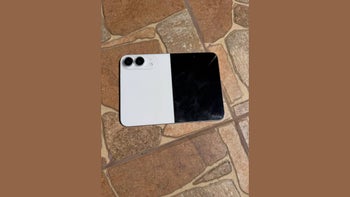
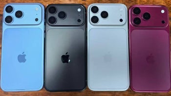
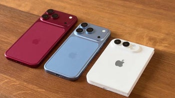
One of the most common reactions (complaints) that I hear with regards to the new Titanium iPhone 15 Pro and Pro Max colors is that they’re boring, overly muted and not very different from one another. This reaction tends to get echoed almost every year when Apple outs new iPhones, but it feels a little bit stronger this time, perhaps due to the fact that the iPhone 15 Pro and Pro Max come with a long-awaited design revamp.
But to this complaint I say: is your phone’s exterior color supposed to be bright, wild and screaming for attention? Maybe, but not always.
Apple's supreme iPhone 15 Pro marketing tricks aside, I’m not going to lie, my initial reaction to the 15 Pro colorway was equally uninspired, but now that I’ve had some time to observe the selection and consider its merits, I think I’m starting to understand where Apple is coming from.
iPhone (Pro) colors have always been neutral and balanced
It took a while for Apple to get comfortable with the idea of simply experimenting with color
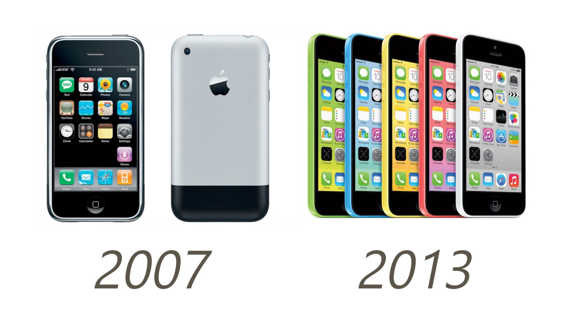
We have to remember that more vibrant iPhone colors are a relatively new thing, with the exception of the 5c experiment.
The first iPhones came in black and gray, then Apple struggled for a while to add white, but it eventually got the hang of it. Then came the iPhone 5s and 5c generation, which actually resembled a line and color configuration akin to what we have today.
Recommended For You
It was at this time that Apple first showed to the world a clear distinction between ‘premium’ and ‘mainstream’ as far as the iPhone line-up is concerned, with the iPhone 5s available in gray, white, and gold. It was clear: if you were to be a serious person of status, style and taste – you wouldn’t be one to be easily impressed by flashy, bright colors. Instead, you would get something a bit more balanced, a bit more restrained.
And if you’d consider yourself a whacky youngster, a hipster, or worse – just an ordinary person, then sure – you could get the jolly colors. However, back in 2013, the idea didn't catch on, the market quickly rejected it, and Apple went back to making high-end, black, gray, white and gold flagship.
5 years later, Apple returned to the premium/mainstream separation with the iPhone XS and XR generation, and this time it worked. Perhaps the prohibitively high price of the XS made it easy for people to swallow the fact that they’d have to settle for a yellow iPhone.
The upmarket iPhones, though? Well, they remained just as restrained and conservative.
I thought Apple can’t paint the iPhone 15 Pro’s titanium, but maybe this is just how it envisioned it to be
Right from the start, I thought “hmm, maybe they can’t reliably paint the new titanium frame in too many shades”. But now I think these are just the colors Apple envisioned for the iPhone 15 Pro line.
If you think about it, this new design is launching with 4 colors, whereas the iPhone X launched with 2. The current iPhone 15 Pro colorway is very similar to the iPhone 12 Pro lineup, with black, white, blue and gold.
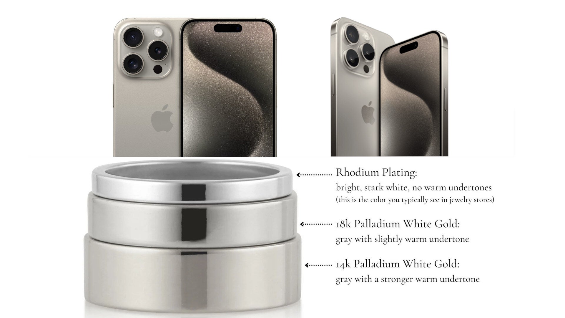
The iPhone 15 Pro in Natural Titanium resembles Palladium White Gold color | image credit - AlyshaWhitfield.com
I have this theory that the Natural Titanium color serves the function of gold, because it does have a warm undertone. So, it’s not really classic gold the way we’ve gotten used to it, but it is something like Palladium White Gold, which is more neutral and whitish. And so, maybe Apple thought the difference between this and a classic yellow gold color would be too minimal.
Besides, Apple is probably planning to add a new color for next year’s launch, which is something it typically does after introducing a new design. This could be something close to the typical yellow gold color we know, like it did with the XS, a green hue like with the 13 Pro, or a purple variant like with the 14 Pro. Or, something entirely new!
iPhone 15 Pro’s Titanium colorway creates a homogenous look across the entire line
The 4 color variations of the 15 Pro line are like different styles of the same thing. This is also reflected in the naming scheme: Natural Titanium, Black Titanium, White Titanium and Blue Titanium.
I believe that it’s actually a good thing and a smart move to have the 4 shades be a bit more similar than usual. First, this way everyone will know you’re rocking the new Titanium iPhone, and second, it makes for a consistent experience, no matter which color you choose.
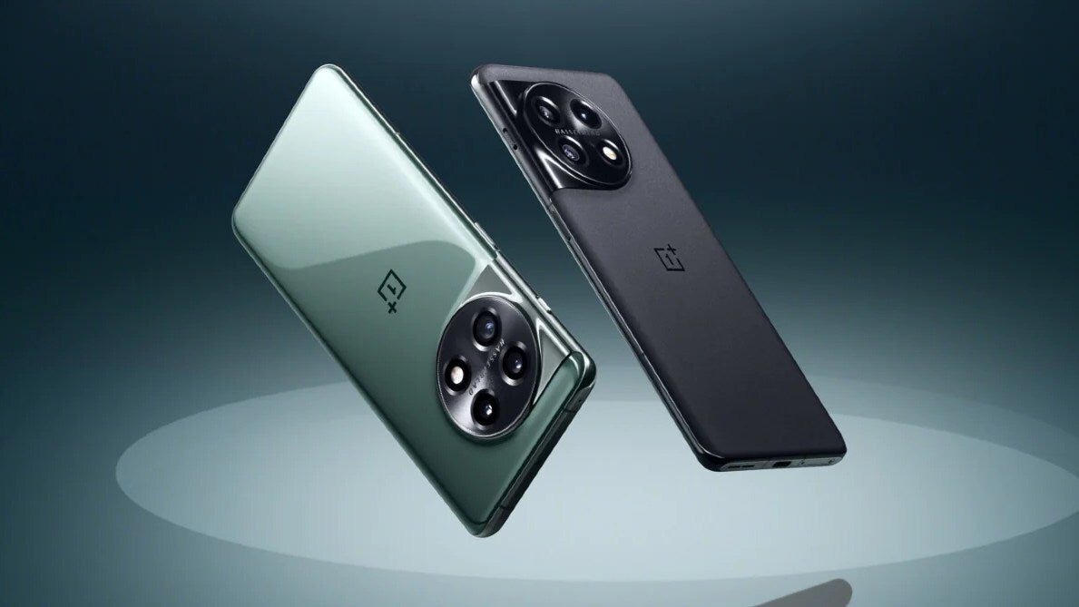
This isn’t always the case in the rest of the smartphone world. For example, the OnePlus 11, which is think is an amazing phone, comes in two different styles which feel very different. There’s a OnePlus 11 in glossy green and a OnePlus 11 in black matte, both of which feel entirely different.
The glossy green OnePlus 11 feels entirely different from the matte black OnePlus 11, and this could be great or frustrating depending on where you stand
Now, on one hand, that’s good because you have different choices for customers. On the other hand, it makes for inconsistency and can also be frustrating for customers, because what do I do if I like the glossy glass of the green OnePlus 11, but I much prefer to have it in black, but the black one is only available in matte? Why?
I’m not arguing that it’s bad to have variety; the case I’m making is that there’s something to be said about getting the same experience you expect no matter the color of the phone you’ve chosen.
Apple’s conservative iPhone 15 Pro colors have lasting power; there’s no room for crazy experiments
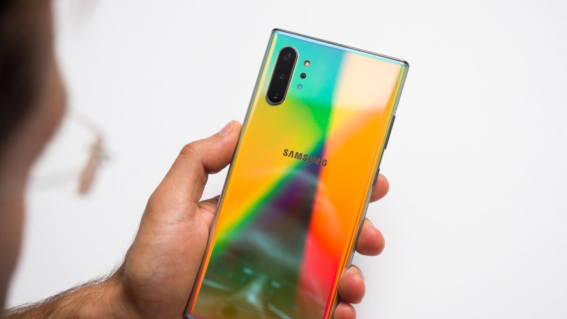
Galaxy Note 10 in Aura Glow color | image credit - PhoneArena.com
Remember the Note 10 in Aura Glow? Where is it now?
We all enjoy seeing crazy new things like the Note 10 in Aura Glow, and manufacturers should definitely keep exploring and experimenting, otherwise we’ll never discover anything new. However, it’s perfectly understandable why Apple wouldn’t want to take crazy risks with its upmarket product and biggest bread earner.
You can have your Mercedes or BMW in all sorts of color solutions, but can you guess which ones are the most popular by far? Black, gray and white. And maybe blue.
Things like Aura Glow are shiny and new, they catch our attention the moment we lay our eyes on them, but they tend to age just as quickly.
Black? Gray? These are classics that never grow old. We keep these phones for an average of two, in some cases even three years (check out our recent market survey on How America Buys and Uses Smartphones). That’s a lot of time, and you want to be able to keep admiring the look of your device throughout the whole period, without it somehow feeling old or getting out of vogue.
Which brings me to my final point, which is cases. Many would say: what’s all the fuss about color if most of us are going to put a case on that phone? Indeed, that’s a great point, and the only thing I’d add to that is – neutral colors like black, white and gray are easiest to match with all sorts of colorful cases! If your phone already has a strong color, it's much more difficult to customize it with a case, because cases have holes, cutouts, transparent backs and other element that reveal details of from the phone's design - they rarely cover up the entirety of the phone.
A green case on a red phone vs a green case on a white phone; neutral design colors are much more flexible in terms of 'dressing them up' with cases
Ever put a green case on a red phone? Funky, sure, but probably not the most stylish look. Put it on black or white, though, and it looks fantastic!
So, yeah, I don’t really get the problem with Natural Titanium, Black Titanium, White Titanium and Blue Titanium. What do you expect, Cherry Blossom?
Now that I think of it, a Cherry Blossom iPhone 15 Pro would be amazing! Apple should totally do it.
Six-month unlimited plan is now 57% off
$90
$210
$120 off (57%)
Mint Mobile is now allowing you to get whichever plan you like for either three, six, or 12 months for just $15/mo. If you go for the six-month unlimited service, for instance, you'll now have to pay just $90 upfront instead of $210.
Rad Slavov is the Editor-in-Chief at PhoneArena. He joined the media in 2008, right on the cusp of the modern smartphone revolution. Through time and perseverance, he amassed a great deal of knowledge and industry know-how, allowing him to guide and organize the company's growing line-up of talented content creators and ever-expanding content portfolio.
A discussion is a place, where people can voice their opinion, no matter if it
is positive, neutral or negative. However, when posting, one must stay true to the topic, and not just share some
random thoughts, which are not directly related to the matter.
Things that are NOT allowed:
Off-topic talk - you must stick to the subject of discussion
Offensive, hate speech - if you want to say something, say it politely
Spam/Advertisements - these posts are deleted
Multiple accounts - one person can have only one account
Impersonations and offensive nicknames - these accounts get banned
To help keep our community safe and free from spam, we apply temporary limits to newly created accounts:
New accounts created within the last 24 hours may experience restrictions on how frequently they can
post or comment.
These limits are in place as a precaution and will automatically lift.
Moderation is done by humans. We try to be as objective as possible and moderate with zero bias. If you think a
post should be moderated - please, report it.
Have a question about the rules or why you have been moderated/limited/banned? Please,
contact us.


Things that are NOT allowed:
To help keep our community safe and free from spam, we apply temporary limits to newly created accounts: