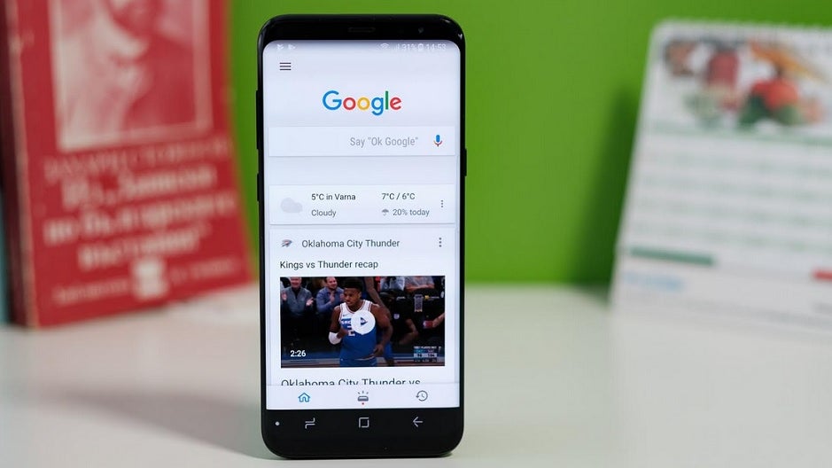
Here's how the imminent Google Search redesign will make it easier and faster to find information
Google says that a design change for the mobile version of Google Search is imminent. In charge of creating the new look was Google designer Aileen Cheng. “We wanted to take a step back to simplify a bit so people could find what they’re looking for faster and more easily," Cheng said. "I find it really refreshing. To me, it’s a breath of fresh air!" The designer went on to state, "Rethinking the visual design for something like Search is really complex. That’s especially true given how much Google Search has evolved. We’re not just organizing the web’s information, but all the world’s information. We started with organizing web pages, but now there’s so much diversity in the types of content and information we have to help make sense of."
Google Search redesign will make it faster and easier to read the information that you're looking for
So what can we expect from this redesign? According to Google's new blog release, Aileen said that five different improvements drove her plan. One was to make it easier for users to read text by making it bigger and bolder; this will help the human eye scan and understand Google Search results faster. The designer noted that "We’re making the result and section titles bigger, as well." The changes being made to text will include more of Google's own font Aileen says. While we’re on the subject of text: The update also includes more of Google’s own font which is already used in Android and in Gmail. "Bringing consistency to when and how we use fonts in Search was important, too, which also helps people parse information more efficiently," Aileen stated.
A redesigned version of Google Search is on the way
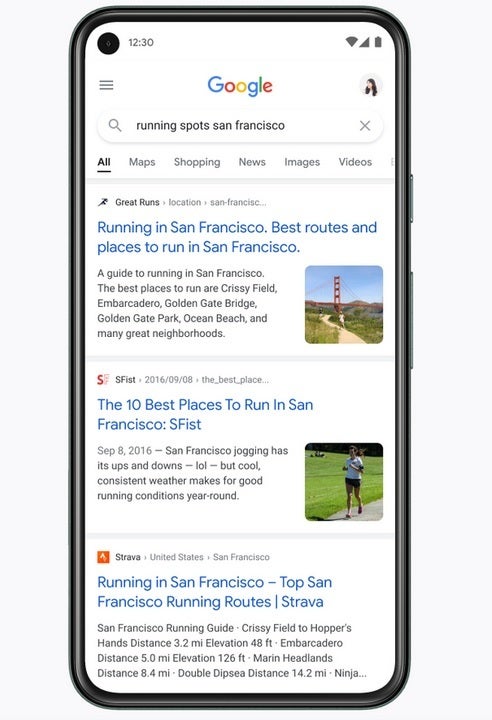
Another goal in the Search redesign is to focus on the information being presented, not on the design used to present it. Cheng said, "We want to let the search results shine, allowing people to focus on the information instead of the design elements around it. It’s about simplifying the experience and getting people to the information they’re looking for as clearly and quickly as possible." If you've ever used Google Search, and a vast majority of those reading this article have, you know how important this goal is. To accomplish this, Google will use a clean background with an emphasis on color to guide the eye toward important information.
Cheng also said that the redesigned Google Search needed to have "breathing room." What exactly does that mean? She explained, "We decided to create a new edge-to-edge results design and to minimize the use of shadows, making it easier to immediately see what you’re looking for. The overall effect is that you have more visual space and breathing room for Search results and other content to take center stage."
Lastly, Cheng wanted the new look for Search to be "Googley." To do this, the designer borrowed elements of iconic Google designs including the Google logo and the Search magnifying glass. She stated that "If you look at the Google logo, you’ll notice there’s a lot of roundness to it, so we’re borrowing from that and bringing it to other places as well. That form is already so much a part of our DNA. Just look at the Search bar, or the magnifying glass."
The Search redesign will borrow from elements of iconic Google icons and designs
While making these changes, Cheng also made it a point to stick with a design that could be instantly recognized as being from Google. That, we'd imagine, is part of the concept of keeping Search looking "Googley." With this in mind, she dropped an anecdote that goes to the heart of her Search redesign. "My three-year-old recently dropped a handful of Legos in my hand, red, yellow, green, blue, and he told me, ‘Mama, this is Google,’"Aileen said. "That’s how playful and well known we are to people. And when we redesign something, we want to bring that familiarity and approachability with us, too."

Popular stories


Latest News


Things that are NOT allowed:
To help keep our community safe and free from spam, we apply temporary limits to newly created accounts: