
iOS 7 Preview

Apple has announced that iOS 7 is coming this fall, but how can one just stand here and wait? We mean, boy it's painful! And knowing that there's actually a way of getting 'iOS 7 beta 1' that is currently available to developers, we decided to go ahead and install the thing on an iPhone 5.
After playing with the software for a while, we feel we're ready to give you our first impressions of Apple's new mobile platform. After all, iOS 7 is supposed to be a pretty big deal - it'll dramatically alter the look of your iPhones and iPads, so go ahead and read on if you want to know what your iOS device is going to be like when it gets the new OS in just a few months. Still, keep in mind that these impressions are based on the first beta version of iOS 7, so we guess that quite a few things may get fixed or changed by the time the final software arrives.
Lockscreen and Homescreen
So, the biggest thing about iOS 7 is that is comes with a brand new user interface, since this is actually the very first major redesign of the platform since 2007. The changes hit you right from the new lockscreen. It's very simplistic with the clock and date at the top, "slide to unlock" text at the bottom and a small camera icon in the bottom right corner for quick camera access. There are also two small arrows at the top and bottom, with the first showing the swipe direction for the Notification Center, and the second for the new Control Center. Of course, your notifications will take the center of the lockscreen.
This is the first iOS lockscreen ever that will make you wonder which direction you need to slide in order to unlock your phone. The arrow below the "slide to unlock" text will try to confuse you that the correct answer is 'up', but it's not. You can also slide to the left, which will make the on-screen elements move to the left, but this will not unlock the phone as well. As before, the correct direction to slide to is 'right', though now that the big arrow pointing to the right is gone, you'll easily mistake it the first few times. Of course, that's something that you'll quickly get used to, but it's the first sign that something's not quite right with the new iOS.
Now that we've arrived at the homescreen, we can start enjoying the beauty of the brand new icons, right? Well, not exactly. Those of us who hoped iOS will get some kind of widget functionality will be disappointed, but what's worse is that the iOS 7 homescreen actually looks like the old iOS homescreen, but with a 'Cartoon' theme applied. Seriously, it's like the more we stare at our iPhone 5 with iOS 7, the more it starts to look like a kids' phone. It is not bad, it's not ugly, but it's certainly not better than what it used to be. And if we simply have to compare it to the old homescreen look, we'd rather say that the new one is worse. But that's just our opinion. Aside from being a bit too cartoony, the new icons are also somewhat inconsistent, with some being truly flat, and others using a very generic-looking gradient effect for a background.
You may also notice that the leftmost homescreen page, which used to be dedicated to the universal 'Search' function, is no longer present. At first, we thought that Apple has simply decided to get rid of it, but after a few hours of playing with iOS 7, we finally found it (entirely by accident)! It turns out that you have swipe down (but not from the top, because that will reveal the Notification Center), and a search bar appears on top of the icons. Not bad, but we would have appreciated it if someone had told us how we're supposed to access the feature.
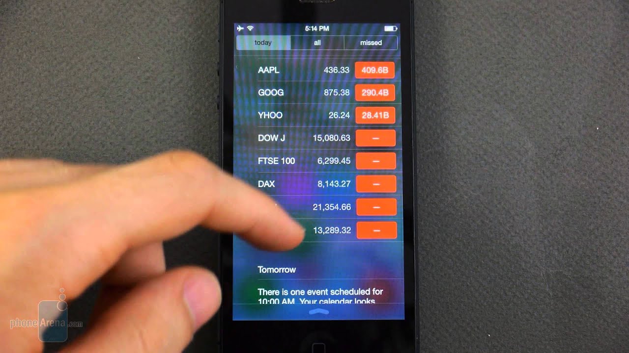
As we said, you can easily reveal the Notification Center by swiping from the top, and surprise, surprise, it's a brand new Notification Center. The new one is not bad at all, as it tries to be a bit more human by showing notes like "The first thing on your calendar today is "Visit grandma", in 30 minutes," or "Tomorrow: There is one event scheduled for 10:00 AM. Your calendar looks clear in the afternoon." It's OK, but it's not necessarily better than the previous Notification Center. In fact, it has even lost some functionality, previously you could, say, select one of your appointments from the Notification Center, and it would send you straight to your calendar. Now, however, you once again see a list with your appointments, but you can't select, or do anything else with them.
The so-called Control Center is a much-appreciated new addition to iOS, as it gives you quick access to frequently used toggles, such as Wi-Fi, Bluetooth and Screen Rotation. It also let's you set the display brightness, use the music player controls, the torch, or some other functions such as the new AirDrop, which allows you to wirelessly share content with other iOS 7 users. The problem with Control Center, is that you can accidentally pull it up if you are scrolling through a list of something (contacts, apps, emails, messages, a web page, etc.), and unfortunately, it may happens quite often, especially if you're using the phone in landscape mode.
Aside from all that, Apple has incorporated some cool effects like animated wallpapers (as in Android), which look pretty cool and can be interacted with using the accelerometer. Static wallpapers also move around as you tilt your device in various directions, providing a sense of depth.
Apps
Naturally, the built-in applications have been redesigned in order to match the new look and feel of the system. In short, they are much more simplistic and have lost the skeuomorphic elements that made them resemble objects from real life. For example, the Notes app no longer resembles a pin board. As a whole, we're OK with the simplification, but we have to say that some app elements have become a bit too basic, like the Stopwatch or Timer, for example. So basic, in fact, that they remind us of a badly-designed third-party Android app made by an indie developer. Thankfully, though, such sights in iOS 7 aren't too many.
Some apps look much better, like the Calendar, for example, though it doesn't really do anything new or different. It's safe to say that other apps work as advertised, meaning that we didn't encounter any real issues there. The stock Camera app has gotten a nice upgrade as it now allows you to choose from a set of 8 photo filters, and it also sports a 'square' photo mode, for those of you who enjoy snapping square photos.
The Safari browser has also been improved, as it now features a more convenient tab view, which is dangerously similar to that of mobile Chrome. The browser also has an almost full-screen view, since it hides the navigation controls at the bottom and shrinks the address bar once you start scrolling, but strangely, those elements tend to pop back up at times while scrolling, and we aren't really sure exactly when and why that happens.
iOS 7 also brings a new multitasking system which allows all apps to run in the background. You're accessing the multitasking UI in the same way - by double-pressing the Home key, and we have to say that the new multitasking view works quite well. It's quite reminiscent of Windows Phone's multitasking menu, but better.
Expectations
It's a bit early to make any conclusions, since we tested a beta version of iOS 7, which means that there's still a lot of work to be done on the platform, but we have to say that we're not impressed by what we saw. There seem to be a lot of elements which have gotten worse after the redesign, and the overly simplistic look of iOS 7 doesn't work in some situations, making for a weird-looking or somewhat frustrating sights.
We guess our biggest complaint about iOS 7 is that it fails to be better than its predecessor, at least visually. Still, it does feature some cool new transitions and effects that make it look fresh and fun, but that's not enough. In its effort to simplify the looks of iOS, Apple has actually made its platform a bit harder to figure out, and that's a pity. We're looking forward to checking out the final iOS 7; not because the beta got us excited, but because we would like to see these issues fixed.
After playing with the software for a while, we feel we're ready to give you our first impressions of Apple's new mobile platform. After all, iOS 7 is supposed to be a pretty big deal - it'll dramatically alter the look of your iPhones and iPads, so go ahead and read on if you want to know what your iOS device is going to be like when it gets the new OS in just a few months. Still, keep in mind that these impressions are based on the first beta version of iOS 7, so we guess that quite a few things may get fixed or changed by the time the final software arrives.
Lockscreen and Homescreen
So, the biggest thing about iOS 7 is that is comes with a brand new user interface, since this is actually the very first major redesign of the platform since 2007. The changes hit you right from the new lockscreen. It's very simplistic with the clock and date at the top, "slide to unlock" text at the bottom and a small camera icon in the bottom right corner for quick camera access. There are also two small arrows at the top and bottom, with the first showing the swipe direction for the Notification Center, and the second for the new Control Center. Of course, your notifications will take the center of the lockscreen.
This is the first iOS lockscreen ever that will make you wonder which direction you need to slide in order to unlock your phone. The arrow below the "slide to unlock" text will try to confuse you that the correct answer is 'up', but it's not. You can also slide to the left, which will make the on-screen elements move to the left, but this will not unlock the phone as well. As before, the correct direction to slide to is 'right', though now that the big arrow pointing to the right is gone, you'll easily mistake it the first few times. Of course, that's something that you'll quickly get used to, but it's the first sign that something's not quite right with the new iOS.
Now that we've arrived at the homescreen, we can start enjoying the beauty of the brand new icons, right? Well, not exactly. Those of us who hoped iOS will get some kind of widget functionality will be disappointed, but what's worse is that the iOS 7 homescreen actually looks like the old iOS homescreen, but with a 'Cartoon' theme applied. Seriously, it's like the more we stare at our iPhone 5 with iOS 7, the more it starts to look like a kids' phone. It is not bad, it's not ugly, but it's certainly not better than what it used to be. And if we simply have to compare it to the old homescreen look, we'd rather say that the new one is worse. But that's just our opinion. Aside from being a bit too cartoony, the new icons are also somewhat inconsistent, with some being truly flat, and others using a very generic-looking gradient effect for a background.
You may also notice that the leftmost homescreen page, which used to be dedicated to the universal 'Search' function, is no longer present. At first, we thought that Apple has simply decided to get rid of it, but after a few hours of playing with iOS 7, we finally found it (entirely by accident)! It turns out that you have swipe down (but not from the top, because that will reveal the Notification Center), and a search bar appears on top of the icons. Not bad, but we would have appreciated it if someone had told us how we're supposed to access the feature.
As we said, you can easily reveal the Notification Center by swiping from the top, and surprise, surprise, it's a brand new Notification Center. The new one is not bad at all, as it tries to be a bit more human by showing notes like "The first thing on your calendar today is "Visit grandma", in 30 minutes," or "Tomorrow: There is one event scheduled for 10:00 AM. Your calendar looks clear in the afternoon." It's OK, but it's not necessarily better than the previous Notification Center. In fact, it has even lost some functionality, previously you could, say, select one of your appointments from the Notification Center, and it would send you straight to your calendar. Now, however, you once again see a list with your appointments, but you can't select, or do anything else with them.
The so-called Control Center is a much-appreciated new addition to iOS, as it gives you quick access to frequently used toggles, such as Wi-Fi, Bluetooth and Screen Rotation. It also let's you set the display brightness, use the music player controls, the torch, or some other functions such as the new AirDrop, which allows you to wirelessly share content with other iOS 7 users. The problem with Control Center, is that you can accidentally pull it up if you are scrolling through a list of something (contacts, apps, emails, messages, a web page, etc.), and unfortunately, it may happens quite often, especially if you're using the phone in landscape mode.
Aside from all that, Apple has incorporated some cool effects like animated wallpapers (as in Android), which look pretty cool and can be interacted with using the accelerometer. Static wallpapers also move around as you tilt your device in various directions, providing a sense of depth.
Apps
Naturally, the built-in applications have been redesigned in order to match the new look and feel of the system. In short, they are much more simplistic and have lost the skeuomorphic elements that made them resemble objects from real life. For example, the Notes app no longer resembles a pin board. As a whole, we're OK with the simplification, but we have to say that some app elements have become a bit too basic, like the Stopwatch or Timer, for example. So basic, in fact, that they remind us of a badly-designed third-party Android app made by an indie developer. Thankfully, though, such sights in iOS 7 aren't too many.
Some apps look much better, like the Calendar, for example, though it doesn't really do anything new or different. It's safe to say that other apps work as advertised, meaning that we didn't encounter any real issues there. The stock Camera app has gotten a nice upgrade as it now allows you to choose from a set of 8 photo filters, and it also sports a 'square' photo mode, for those of you who enjoy snapping square photos.
The Safari browser has also been improved, as it now features a more convenient tab view, which is dangerously similar to that of mobile Chrome. The browser also has an almost full-screen view, since it hides the navigation controls at the bottom and shrinks the address bar once you start scrolling, but strangely, those elements tend to pop back up at times while scrolling, and we aren't really sure exactly when and why that happens.
iOS 7 also brings a new multitasking system which allows all apps to run in the background. You're accessing the multitasking UI in the same way - by double-pressing the Home key, and we have to say that the new multitasking view works quite well. It's quite reminiscent of Windows Phone's multitasking menu, but better.
Expectations
It's a bit early to make any conclusions, since we tested a beta version of iOS 7, which means that there's still a lot of work to be done on the platform, but we have to say that we're not impressed by what we saw. There seem to be a lot of elements which have gotten worse after the redesign, and the overly simplistic look of iOS 7 doesn't work in some situations, making for a weird-looking or somewhat frustrating sights.
We guess our biggest complaint about iOS 7 is that it fails to be better than its predecessor, at least visually. Still, it does feature some cool new transitions and effects that make it look fresh and fun, but that's not enough. In its effort to simplify the looks of iOS, Apple has actually made its platform a bit harder to figure out, and that's a pity. We're looking forward to checking out the final iOS 7; not because the beta got us excited, but because we would like to see these issues fixed.
iOS 7 preview images

Popular stories

Latest News


Things that are NOT allowed:
To help keep our community safe and free from spam, we apply temporary limits to newly created accounts: