Leaked design elements for the upcoming new Android version
Update: The new Android design is now official. Learn all about what Google calls Material Design here.
We've just heard whispers that the
next Android version will jump to the number 5.0, and carry the name Lollipop, but now we’re also seeing mockups of what could very likely be the brand new design of Google’s operating system. Note that these are not actual screenshots, but rather mockups of what the Android redesign might look like, based on information from sources in the know sharing their knowledge with Android Police.
The new, so called
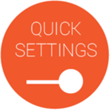
‘Quantum Paper’ design is sleeker and takes inspiration from Google Now’s cards, implementing something similar in the notifications tray. Not just that - the whole ‘Quick Settings’ panel is richer in options as well. You can also see how much more functional the quick settings are as you can select a Wi-Fi network to connect to right from the notification dropdown, as well as check your data usage and see Bluetooth-paired devices.
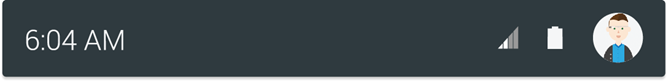
This new design circles around flat icons with the traditional charcoal gray background color contrasting with white fonts, but the new element is the bright red used for toggles that really distinguishes them from the other visuals like buttons.
The card-like interface for notifications, on the other hand, reverses the colors as the background for it is white, while the fonts are in gray and black.
A particularly cool accent in the new notification bar is your Google+ avatar that reminds you that you can quickly jump into your section of the Google cloud. All those often subtle changes together combine for a fairly big difference in the way Android looks, adding a splash of color and a subtle, modern change toward more flatness. As likely as all this seems, until Google unveils its new Android 5.0 Lollipop later today at
Google I/O 2014, though, let’s keep a healthy grain of salt for all this.
Android 5.0 Lollipop new design images
source:
Android Police
Read the latest from Victor Hristov


Things that are NOT allowed:
To help keep our community safe and free from spam, we apply temporary limits to newly created accounts: