An in-depth look behind Android's paper-like new design
Materialising Material
Android's new visual language is inspired by nature, physics, and the bold, graphic look of print-based design. Or in other words, a design based on the qualities of paper. When experiencing Material Design, look for material metaphors - "use of familiar tactile attributes" and "realistic lighting" to provide a "rationalized space" and a "system of motion".
The second foundation is motion. Google is being very specific about how Android has to move on your device's display - "All action takes place in a single environment. Objects are presented to the user without breaking the continuity of experience even as they transform and reorganize. Feedback is subtle yet clear. Transitions are efficient yet coherent."
Finally, Google gave print design its mobile device 'renaissance' - "The fundamental elements of print-based design—typography, grids, space, scale, color, and use of imagery—guide visual treatments - create hierarchy, meaning, and focus. Deliberate color choices, edge-to-edge imagery, large-scale typography, and intentional white space create a bold and graphic interface that immerses the user in the experience." When was the last time you read a print magazine? Now is the time to buy a beautiful mag and immerse yourself in its pages in preparation.
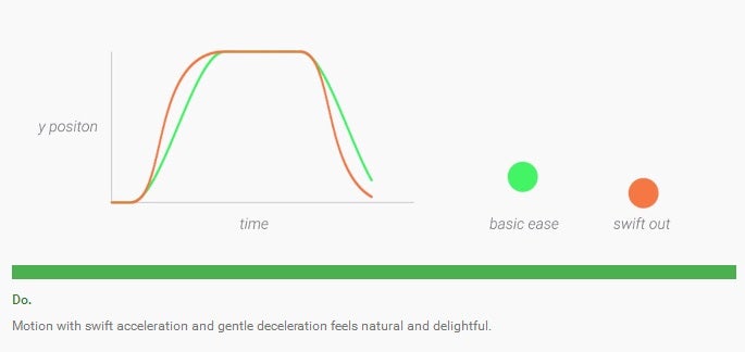
Did we say something about physics? Oh, boy! Google has went borderline scholar on Material Design's animation system. "A critical aspect of motion for material design is to retain the feeling of physicality without sacrificing elegance, simplicity, beauty, and the magic of a seamless user experience." This translates to abandoning mechanical, linear movement in favor of swift, elegantly dancing elements. Objects entering the screen space move at peak velocity, as natural movement commands. "A person entering the frame of vision does not begin walking at the edge of the frame but well before it. Similarly, when an object exits the frame, have it maintain its velocity, rather than slowing down as it exits the frame." It's safe to say Google and app developers will no longer distract you with unnecessary changes in velocity.
Another big push towards making Android in tune with nature is Responsive Interaction. This means the interface elements will react to user input in a logical, predictable manner guided by principles Google has broken down to Surface Reaction (instantaneous visual confirmation at the point of contact), Material Response (transforming materials upon touch or click), and Radial Action (actions will visually connect to their input epicenter - voice enters through the mic icon, keyboard through keyboard keys, etc).
Another way in which Material Design delights users is Meaningful Transitions. "Transitioning between two visual states should be smooth, appear effortless, and above all, provide clarity to the user, not confusion." - proclaims Google, adding that "as transitioning elements move around the screen, they should behave in a coordinated manner. The paths elements travel along should all make sense and be orderly."
Color-crazy!
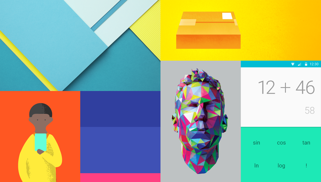
Don't like muted colors and flat design? Too bad - this is the future. According to Google, Material Design's color representation is all about "bold color statements juxtaposed with muted environments, taking cues from contemporary architecture, road signs, pavement marking tape, and sports courts." Bold shadows and highlights, unexpected and vibrant colors are in tow. App menus will, generally, adhere to a palette of three colors - primary, secondary, and accent. Grey text, icons, and dividers will use alpha values instead of solid colors for better representation.
Iconic look
Can you see them? These are Android's new icons - "simple, modern, friendly, and sometimes quirky", as described by Google. Designers will be playing with symmetry and consistency of shapes to give icons an unique quality. Round curves will trump over sharp, dangerous corners. Bear in mind, though - "consistency is important". Thus, developers are urged to use Android's system icons whenever possible across different apps.
Quantum Paper
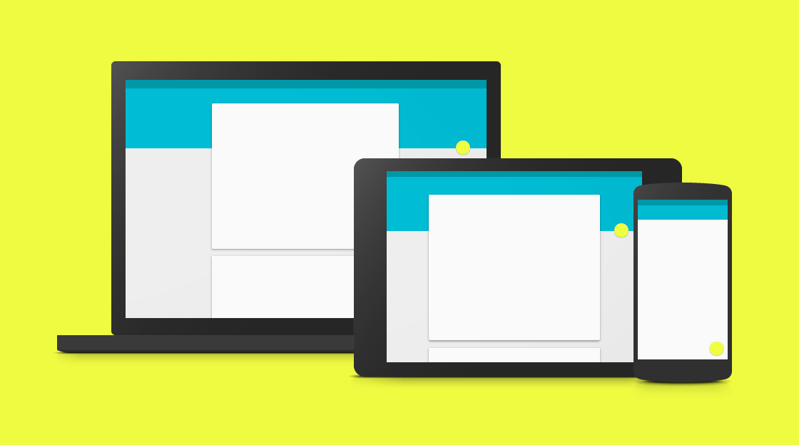
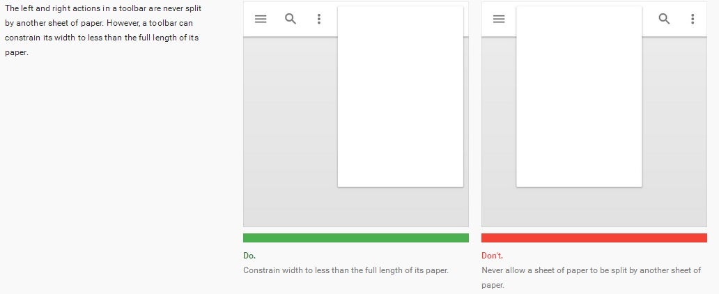
Google is taking the paper mantra very, very seriously. App designers must switch to thinking of each pixel (with the exception of system/status bars) as if its residing on a sheet of paper. Layouts will be arranged like paper sheets, which are joined by seams, moving and overlapping together. You really have to see it in action to understand what the philosophy is about. What's most important, however, is that Google has laid down strict principles on how different windows and menus should be behaving. Hopefully, this will lead to seamless, uniform apps.
Conclusion
Google has went off the deep end in making Android a smart, elegant, user-centric operating system. The underlying principles and philosophies are incredibly complex and deep. We are seeing Google take forceful, decisive action to give Android a distinct, finished look - one that leaves absolutely zero doubt which operating system you're using.
We are leaving you with a huge gallery of screenshots from the revamped Android. Soak them in and get your own impressions of the new buttons, cards, dialogs, menus, sliders, and many more components which will be waiting for you in the Android "L Version" update. And if you happen to be unhappy with Google's change of direction, weep not - the good, old Holo theme will be always there, at least for Android's menus.
Follow us on Google News

Popular stories


Things that are NOT allowed:
To help keep our community safe and free from spam, we apply temporary limits to newly created accounts: