Google tests more changes for the Google Play Store UI
Google is apparently playing around with the Google Play Store until it is completely satisfied with the way that it looks. The latest changes, according to Android Police, include moving the Games tab to the first position, followed by an Apps tab, Movies & TV, Books, and Music. Currently, the Home tab, which contains a combination of games and apps, is first, followed by Movies, Books and Music.
With the new setup, you'll find only games under the Games tab, while the Apps tab shows non-gaming apps. The new UI could make it quicker for game players to find new titles to play. In the same vein, it could also make it easier for those who don't play mobile games to find new and interesting apps to install. But why put Games first instead of Apps? That's an easy question to answer. Games produce much more revenue for Google than paid apps do.
Other changes spotted include the removal of the three dot overflow menu found to the right of every title listed under any of the tabs selected. Tapping on the menu brings up three options: Install, Add to Wishlist, Not Interested. But don't fret. With the UI being tested, a long press on an app's name or icon will result in the appearance of a pop-up carrying the same options.
Google is testing the new features by sending out the changes via a server-side update to certain Android users. Whether it intends to roll out these changes for all Android users is unknown for now. Last month, we told you that Google had changed the layout for apps in the Play Store and darkened the colors for each category.
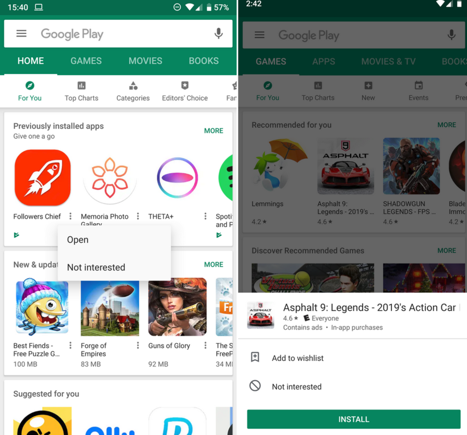
The current Google Play Store UI at left, and the UI being tested

Popular stories


Latest News

Things that are NOT allowed:
To help keep our community safe and free from spam, we apply temporary limits to newly created accounts: