Google testing card-like interface for search results in the Play Store app
Google is testing a new way for the Google Play Store to show search results to its users. Instead of a list of apps that scrolls, you will see a card-like interface for each app that includes the screenshot images found on the actual Play Store listing. The cards also scroll. However, instead of seeing seven apps appear at a time, the larger size of the cards leave room for only 3.5 to be viewable at once. Also gone is the three dot menu to the right of each app listing. All that included was a link to install the app, or a link to add the app to you wishlist.
Just because Google is testing this out, it doesn't mean that we will see this card interface rolled out to all users of the Google Play Store. It's possible that if Google receives enough positive feedback from those who get to test out the new search interface, we will see it implemented for all Android users. Frankly, we find it less crowded. You can also see at a glance the number of times an app has been downloaded.
If you have an opinion on the new layout, let us know what you think by dropping your comments in the box below.
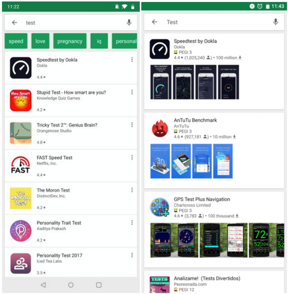
The current Google Play Store search UI on left, and the new card UI being tested on right
source: AndroidPolice

Popular stories


Latest News


Things that are NOT allowed:
To help keep our community safe and free from spam, we apply temporary limits to newly created accounts: