Galaxy S8+ vs Galaxy S7 edge interface comparison: here's what's changed
The Samsung Galaxy S8+ unit used for this article was kindly provided by Samsung Romania.
To say that the Galaxy S8 is an improvement over the Galaxy S7 will be the understatement of 2017. While the differences might not seem that big on paper and in pictures, one has to hold Samsung's new flagship in their own hands in order to really see what the fuss is all about. Believe it or not, last year's S7 edge feels archaic when used alongside a shiny new Galaxy S8 or S8+. We've already had the chance to compare the new flagship against its predecessor (you can read said article right below) and already concluded that Samsung did a great job with its 2017 Galaxy S lineup, and that's especially true for the hardware.
But what about the other two legs of the tripod - software and user experience? We took upon ourselves to find out and compare how the Galaxy S8 Plus fares against the Galaxy S7 edge.
Oh, and it's also worth mentioning that both devices are currently running the same version of Android as well as Samsung's refreshed interface. There aren't many differences between the two Nougat devices, though you'll find plenty of those if you compare the S8/S8 Plus with a Marshmallow-running Galaxy S7 or S7 edge. We've done a similar comparison already - you can find it right below.


Lock screen and home screen
Not many differences here. Aside from the different aspect ratios of the screenshots below, you'd be hard-pressed to find any differences. Both phones allow you to customize the shortcuts in the bottom left and right corners; both show your notifications and general information about the charging status of your device.
You are also quite likely to notice the refreshed iconography on the Galaxy S8 and S8+. It helps create a more coherent look all around, though we can easily see lots of peeps not liking this one. Luckily, you can still change things up by downloading and applying a system-wide interface theme from Samsung's store. The same applies to last year's Galaxies, so not much has changed here.
Galaxy S8+ vs Galaxy S7 edge
App drawer
Whether you'd use an app drawer on the Galaxy S8/S8+ or not is totally up to you. There's no app drawer icon by default, which is great — you open this one by swiping your home screen up or down; you can also close it by doing the same thing inside the app drawer. Meanwhile, all of your icons are scattered across the horizontal pane. That's convenient and intuitive, though we can easily see why some folks might not be thrilled with this change, but fortunately for them, there's
App drawer - Galaxy S8+ (left) vs S7 edge (right)" 
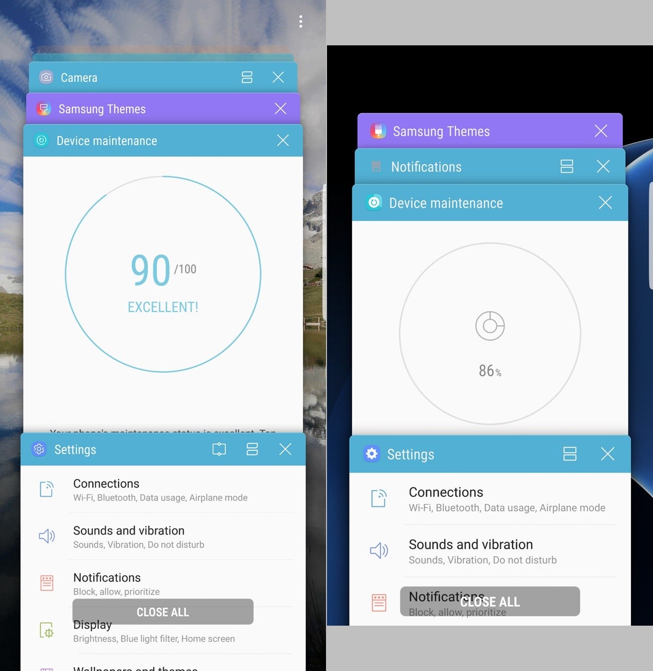
Notifications and quick settings
You can hardly discern any differences between the notification shades of the Galaxy S8/S8 Plus and S7/S7 edge. It's worth noting that the new crop of Galaxies lacks a search bar in the quick settings
Notifications and quick settings - Galaxy S8+ (left) vs S7 edge (right)
Settings
Let that sink in — the settings menu on the Galaxy S8/S8+ fits all of its entries on a single page. Meanwhile, thе S7/S7 edge requires you to swipe a bit before you can see all the options. The reason for this is not only the extraordinarily tall display.
Both phones also flaunt Samsung's new streamlining philosophy inside the Settings menu. That's a double-edged sword, though - while that's making everything look clean and streamlined, you might have a hard time guessing where some of the not-so-obvious settings are tucked in. It will be a trial and error for many users.
Settings - Galaxy S8+ (left) vs S7 edge (right)" 
Edge panels
Being the spiritual successor to the S7 edge, the S8+ comes along edge panels that can be activated by swiping a certain handle on the left or right portion of the screen. The edge panels on the two phones are pretty much similar in terms of appearance and overall functionality.
Stock apps
Little has changed in the stock apps as well. Whatever you have on the S7/S7 edge you'll also find on the Galaxy S8/S8+. Of course, the additional screen real estate fits more contacts or messages or even photos in the gallery, which is beneficial to the user experience, all things considered.
Split-screen multitasking
Same old, same old, but that's not a bad thing. Never change a winning team, we guess.
Galaxy S8+ (left) vs S7 edge (right)
Camera
Galaxy S8+ (left) vs S7 edge (right)
Both phones employ similar-looking camera apps that are sleeker than ever. The interface on either phone is now mostly gesture-oriented: you swipe up or down to change cameras, left for camera modes, and right for filters. You will only have to meddle with old-school buttons when you want to change enable/disable HDR, the flash, or access the settings menu of the camera. All in all, the camera app is now a joy to use and looks way, hmm, sexier than before (if apps can look sexy at all, that is).
Samsung Galaxy S8+ UI screenshots
Follow us on Google News

Popular stories

Latest News
Things that are NOT allowed:
To help keep our community safe and free from spam, we apply temporary limits to newly created accounts: