Feedly for Android redesign may take getting used to
The Android beta version of Feedly got a major redesign that modernizes the look and feel of the app, but it may take power users some getting used to. As would make sense for a news reader app, the Feedly redesign puts the focus on the content, but the changes have led to the removal (or streamlining) of features.
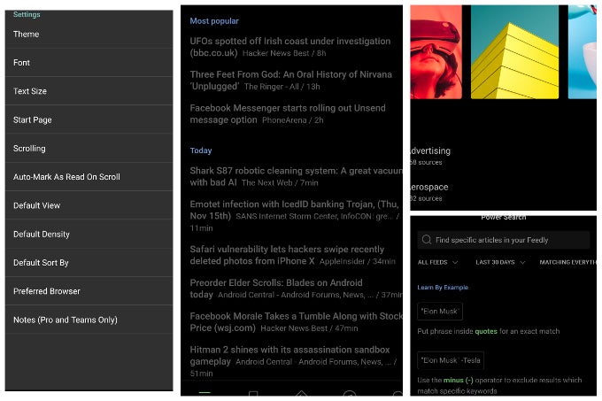
The first and most obvious change is the addition of tabs along the bottom of the screen giving users easy access to feeds, saved items, favorites, discover, and search. The favorites tab is now the default start screen and there appears to be no way to change that. Additionally, the default article view has changed. Now Feedly will show you a few popular items first, then the chronological view, and all articles are in a scrolling list rather than pages, although users can revert to pages in the settings if you prefer.
The biggest usability change is with the gestures and interactions. Previously a short swipe from the right would mark a single item as read (this is still the same) while a longer swipe would mark everything on the page as read, while a long press on an item would save it to your read-later list. Now, marking everything as read is gone and saving has been switched to a swipe from the left, with a short swipe saving an item to read-later and a longer swipe saving to a custom board. The long-press menu now gives options to save an item to a board, share, keep as unread or mark all items above or below as read.
Overall, the new layout is much more modern and fluid, but depending on how much you relied on certain gestures/interactions, it may take some time to adjust to the new UI. Right now, the changes are only available to Feedly beta users on Android, but the update will be making a wide release in the next few weeks.
Download: Feedly (beta)

Popular stories


Latest News


Things that are NOT allowed:
To help keep our community safe and free from spam, we apply temporary limits to newly created accounts: