
Editorials
A light-hearted look at my "favorite" Apple design fails (Vision Pro is in here too)
This article may contain personal views and opinion from the author.
When you buy an Apple product, you're likely to find a piece of text on it that reads: "Designed by Apple in California."
Apple's design team has consistently delivered some impressive, premium-feeling, thin and light devices – MacBooks, iPhones, iPads, iMacs, keyboards, Apple Pencils, mice, and more.
But even the acclaimed design team behind the trillion dollar company can occasionally screw things up a bit, especially if its goal is aesthetics and thinness above all else.
Let's take a look at my personal favorite Apple design fails, the reasons behind them, and whether they were eventually fixed.
Let's also use this opportunity to appreciate the design and build of our tech products, while keeping in mind the compromises a design team has to settle with, in order to achieve its goal.
The iPad webcam situation – still wrong, but not for long
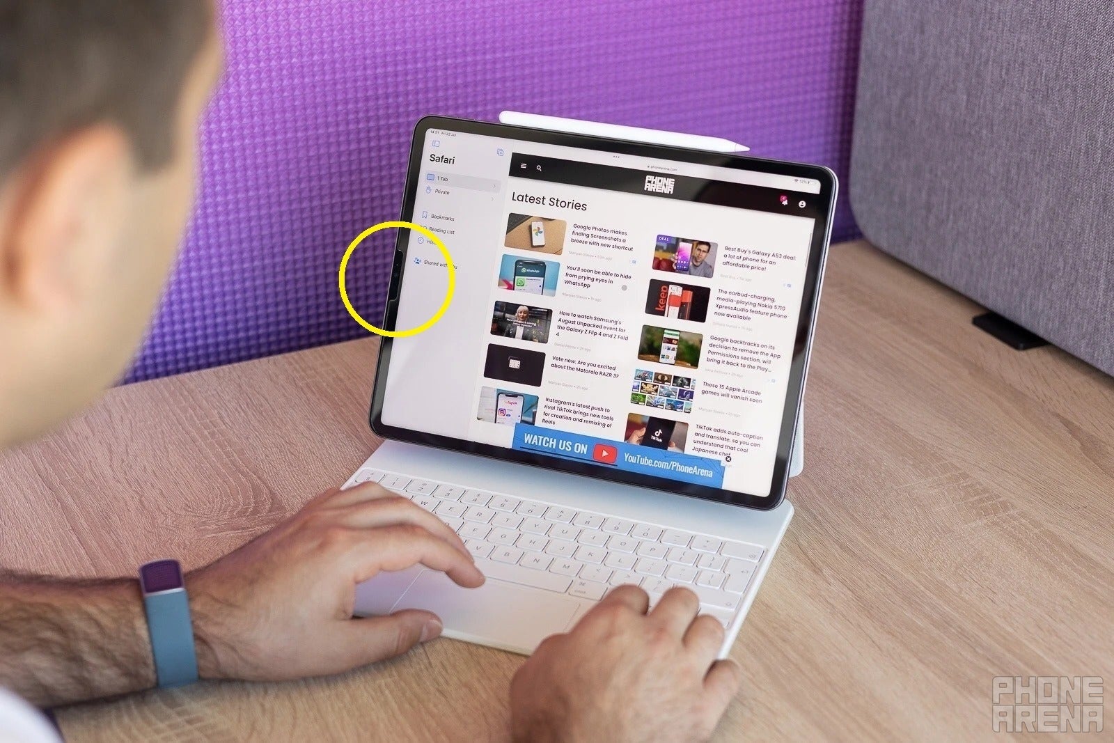
The 2022 iPad Pro; front camera still centered inside the left bezel
When the iPad was first introduced the times were quite different. People were more than happy just to own a giant touchscreen tablet, and simply watch movies or browse the web with it.
The iPad didn't need to be anything more than a big iPhone. It didn't really matter where its front camera was positioned either, because we weren't constantly Zoom calling back in 2010. In fact, the first iPad didn't even have a camera.
But yeah, it's 2024 now, and the iPad has blossomed into a unique, versatile, powerful computer, with true multitasking and desktop-class apps. More importantly – its users now need to do video conferencing. A lot.
Whether it's a kid who uses an iPad for school, or a college student, or a professional, they're all likely having to join Google Meet or Zoom calls regularly. Their laptop-like iPad positioned in landscape, whether in their hands, on a kickstand, or inside a Magic Keyboard.
And where's its front-facing camera? Still centered in the left side bezel. Not at the top center, as it is on any laptop or modern Android tablet; nope, it's still in the wrong spot, making the user look off-center and double-chinned as heck.
- Why?
The top bezel of a modern iPad Air and iPad Pro contains a magnetic connector, and a wireless charger for the Apple Pencil 2.
Those components are taking up internal space in the iPad, precisely inside the top center bezel, so Apple likely couldn't figure out how to fit a webcam in there also.
- Was this fixed?
We expect Apple to announce new iPad Air and Pro models, plus a new Apple Pencil, in the coming days.
Leakers suggest that these new iPads will finally have the front camera in the correct spot, likely due to a new Apple Pencil charging system, or at the very least a relocated one. That would allow for the front camera to be moved to the correct spot we all want it to be in.
This was also already fixed on the base iPad model (the non-Pro or Air), as it doesn't contain an Apple Pencil wireless charger. Thus, moving the webcam to the right spot wasn't such a design challenge, as it is on the iPad Air and iPad Pro.
Apple Pencil 1 charging by sticking out of the side of the iPad like a Q-tip
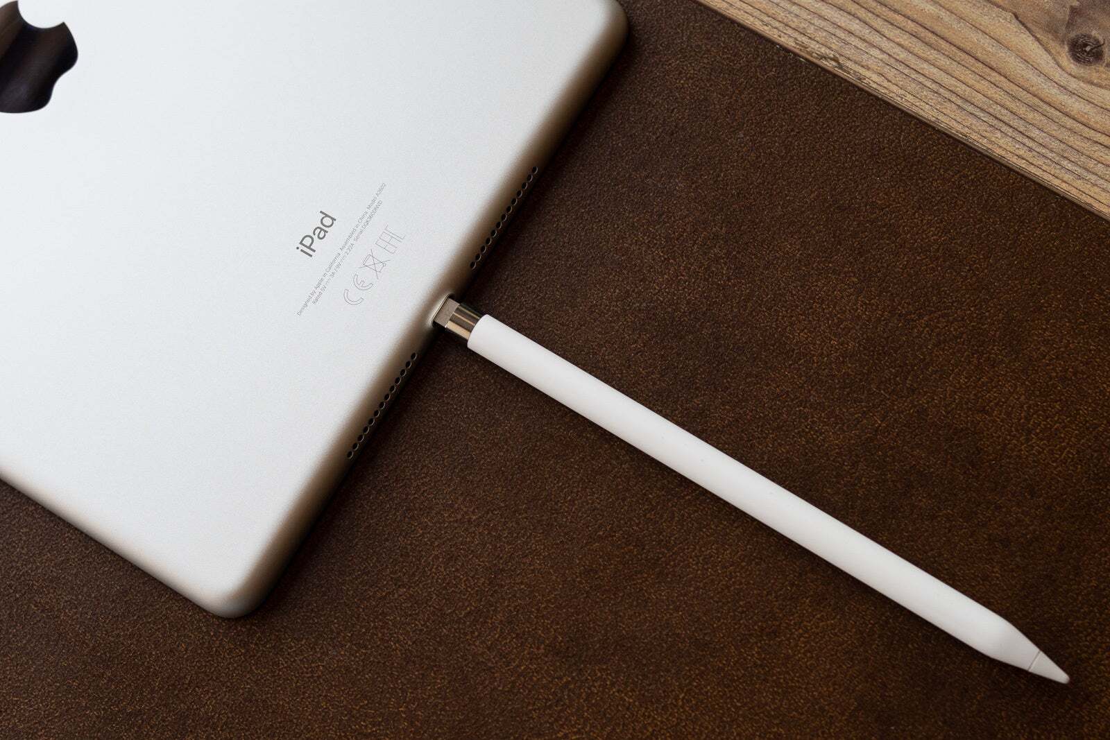
A first-gen Apple Pencil charging; yep, this looks good
Apple is known for coming up with simple, elegant solutions when it comes to both hardware and software, except in this case, obviously.
The first Apple Pencil uses a Lightning port, as opposed to the magnetic wireless charging of the Apple Pencil 2 (and likely the upcoming Apple Pencil 3).
And back when the first Pencil came out iPads also had a Lightning port, so in order to charge it you had to stick it to the side of the iPad awkwardly. It would have to stay there, sticking out of the iPad for up to 30 minutes until it was fully recharged. Definitely an interesting look!
- Why?
It's reasonable to suspect Apple simply didn't have a more elegant solution in mind, or at the very least, it needed time to implement one into future iPads. Which it did. Thus…
- Was this fixed?
Yes, Apple's successor to the first Apple Pencil charges wirelessly, while snapping magnetically onto the top of current iPads. It's a far more elegant solution, albeit (as mentioned previously) it prevented us from getting a front camera in the right spot for quite a while.
The Apple Magic Mouse "plays dead" while it's charging
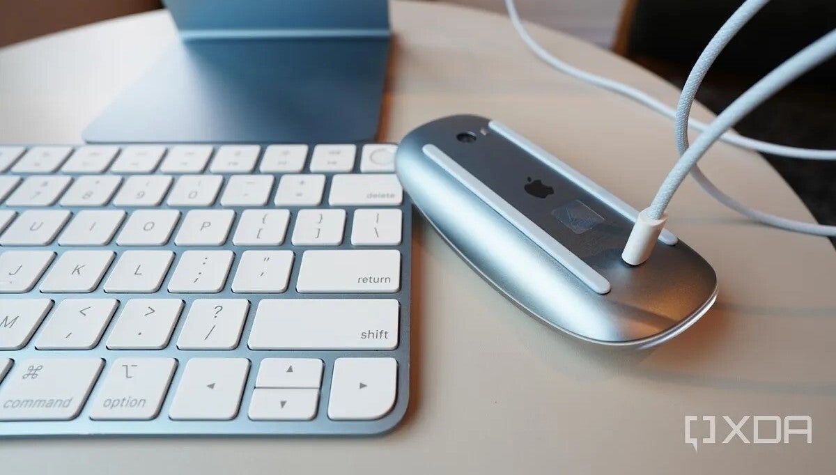
An Apple Magic Mouse charging like it's supposed to (Source - XDA Developers)
Even to this day, Apple's touch-only Magic Mouse continues charging in a very unusual way. You have to flip it upside down, and plug a Lightning cable into its port, which is on the bottom of it.
See, on any normal contemporary mouse that charging port would be on the front, or on the back of it, but Apple, often focusing on thinness and sleekness above all else, designed its Magic Mouse to be – what else – super thin and slick. Which means – no space for that.
So, it looks like this when it's charging… Kind of weird having this on your desk, but hey, it works, I suppose. What other mouse can do tricks, like "play dead" and "charge awkwardly"?
- Why?
In its effort to make the Magic Mouse as thin, sleek, and unique as possible, Apple's design team couldn't fit a charging port on the front, or the back of this mouse. So, bottoms up!
- Was this fixed?
Nope, the Apple Magic Mouse hasn't gotten a redesign yet; it's still charging the exact same way in 2024.
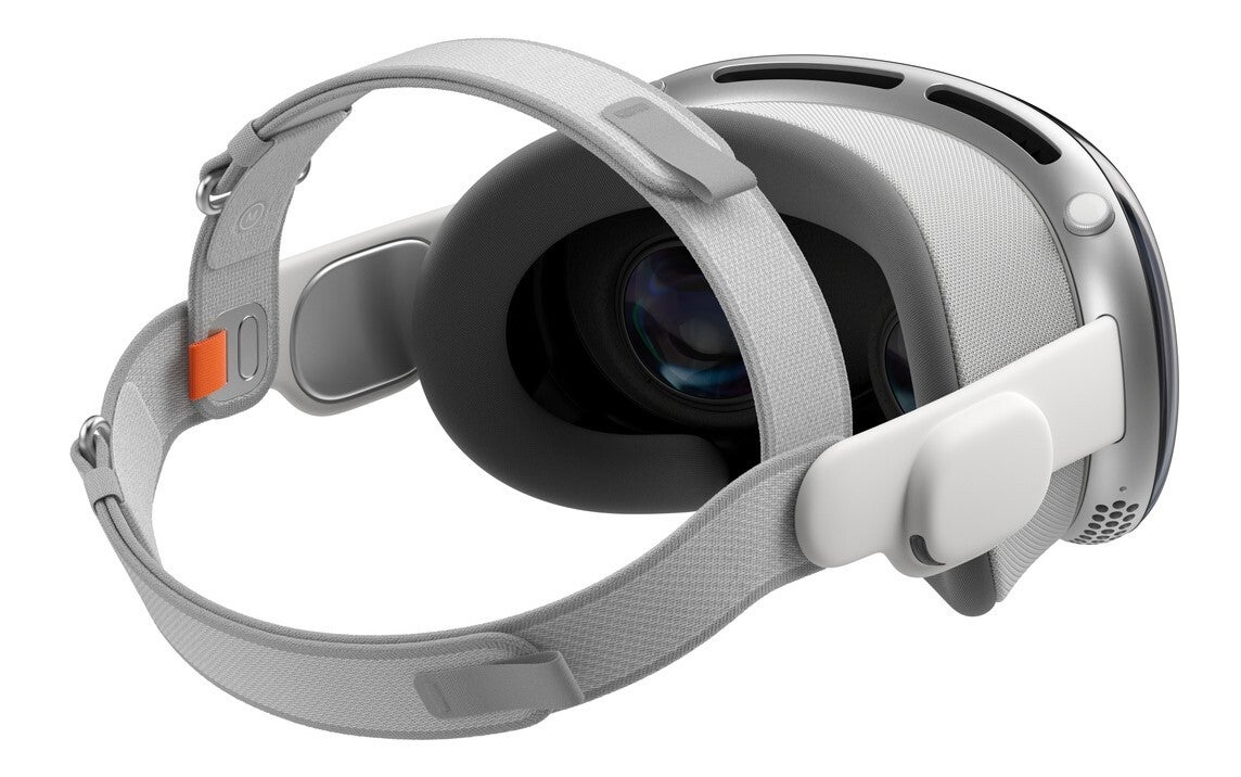
The Apple Vision Pro's default head strap makes the headset front-heavy – looks over comfort

The Apple Vision Pro with its default head strap
You can tell Apple really wanted its Vision Pro to not look like any other AR/VR headset, all the way down to the head strap.
The Vision Pro's default head strap, that we see prominently in marketing materials, was clearly designed to be unusual, and unmistakable.
That's commendable – I'm told it's super soft to the touch; a lovely piece. However, as you can see, it only holds the headset to the back of your head.
There's good reason any other chunky AR/VR headset on the market comes with a more intricate head strap, notably with a piece that goes over your head, in order to balance out its weight better.
So the top of your head takes some of the weight, the back of your head too, and traditionally – your forehead and cheeks. At least judging by me – that's where I usually get red skin marks after wearing any headset for an hour.
However, with Apple's head strap design, the top of your head is out of the equation, and all the weight naturally goes only on your face. And the Apple Vision Pro is not a light headset by any means, so this is plainly not a comfortable solution, just a good-looking one.
- Why?
This less-than-comfortable head strap was most likely designed to look aesthetically pleasing, unmistakably Apple, and to not ruin people's haircuts, which – to be fair – are all valid reasons.
However, in an effort to design something unmistakably different, Apple glossed over the part where it should hold your headset as comfortably as possible too, and that's simply not a design that's up to the task.
It needs an overhead strap, like any other headset. Either that, or a much lighter headset to hold.
- Was this fixed?
Thankfully, the Vision Pro Dual Loop Band exists
Technically. Apple likely realized this marketing-focused head strap won't do it for many users, so it included a more traditional head strap it calls the "Dual Loop Band", with the Vision Pro.
So everyone wins – Apple gets to promote the headset with the good-looking, unique, but uncomfortable single-band head strap, while users get to immediately swap it out for a more comfortable, yet generic dual-band one.
The Apple Vision Pro's battery is external, and meant to stay in your pocket… This isn't normal for AR/VR headsets
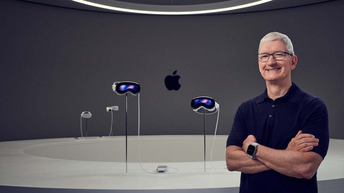
Apple CEO Tim Cook posing in front of Vision Pro headsets; note their external batteries
Off the bat, I should make it clear that my opinion on external batteries isn't negative. In fact, I wish all headsets (e.g. the Quest 3) did this, in order to lighten some load off your face.
But Apple didn't make this design choice just to shed weight off the Vision Pro headset.
It is already such an over-engineered piece of hardware, that it's basically impossible to also fit a battery in. It has an external lenticular screen, tons of cameras and sensors, it's all glass and metal for some reason… It's too heavy.
The average VR headset, such as the popular Quest 3, is made out of plastic for a reason, and it's not just cost savings – plastic is lighter. The average headset also doesn't include a creepy lenticular display up front, in order to show others where your eyes are looking. It doesn't have that many complex sensors too, usually just about six small cameras and a depth sensor, if that.
So the average headset manages to fit its battery inside just fine. As unlike Apple, it's not trying to be premium and over-engineered as heck, yet somehow also thin.
But Apple made some weird choices there, so… we got an external battery. Again, I'm not opposed to the idea, but if the headset wasn't so over-engineered, and maybe used plastic instead of metals, things could've been different, and simpler for the user.
- Why?
The Apple Vision Pro has notably more (and more complex) components than the average headset, and it's already quite heavy even without a built-in battery.
- Was this fixed?
Obviously not yet, as the Vision Pro is a fairly new product, but there are rumors of a cheaper Apple Vision headset coming eventually, which might drop the outer lenticular display, and use lighter build materials.
So, it's possible that a cheaper Vision model might use an internal battery, as opposed to one that dangles outside of the headset.
The 2016 MacBook – peak "beauty and thinness over functionality"
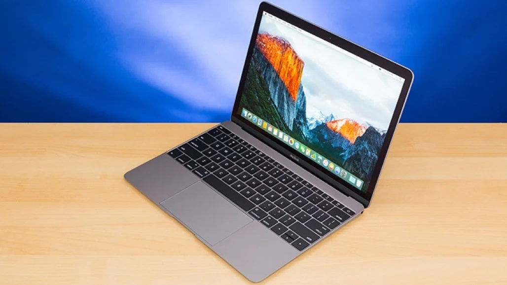
The MacBook in question (Source - PCMag)
Back in 2016 Apple released what I believe to be its most "aesthetics above all" product – and it was a MacBook.
A beautiful MacBook indeed, one that I really wanted, for its ultra sleek, ultra thin design, and edge-to-edge keyboard.
But those looks didn't matter for long, considering it only had a single USB Type-C port… to be used for everything – charging, connecting peripherals, external storage – everything.
But even more notably – that MacBook used a new butterfly-mechanism keyboard, and a super shallow one at that. It didn't provide much tactile feedback, nor was it durable in the long run. Or in the short run, for that matter. It was notoriously prone to failure, and all that – in the name of thinness.
- Why?
To make the laptop as thin and sleek as possible.
- Was this fixed?
Yes, after countless complaints online Apple started releasing thicker MacBooks using its more traditional scissor-mechanism keyboards. Those are far more reliable and tactile.
Recent MacBooks have started getting more ports too, including everyone's favorite magnetic MagSafe charging port, even! So Apple definitely listened, and atoned for that one.
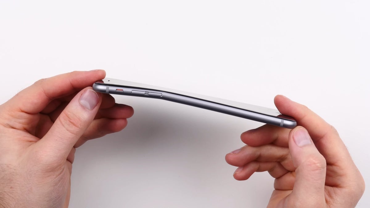
A classic – the bendy iPhone 6, because… thinness, again
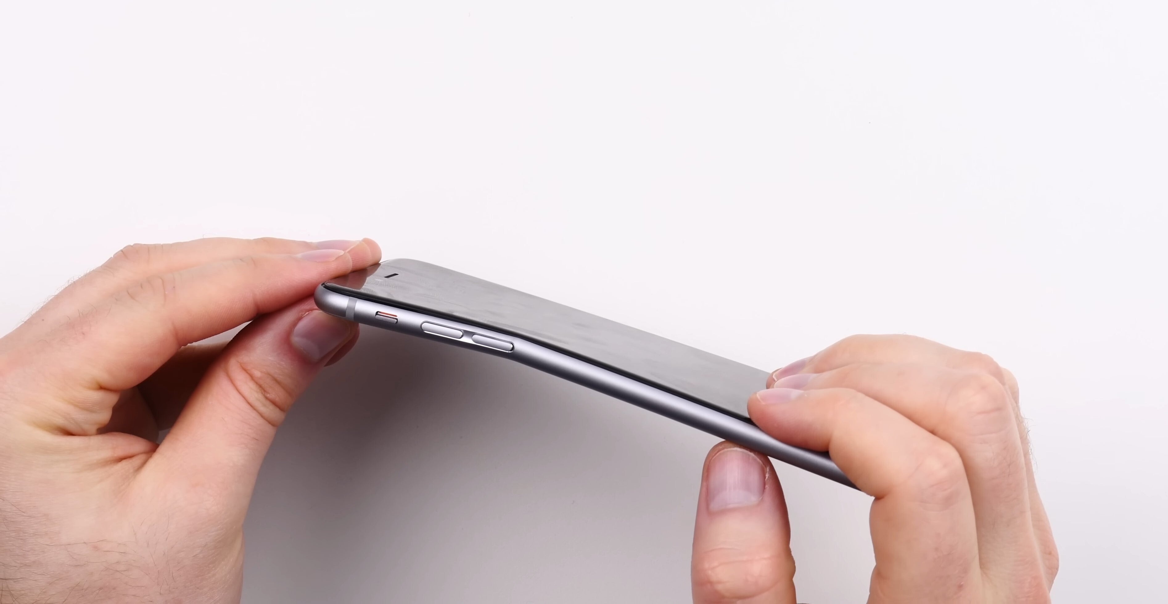
A bent iPhone 6 (Source - Unbox Therapy on YouTube)
I remember a friend showing me his iPhone 6 back in the day, about 10 years ago… how time flies. Anyway, I was strictly on team Android back then, but couldn't really pretend this wasn't the thinnest and most beautiful phone I had seen at the time.
It was indeed a fantastic piece of hardware. But back in 2014, things like bend tests weren't exactly as prominent for every new device as they are today. If your phone wasn't sturdy – you'd unfortunately find that out on your own.
And a lot of iPhone 6 users found that out on their own. In fact, I'm pretty sure the iPhone 6 fiasco started the YouTube trend of people bend-testing smartphones and tablets – it was definitely the first modern folding phone, by accident.
Wasn't as bad as Samsung phones bursting in flames on plane flights, but still – quite a PR disaster for Apple and its design team.
- Why?
Likely another effort from Apple's design team to make the device as thin as possible – and it was a great effort – the phone was beautiful and ultra thin indeed, but definitely not durable.
The phone's volume keys area was a weak spot, and with a bit of pressure, it would start bending there, quite easily.
- Was this fixed?
Yes, Apple has since addressed the weak spots in its earlier iPhone designs, and no longer seems to strive for thinness above all else. So modern iPhones do survive bend tests really well.
Another classic – the iPhone 4's Antennagate
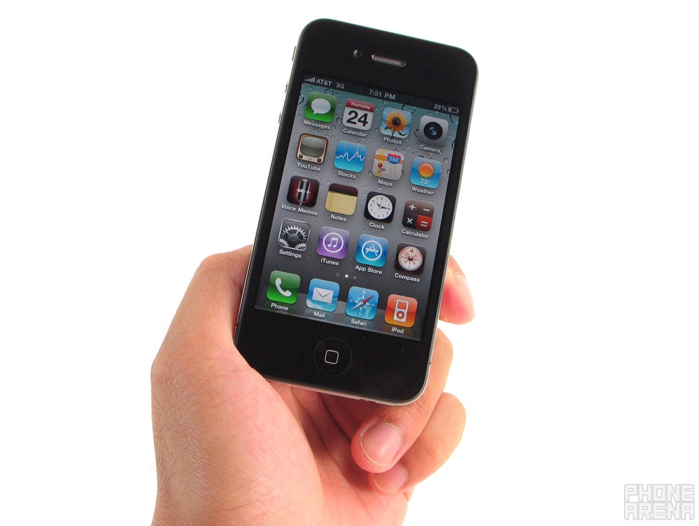
Long, long time ago, back in 2010, the iPhone 4 came out. A beautiful, tiny, industrial-design smartphone, one that everyone wanted.
But, while its design was beautiful on the outside, things inside were a bit iffy. A lot of people would notice that their cellular connectivity would seemingly drop for no reason at all, during calls.
Turns out – there was a reason – the phone sported a new antenna design. The spot where the antenna would get signal through was pretty easy to block with your hand, by just naturally holding the iPhone during a phone call.
Apple's then-CEO, the late Steve Jobs famously responded to people's increasing complaints with: "Just avoid holding it in this way."
This ordeal turned into a lawsuit, as most things do, and the phrase "you're holding it wrong" remains a well-known meme even to this day, 14 years later.
- Why?
Likely an antenna design oversight.
- Was this fixed?
Indeed, Apple offered the affected users a free bumper case, which was meant to give the iPhone 4's antenna more space to get signal through, and current iPhones clearly don't have such issues anymore, as one would expect.
What are your most memorable design fails?
Share yours! Have you ever owned a piece of tech, such as a smartphone or a tablet, that was built poorly, or had odd design choices?
Or do you remember any of the aforementioned cases fondly? Or any that weren't included here? As this isn't a definitive list by any means…
Share your experiences in the comments section below.

Popular stories


Latest News

Things that are NOT allowed:
To help keep our community safe and free from spam, we apply temporary limits to newly created accounts: