We've waited patiently, and now the time has come for Apple to reward us with a brand new iOS experience. iOS 7 is here, and while the latest version of Apple's mobile platform has been met with mixed feelings by critics, Apple has made it clear that this is the way it's going to be - no matter if you like it or not. With hopes that it's all a matter of getting used to, and that Apple has been polishing and improving its software since the early betas, we took a deep breath and installed iOS 7.
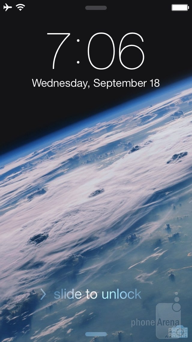
Lockscreen
The new, simpler, flatter user interface starts with the installation itself. Both the Apple logo and the progress bar give a hint that things will get much more minimalistic once you install iOS 7. And they certainly do. Once the installation is complete, you're greeted to the new lockscreen, which is... very similar to the old one, really, and will eagerly display upcoming appointments, missed calls and messages, as well as other app notifications.
The UI clearly indicates that you have to swipe to the right in order to unlock the phone, but there are two new elements. There are small handles positioned at the bottom and the top of the screen, indicating that you can pull upwards and downwards, respectively, in order to reveal... something.
Recommended For You
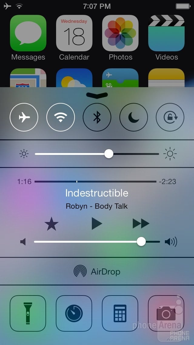
Control Center
Pulling upwards, you'll reveal the brand spanking new Control Center. It is a much-appreciated new addition to iOS, as it gives you quick access to frequently used toggles, such as Wi-Fi, Bluetooth and Screen Rotation. It also let's you set the display brightness, use the music player controls, the torch, timer, calculator or some other functions such as the new AirDrop, which allows you to wirelessly share content with other iOS 7 users. The problem with Control Center, is that you can accidentally pull it up if you are scrolling through a list of something (contacts, apps, emails, messages, a web page, etc.), especially if you're using the phone in landscape mode, when there's less room to scroll and you're more likely to touch the bottom edge. Additionally, if you are on the lockscreen and try to open Control Center, you may accidentally open the camera instead, because its shortcut isn't that far from the center (where the Control Center handle is), and the gesture used to start the camera is exactly the same (upwards pull). Still, we definitely like the idea of Control Center and will certainly use it a lot. That's one feature iOS needed desperately. Oh, and by the way, you can access Control Center from each and every screen in iOS 7, including when running an app.
Notification Center
Pulling downwards, you'll reveal the updated Notification Center. And we have to say, the new one is not bad at all, as it tries to be a bit more human by displaying notifications like "The first thing on your calendar today is "Visit grandma", in 30 minutes," or "Tomorrow: There is one event scheduled for 10:00 AM. Your calendar looks clear in the afternoon." Overall, the new Notification Center looks cool, but we can't really understand why the current weather conditions and the forecast have to be written in text, instead of being displayed in the old way, which was a self-explaining graphic widget. It would have been much more intuitive if we could just see a sunny icon with a large number for the temperature written right next to it, rather than having to read the following piece of text "Mostly sunny conditions with 35 kph winds out of the west. The high will be 21°. Clear tonight with a low of 10°." And is the wind speed really so important to be placed in the Notification Center? Anyways, we might be nitpicking here. Just like Control Center, Notification Center can be pulled down in every screen that you may be in. So no matter if you're playing a game, watching a movie, or something else, checking your appointments and other notifications will always be one swipe away (two, actually: one to display the down arrow, and another one to pull it down).
Homescreen
So, with all of this out of the way, it's finally time to unlock that iPhone and enter the new homescreen! The first few times you unlock an iPhone with iOS 7 will feel very cool, because there's a new unlock animation that's quite fancy. However, it is also a bit slow, and by the time it finishes, chances are that you'd already want to start doing whatever it is that you want to do on your iPhone. Well, unfortunately, you won't be able to, because you'll have to watch the whole animation until it ends, and then proceed with your activities. It's not so bad, but it might be irritating if you're in a hurry.
Anyway, let's turn our attention to the new icons. Well, the icons are... let's just say that they have a somewhat simpler, more colorful, and even childish look to them. Some love them, others hate them, end of story. Actually, there's one more thing - the clock is now animated and will show the correct time. Sadly, the weather app won't - it's just a static icon with a cloud and a sun drawn on it. It's very cool that icons can now be animated (the seconds arrow is moving in real time), but it's a pity that this new piece of functionality hasn't been used for other apps as well. And by the looks of it, it probably won't be open to third-party app developers. Oh well, maybe in iOS 8...
Other than that, the iOS 7 homescreen works in exactly the same way as your old homescreen. You have your icons positioned over multiple pages, you can create folders with icons (that now have an almost unlimited capacity), and, as before, all of the system and app settings are stored within the Settings app. You may also notice that the leftmost homescreen page, which used to be dedicated to the universal 'Spotlight' search feature, is no longer present. Instead, you can access the universal search tool from any homescreen page by swiping downwards (as long as you don't swipe from the top, because that will pull the Notification Center down).
Aside from all that, Apple has incorporated some cool effects like animated wallpapers (as in Android), which look pretty cool and can be interacted with using the accelerometer. Static wallpapers also move around as you tilt your device in various directions, creating a pleasing sense of depth.
Applications
Naturally, the built-in applications have been redesigned in order to match the new look and feel of the system. In short, they are much more simplistic and have lost the skeuomorphic elements that made them resemble objects from real life. For example, the Notes app no longer looks like a pin board. As a whole, we're OK with the simplification, but just as with the rest of the design elements, we can't necessarily say that they look better than before. They just have a different (lighter, cleaner, simpler) style.
Such is the case with the Phone/Contacts app - it has pretty much the same functionality (five tabs: favorites, recents, contacts, keypad, voicemail), but just has a lighter theme. There is one notable new feature, though, and that's the ability to block certain contacts. The same observations are true for the Messages and Email applications.
Some apps, however, have really benefited from the new design. One such example is the Calendar. Although it doesn't really do anything new or different, the redesign has made if feel much more modern. Meanwhile, other organizer tools such as the Timer, the Alarms and the Stopwatch haven't gained so much from the redesign, but are still fine and work as expected.
The beloved Safari browser has made some good progress, as it now has a full-screen option in portrait mode, a unified search bar and a new tab view, which tends to be more convenient than the old one. You can still share webpages (now with AirDrop as well), bookmark, or add them to your reading list.
The stock Camera app has gotten a decent upgrade as well - it allows you to choose from a set of 8 photo filters, and it also sports a new 'square' photo mode, for those of you who would enjoy snapping square photos. The panorama picture option is once again here, of course, and so is HDR. If you've been hoping for some more advanced options, such as ISO, sharpness and so on, you're in for a disappointment, because the camera app is just as simple as before. And that's not necessarily a bad thing, because it's incredibly fast and easy to use. If you'd like a more "manual" experience, well, you'll surely find an app for that.
With iOS 7, Apple is introducing iTunes Radio, which is a new free music-streaming service. iTunes Radio is integrated in the music app, and lets you create your own music stations, based on genres. It will show ads to recoup some of the streaming costs, but hey, that's free music we're talking about here. iTunes Radio learns what you have liked before and creates similar alternative stations for you, and it can also remember your history so you have your preferred music on all your iDevices, which includes iOS 7-compatible iPhones, iPod touches, iPads, as well as the iTunes program on Mac and PC, and even Apple TV. By the way, the App Store and iTunes Store have been redesigned once again. They work in pretty much the same way as before, but their visuals have been altered so as to create a more immersive feel. It's a nice change.
iOS 7 also brings a new multitasking system which allows all apps (as in, all apps) to run in the background. You're accessing the multitasking UI in the good old way - by double-pressing the Home key, and we have to say that the new multitasking view works quite well. It's quite reminiscent of Windows Phone's multitasking menu, but better.
Siri, your smart personal assistant... is still here. But that's not much of a surprise. The news is that it has gotten even smarter, as it can now make better searches on Wikipedia, Bing and Twitter, in cases when she can't directly answer your question. You can have Siri do some basic things for you, such as changing the display brightness, or turning on/off Bluetooth, Wi-Fi, etc. Finally, Apple has made the assistant much more customizable - for example, it can now have a male voice and speak in a number of new languages, such as German and French.
Conclusion
The "old" iOS look has been around for 7 years now, and it's been everywhere. We've gotten so used to it, that we're now finding it hard to embrace the new one. Still, we've asked for it. After 7 amazing years, we were ready to see some substantial change in what has been the industry's benchmark OS, and Apple has delivered. The result will surely not appeal to everyone, but if we give it some time, we believe it'll be quite easy to adjust to iOS 7. After all, it's still a great OS with tons of advanced functionality and the richest app ecosystem around.
Probably our biggest complaint about iOS 7 is that it still lacks some sort of widget-like functionality. It doesn't have to be widgets, it can be live-icons or whatever, but as of now, all you'll be getting is an animated clock and a calendar icon that shows the correct date; everything else will remain static. We're sure that such functionality is coming, but it'll probably be at least another year before it can grace our iPhones and iPads. At best.
At the end of the day, iOS 7 is a substantial update. With some useful new features like Control Center and iTunes Radio, as well as a fresh new appearance, the first (and probably most difficult) step towards modernization has been made. This isn't to say that it doesn't need more work - quite the contrary - it does, but with a new management and design team behind iOS, we're sure that only good things are in store for us going forward.
RATING: 8.5/10
Six-month unlimited plan is now 57% off
$90
$210
$120 off (57%)
Mint Mobile is now allowing you to get whichever plan you like for either three, six, or 12 months for just $15/mo. If you go for the six-month unlimited service, for instance, you'll now have to pay just $90 upfront instead of $210.
Rad Slavov is the Editor-in-Chief at PhoneArena. He joined the media in 2008, right on the cusp of the modern smartphone revolution. Through time and perseverance, he amassed a great deal of knowledge and industry know-how, allowing him to guide and organize the company's growing line-up of talented content creators and ever-expanding content portfolio.
A discussion is a place, where people can voice their opinion, no matter if it
is positive, neutral or negative. However, when posting, one must stay true to the topic, and not just share some
random thoughts, which are not directly related to the matter.
Things that are NOT allowed:
Off-topic talk - you must stick to the subject of discussion
Offensive, hate speech - if you want to say something, say it politely
Spam/Advertisements - these posts are deleted
Multiple accounts - one person can have only one account
Impersonations and offensive nicknames - these accounts get banned
To help keep our community safe and free from spam, we apply temporary limits to newly created accounts:
New accounts created within the last 24 hours may experience restrictions on how frequently they can
post or comment.
These limits are in place as a precaution and will automatically lift.
Moderation is done by humans. We try to be as objective as possible and moderate with zero bias. If you think a
post should be moderated - please, report it.
Have a question about the rules or why you have been moderated/limited/banned? Please,
contact us.


Things that are NOT allowed:
To help keep our community safe and free from spam, we apply temporary limits to newly created accounts: