iOS 6 vs iOS 7 design differences comparison: the end of skeuomorphism
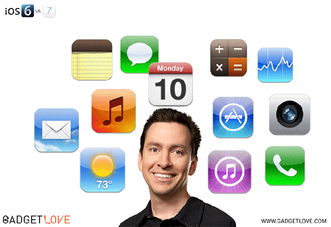
Skeuomorphism is giving a familiar look and feel to novelties, not asking people to adapt to change immediately, and introducing a more gradual and comfortable transition for them. Apple's former iOS chief Scott Forstall has been a big proponent of this design concept, and has enjoyed the full support of Steve Jobs through the years, resulting in the all-too-familiar sights there, like tape reels, notebook springs, fake wood, virtual leather and green baize... until iOS 7.
Apple's CEO Tim Cook and the lead designer Sir Jony Ive barely gave it a chance after Steve Jobs' passing for about a year or so, and then ditched Forstall and skeumorphism forever. Who can blame them? Folks growing up now will never know what a paper notebook is, let alone a tape reel, and book shelves will only be used in libraries or museums, so skeuomorphism has done its thing, introducing people to shiny 3D buttons that look like physical one begging to be pressed. Nowadays all are too familiar they are pressing something on a capacitive screen, so the real thing only looks out of place and ancient. As you can see in the funny GIF by Gadget Love above, Scott's childish smile and shiny buttons have been replaced by the more sophisticated minimalism of Jony Ive.
We've compiled a few examples of the differences in design between iOS 6 and iOS 7, so you can gauge the sea of change that Apple's mobile OS has undergone from just one edition to the next. Everything - from icons through menus to controls and notifications - is layers of flat, minimalistic, hip, translucent and colorful, making it much easier on the eyes and out of the way for the actual tasks you do with your iPhone or iPad. What do you think about the visual changes between iOS 6 vs iOS 7?
iOS 6 vs iOS 7 design differences

Popular stories


Latest News


Things that are NOT allowed:
To help keep our community safe and free from spam, we apply temporary limits to newly created accounts: