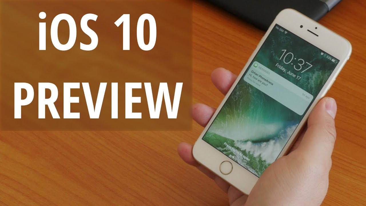
iOS 10 Preview: fun meets functionality in the biggest iOS update ever

It is not the kind of news you can easily miss – Apple announced a major new iOS version at the annual WWDC event. It is called iOS 10, as expected, and it is jam-packed with goodies, including a redesigned lock screen, a more engaging Messages app, a smarter Siri, and new 3D Touch actions. In all likeliness, the iOS 10 release date is set in September, when Apple is going to announce the iPhone 7, and for those feeling extra curious, a beta version of the new software will be made available in July for public testing.
Patience, however, is not something we have a lot of. Since waiting a month to get a taste of the upcoming release didn't feel like an option, we installed the iOS 10 developer preview on our iPhone 6s soon after it became available. This isn't something we'd advise anyone to do, unless they make apps for a living. The early iOS 10 release we're testing is still too rough around the edges – it is suitable for devs to adapt their apps for use on the new release, but not reliable enough to be a daily driver. Yet for now, this is the only way to get a first-hand impression of iOS 10, so let's dive into it and see what Apple's new software might impress us with.
The lock screen, reimagined
Speaking of the iOS lock screen, owners of the iPhone 6s and 6s Plus surely know how fast their phone's fingerprint scanner is. It could be regarded as too fast in a way – pressing the home button unlocks the device instantly, not giving us a chance to peek at our lock screen notifications. To rectify this, iOS 10 wakes the screen of our iPhone 6s as soon as we physically lift the device up. This lets us catch up on notifications without having to press a single button. All in all, this is a neat addition to the lock screen experience, but we also think that it could have been executed better. In its current form, the feature lights the screen up only if we lift our iPhone vertically, as if to hold it in our hand. The screen rarely turns on if the handset is lying on a table and we tilt it sideways.
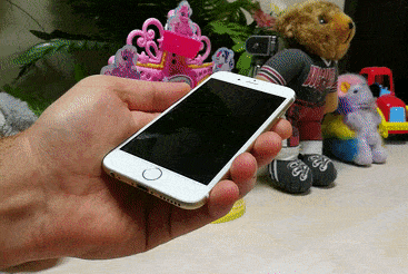
Our iPhone 6s wakes up by magic!
It must be clarified that this lift-to-wake action works only on our iPhone 6s, while the iPhone 6 does not support the feature. However, we can still get our notifications at a glance, whether or not we've enabled fingerprint locking on the last-gen iPhone. Pressing the home button and lifting our finger will light the screen up, but won't unlock the device. Pressing the home button without lifting our thumb reads our fingerprint and unlocks the iPhone. Overall, it is a workaround we find reliable, despite this being just an early iOS 10 release.
Another tweak we must highlight is the new camera shortcut. Sliding to the left from any point of the lock screen will instantly take us to the camera app, meaning that we don't have to aim for that tiny button in the corner anymore. On the downside, the swipe has to be really convincing for the shortcut to work. Its sensitivity might change in time for the official iOS 10 release, or course.
A new home for all your widgets
As we stated above, the swipe to unlock gesture has been removed in iOS 10. Instead, sliding a finger to the right on the lock screen takes us to a page with our widgets, arranged in a vertical list, with a quick search bar stuck permanently at the very top. The same swiping gesture also works on the iOS 10 home screen if you're looking at the first page of apps. Whether we like it or not, this is where widgets are meant to reside in the new iOS release. Meanwhile, the pull-down notifications panel is now just that – a panel with all your notifications and nothing more getting in the way. It's a change we don't mind, actually.
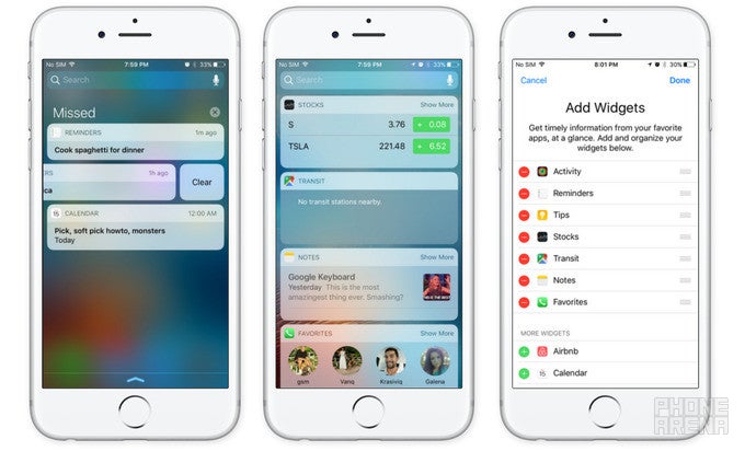
The iOS 10 notifications tray shows notifications only. Widgets are at a swipe's distance from your home screen
Still, we're not sure how to feel about the inclusion of widgets on the lock screen. It seems like an unnecessary complication – one that Android abandoned years ago. On the other hand, Android's implementation of lock screen widgets was never the most elegant one, while iOS 10's execution is simpler, therefore more promising. Folks who actually use iOS widgets might find it convenient to have them at a swipe's distance, but for now, we can't really say whether we like their addition or not.
3D Touch is more useful than ever
Tidying up the Control Center
On the topic of 3D Touch, the feature is now baked into parts of Control Center. For example, hard-pressing on the flashlight offers three brightness settings, and the timer presents us with a few common duration presets. As for the panel itself, it has been reorganized and feels a bit less crowded as a result. Our music controls are now placed in their dedicated tab, with plenty of room for buttons, a progress bar, and album art to be shown.
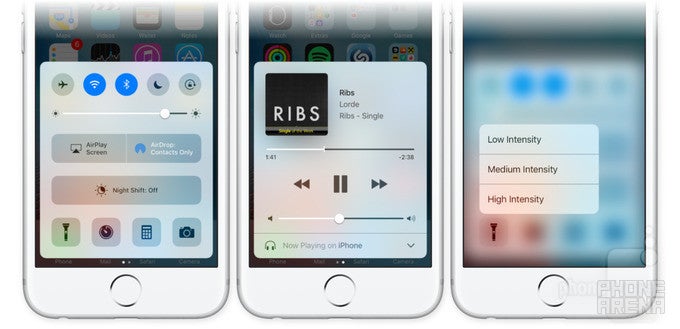
The iOS 10 Control Center adds a dedicated panel for music. 3D Touch is also there
Messages – now 264% more fun
Messages in iOS 10 lets you add effects to your texts (iMessage only) – confetti, balloons, fireworks or lasers can fly in the background, while text bubbles can be made bigger or smaller, depending on the nature of the message you're sending. But the most peculiar addition is called Invisible Ink. In a nutshell, it obscures the text or image you're sending. Then the recipient reveals the big surprise with a swipe. Furthermore, you can send hand-written messages or doodle on images before sending them. The downside of all these goodies is that the UI leaves room for improvement. It took us a while to get the hang of the said doodling effects, and the gesture to change the size of chat bubbles didn't always work. In all likeliness, this will be fixed in the final iOS 10 release.
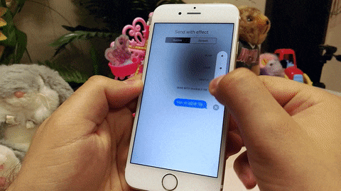
The iOS 10 effects added to Messages look sweet
But there's a lot more coming in Messages on iOS 10. Links, for example, are automatically turned into previews of the content they lead to, videos play right in the chat box, and pressing on a message lets you add a reaction to it. Fans of emojis will be happy to know that there's emoji prediction as you type, and switching to the emoji keyboard will highlight every word in your message that can be replaced with one. Besides, emojis are three times bigger.
There's also the addition of apps into Messages. While these aren't fully functional yet, their purpose will be to add stickers and animations to messages or to share songs right in the chat box. Advanced functions like sending money via Square Cash or ordering food via DoorDash are also possible.
Siri just leveled up

These are just some of the many possibilities iOS 10 will unlock, and we're curious to see what ideas developers will come up with. For now, however, Siri in the iOS 10 dev preview only responds with an "I cannot do that" error message if we try to try its new abilities.
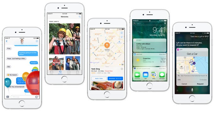
Have you ever wanted a way to dig out all the cat photos in your library? Well, even if you haven't, Photos in iOS 10 is smart enough to do that. Using advanced techniques, the app can recognize scenes and common objects – cars, flowers, animals, even sunrise and sunset photos. All computations are done locally, Apple brags, to put the chance of unwanted data access to a minimum. This new ability sounds fun and useful indeed, and while its recognition abilities are far from flawless, we see things improving in the future.
The app's image analysis abilities extend into facial recognition. Pretty much every person that you take a picture of (with their face in it, of course) gets their own album. This makes it easy to access all the photos of people who matter the most.
No less cool is the new Memories feature, which is special enough to deserve its own tab. It automatically generates photo albums of events, which makes it great for reliving a recent vacation, for example. Images deemed interesting by the Photos app are highlighted, and the location where they were taken is shown on a map. What's awesome is that a movie containing both images and video of the particular event are generated automatically, with background music and all. It's nothing new as a concept, but we find it nice having nonetheless.
While Apple Music is proving popular among iOS users with its 15 million paid subscribers, the app itself could use some fine-tuning. That's exactly what we're getting with iOS 10. The new user interface is simpler to navigate, making it easier to get to the music we want to listen to. We really appreciate that our library is now in focus, with all playlists, artists, songs, and albums accessible in a tap. There's also a separate section for all the music that's been downloaded, which is nice. And for those who like singing along, lyrics have been added, accessible with a swipe up in the Now Playing screen. If you're not sure what you feel like playing, Apple Music will help you out with its daily curated playlists and the selection of music chosen according to your taste.
Photos are turning into Memories
The app's image analysis abilities extend into facial recognition. Pretty much every person that you take a picture of (with their face in it, of course) gets their own album. This makes it easy to access all the photos of people who matter the most.
No less cool is the new Memories feature, which is special enough to deserve its own tab. It automatically generates photo albums of events, which makes it great for reliving a recent vacation, for example. Images deemed interesting by the Photos app are highlighted, and the location where they were taken is shown on a map. What's awesome is that a movie containing both images and video of the particular event are generated automatically, with background music and all. It's nothing new as a concept, but we find it nice having nonetheless.
Apple Music turns it to 11
While Apple Music is proving popular among iOS users with its 15 million paid subscribers, the app itself could use some fine-tuning. That's exactly what we're getting with iOS 10. The new user interface is simpler to navigate, making it easier to get to the music we want to listen to. We really appreciate that our library is now in focus, with all playlists, artists, songs, and albums accessible in a tap. There's also a separate section for all the music that's been downloaded, which is nice. And for those who like singing along, lyrics have been added, accessible with a swipe up in the Now Playing screen. If you're not sure what you feel like playing, Apple Music will help you out with its daily curated playlists and the selection of music chosen according to your taste.

Apple Music in iOS 10 gets a welcome redesign
iOS 10 Release еxpectations
Even though we're wrapping things up, there's actually a lot more coming with iOS 10. For example, the clock app reminds you when it is bedtime and tracks your sleep habits, collaborative notes are to be added to the Notes app, Maps is getting an overhaul, the Phone app can warn you if an unknown caller is actually spam, the Home app lets you interact with IoT smart products, Apple News is getting subscriptions, many stock applications can be removed, and the list goes on. But even the iOS 10 changes we previewed are enough to back Apple's words – this is looking like the biggest iOS update yet.
Indeed, iOS 10 is an exciting update, and for a very good reason: it is focused on the user experience as a whole. Apple doesn't just throw features here and there because that's what we're expecting of it. The new iOS release aims to make iPhones and iPads more helpful, more practical, more fun to use, and we feel like the target is going to be met.
And for developers, iOS 10 marks the beginning of a new chapter – one where Apple's platform is more open than ever. Having access to Messages, Siri, Phone, and Maps will pave the way for more engaging, more functional apps to enter the App Store.
Sure, there are quirks in iOS 10 we're not quite thrilled about, but there's nothing dealbreaking on the list and there's nothing we can't get used to. Besides, let's not forget that we're looking at an early iOS 10 version, so the software is very likely to change for the better by the time it is ready for official release. Until then, keep in mind that there's a lot to be excited about.
Popular stories


Latest News


Things that are NOT allowed:
To help keep our community safe and free from spam, we apply temporary limits to newly created accounts: