Cleaner UI is being tested for Google Maps
Google Maps does a lot more than get you safely from point "A" to point "B" on time. It also tells you where you can find restaurants that serve certain food in the city that you're visiting, where you can find some entertainment nearby, and more. The bottom line? Google Maps provides those on the go with very important information that they need to get through the day.
According to XDA, Google is testing a new look for the Google Maps app that replaces the white bar now found on the top of the route option screen with the user's starting location and his destination. Icons resembling the different modes of transportation such as driving, public transportation, walking, biking, and others are now gone from the destination box. These options are now found in a scrollable list moved to the bottom half of the display. Each mode of transportation shows how users how long it will take them to reach their destination using that mode. A "Depart at" button allows the user to set a specific time to start a journey, and an "Options" button will likely offer users routes to avoid highways, tolls, and more.
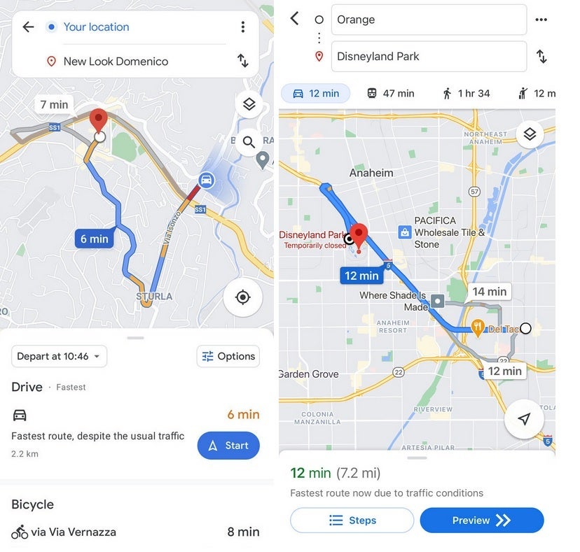
New Google Maps UI on left, current UI on the right
The new UI makes it easier for Google Maps users to see the difference in transportation time for their route depending on the mode of transportation being used. The new route option interface is currently being tested so don't waste too much time wondering why you don't see it yet on your phone. Google, as we told you recently, is testing a split-screen interface for Maps' Street View navigation.
If for some reason you don't have Google Maps on your phone, you can tap the appropriate link to install the app from the Apple App Store or the Google Play Store.

Popular stories


Latest News


Things that are NOT allowed:
To help keep our community safe and free from spam, we apply temporary limits to newly created accounts: