The Fitbit app is getting a makeover – one that we all saw coming. Some users are already seeing the changes roll out, and it looks like Google’s plan to give Fitbit a proper Material 3 glow-up is finally taking shape.
This redesign brings Google’s Material 3 Expressive (M3E) style to the Android app, along with a few navigation tweaks. The bottom bar is now shorter, and syncing your Pixel Watch or Fitbit device is as easy as pulling down from any of the four tabs.
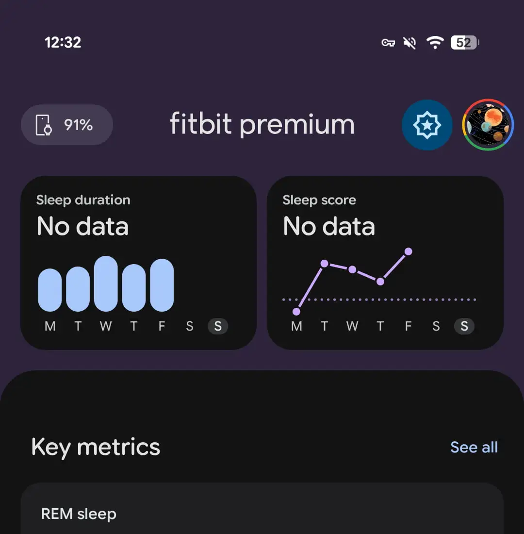
When you do, you’ll see a circular loading animation cycling through those signature M3E shapes. Once syncing finishes, the “Fitbit Premium” label disappears from the app bar, and a linear progress indicator takes its place.
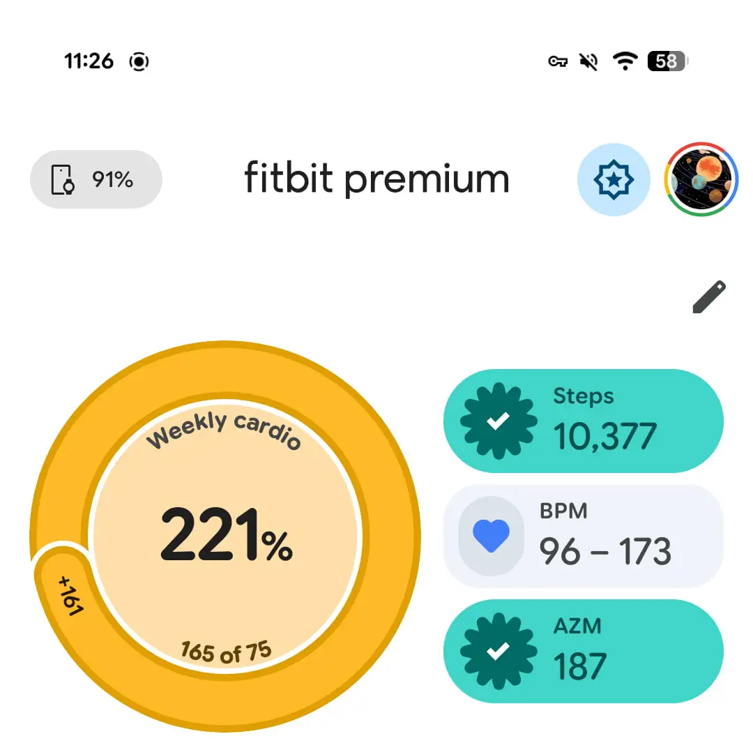
If you completed a goal, a checkmark appears. | Image by 9to5Google
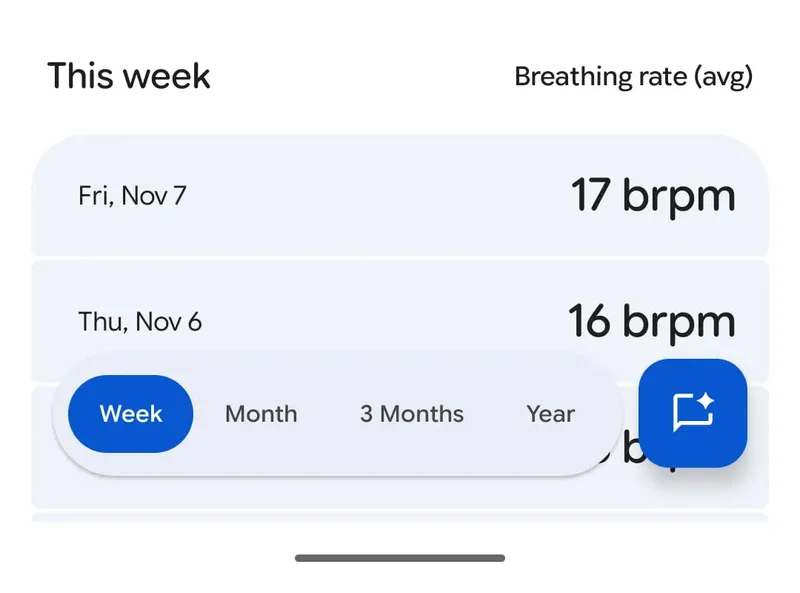
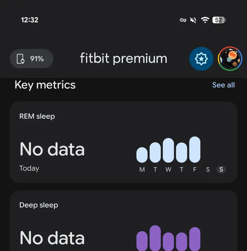
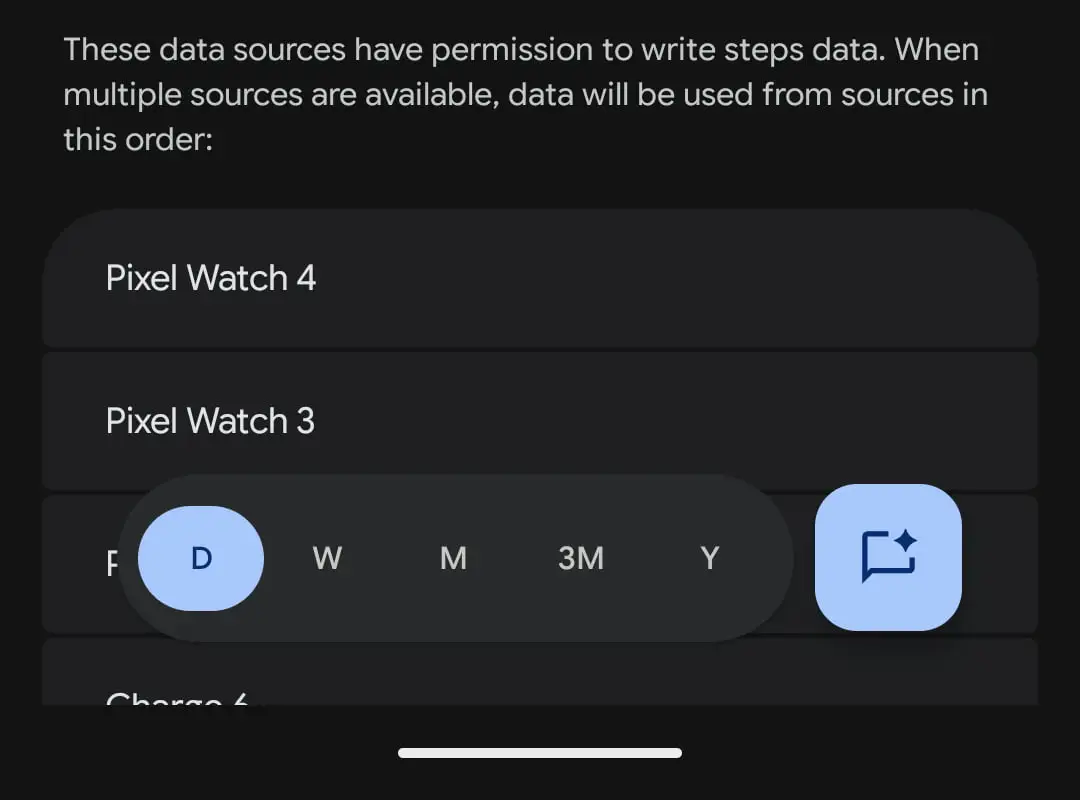
You’ll also notice the new expressive shapes pop up in other parts of the app – like the checkmark animation when you hit a goal. Each metric view now has a floating toolbar with a FAB (floating action button) to switch between time frames. For stats such as Steps and Sleep, you can toggle between Day, Week, Month, 3 Months, or Year.
Recommended For You
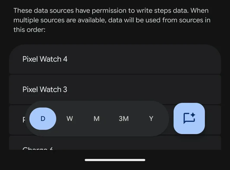
There is now a floating button for the personal AI coach. | Image by 9to5Google
Every pill-shaped bar has a floating button that opens the personal health coach, and the Today, Fitness, and Sleep sections now use a layered sheet-style design. The top stats sit on a themed background, while the rest of the content flows on a card layer that expands as you scroll. You’ll notice distinct color themes – teal for Fitness and purple for Sleep – that add some nice visual separation.
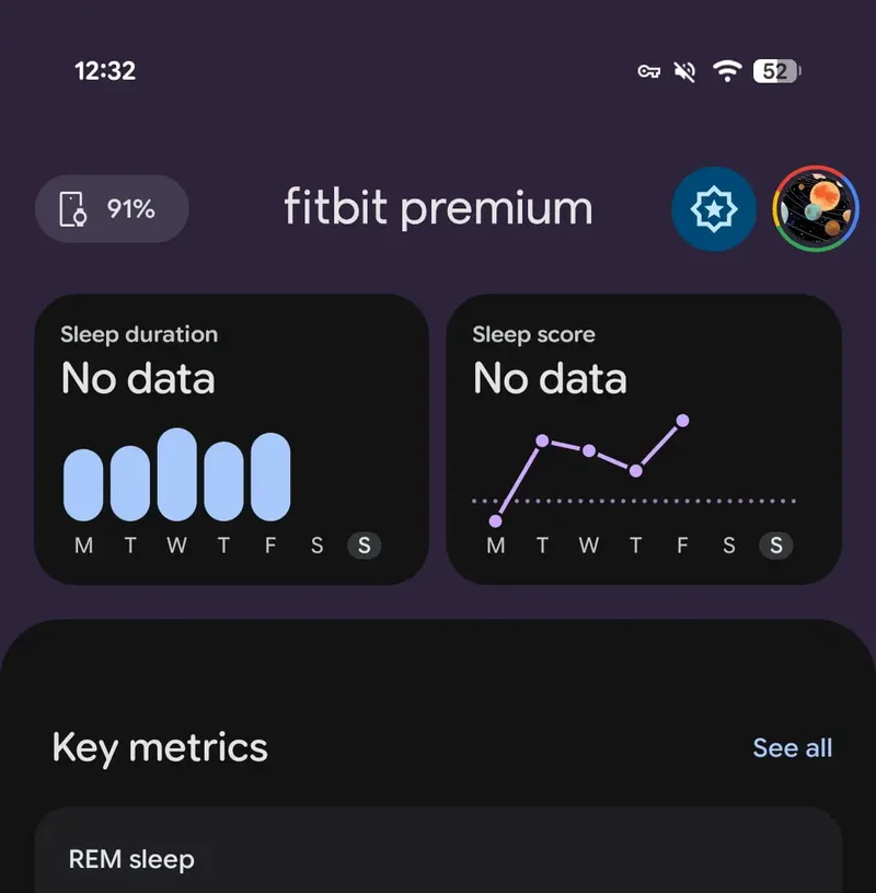
The app continues to lack Dynamic Color. | Image by 9to5Google
One thing still missing? Dynamic Color. The bottom bar, toolbar, and FAB still rely on Fitbit’s default blue accent for now.
Google actually delivers
Even though it’s still in Preview, it’s nice to see Google following through on its promise to modernize Fitbit. The app is central to the whole Fitbit experience – whether you’re using a tracker or smartwatch, it’s where all your health and fitness data lives. So giving it a design that matches other Google products feels like a step in the right direction.
What do you think of Fitbit’s Material 3 redesign?
Love it — looks modern and clean.
59.41%
It’s fine, but a bit too busy.
15.84%
Prefer the old design.
24.75%
101 Votes
Still early days, but promising
Looking through the preview screenshots, the layout does seem a little busy right now – but that’s something that can easily change before the full release. If you’re a Fitbit Premium subscriber, it’s definitely worth checking out the update early. It might not be perfect yet, but it’s clear Google is putting real effort into making Fitbit feel more cohesive and modern.
Tsveta, a passionate technology enthusiast and accomplished playwright, combines her love for mobile technologies and writing to explore and reveal the transformative power of tech. From being an early follower of PhoneArena to relying exclusively on her smartphone for photography, she embraces the immense capabilities of compact devices in our daily lives. With a Journalism degree and an explorative spirit, Tsveta not only provides expert insights into the world of gadgets and smartphones but also shares a unique perspective shaped by her diverse interests in travel, culture, and visual storytelling.
A discussion is a place, where people can voice their opinion, no matter if it
is positive, neutral or negative. However, when posting, one must stay true to the topic, and not just share some
random thoughts, which are not directly related to the matter.
Things that are NOT allowed:
Off-topic talk - you must stick to the subject of discussion
Offensive, hate speech - if you want to say something, say it politely
Spam/Advertisements - these posts are deleted
Multiple accounts - one person can have only one account
Impersonations and offensive nicknames - these accounts get banned
To help keep our community safe and free from spam, we apply temporary limits to newly created accounts:
New accounts created within the last 24 hours may experience restrictions on how frequently they can
post or comment.
These limits are in place as a precaution and will automatically lift.
Moderation is done by humans. We try to be as objective as possible and moderate with zero bias. If you think a
post should be moderated - please, report it.
Have a question about the rules or why you have been moderated/limited/banned? Please,
contact us.


Things that are NOT allowed:
To help keep our community safe and free from spam, we apply temporary limits to newly created accounts: