This article may contain personal views and opinion from the author.
I've been using Inbox by Gmail for just one week now, and I will fully admit that I'm hooked. It has completely replaced Gmail on my laptop, and on my Moto X; and, I see no reason to go back. The app has won me over in a number of small ways, which have been enough to overcome the fact that I don't even use the app to its fullest extent. Aside from a fake reminder I created for my hands-on with the app last week, I haven't created a single reminder since using Inbox. But, that hasn't taken away from the secret genius I've found in the app.
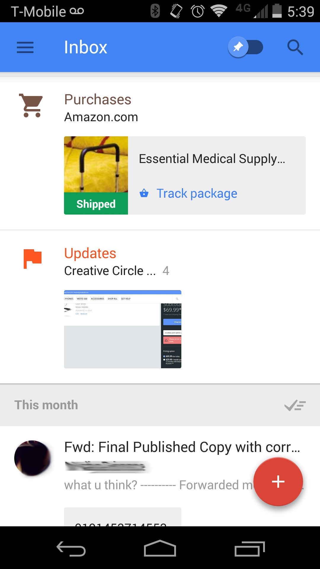
For those who missed my hands-on with the app, here's the breakdown: Inbox is a new Gmail app, created by the Gmail team itself. It is currently invite-only (and, sorry, I've given out all of my invites), and aims to rethink how people use email. Inbox essentially envisions your email as a big do-to list, so the major changes are options to "pin" a message that is important, "snooze" to make an email bounce back to you if you can't deal with it right away, and surface key information from within an email like flight info, package tracking, and more. All of these subtle changes are aimed at one thing: making you more productive (or at least making you feel like your actions have meaning).
Recommended For You
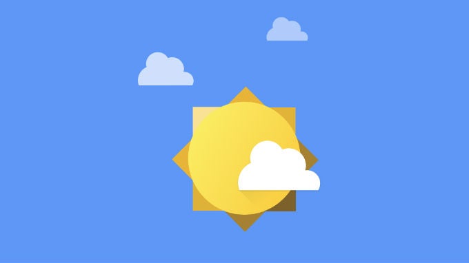
I won't claim to use Inbox to its fullest. As mentioned, I haven't created a single reminder; and, on top of that, I've yet to use the "snooze" feature either. The thing is that I'm just not obsessive enough to need to get to "inbox zero", nor do I even really believe that to be a worthy goal. If I did, I would see that sun icon above take over my Inbox; but, I don't need to get to zero, I just need to get to five or ten. Even before getting Inbox, my aim was to clear out anything that wasn't necessary, and only leave the items that I needed to deal with. Of course, that's exactly what Inbox is designed for. The way that Inbox pushes you towards that goal is with three key features - pin, snooze, and done. The amazing part of the app is that the only one of those three items that is new is the "snooze" feature.
Although, even that isn't quite accurate. The "snooze" feature allows you to basically have a message disappear from your inbox, and bounce back to you as a new message after a certain period, at a specific time, or when you reach a specific location. This is a new feature in terms of what you would get directly from Google, but it could have been found in the Gmail app Mailbox, or with Boomerang, a Gmail extension. So, it's not completely a new feature, but likely new for most users. The interesting thing is that the rest of Inbox is exactly the same as Gmail, when you get right down to it.
The space to work
When I say that aside from "snooze", Inbox is exactly the same as Gmail, I mean just that. Not counting "snooze", here are the differences between Inbox and Gmail:
Design
Nomenclature
End of list. Sure, those are two relatively broad categories, but even once you dive in, there are no new features added by renaming things, and only a couple of new features added with the design.
The Gmail layout is a list of messages, and it is surrounded by more lists - a very utilitarian design. But, Inbox opens up your email, both figuratively and literally. The design has more white space, almost like board with do-to items on it. The white space acts like a reminder that these are just tasks, and you can find your way through, one message at a time, to the sunshine on the other end. And, each email is also more open, with easier access to important content, like attachments, or actionable information.
Inbox breaks up your messages by when you received them, giving a bit of space between today's emails and older ones, and subtly noting which messages are more recent, and likely more pressing. There are the Google Now type contextual additions for messages, allowing you to take actions - track packages, check in for flights, download an attachment, or watch a YouTube video - and get things done, maybe without even opening the email fully. And, there is the "Pin" view, to see reminders and items that you've decided need to be dealt with. But, the main difference in design is only found on the web, where the navigation pane on the left has been hidden by default. This minimizes the clutter, and really puts the focus on the messages you need to deal.
This last change alone has been enough to alter my usage quite drastically, because even these subtle changes are all designed to spur more action; or, at least, they make you feel like you are taking more action. Unless I needed to dive deep into my message history, I was never one to use Gmail search all that often. I have about forty tags in my Gmail that would filter my messages as they hit my inbox; so, once I was done with something, I just hit the archive button in Gmail, and the message was filed away where I could easily find it. This meant that if I knew what I needed was relatively new, I'd just go into that tag and get the info that I needed.
Now with Inbox, those filters are still in place, but I never think about them, because I'm never reminded that they're there. New messages are still automatically tagged, but there are no tags shown in your inbox or even in the message itself. The only way you know it has been tagged is to go into that label; but, I don't go into the label folders anymore. My labels are hidden away in hamburger menu, and are far enough of a scroll down (past the Inbox, Drafts, Sent, Trash, Bundles, etc) that it just feels easier to search. Of course, that's what Google always thinks is the best for users; and with Inbox, it has found the way to push me to do just that.
Sounds like action
Possibly the bigger change-that-isn't-really-a-change is with how features are named in Inbox. This is the secret genius of the app: Done, Pin, and Bundles are not new features at all. The first two features are simply Archive and Star, renamed, and Bundles is a new name for message categories. That's it. But, the difference those simple changes make is quite astounding, because the change in nomenclature changes how the app feels and how you feel about it, because it both makes it clearer what will happen, and why you should be using those options. Everything becomes more actionable.
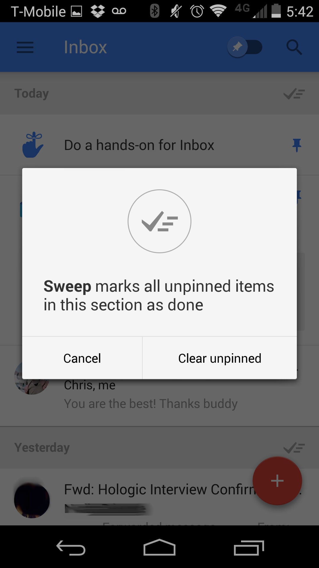
"Archive" is a fairly utilitarian term, and feels like a job that you have to do. Sure, people understand it to be a repository of old stuff, but it was never quite clear for some why archiving an item was necessary. We all know those people: they have thousands of unread messages in their inbox, and no organizational structure to their email. These are the people that depend on Gmail search to find anything, because otherwise, their email is just a mess. But, changing that feature to be named "Done" makes it perfectly clear: you hit that button when you're done with something and it will go away; you have accomplished something. This metaphor extends to the "sweep" function as well (which you will know if you've used Outlook). When you "sweep", you get rid of everything that is unwanted and cluttering your space. Sweeping leads to cleanliness.
When you combine that with the power of Bundles, suddenly anyone can get to (or close to) "inbox zero" with little effort. Bundles, as mentioned in my hands-on, are the same as Gmail auto-label categories, but with expanded reach. In addition to the same categories you can have in Gmail - Social, Promotions, Updates, and Forums - Inbox adds in three very useful new ones - Travel, Purchases, and Finance. Between these seven categories, Google pretty much has you covered. Sure, you can make your own custom bundles if you want (and the tools there are impressive), but most will be able to get a lot of value from just those seven. This is also a huge help for disorganized users, because Google does the organization for you.
The last change is shifting the Star/Starred feature to being Pin. This is a bit more of a subtle change, but again an important one. The idea of "starring" something implies a certain level of importance, and more that it is something you may not want to forget. It's the same metaphor Chrome uses for bookmarks. You star something that you want to remember, and maybe get back to, but there isn't really any sense of urgency with it. On the other hand, "Pin" is brings that sense of urgency, that this is something you need to take action on. If you "put a pin" in something, that is a reminder you have to deal with it at some point.
Of course, there is also a bit of a functional change between starring and pinning. If you star something in Gmail, you can archive that message and still have it show in the "starred" folder. This is not the case with pins. If you pin something, it won't disappear when you "sweep" out your inbox; but, if you have something pinned and you hit that "done" button, it will disappear. If an item is important enough to pin, it is something you have to deal with, and something you don't want hidden away until it is truly "done".
Conclusion
Inbox isn't reimagining email; it is simply shifting how you deal with your email, or at the very least, how you see yourself dealing with your email. My usage in the switch between Gmail and Inbox is almost the same. I use the search feature a bit more often, but otherwise, I'm using it the same way I used to use Gmail. I'm not using the advanced new features, though I do see the value in them; but, even so, Inbox makes me feel like I'm being more productive, and getting more done. And, that's the real value of Inbox - whether or not you actually become more productive with it (and you certainly can, if you take advantage of all the features), it is simply more pleasurable to use than Gmail.
Everything in Inbox is designed to spur you to action, and therefore, it feels more rewarding when an action is complete. It feels good to use Inbox, because a "sweep" is more satisfying than selecting all and archiving or deleting; "Pinning" something imbues that message with a new importance; and, most of all, hitting that "done" button is far more satisfying than "archiving" a message. "Archiving" is a chore; "done" is a reward. These are subtleties of design that have often been lost on Google, but have been found with Inbox. I love it, and I definitely hope that these small changes can infect other design teams at Google.
Get Visible as low as $20/mo for 1 year. Limited time offer with code: FRESHSTART
$20
/mo
$25
$5 off (20%)
Offer Ends 6.1.2026 at 11.59pm ET. New members get $5/mo off the $25/mg Visible plan, $35/mo Visible+ plan, or $45/mo Visible+ Pro plan for the first 12 months. Promo code FRESHSTART required at checkout.
Michael Heller is known for his clear and informative articles on mobile technology. He explores important topics such as the rollouts of 5G networks and the advancements in mobile payments, offering readers insights into the evolving tech landscape.
Recommended For You
COMMENTS (10)
COMMENTS (10)
All comments need to comply with our
Community Guidelines
PhoneArena Community Rules
A discussion is a place, where people can voice their opinion, no matter if it
is positive, neutral or negative. However, when posting, one must stay true to the topic, and not just share some
random thoughts, which are not directly related to the matter.
Things that are NOT allowed:
Off-topic talk - you must stick to the subject of discussion
Offensive, hate speech - if you want to say something, say it politely
Spam/Advertisements - these posts are deleted
Multiple accounts - one person can have only one account
Impersonations and offensive nicknames - these accounts get banned
To help keep our community safe and free from spam, we apply temporary limits to newly created accounts:
New accounts created within the last 24 hours may experience restrictions on how frequently they can
post or comment.
These limits are in place as a precaution and will automatically lift.
Moderation is done by humans. We try to be as objective as possible and moderate with zero bias. If you think a
post should be moderated - please, report it.
Have a question about the rules or why you have been moderated/limited/banned? Please,
contact us.


Things that are NOT allowed:
To help keep our community safe and free from spam, we apply temporary limits to newly created accounts: