Samsung Galaxy Note5: An in-depth analysis of the available display modes
In simple terms, the entirety of the internet, Android, third-party software, all these platforms were built from the ground up with a particular color space in mind: sRGB or Rec. 709. So a display that is calibrated to the sRGB standard would produce any image exactly like the designer (who works in sRGB) imagined it. Change that calibration to something else — for example something that has "140% the color gamut" — and you're getting an interpretation of that same design work. It looks different and is neither true to life, nor true to the source unless it was created with that specific gamut in mind. So demanding color-accurate displays is more than just an obsession on the part of heavily involved members of the public.
To Samsung's credit, we've been noting significant improvements in this regard, with its more recent devices like the Galaxy Note 4 and Galaxy S6 offering a dedicated 'Basic' color profile that is very close to perfect as far as the sRGB space is concerned. It's not active by default, sure, but if you want true-to-life content, you can get it, and if you want overly saturated colors, then you can have those as well. A perfect solution. But does it still hold water for the all-new Galaxy Note5? Let's dig deep and find out.
One clarification
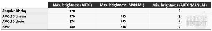
Before we start analyzing data from color charts and what not, we should make one important clarification: the Samsung Galaxy Note5 ships with the so-called 'Adaptive display' mode turned on by default. The remaining 3 options — the aforementioned 'Basic' plus AMOLED photo and AMOLED cinema — can only be activated by going through the Display menu within Settings. Unfortunately, we can't really measure Adaptive display's performance, as it optimizes the color range and saturation of hues automatically depending on the content currently being displayed. As such, the calibration varies.
In years past, Adaptive display was the mode to go for (or stay in) if you planned to use your Galaxy S/Galaxy Note flagship right underneath the sun, as it managed to crank the brightness of the screen higher than any other mode. So even if you didn't like what you got with its wide gamut calibration, you had little choice if you felt the screen is hard to read within other modes. We found something interesting about Adaptive display this year, however: it's no longer the brightest! Indeed, the Note5's display can get just as bright under both AMOLED cinema and AMOLED photo, and almost as bright under Basic. That's great news if, in years past, insufficient brightness kept you from sticking with, say, Basic.
AMOLED cinema
Like before, Samsung has included AMOLED cinema, undoubtedly with the intention for it to be used when watching movies on the Note5's 5.7-inch display. While the company hasn't made this obvious, we believe it likely that it's targeting a color space popular within the movie industry, such as DCI P3 or similar. In any case, the idea behind it seems obvious — offer a significantly larger color gamut. And while it does that, it's worth pointing out that, at the same time, average gamma sits at the low value of 1.97, while 2.6 is considered ideal for DCI calibration (that stands of Digital Cinema Initiatives, by the way), and color temperature, at 7623K, is rather high. In other words, AMOLED cinema is probably a bit more about Samsung's vision than anything else.
In any case, if we consider a conventional sRGB color space, AMOLED cinema proves to be the most color incorrect mode of the three, with average color error of 7.39 (Delta E or ΔE), which, compared to most devices on the market, is neither good nor bad. Moving on, grayscale response finds itself in a similar position — at ΔE 5.4, it's once again neither terrible nor good, and the real world implications of this are that we have a rather bluish display. This is the result of an imperfect balance between the three primary colors — Red, Green, and Blue (or RGB) — with red being underrepresented, blue dominating, and green sitting in the middle.
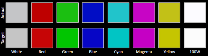
In all, for most users AMOLED cinema mode will be mostly for effect. If you like it, sure — go ahead and use it — but don't expect life-like color reproduction. Of course, the very idea behind the calibration is to account for Samsung's vision (we imagine) of what cinematic content should look like, and in our experience it doesn't look bad. The problem is, the most of the content we'd usually get our hands on won't be calibrated for Samsung's AMOLED cinema, so it'll look off. Using the sRGB color space as the target here, the chart below exemplifies the kind of deviations you can expect:
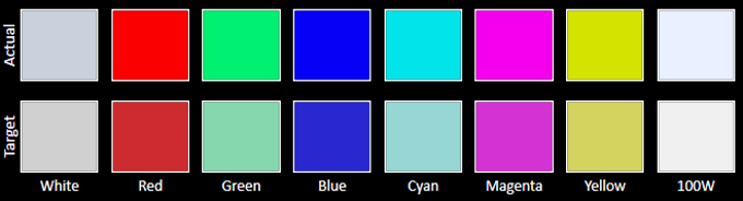
As you can see, all measured colors are off and have higher luminancy (that is, we perceive them as brighter), with red, green, and cyan being the worst offenders. As mentioned already, you can see the effect of the messed up RGB balance with pure white (100W on the chart), which is displayed with a visible bluish overcast.
Finally, going back to that gamma value of 1.97 mentioned earlier, it's important to understand how we derived that number and what it means. First, 1.97 is simply the sum of the gamma at various levels of brightness, so it's just the average. This is crucial to understand, as the reality is that, at lower brightness gamma is high, while at higher brightness it goes down. In effect, this means that darker portions of any one image will be even darker, while highlights will be significantly brighter.
AMOLED cinema measurements
AMOLED photo
AMOLED photo is quite different from AMOLED cinema in terms of the aims which Samsung engineers obviously put in front of themselves, and is in many ways quite alike Basic, as you'll find out later. Still, the main difference between the two other modes is the color space it is seemingly targeting: Adobe RGB.
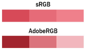
The same three shades of red as they would look under sRGB and Adobe RGB (given proper equipment and workflow for the latter). Image courtesy of fstoppers.com
Anyway, moving onto calibration, we thought it made sense to measure performance relative to both sRGB (since 99.9% of what you see is created with it) and Adobe RGB (because that seems to be idea behind the mode), and see how it does. First, we start off with an excellent color temperature of 6694K, which is very near the target 6500K, and is the result of a fine balance between blue and red. Of course, if you display sRGB content whilst using AMOLED photo (and you will, almost always), the mode will prove better calibrated than AMOLED cinema, but worse than Basic, with an average color error of ΔE 4.47, though grayscale response is excellent at ΔE 1.85. In comparison, when measured with the Adobe RGB gamut as baseline, we observe essentially no deviation (at least not perceivable by the human eye), at ΔE 1.75, which is excellent.
Gamma is also good, at 2.09, and the response is relatively consistent across the board, though highlights tend to be brightened up unnaturally. Finally, as mentioned, the balance between red, green, and blue is considerably better than in AMOLED cinema, and is also consistent across the range.
In conclusion, AMOLED photo strikes us as the odd one out that has near zero practical appeal. Sure, AMOLED cinema doesn't at all qualify as a color-correct profile, but at least it's effectual. AMOLED photo, on the other hand, is not as accurate as Basic, nor as effectual as AMOLED cinema, and it's benefits are limited to a tiny, tiny portion of the user base.
Basic
We won't lie to you — if any of the display modes available to your Note5 matter, it's Basic. In it, appreciators of color-correct displays can finally find some solace and an escape from the overly saturated colors characteristic of Samsung's Super AMOLEDs.
Starting with color temperature, in Basic it sits at the excellent 6722 (6500K being the reference), indicating a very good balance between red and blue. Speaking of primaries, the RGB balance under Basic mode is also up to snuff, with blue being far less dominant than in AMOLED cinema. Gamma, too, at 2.09 (average) is close to the reference value of 2.2, and in this case it's reasonably consistent across the brightness spectrum. Still, with some exceptions, brighter portions of images are made even brighter.
As promised, Basic delivers the most true-to-life image compared with the rest of the display modes available, with an excellently small average color error of ΔE 1.32 and ΔE 1.94 for grayscale error. Those are great results, as ΔE is a measure that takes your eye's ability to perceive color errors into account, and values under 2 are considered imperceptible. That means that grays look gray, whites look white, reds look red, and so on and so forth. Here's the obligatory color chart:
In all, Basic mode proves well-suited for viewing sRGB content, and is near perfectly calibrated to do so. Sure, gamma is a bit off, and that's not unimportant, but overall we definitely like what we're seeing here. So for those of you looking to experience content the way it was intended, you needn't look further than Basic. Obviously, do keep in mind that Basic looks duller in comparison with the other available modes on the Note5, and that's the whole idea really — the real world isn't quite as neon-green as those would have you believe.
Basic mode measurements
Conclusion
In many ways, the 5.7-inch Super AMOLED display on the Samsung Galaxy Note5 is no different than what you get with the Galaxy S6. It's bigger, so it manages lower peak brightness, but the dedicated display modes act and perform almost identically to their counterparts on the S6. The only really important difference is their ability to get just as bright as when in Adaptive display, which is just not the case with the S-line flagship.
That's an important benefit, as it means that folks who like color-correct displays can now go in Basic and stick to it without having to constantly decide between life-like image reproduction and sufficiently high brightness to read the display. Obviously, if you like the overstated colors of AMOLED cinema, nothing's stopping you from sitting in it full-time now, as well. Like before, AMOLED photo is the super-niche option, so we hope Samsung didn't spend too much time calibrating for it.
Overall? A great display once again, though it would appear that the real improvements don't really have much to do with color calibration, but power draw instead, and that's not at all insignificant. How else do you think the Note5 managed a better battery life than its predecessor, the Note 4?

Popular stories


Latest News


Things that are NOT allowed:
To help keep our community safe and free from spam, we apply temporary limits to newly created accounts: