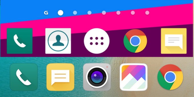
LG's new G5 is here, and apart from the head-turning specs, the phone also brings some changes in the UI department. Indeed, the software of the new flagship has been tweaked, just as it's fitting for such a high-tier smartphone. So, in case you're eager to see what has changed and what hasn't, worry not, we got you covered! Head to the gallery below and see for yourself how LG has spiced things up!
First of all, there is no app drawer on the G5, which is a feature that is rumored to become a standard this year with the arrival of Android N. Well, LG seems to be ahead of the curve this time around! Another thing that's notable here is that LG now puts it faith into iconography with slightly curved edges, which is a stark departure from last year's 90-degree angles that could be spotted on all G4 stock icons. Additionally, the color scheme has been changed from pastely hues to predominantly white ones.
Yes, white is now the dominant color in the quick settings/notification tray and the stock menus of the phone, which might not float just everyone's boat. True, the G5's UI looks nicer and more toned-down than before, but if you've been a sucker for the the darker and colorful backgrounds of the G4, then you're in for some bad time with the G5.
Without much ado, here's what we're talking about. You can check out the LG G5's UI to the right, while the brief comparison with the G4 is right below!
LG G5 UI vs LG G4 UI comparison
Read the latest from Peter Kostadinov


Things that are NOT allowed:
To help keep our community safe and free from spam, we apply temporary limits to newly created accounts: