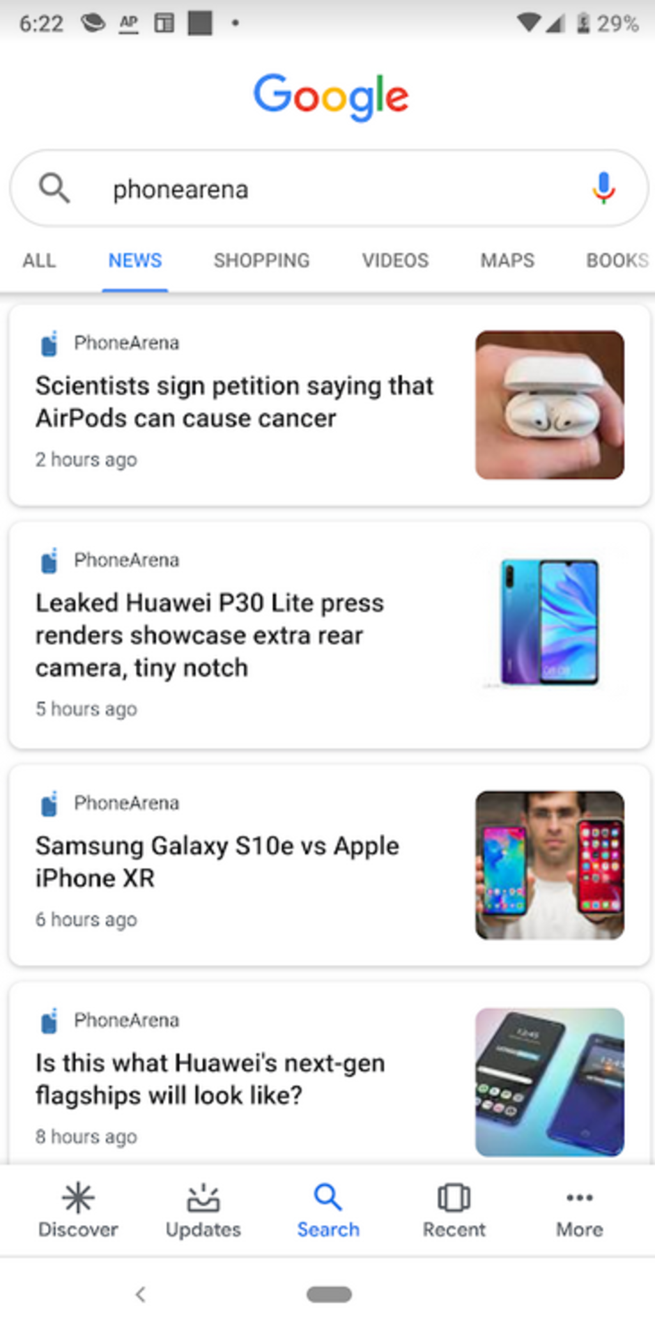
Do the headlines on the Google Search app for Android look different to you?

It looks like Google has changed the UI of its search app for Android users, freshening up the look with its Material Design. The change can be seen where headlines appear underneath the search bar and in the News tab. Using Google Sans font, bigger bolder headlines are displayed along with some additional white space. The change does make it easier to read the selection of stories. Besides the app, the Material Display UI can be found in the mobile web version of Google (Google.com).
Over the last year, Google has updated several of its apps to Material Design, and in many cases it added a Dark mode to those apps. That is because of the more liberal use of the bright white background with this look. In the dark, or at night, the background throws off enough white light to melt your retinas. It also can be a distraction to others in the room who might want to sleep, read or watch television. However, as far as we can tell, Google has not included a Dark mode with this update.
It is possible that not everyone has received the update, although we tested a Pixel 2 XL running Android 9 Pie and a Moto Z Play with Android 8.0 Oreo, and both phones did have the new UI. If the updated Material Design look for the search app has yet to hit your phone, be patient. You should see it soon. Another change that Google could be testing, according to Android Police, (we have yet to see it) adds a new category called Related Coverage under the very first headline. This is a carousel of stories that deals with the same subject matter as the top headline found on the page.

Popular stories


Latest News

Things that are NOT allowed:
To help keep our community safe and free from spam, we apply temporary limits to newly created accounts: