This article may contain personal views and opinion from the author.
Back when Google Reader was in the midst of its death rattle, I assumed that Google wasn't going to completely abandon the news aggregation game, and that seems to be true. Unfortunately for those who were in love with Google Reader, there isn't yet a Google option that will allow you to easily move over your Reader world (assuming you are still holding on to that OPML file), but it does look like Google Play Newsstand is at least on the path to be the spiritual successor to Google Reader.
Obviously, if you're still looking for a complete replacement for Reader, then you obviously haven't looked too hard because there are plenty of options. The front runner right now seems to be Feedly, although services like NewsBlur, The Old Reader, and Digg have their supporters as well. But, as Google said when it first announced that it would be shutting down Google Reader, the way that most people find and consume their news is changing. Only the most hardcore news junkies or those who's job depends on keeping track of the news really need to be using an RSS reader anymore. Most people get their news via social networks, either by following news sources, or through links shared by friends.
Still others get their news in so-called "magazine" apps like Flipboard, which are quite a lot like RSS readers except that they can offer content creators more control over presentation, and they don't include the unread article count that you would find in an RSS reader. The simple removal of an unread article count is a profound difference, which makes it a much more casual experience, and makes it feel less like work, especially for those who constantly have the thought, "must... get... to... inbox... zero!" This is of course the path that Google is taking with its Newsstand app, because Newsstand really is just the old Google Play Magazines app that has had newspapers added and Google Currents mashed in as well. But, Newsstand has two major benefits compared to its Google Currents roots: design and Google Play.
Recommended For You
Design
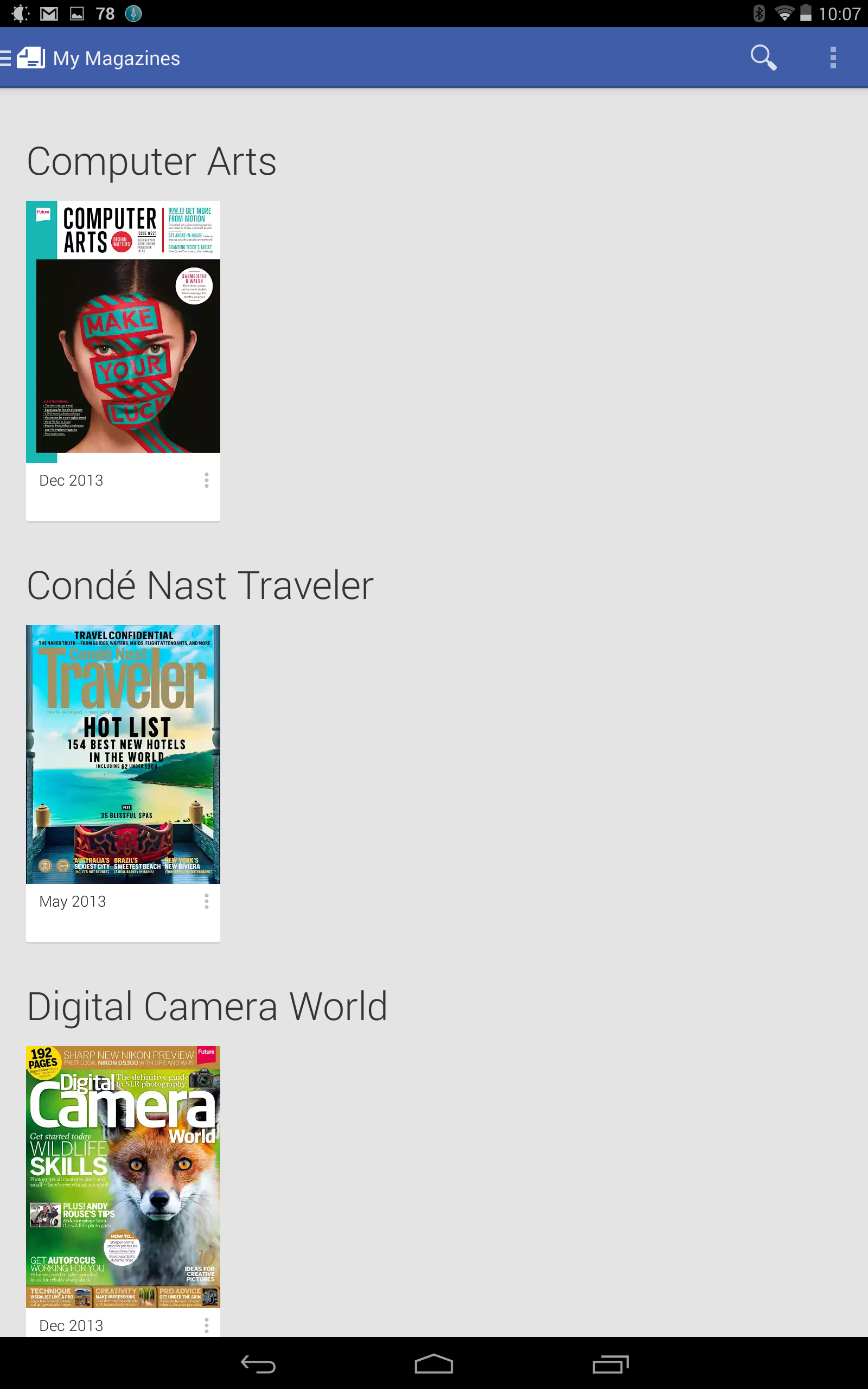
One quick mention right off the top, I'm not going to spend much time on the Magazines section of Newsstand, because it is essentially the same as the Play Magazines app. The only real difference is that the "keep on device" pin has been hidden in a menu on each issue (despite the fact that is the only thing in the menu). It seems like the pin could have just been where it was before instead of adding that extra step to the process. Even the bad layout of the old Google Play Magazines app is still here and making bad use of a larger screen. If you have a bunch of single issues from various magazines (which is likely given how many free issues are in the Play Store to accompany the Newsstand app launch), they are listed in a row, leaving tons of blank space on a larger tablet. But enough of old gripes, and onto the real meat of this section: the updates (both good and bad) from Currents to Newsstand!
Google Currents was always a fairly annoying app. It was obvious that Google could do something good with it, but never really put enough effort into doing so. There was good support from content creators, so post major publications were included, but aside from the one update which brought the Google+ style card layout to the app, there was never much visually to get excited about. The same is not true for Newsstand, at least not on the news side of things. Google obviously put more effort in and it shows, but I do wonder if Google might have over-thought some of the choices.
The first thing you'll notice is that the layout in Newsstand is more image-heavy, which really just means that the images that accompany a story have been expanded. It's a choice that gives the app more visual pop, but it is certainly a drawback as far as the app being a news reader. This is especially true when your device is in landscape orientation, because you may end up only seeing one actual headline and the rest of the screen is filled with an image that may or may not be helpful in describing what the story is about.
Another thing to note, which will be a big issue for those who love the way an RSS reader functions: Newsstand has done away with the chronological news feed that had been the way Currents handled news. Now, Google is using some sort of algorithm to decide which articles are the most important and bringing those up to the top. Google is also promising that the app will learn over time, and get better at finding the stories that would be of the most interest to you. If this works well, it will certainly help with issues of missing a big story, but for those who like to see everything, this layout could be an issue and right now there is no way to to switch the feeds to be chronological.
Newsstand vs Currents
The top bar for each news source is also something of a mixed-bag. It has faint images swimming in it, which is nice compared to the plain bar of Currents. It's also nice that Google has removed the drop-down menu for switching sections in a publication, but the new layout doesn't adapt well. Now, all of the sections are lined up in a row, which works well on a large tablet in landscape, even if there are a bunch of sections (like in The Guardian). But, if you are on a smaller screen, or just switch your display to portrait orientation some of those sections will disappear off the edge of the screen, and there is no visual cue to let you know that swiping will let you scroll through to the other sections, or even a visual cue to let you know that those other sections are there at all. Also missing is the option that Currents had to customize the list of sections in order to compact a longer list by removing things you don't care much about.
Another mixed issue with the top bar is the back button. The back button is always in the top left, as usual. Except now, when you are in portrait orientation, the source logo will be in the middle of the bar, leaving only the faint back button with no icon. The nice thing about it is when you scroll up through the news feed that bar squashes down, and the source logo slides neatly to where it should be next to the back button. But, before that it is a little odd to see a back arrow with no icon next to it.
Once you get into an article, Newsstand absolutely blows Currents out of the water. Currents had the unfortunate UI that was trying to mimic Flipboard, meaning that rather than having a single article that you scroll through like you would in most digital instances, articles were broken up into pages that you would slide through by swiping right and left. When you got to the end of an article, another swipe would bring you to the next article. Now, thankfully, articles are a single page that you can scroll through vertically, and swiping left and right will move you to the previous and next stories. Just as it should be. The "save" button has also been swapped out for a "bookmark" button, which does the same thing but makes more sense with the magazine metaphor.
The sources screen has also gotten a visual overhaul, which again is a mixed-bag. In Currents, all of your sources were in the slide-out menu on the left, and they were organized into categories. Now, they are just a grid of icons, which again is more visually appealing to an extent, but doesn't allow for as much organization, although it is still possible to drag the icons around to rearrange, which is nice. It seems likely that category organization will be coming back in a future update.
Newsstand vs Currents
Overall, the news section of Newsstand is a better way to consume content than Currents ever was. The layout is nicer, although it does have some quirks that need ironing out. But, the other big change here is in how you get the content that you want, because Newsstand has full Google Play integration.
Google Play and content
Back when Google first announced the shutdown of Reader, I expected to see news become a bigger part of Google+ (which could still happen given the expansion of vanity URLs), but my dream scenario was for Google to finally make a worthy mobile version of the killer Google News website. There is the stock News & Weather app from Google, but that hasn't seen an update since Android 4.2; and, even worse, that app doesn't exist at all for Android tablets. It is an app that looks to be on the verge of abandon by Google, which usually means that there will be a Google branded app that will be making its way into the Play Store as a replacement. While the Play Newsstand doesn't yet include a real-time feed of news, it does allow you to follow certain topics, just like Google News would do, and is well on its way to becoming Google's one-stop source for news.
The big mistake I made in thinking that the strategy would be to leverage Google+ is that it is the wrong hub for such a venture. Google+ is the social and identity hub while Google Play, much like iTunes for Apple, is the content hub for most Google services, and that is really the star of the show when it comes to Newsstands: the content.
As always, you can find, purchase, or subscribe to magazines through the Play Store, but the big addition here is not just newspapers and newspaper subscriptions, but all of the digital content that you would have found through Google Currents which has now been added to Google Play. This is even better for those digital content providers because the Play Store offers much better visibility and discovery tools than were ever present in Currents. Google Currents had featured lists of sources, but for the most part you had to know what you wanted in order to find it there. Now, using the Play Store, there are more categories and tools to find the content that you want, even if the categories aren't always the best organized (like having LifeHacker listed next to Ebony in the Special Interests category.)
Still, simply having this content in the Play Store will not only make discovery easier, but it will help to drive users from the content to the Newsstand app, because it will be much easier for creators to add links to the Play Store, so users can add the subscription. Additionally, having this content in the Play Store allows users to review the sites, which allows you to more easily find the best sources for your news.
Content and Google Play
Of course Google Play isn't the only way to get content, because Google left in the options that had been a part of Currents. There are curated lists of sources organized into categories, and each category has a main feed which you can subscribe to that will give you the best of the best. You can search for topics in the Newsstand app itself which could give you a topic feed to follow, specific articles on that topic, or even RSS feeds from sources that are well known for covering that topic. The inclusion of RSS feeds is an interesting one, because it doesn't force content creators to add their site to the Play Store library, and it allows users to find smaller sources that may not bubble up in the Play Store or may not be in the Play Store at all.
Conclusion
All in all, Newsstand looks to be a powerful tool for gathering your news, and could easily replace every other app you might use (unless you really need that unread article count). As a separate entity, Google Currents always felt neglected and odd; but, now that it has been folded into Newsstand and has the Google Play branding, it is a safe bet that Google will be giving the service much more attention than it has been. The Newsstand app is still certainly in need of some more polish and tweaking, but overall it is a really nice option from discovery to consumption.
In a lot of ways, Newsstand feels like not only the app that Google had always wanted Currents to be, but the app that Google had always wanted Reader to be. Google Reader had somewhat trapped the company in the organization of news - you subscribe to an RSS, it feeds in, you read. That's all there was to Reader. It worked extremely well for certain people, and RSS readers are still working extremely well for some. But, Google's aim to organize the world's data has evolved beyond simple feeds into curation, relevance, and serendipity, which were all things that couldn't be done with Google Reader, because at some point the entrenched user base will buck against any change, even those that are good for the overall community (just look at YouTube right now).
Google needed to blow up Reader (and be resigned to the knowledge that someone else would take up the torch, as Feedly and others have done) and come back with a completely new service. Google Currents gave a glimpse at what Google's intentions were, but that was more of a beta test than anything else. Newsstand is the true vision, and if it ever adds in real-time streams like Google News, it could even bring over the RSS faithfuls like myself.
Michael Heller is known for his clear and informative articles on mobile technology. He explores important topics such as the rollouts of 5G networks and the advancements in mobile payments, offering readers insights into the evolving tech landscape.
COMMENTS (8)
COMMENTS (8)
All comments need to comply with our
Community Guidelines
PhoneArena Community Rules
A discussion is a place, where people can voice their opinion, no matter if it
is positive, neutral or negative. However, when posting, one must stay true to the topic, and not just share some
random thoughts, which are not directly related to the matter.
Things that are NOT allowed:
Off-topic talk - you must stick to the subject of discussion
Offensive, hate speech - if you want to say something, say it politely
Spam/Advertisements - these posts are deleted
Multiple accounts - one person can have only one account
Impersonations and offensive nicknames - these accounts get banned
To help keep our community safe and free from spam, we apply temporary limits to newly created accounts:
New accounts created within the last 24 hours may experience restrictions on how frequently they can
post or comment.
These limits are in place as a precaution and will automatically lift.
Moderation is done by humans. We try to be as objective as possible and moderate with zero bias. If you think a
post should be moderated - please, report it.
Have a question about the rules or why you have been moderated/limited/banned? Please,
contact us.


Things that are NOT allowed:
To help keep our community safe and free from spam, we apply temporary limits to newly created accounts: