The pros and cons of Dark Mode: Here's when to use it and why

For the past couple of years, one of the most often requested software features users have clamored for is the venerable "dark mode", or "night mode", if you will. iOS and Android both received system-wide dark modes in 2019, though many phone manufacturers had taken users' demand close to heart and included dark mode into their custom Android interfaces earlier. The same applies to a large majority of the most popular mobile apps found on both the Apple App Store and the Google Play Store, and with a few notable exceptions (looking at you Instagram) you can have all of your interface dark. It seems that for now at least, the dark mode fad is here to stay.
And dark mode is universally lauded as this magical toggle in your phone's interface settings that will magically reduce eye strain, eye fatigue, help you sleep better at night, solve world hunger, and whatnot. Is there any truth to this or is it yet another fad that could be actually doing more harm than good?
Let's explore.
Contents:
What is dark mode?
Dark mode from a usability perspective
Why dark mode looks unnatural
Counter-point: Dark mode and it's effect on myopia
Dark Mode from a design point of view
What is dark mode?
Although the specific hues and colors vary, dark mode is the color scheme of any interface that displays bright text and interface elements atop a darker background. In contrast (no pun intended), light mode is the much more prevalent color scheme of displaying darker text atop a bright background.
Surprisingly enough, dark mode predates light mode by a couple of decades. At the core of its inception, dark mode was not an intended solution, but merely a by-product of the technology in the early beginnings of personal computing. Back in the early days of the personal computer, monochrome CRT monitors with phosphorus were used, and under normal conditions, the phosphorus inside appeared dark. The phosphorus only lit up when an electron beam hit it. Being monochrome, the early computer monitors could only display a single color, which was defined by the type of phosphorus used - the most prevalent were green monitors thanks to the P1 green phosphorus, but you could also get your hands on a P3 amber-phosphorus screen, which were quite desirable thanks to the reduced eye strain and less disruptive of the user's circadian rhythm, and even a P4 white-phosphorus monitor if you were lucky.
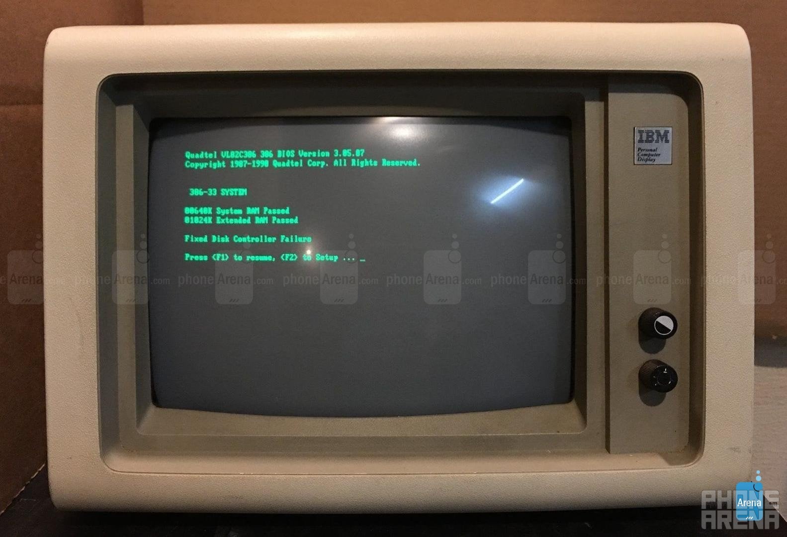
Dark mode nostalgia - IBM 5151 monochrome monitor
Meanwhile, software also "encouraged" the wider adoption of dark mode. When you think of old computers, you're most likely imagining the same white/green text prompt in the top left corner of a predominantly dark image, which was the default "homescreen" of most computers through the 60s, 70s, and early 80s. These early user interfaces didn't have much going on for them and were, by default, mostly dark in appearance.
The exact time when "light mode" saw the light of day is a bit harder to pin down, but could most likely be traced to the Xerox PARC graphical user interface (which heavily inspired Apple's Macintosh and multiple other operating systems at the time), which utilized dark text and interface elements atop a mostly white background. It's closely linked to the advancements in both display technology and the arrival of the modern graphical user interface. The more advanced RGB CRT monitors, which were capable of displaying color, became the forefronts of the "light mode" revolution.

The Xerox Alto in 1973 was among the first computers to utilize a light interface mode, which inspired Apple's Lisa, Macintosh, and other operating systems
As monitors were now capable of displaying complex interfaces, and most importantly, render white colors, computer designers and programmers utilized the technology to emulate the age-old look of written paper that was perceived to be more user-friendly to the regular Joes that were dabbing into the wondrous world of mobile computing for the first time. To be successful, technology needs to be friendly and non-intimidating. The rise of skeuomorphism in GUIs, which closely mimics the appearance of real-world objects in software, also made good use of light mode as it allowed for more natural depiction of the interface elements and a more natural depiction of shadows.
Interestingly enough, just as the development of display technology ushered in the dominant phase of "light mode", it's the same development of display technology that once again sparked the public's renewed interest in darker interfaces - thanks, OLED!
Dark mode from a usability perspective
Dark mode is stylish and hip, no second opinion about that. Although it might not be as legible as light mode, dark mode interfaces posses a certain charisma that could be associated with boldness, formality, sophistication, mystery, strength, luxuriousness, etc. Simply put, all of these traits are quite appealing and desirable, especially when it comes to marketing. However, black is a particularly strong color that evokes strong emotions in people and could easily overpower an individual when it's overdone.
Dark mode is particularly useful when you want to highlight a specific type of content. Spotify, Netflix, and Steam (or the Holy Trifecta of Procrastination, as I like to call them) are quite possibly the most popular apps and services that are designed with dark mode in mind. Why? Because they want you draw your eyes towards the colorful and vibrant album art, video and game thumbnails. Dark mode makes the latter pop out in a specific way that light mode can't.

The Holy Trifecta of Procrastination is in dark mode by default
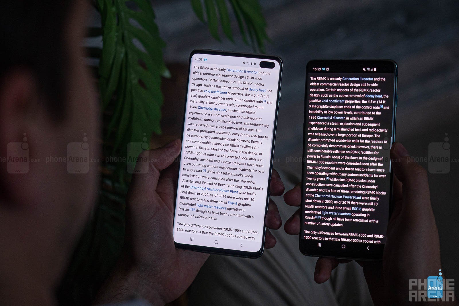
However, it's quite tricky to pull off a good dark mode interface. One if its biggest problems is blurriness. For one, dark mode forces us to open our pupils more in order to capture the necessary visual information, which leads to reduced overall sharpness. Meanwhile, a light mode interface forces our pupils to close down and adjust to the increased brightness, which improves sharpness. Yes, that's basically how camera apertures work as well - wide-open apertures capture more light but aren't as sharp as a smaller aperture opening. This is why dark text on a white background would generally appear sharper to your eyes.
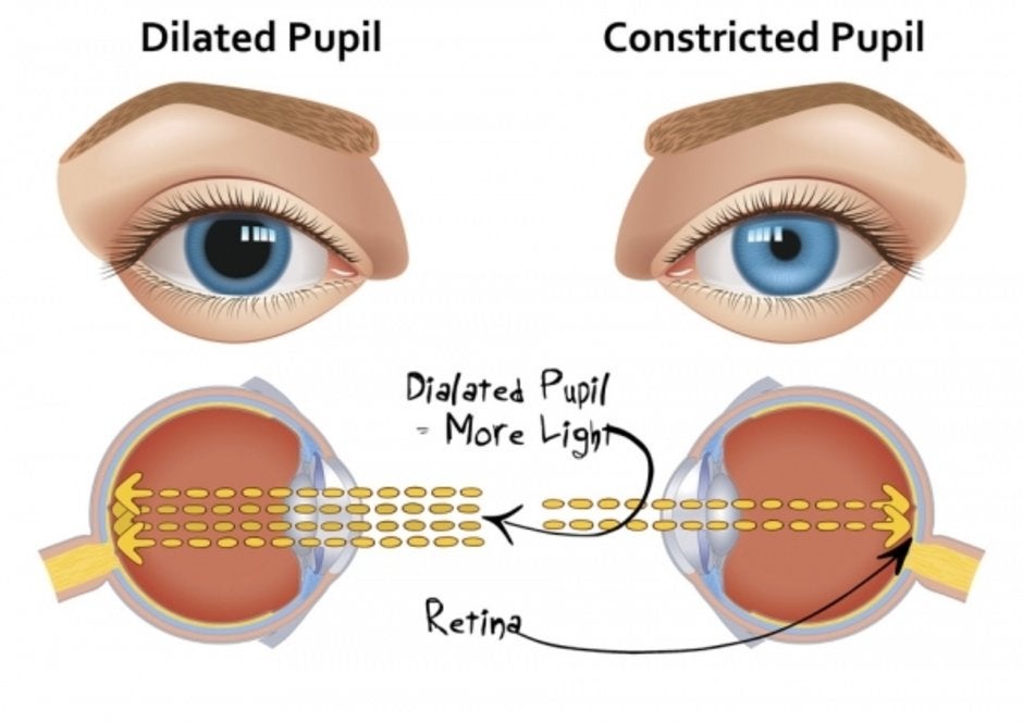
Dilated pupils let in more light, but perceived sharpness suffers
Another thing to consider is an effect called "halation", which is the bane of users with visual impairments and dark mode interfaces. Although halation is a bigger problem with color gradients, it has quite a lot of effect on high contrast texts as well. Halations makes white text seemingly wash out and bleed onto the darker background and appear way blurrier than they actually are. This is especially true for folks with astigmatism and/or myopia (near-sightedness), who have a particularly hard time with halations.
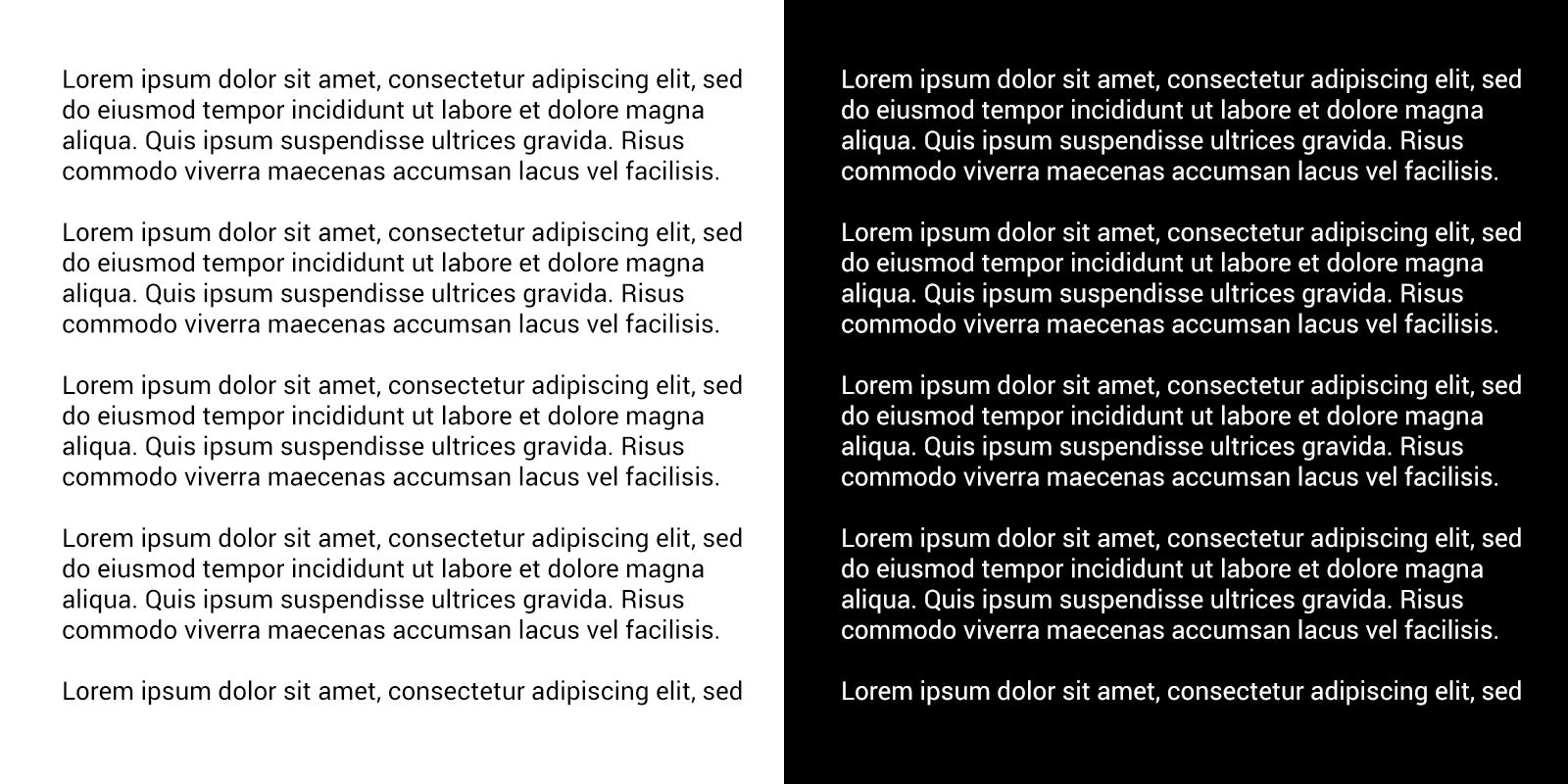
Check out the illustrative image below. Even if you have perfect 20/20 vision, you are likely to see halos around the white characters displayed on the black background. Meanwhile, you are unlikely to see any washing out and bleeding present in the left part of the image, which displays black characters atop a white background.
Check out the illustrative image below. Even if you have perfect 20/20 vision, you are likely to see halos around the white characters displayed on the black background. Meanwhile, you are unlikely to see any washing out and bleeding present in the left part of the image, which displays black characters atop a white background.

Halos demonstrated - light mode vs dark mode
This effect might be stronger when viewed with a font that is lower weight:
The images on the right should have quite a lot of halos and characters seemingly bleeding into one another and the background as well. This "halation" effect should be quite obvious if you're suffering from astigmatism. For such individuals, dark mode interfaces might not appear optimal and could actually lead to more eye strain as you're struggling to make out the characters. Halation is way, way less common on light mode interfaces, which is why they are recommended to individuals that are suffering from the unpleasant effects of astigmatism.
Dark mode looks unnatural
Multiple scientific studies and surveys over the years have concluded that the human brain is all but hard-wired and predisposed to favor dark images displayed atop a bright background. It's argued that the reason for that lies within our own evolution as species: our species, homo sapiens, has been around for 200,000-300,000 years at least, and for 99% of that time, our ancestors' have been mostly active throughout the day (diurnal species). It's accepted that early humans have lived in the African savanna, and what's the one thing that's true about African savanna in the daytime? That's right - blindingly bright background and generally darker objects that cast heavy shadows. Thus, the early homo sapiens brain had to evolve in such a way that it could quickly and efficiently distinguish food, useful tools, dangerous predators, and other objects of interest from the background with the help of perceived visual contrast.
Need further proof? Let's say that the earliest known instances of human art--the prehistoric wall paintings found inside multiple caves around the world--are perfect depictions of why we are predisposed to favor dark mode media. Googling "prehistoric cave paintings" will quickly show you that the vast majority of our artsier ancestors favored dark objects drawn over a lighter background simply because that's how they saw the world around them. Be it bison, mammoths, horses, lions, rhinos, and even other humans, you'll see dark subjects drawn with charcoal against the brighter background. The ones that particularly stood out to me were the paintings in the Chauvet Cave in France, dated at around 30,000 - 28,000 B.C., which are so sophisticated in their appearance that they could probably gather some love at a modern art exhibition. Thank you, prehistoric Picasso!

Lions chasing prey, Chauvet Cave, France, circa 30,000-28,000 B.C.
Our eyes would be quite useless if they couldn't detect the minute contrast differences between different objects, because they are much more sensitive to the subtle contrast differences than they are to luminance, to the point where two objects with indistinguishable contrast would be perceived as melded with one another. Contrast is so important that without it we wouldn't be able to see the world in three dimensions.
But wait, if contrast is truly that important, why is isn't it true that both bright text on dark background, and the opposite, dark text on bright background, have similarly strong contrast properties? This is true, but scientific studies have concluded that the human brain works better when exposed to positive and not negative polarity.
In the scientific field, bright text over a darker background, which we call "dark mode" nowadays, is referred to as 'negative polarity'. Conversely, dark text over a bright background, which we refer to as "light mode", is known as 'positive polarity'. A study conducted by A. Buchner and N. Baumgartner back in 2007 argues that the human brain is predisposed to favor positive over negative polarity when it comes to focusing speed, concentration, and proofreading "performance", which has huge implications to our digital lives nowadays. After all, the majority of things we do on our devices revolves around reading and writing text. Buchner and Baumgartner find that this is true regardless of ambient lighting, so no matter if it's day or night, light mode interfaces will allow you to focus faster on the text and display elements, whereas dark mode interfaces will make it a bit harder to distinguish text and visual interface elements, thus hindering your reading performance and ultimately straining your eyes.
There's a perfectly valid reason for that - white text against a dark background looks unnatural to us because it's so different from text printed on paper.
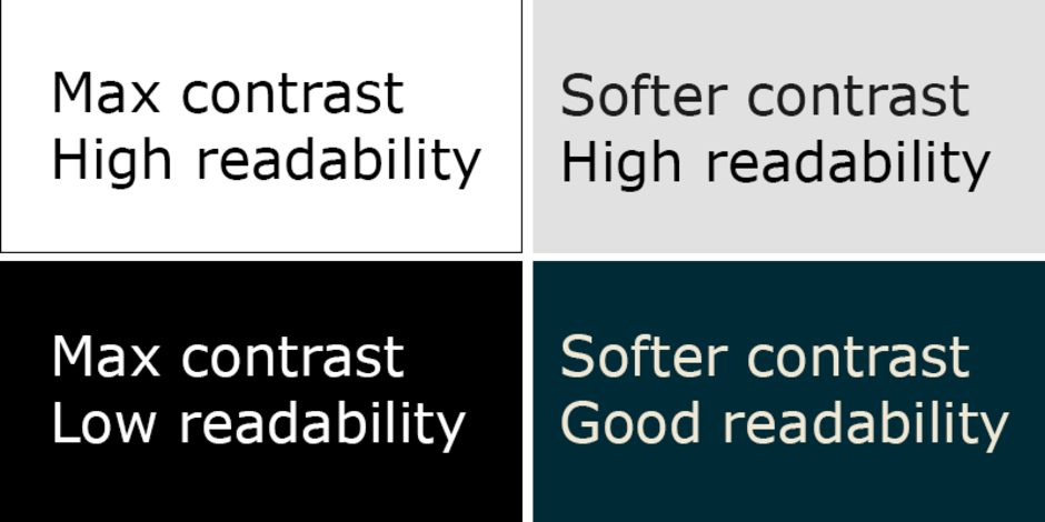
Differences in readability illustrated
"In a series of experiments, proofreading performance was consistently better with positive polarity (dark text on light background) than with negative polarity displays (light text on dark background). This positive polarity advantage was independent of ambient lighting (darkness vs. typical office illumination) and of chromaticity (black and white vs. blue and yellow). A final experiment showed that colour contrast (red text on green background) could not compensate for a lack of luminance contrast."
Another study finds that positive display polarity is especially advantageous when it comes to reading small text on displays. The study found this to be applicable to all kinds of devices using displays to present information, but mostly for modern phones as they are naturally the most widespread medium for text and media consumption.
And these aren't even all the studies that tackled the matter of positive versus negative polarity. Tinker (1963). Radl (1980), Bauer and Cavonius (1980), Cushman (1986), Gould et al (1986), and others have all found out that the human brain enjoys faster readability and prefers dark text and objects displayed on a light background.
Hanna and Hall from the University of Missouri
Counter-point: Why dark mode is good for your eyes

A scientific report dubbed "Reading and Myopia: Contrast Polarity Matters", conducted Andrea C. Aleman, Min Wang, and Frank Schaeffel (read it here) that was published on Nature.com explores the effects of contrast polarity on human eye, and comes to the conclusion that negative polarity (dark mode) is way less harmful to your vision in the long run than light mode. The report finds out that the likes of dark mode essentially inhibit the development of myopia in your eyes, which is the medical term for nearsightedness, while light mode quickens the development of myopia.
Myopia is currently the number one vision disorder in the US, with more than 40% of the adult population suffering from nearsightedness and having to resort to prescription glasses and/or contact lenses. According to certain scientific forecasts, half of the world population in 2050 will be nearsighted, making it by far the most widespread health disorder on a global basis. One of the implied reasons for myopia is the undesired thinning of the choroid, a 0.1-0.2mm thin layer that lies beyond your retina and is responsible for supplying it with oxygen.
What's the connection between dark mode and the choroid, and to a larger extent, myopia? To answer this question thoroughly, we'd have to take a peek inside our eyes.
What's the connection between dark mode and the choroid, and to a larger extent, myopia? To answer this question thoroughly, we'd have to take a peek inside our eyes.
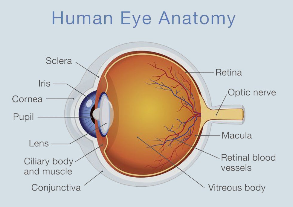
Anatomy of the human eye
Notice the retina at the back of the eye? Good. As you likely know, the retina is the light-sensitive layer of tissue at the back of your eye that captures light information and translates it to signals that get sent to your brain through the optic nerve. If you’d love a more modern analogy, if our brains are a camera, the retina is the image sensor and does the heavy-lifting.
Yet, the retina is not a homogeneous layer of cells as it's actually made up of a few different cell layers that have their own dedicated purposes. The retina consists of six different layers. You've likely heard of the rod cells, which function best in dim lighting conditions, and cone cells, which are responsible for our color vision.
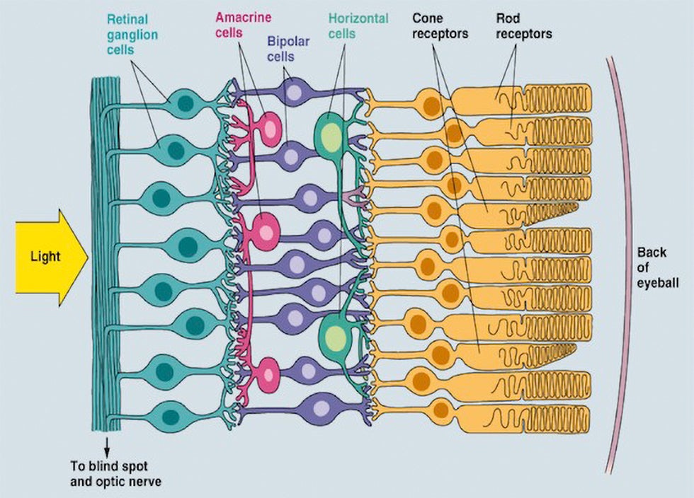
Anatomy of the human retina
However, in order to learn how dark mode saves our eyes, we need to take a deeper look at the outermost photosensitive layer of the retina - the ganglion cells. Ganglion cells are combined in clusters with diverse physiological structure - the central receptors are dubbed ON structures, whereas the periphery is called an OFF structure. Turns out that ON and OFF structures react differently to white text on dark background and dark text against a bright background, as concluded in the "Reading and Myopia: Contrast Polarity Matters" report by Aleman, Wang, and Schaeffel.
Black text on white paper contains large bright areas with constant luminance. Neither ON nor OFF receptive fields would provide any output in these areas. However, on the black lines of the letters, most receptive field responses will be OFF, because the dark center pixels of the receptive fields are surrounded by, on average, brighter pixels, generating negative contrast. If the output of all receptive fields is added, the overall result is “OFF dominance”. The opposite is true for bright text on dark background. In general, the closer the ratio of bright to dark areas is to “one”, the more similar is ON and OFF stimulation.

Simply said, the study finds out that:
- "Light mode", positive polarity (dark text displayed on a bright background) overstimulates the OFF ganglion cells and stimulates myopia;
- "Dark mode", negative polarity (bright text displayed on a dark background) overstimulates ON ganglion cells and inhibits myopia.
So, what are the implications here? Well, for better or worse, the report cited above finds out that over-stimulating the OFF ganglion cells leads to the thinning of the choroid that we mentioned a couple paragraphs before. Conversely, over-stimulating the ON cells, which would happen if you predominantly use dark mode on your device, leads to thickening of the choroid. The report points out that an hour of overstimulating the OFF cells for an hour thinned the choroid by about 16 µm, whereas one hour of reading white text on a black background thickened the choroid by 10 µm. Albeit they might appear small and irrelevant, these differences in thickness might be affecting your eyesight quite a lot.
As we mentioned already, choroid thickness has been proposed as one of the early indicators of myopia development - thinner choroids are believed to stimulate myopia, whereas a thicker choroid inhibits myopia development. In other words, dark mode on your phone probably wouldn't prevent you from becoming nearsighted, but will most likely slow down this undesirable effect to your eyes. Conversely, traditional instances where dark text is displayed onto a very bright background would do you more harm than good.
Dark mode on our phones
We already established the notion that most modern smartphones already have dark mode or will score one by the end of the year. It's hard to point out who was the pioneer in this field, but we can probably link the advent of dark interfaces to the rise of OLED displays. Once a rarity, these organic displays slowly but steadily occupied the high-end flagship niche and can now be found on any 9 out of 10 flagships. OLEDs are seeping into the mid-range, too, and it probably wouldn't take long before LCD becomes a finished chapter in smartphone history.
One of the often-cited reasons why dark mode is seemingly such a desired features by phone users is one that has little to no connection to legibility, design, and prehistoric cave paintings - it's battery savings. Of course, the battery-saving potential of OLED displays can hardly be ignored - as you know, when OLEDs display black, the respective pixels are turned off, which saves some battery. This is in stark contrast with LCD displays, which are always on, regardless of the image being displayed and would draw the same amount of power if you look at a glaringly white web page or something pitch black.
Applying a system-wide dark mode to your OLED phone and painting all of your most commonly used apps dark is unlikely to double or triple your battery life on a day-to-day basis, but it would probably give you an extra hour or so of battery life, which could be vital in certain situations.
Conclusion: Should you use dark mode or not?
Yes, but you should use light mode as well.
Regardless of all the proof, studies, and research that are available, using dark mode over light mode is ultimately a personal choice of each individual. No matter what the science says, if you like dark mode more, you're going to use dark mode. If you are a light mode person, sure, go ahead - the choice is yours. Personal preference rules king here again.
Personally, I enjoy most of my interfaces dressed in dark. When I'm watching videos or looking at pictures, dark mode is on by default, and I''d even go out of my way to customize each and every app or website I use on a daily basis to have dark mode, be it with a third-party app, a simple settings toggle, or even an extension. The same applies to doing audio-visual work on a daily basis - both Adobe Photoshop and Premiere come in dark mode by default, as it makes audio-visual content pop up in a non-distracting way.
Dark mode is god-send in dimly lit environments
With all that said, I feel that most people use dark mode wrong. I admit I did that, too - as soon as dark mode got added to an app or a service I used, I immediately enabled it and never turned it off. Much later I realized that dark mode should only be enabled during the night, if you happen to be using your phone to combat insomnia, or in certain apps that are more content-heavy and don't involve lots of reading. For example, watching some Netflix, a YouTube video, or browsing through your gallery - in short, everywhere where you don't have much text and want to have the content truly pop up.
However, nowadays that I've wizened up, I rely on the good-ol' light mode during the day and when it comes to reading/writing lots of text purely for legibility reasons. How do I do that? Often manually, but whenever possible, I schedule dark mode to turn on at a specific time or to automatically enable and disable itself at sunrise and sunset. There's a simple experiment you could try to determine whether you need dark mode or not right now - simply go outside, under the bright sun, and use your phone as you would. Even at maximum brightness, a dark mode interface would be harder to make out than a light one. Conversely, you should probably turn dark mode on when the ambient lighting goes down in order to eliminate some of that blindingly-bright light at night. Of course, lowering the brightness or enabling a blue-light filter in this particular case could also help immensely.
In the end of the day, is dark mode a fad or a necessary interface solution for many? I feel that it's a little of column A and a little of column B: dark mode is а trendy fad, but it has its real-life usage implications that make it a valuable option for popular modern user interfaces like Android iOS.
For one, I cherish the fact that we are given the option to choose between dark and light mode depending on our specific needs.
Everything in moderation, including moderation.
Everything in moderation, including moderation.
References & bibliography:
1. Andrea C. Aleman, Min Wang & Frank Schaeffel (2018). Reading and Myopia: Contrast Polarity Matters. Scientific Reports vol. 8, Article number: 10840 (2018)
2. A. Buchner, N. Baumgartner (2007). Text–background polarity affects performance irrespective of ambient illumination and colour contrast. Ergonomics Vol. 50, No. 7, July 2007, 1036–1063
3. Piepenbrock, Mayr S, Buchner A (2013). Positive display polarity is particularly advantageous for small character sizes: implications for display design. Human Factors: The Journal of the Human Factors and Ergonomics Society, December 2013
4. Bauer, D., Bonacker, M., and Cavonius, C. R. (1988). Reading from paper versus reading from screens.
5. Hall, R., Hanna, P. The Impact of Web Page Text-Background Color Combinations on Readability, Retention, Aesthetics, and Behavioral Intention. Behaviour & Information Technology Journal.
5. Hall, R., Hanna, P. The Impact of Web Page Text-Background Color Combinations on Readability, Retention, Aesthetics, and Behavioral Intention. Behaviour & Information Technology Journal.

Popular stories


Latest News


Things that are NOT allowed:
To help keep our community safe and free from spam, we apply temporary limits to newly created accounts: