When a new product segment begins to gain relevance in the market, some companies out there are quick to jump on the bandwagon and crank out devices that might not fully grasp the full potential of what it’s sought out to accomplish. Interestingly enough, we’re seeing that all too evident in the Android tablet market as some manufacturers hastily come up with tablets that don’t necessarily take advantage of the new medium, but even worse, they essentially emulate the smartphone experience. Call it an outcry or something, but with that type of mentality, you pretty much place a death sentence on that particular device. Thankfully though, Google decided to intervene before the market is saturated with these so-called tablets that are simply giant sized smartphones at their core.
Recommended For You
Clearly Apple has a head start in this thriving new market, but now that Android 3.0 Honeycomb is finally here, we’ve got something that realizes the specialty that’s needed in order to provide an encompassing experience. Although it improves upon some of the core foundations brought along by previous versions of Android, this one is specifically catered to adapt to the increasing functionality that is coming around with tablets. So let’s take a closer look shall we?
Android 3.0 Honeycomb – just another iterative creation?
Fragmentation is one common theme that we see splattered across Android since many devices decide to pour their own unique spin on the open platform. Although it’s still a widespread occurrence among Android smartphones, some were curious to know whether or not it would continue to show prominence among the increasing amount of Android tablets coming to market. Luckily, Google decided to firmly ensure that the experience wouldn’t be simply a rehash of the current mobile platform on smartphones, but rather, a totally new one that would envelop all the qualities and functionality that would glorify the overall tablet experience.
Being a long time user of the Android platform, we were a little bit overwhelmed when we finally got to check out the new Honeycomb experience for the very first time. Strangely, it felt somewhat so foreign at first, as if were something completely new and different, but we soon realized that its visual presentation plays a crucial role in giving it that substantial iterative look and feel.
On the surface, the mostly holographic cues enable the platform to look so futuristic over things that we currently see in the world of mobile OSs. And rightfully so, it tantalizes us with its strategic implementation of highlighted borders, mostly found with icons and widgets, to emulate the look of light being forced through translucent tubes. It’s actually these kinds of small details on the visual side that provide the wow factor you’d want to see with any new platform out there – and it’s done very well to give it enough character over previous versions of Android.
However, after being presented with all the eye pleasing graphical eye candy exhibited by the platform, we find ourselves quickly realizing that it’s very much the same old Android underneath it all. Now it doesn’t mean that it solely focuses on presentation, but it does keep in mind all the whole hearted practicalities we’re so used to finding with Android – like its rich personalization. Still, it’s rather inviting to see that they’ve built upon the foundations of Android, and molded it into something new that’s positively optimized for the tablet segment.
Home screen, Main menu and Visuals:
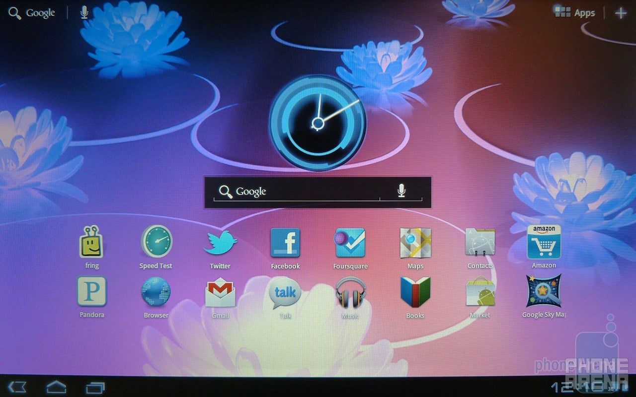
Finding ourselves for the very first time at the homescreen of Honeycomb, it instantly reminded us of the world of TRON. Much like the computer generated atmosphere of TRON, we find many aspects of Honeycomb employing these lighted borders and blurring effects to give off that other worldly feel with its interface. Definitely eye catching indeed, we’re presented with 5 home screens to fill their void with an abundant set of items – which is very much Android like. Naturally, there’s plenty of personalization found with Honeycomb as it boasts a decent set of widgets, wallpapers, shortcuts, and others to choose from. Aside from the healthy amount of static wallpapers offered right off the bat, we find very few live wallpapers that are specifically created for the new platform.
Widgets of course have become a standard thing with Android as a whole, but even though there are some interactive ones available, like the Gmail or bookmarks widgets, we’re only treated to a single Honeycomb clock widget. Fortunately though, they don’t take up a huge chunk of real estate and still give you enough leeway without making it look too cluttered. We also like how some of them provide specific core functions, like being able to quickly scroll through emails with the Gmail widget, without having to directly launch the app.
The 5 home screens can be filled with widgets
At the bottom of the interface, we now find a System Bar that is always present in every orientation or app that you run – and it’s also the place where we find the customary set of Android buttons. These include things like the Back, Home, and Menu buttons – the latter of which only pops up with certain apps. Additionally, we now find a Recent Apps button placed on there as well that instantly displays thumbnails of some of the most recent apps that have been running. Much like performing a long press of the home button with an Android smartphone, the Recent Apps button allows you to juggle around different things; thus being a great tool for any productive individuals out there.
Instead of finding Notifications Panel lining up the top area of the interface, it’s now positioned in the lower right section of the System Bar – which is very much Windows like. In fact, we find the digital clock always here, and when it’s pressed, it’ll allow you to get access to the usual Android settings. If you happen to get a notification, it’ll briefly appear as a window in the Notifications Panel – which is definitely not obtrusive at all. However, if you choose to ignore the notification, it’ll end up being displayed as an icon in the Notifications Panel.
The System Bar is in the bottom of the screen
Depending on what you’re doing, the Action Bar will offer you specific functions that are tied together with the app you’re running – and it is positioned at the very top edge of the interface. On the homescreen, we’re presented with Google Search and Voice Search in the upper left corner, while the buttons for the Apps Panel and personalization are found in the upper right. But if you’re running something like the web browser, it’ll transform and give you the address bar, navigation controls, and others.
The Action Bar sits at the very top edge of the interface
Unfortunately, the Apps Panel hasn’t received any visual upgrade with Honeycomb seeing that it simply resorts to sticking with the usual grid-like view with no 3D looking effects aside from the transition effect that runs initially. Still, icons will accumulate and you’ll have to swipe left and right in order to traverse between all your apps.
The Apps Panel in Honeycomb
Sure we might have been somewhat overwhelmed at first with the new layout of Android, but after poking around for a few minutes, we realized that it still embodies all the lovable aspects we’ve come to appreciate with the platform. Meanwhile, the visual presentation is definitely invigorating to separate it from previous versions, but underneath it all, we’re still presented with the core foundations of Android. Moreover, the notifications system has been retooled to better suit the tablet experience and its implementation is well executed.
Contacts App:
Turning our attention to the address book, it mainly relies on a layout that one would easily come to think as becoming the norm for any tablet. Specifically, there are basically two panes displayed on-screen – the left one being your scrollable listing, while the other displays all the relevant content associated with each person.
Since this is a Google built platform, it’ll sync with your Gmail contacts; as well as others found with your social networking accounts. In the Action Bar, you can set it to display contacts according to your accounts, or simply have all of them loaded together at once. And if you don’t feel like going through the listing, which is organized in alphabetical order starting with the first name, you can always tap the search bar and find specific names.
Contacts app
The Contacts app in portrait mode
Of course, there are plenty of specific pieces of information that you can add in with each person –like email addresses, phone numbers, birthdays, and instant messaging accounts. As much as we like seeing contacts from our social networking accounts loading up in the address book, it doesn’t offer the tight integration we’re so accustomed to see with other Android smartphones. Meaning, it’ll display the most recent Twitter post within the contacts app, but unless you’ve got the official Twitter client installed, it’s not going to do much in terms of aggregating content.
Messaging and Email:
When you’re composing a message of some sort, you’re only presented with the stock Honeycomb keyboard – which surprisingly leaves out numbers built into the first row of buttons; much like what’s found with Gingerbread’s layout. Albeit, there are some commonly used punctuations available at your disposal all from the main layout, but if you need to throw in something else, you’ll have click the specified numbers and punctuations button. Obviously, the portrait option might prove to be a bit unwieldy for some people, but as with almost anything, the landscape one provides a suitable amount of space. This here all depends on the specific device you'll be using Honeycomb though.
When you’re composing a message, you’re presented with the stock Honeycomb keyboard
Does typing get your fingers cramped? Well, you can always click that magical microphone button on the keyboard to activate the platform’s voice recognition service – which will convert your spoken words into text. Indeed, it’s a nice feature seeing that it works well on most occasions during our experience.
Lastly, the platform also has auto-correction and suggestions in place to properly aid you as you begin to type at a rapid speed. With auto-corrections however, you can either set it to off, modest, or aggressive.
Being human and all, we’re prone to make an occasional mistake as we speed type without bothering to double check ourselves. So in the event we have to go back and modify something, you can eye ball the location and tap it to get the cursor in place. If that’s not helping, you can also drag the cursor into the correct position as well. And finally, you can highlight something by simply holding down a word, then adjust the cursors to the correct areas, and simply either press the copy or cut buttons in the Action Bar.
Just like any Android smartphone out there, emails are broken down to basically two forms – Gmail and everything else. You’ve got one app strictly for Gmail, which does a phenomenal job in translating over the desktop experience to the nail. At first, it’s laid out in the customary two paned system with the left most showing all your folders, while the right one mainly displays who the email is from and a snippet of the its contents. However, when you select one of them, the whole thing shifts over to the left as the full email is displayed within the right pane.
Emails in Honeycomb
Productivity is in full effect with the Gmail app since we’re treated to some of the most frequently used functions we’d come to experience with the desktop version. Again, the Action Bar enables you to switch between accounts, search for specific keywords within your emails, archive items, delete stuff, and label things. And finally, emails within the Gmail app are organized in a threaded view to keep you on your toes on the history of your conversation between someone else.
Secondly, you’ve got the regular email app that namely offers the same layout with the Gmail app, but it’s limited in what it can handle. Obviously, you can display emails according to which account you have selected in the Action Bar, but there is also a combined view as well that drops everything together – however, it’s color coded to make it easier to view. Unfortunately though, threaded view is blatantly missing with the regular email app – so that means you’ll need to backtrack on older emails for a refresher.
Organizer:
You’d think that there would be something completely new with the calendar with Honeycomb, but in all honesty, it’s basically nothing we haven't seen before. Granted that you can sync calendars from multiple accounts, which is then colored coded, but it’s basically the same old functioning calendar app we’ve been using. In the Action Bar, we have the option to display the calendar in month, week, or day view, and we also find some additional functions like doing a search and creating a new appointment.
When you’re in the month view, the layout is typical since it’ll place the entire month’s calendar on-screen with appointments listed on their specific days. However, when you select day or week view, it’s transformed into the familiar two paned layout that displays your appointments on one side, while the other pops up a mini month calendar with the color coded labels of your accounts nearby.
Adding an appointment is easily accomplished by simply tapping on the associated icon in the Action Bar or performing a long press in any spot in your calendar. Once you’ve got it up, there is an abundant set of information that you can set that range from things like reminders, to the actual start and end times of the event.
Sadly, the Clock App with Honeycomb is downright prehistoric compared to the offerings we’re so used to seeing. That’s because it’ll only display a supersized version of the digital clock found in the Notifications Panel, and from here, you can set up multiple alarms. Yup, that’s pretty much the extent of its functionality as it lacks items like a stopwatch, timer, or world clock.
The Calendar app
Furthermore, the Calculator App doesn’t make any headway with Honeycomb since we’re once again greeted with a giant sized version of the traditional one found with Android. Aside from its palm friendly sized buttons, we have access simultaneously to both the basic and advanced functions.
The Calculator App is a giant sized version of the traditional one found with Android
Yeah it’s missing some organizer functions, but that’s where the Android Market comes to mind as we’re sure there are plenty of third party offerings available to fill in the gap.
Exploring the Internet:
When running the Android browser, its presentation is almost similar to what’s found with the Google Chrome browser on a desktop computer. Satisfying indeed, we’re presented with the conventional set of features like pinch gestures for zooming, smooth kinetic scrolling, double tap to zoom in/out, and long pressing for additional functions.
However, support for Flash 10.1 is uncharacteristically absent with the web browser – for now though. But don’t fret because it seems that a software update is going to be made available in the near future that will bring it along; thus completing its transformation in offering a true desktop like experience.
The Android Honeycomb browser lacks support for Flash 10.1
In the Action Bar, we have access to the navigation controls, address bar, opening a new tab, Google Search, and bookmarks – the latter of which will sync with your Google Chrome bookmarks. Also, we find the option to open a new tab in “incognito” mode which essentially covers your tracks while surfing the web; thus not leaving any cookies behind whatsoever.
And finally, the sharing features are all there as well since you have options like sending links via Bluetooth, Email, Facebook, Gmail, or Twitter. In terms of performance, complex pages load up just like they do on a desktop browser, but it’s nice to see that we rarely find long passages of text being crunched into a narrow view. However, it would be nice for certain pages to automatically load their full experience as opposed to their mobile friendly variants – like Wikipedia. Not forgetting that this is a tablet optimized platform, it’s nice to see a new look with the browser as it offers some engaging features that are akin to tablet use.
Android Market:
Still in its infancy, the only thing that’s holding back Honeycomb is the paltry set of tablet optimized apps available in the Android Market. Sure we’re greeted to a new layout with the Android Market, which organizes searches between tablet optimized ones and the usual others found with the platform, but it would’ve been nice to see plenty of optimized third party apps from the onset. Regardless, we’re seeing more and more coming in with each passing day, and eventually, it’ll be at a healthy level.
With the new interface, there is a carousel of featured apps rotating in position at the top, while others are broken down by category beneath it – these include featured tablet apps, top fee apps, best-selling apps, and Verizon. Moreover, there is a section in the Action Bar that place you into the Books Market. And we no longer have to actually launch the Android Market to see any available updates because the platform will automatically pop up a notification for you.
Even though most of the legacy apps are freely available for download, we did experience some unexpected and abrupt force closures with certain apps. It appears that there are still some bugs with the new platform since apps continue to crash at random, but as we all know, it will more than likely be addressed with future updates. Ultimately, Honeycomb’s place in the tablet world is going to come down to its developers since they hold the keys in producing apps that are meticulously optimized for the tablet experience.
Camera:
Much like the stock camera interface of previous versions of Android, there isn’t anything particularly advantageous with the one for Honeycomb. Naturally, a good portion of the interface is reserved for the view finder, but it’s surprising to see that Google decided to leave out something like touch focus. Nevertheless, most of the controls are located on the right side of the interface as a large dial mainly dominates the area. Using your thumb, you have quick access in changing the flash mode, white balance, color effect, scene mode, and camera setting. Additionally, we find the“-“ and “+” buttons on there as well to give you access to up to 8x digital zoom. And finally, switching between video and camera mode is easily executed by pressing the associated toggle in the bottom right area – and that’s where we also find the button to switch to the front facing camera as well.
Although there are few available options with the flash, white balance, and color effects, there is an extraordinary amount for the scene mode – these include things like auto, action, portrait, landscape, night, theatre, beach, snow, sunset, steady photo, fireworks, and night portrait. And under the camera settings, you’re presented access to changing the focus mode, exposure, picture size, and picture quality.
The stock camera interface in Honeycomb
As for snapping shots, you simply press on the on-screen shutter key; which kicks on the focus. And when the toggle in the view finder turns green, you release your finger from the shutter key to capture the shot. Simple enough! Once you’ve got it, there is a three second delay before you’re ready to shoot another picture – with the most recent one being displayed in the preview window on the view finder.
Running the Gallery App, the first thing to capture our eyes is its 3D like stacking effect that makes it seem like folders are stacked up top of one another. Once you make a selection, it’ll display all the content of the folder into a grid-like view that is scrollable from left to right. When you’re viewing a photos, you can swipe left and right to see some additional ones, but you’ve also got pinch gestures to zoom in.
The Gallery App
Sharing specific items is easily done by pressing the sharing icon in the Action Bar – which allows you to send photos to Picasa, Bluetooth, Twitter, Facebook, Gmail, and regular Email. Regretfully, there are only a limited set of editing tools on-board with it – such as rotating and cropping only.
Multimedia:
Previous Android music players lacked any eye candy to rival some of the glitzy effects shown off by Apple’s Cover Flow mode, but definitely refreshing, we finally see a major overhaul with the Honeycomb music player. When you select the “New and recent” option in the Action Bar of the music player, we’re greeted with a fancy looking 3D carousel that enables you to smoothly browse through all your albums. Clearly a nice touch to its presentation, it doesn’t stop there because we’re transported to a grid like view with all the album covers when the “Albums” and “Artist” options are selected from the Action Bar. Obviously, you can scroll up and down, but we adore the articulating movement of the interface as you tilt the tablet.
We finally see a major overhaul with the Honeycomb music player
When a song is actually playing, it displays all the items we’re normally accustomed to seeing at this point – like the album cover, track information, and on-screen controls. But if you happen to go back to the homescreen or something else, an icon of the mini player will show up in the Notifications Panel. Pressing on it, it’ll pop up the actual mini player with controls like reverse, pause/play, and forward available to you. Without a doubt we’re more than satisfied with the updated presentation, but it would’ve been nice to see some other fancy looking visualizations or equalizer settings.
Not necessarily something we’d expect to don some kind of new look, but the video player pretty much sticks with the usual approach with its functionality and presentation. When videos are playing, which can be done in either orientations, you have a single button in the middle to play or pause it – plus you’ve got a toggle in the time line that you can move to specific areas.
The video player
Movie Studio:
Video editing buffs will surely appreciate the basic set of tools available to them with the Movie Studio app with Honeycomb. Sure it’s no professional grade software, but it nonetheless enables you to quickly compose a reasonably passable edited video on the go. The interface is probably more familiar to those who have played around with other video editing software, but it can prove to be daunting for other novice users. At the bottom of the interface, you’ve got the time line, while on the left and right sides, we find specific controls to pause, play, reverse, forward, and a knob that precisely gets you to a specific time frame. From here, you can throw in content, either photos, videos, or music, by pressing the associated buttons in the Action Bar. And if you want to throw in some kind of titles, effects, or transitions, you essentially have to long press an area in the time line where you want it to happen.
Once you’re content with the all the edits and deem it as a masterpiece, you can export the video and watch your creation.
The Movie Studio app
YouTube:
Hands down, the YouTube client with Honeycomb is by far our favorite amongst anything else out there. Not only do we find its interface adept at providing relevant content, but it’s layout is structured to perfectly encompass a wide array of functions like commenting, liking, sharing and searching videos. Moreover, we’re given the option to play a video in either standard or high quality – and it’s totally independent of what kind of data connection we have. Finally, we find the new grid-like carousel of its presentation intuitive as it aggregates some of the most recent content associated with our subscriptions.
The YouTube client with Honeycomb
Google Maps:
Being the Google product it is, there is no denying that plenty of love is placed with Google Maps. In fact, we experience all the wonderful set of features that have made the app become one of the most widely used for any Android users out there. From 3D views to free voice guided turn-by-turn directions, there is a substantial amount of useful features offered by the app. Although the bulk of the interface is reserved for the map, specific functions pop up in separate windows to always give you focus on what you’re looking at on the map.
Google Maps
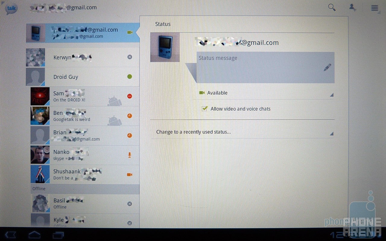
Google Talk:
Aside from being able to instant message your Google Talk buddies, we find video chat implemented with the app now. As long as you see that camera icons alongside the names of your buddies in Google Talk, you’ll be able to video chat with them over your data connection. In our test, we used it over a 3G connection, and we have to say that it’s a respectable experience since voices were mainly clear – although video is a on the pixelated side of things.
Google Talk
Conclusion:
At the beginning when we were first sat down with the platform, we were utterly awe stuck by its futuristic appearance – which naturally helps in creating some buzz with anything new. Sure we felt just a tiny bit overwhelmed at first because of its entirely new layout, but after some time playing and fully comprehending the new platform, we gather it to still be the tried and true Android experience we’ve come to appreciate.
To its credit, Google did a phenomenal job in really boosting the multi-tasking and notifications aspects of the platform – and it’s well executed in functionality and presentation. Additionally, the overall holographic appearance of the homescreen enables it to not only separate it from previous versions of Android, but from other platforms as well. Come to think about it, we find a good balance of visual presentation and usability with the platform from a tablet perspective.
As much as Google has done a magnificent job in building the platform from the ground, there are still some underlying issues present with some third party apps that cause them to become unstable – and thus force closing. Moreover, it’s all going to come down to developers in creating apps that are not only exciting, but fit to take advantage of the new medium that tablets encompass.
Sure there might be some people out there that would argue that this current build of Android is not a complete 1.0 version, but as we’ve come to see with most things, anything new being released will always have some aspects that aren’t quite deemed as fully thought out. In the end, however, we’re confident that things will ripen over time and that Google will push out some exciting new concepts that are best experienced for their tablet platform.
Get Visible as low as $20/mo for 1 year. Limited time offer with code: FRESHSTART
$20
/mo
$25
$5 off (20%)
Offer Ends 6.1.2026 at 11.59pm ET. New members get $5/mo off the $25/mg Visible plan, $35/mo Visible+ plan, or $45/mo Visible+ Pro plan for the first 12 months. Promo code FRESHSTART required at checkout.
A discussion is a place, where people can voice their opinion, no matter if it
is positive, neutral or negative. However, when posting, one must stay true to the topic, and not just share some
random thoughts, which are not directly related to the matter.
Things that are NOT allowed:
Off-topic talk - you must stick to the subject of discussion
Offensive, hate speech - if you want to say something, say it politely
Spam/Advertisements - these posts are deleted
Multiple accounts - one person can have only one account
Impersonations and offensive nicknames - these accounts get banned
To help keep our community safe and free from spam, we apply temporary limits to newly created accounts:
New accounts created within the last 24 hours may experience restrictions on how frequently they can
post or comment.
These limits are in place as a precaution and will automatically lift.
Moderation is done by humans. We try to be as objective as possible and moderate with zero bias. If you think a
post should be moderated - please, report it.
Have a question about the rules or why you have been moderated/limited/banned? Please,
contact us.


Things that are NOT allowed:
To help keep our community safe and free from spam, we apply temporary limits to newly created accounts: