Do you like Samsung's new TouchWiz 'squircle' icons?
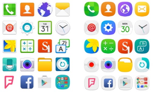
Initial Galaxy S6 (left) vs Galaxy S7 (right) iconography
Samsung's TouchWiz icons and menus have always been a ragtag bunch, as with each subsequent update Samsung turned out with different styles applied to different sections, some round icons, some square, and don't even start us on the look and feel of the notification bar. The Galaxy S7 and S7 edge, however, as well as those Samsung handsets that have received their Android 6.0 Marshmallow update to a certain extent, are enjoying a new kind of iconography that Samsung rightfully calls 'squircles,' or circles trying to fit in squares.
This is the most visible change in Samsung's updated TouchWiz interface that will stare at you starting from the lock screen, and continue to please your sense of aesthetics everywhere you go, as you can now apply the "squircle" form to third-party app icons as well by turning on the icon theming function from the settings.
This way you won't have a browser icon with nice, polished rounded corners, yet a squarish Facebook app icon, for instance, but everything will look like one smooth, uniform interface - a much needed change in TouchWiz. That is why we wanted to ask you if you like the new coherent "squircle" iconography of TouchWiz? Pick a side in the poll below, and tell us if you think those resemble a certain icon pack.
Do you like Samsung's new TouchWiz 'squircle' icons?
Yes
39.47%
No
41.79%
Whatever, man
18.74%
Follow us on Google News

Popular stories
Latest News
Things that are NOT allowed:
To help keep our community safe and free from spam, we apply temporary limits to newly created accounts: