It's a sweet little tradition of ours to closely examine the screens of top-shelf handsets. Handsets like the Galaxy S5, for example! And by "closely examine", we mean we take that phone to our lab, do some scientific measurements, and then compare it to the other top offerings in the field.
So, being a fresh representative of Samsung's flagship smartphone line, the Galaxy S5 is, naturally, equipped with Samsung's favorite display technology - Super AMOLED. It's a somewhat controversial display tech that captivates users with its contrasty and punchy visuals, but fails to achieve the level of color accuracy exhibited by the quality LCD screens out there. More often than not, the choice smartphone users have to make is just that - will they take the striking, yet unrealistic colors of the AMOLED, or will they stick with a more natural, ordinarily-looking LCD.
As a quick teaser before we dive in, we'd mention that with the GS5, Samsung's AMOLED display is moving yet another step forward. However, as you'll see in the following lines, there's still quite a bit of room for improvement for the company's display technology. Yes, outdoor visibility is now pretty decent, but overall color balance still leaves a lot to be desired. If you simply put a quality LCD next to the GS5's screen and play a video, you'll instantly notice the predominant greenish hue in the GS5 that make things seem a bit weird (mostly visible when you have a reference right in front of you).
Brightness and visibility
With maximum brightness of 500+ nits, the iPhone 5s 'outshines' the competition (image colors not representative of real display colors)
The Samsung Galaxy S5 has an improved screen brightness handling - it can now easily reach over 440 nits when the sun is shining brightly above you, allowing for outdoor visibility that is just fine. The differences between the GS5's display and most LCDs in this area are now almost negligible, with only some rare examples, such as the iPhone 5s and its brightness of 500+ nits, being able to separate themselves in the lead. In the image to the right, you can get an idea of how the smartphones we've tested rank in the brightness department. As you can see, the iPhone 5s shines slightly brighter than the rest in the pack, followed by the Nexus 5 and One (M8).
Recommended For You
On the other hand, the Samsung Galaxy S5 is a winner when it comes to minimum brightness - you know, the kind of thing you'd greatly appreciate while viewing your handset in the dark. The GS5 is superb in that, as it can go to as low as 2 nits. The iPhone 5s is close behind with its 5 nits minimum brightness, followed by the G2 and its 8 nits.
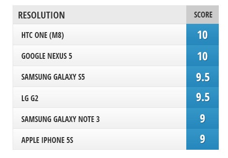
Resolution
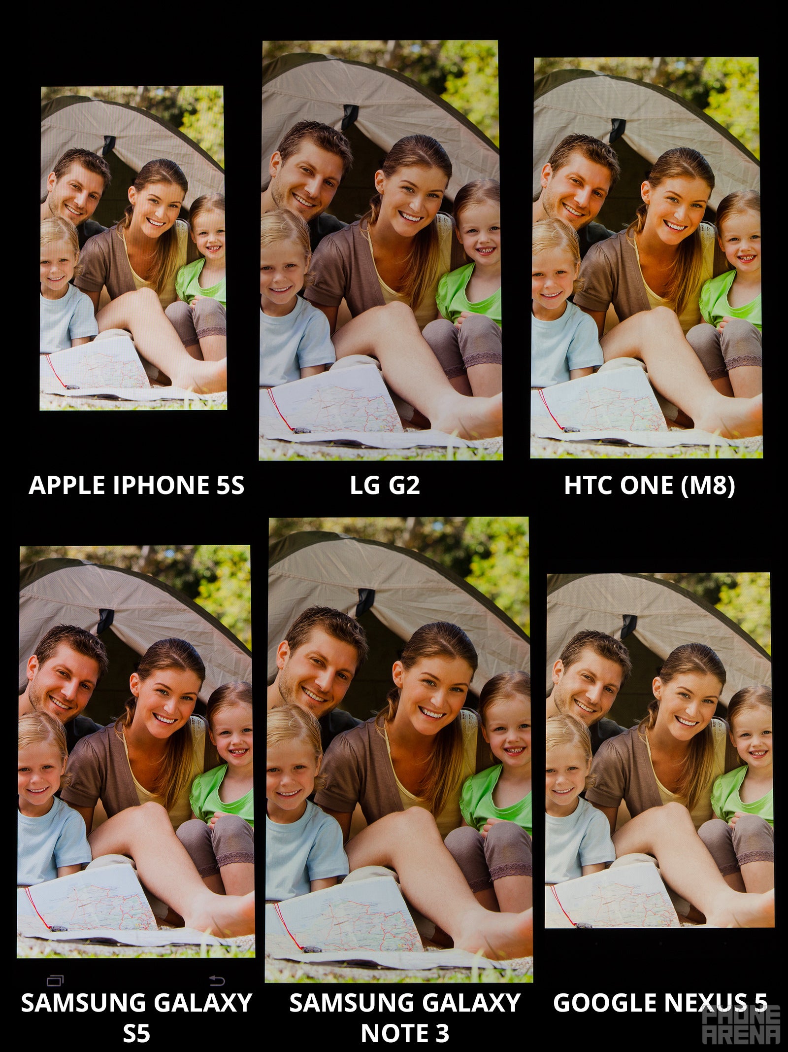
Nowadays, most high-end smartphones come with 1080 x 1920 resolution, guaranteeing incredibly high density and clarity. Due to that, all handsets tested in this display comparison offer a more or less spectacular pixel density. The iPhone 5s, with its 640 x 1136 pixel resolution, is slightly behind the pack, but due to its smaller screen size, things still look extremely clean.
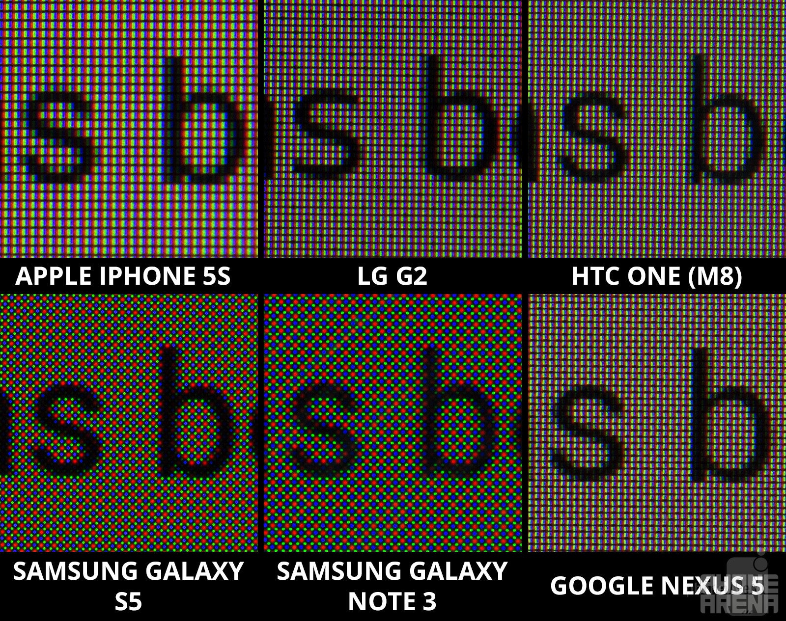
An interesting specific of the AMOLED displays installed on the Galaxy S5 and Note 3 is that they are using a different, diamond PenTile pixel arrangement. This used to introduce some graininess in the image, compared to a standard RGB matrix, but with resolutions of about 1080p and up, this nasty side effect is now next to invisible. Check out the following picture for a close-up shot on the different pixel arrangements of the participating handsets!
The Galaxy S5 and Note 3 feature diamond PenTile pixel arrangements, but this doesn't really detract from their clarity
Color reproduction
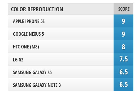
Inaccurate color reproduction has long been an issue for AMOLED screens. Here's the thing: AMOLED screens, especially those used by Samsung, produce extra-saturated, contrasty, and punchy colors that happen to be very alluring for consumers. However, what's often missed is that those colors are also quite off. For example, green and blue are usually too strong, while secondary colors, like yellow, often appear greenish. That is not the case with IPS LCD screens. So, why should we care if Samsung's screens are inaccurate, when they actually look so eye-catchy? Well, this type of issue certainly isn't going to annoy some users that much, but in our opinion, it's relatively important, because it has a substantial impact on the look of all content on your phone. For example, if you're watching a video, people usually do not appear with a natural tone to their skin, but rather, they start looking like carrots - with an orange look, due to the overly-boosted color tones. Besides, everything has a bluish/greenish tint on it, because of the disbalance of colors. Another reason why you want the colors of your screens to be as close as those specified in the sRGB colorspace (that's what we mean by saying 'an accurate screen'), is that most content out there is created with this colorspace in mind, meaning that if you want content to look as intended, you need to have a screen that's as close as possible to the reference sRGB values.
The Galaxy S5's display isn't such a screen. Yeah, Samsung lets you choose between a number of screen presets, but each of them is more or less far from the target. The Standard mode provides that striking punchy effect, however, its color temperature is very high, suggesting an overall bluish look (color temperature of 8100 K). The Professional Photo mode will get you closest to an accurate and pleasing look with the GS5. With it enabled, color temperature drops to about 7200 K (6500 K being the reference point), while colors are no longer super-saturated (although they are still quite vivid). Sadly, the display keeps its greenish tint, which, as you can guess, isn't something to be happy about. The so-called Cinema mode dials things down just a bit more, making colors look calmer and a bit more ordinary, however, red gets too dim in this mode, rendering the screen somewhat lifeless and dull-looking. Even in this mode, Delta E (color error) is still quite high, at about 7 for grayscale and 5 for RGBCMY measurements, meaning that colors are still far from reality.
When it comes to overall color balance and accuracy, the iPhone 5s and Nexus 5 have the best screens around, with the iPhone 5s having a slightly better balance between primary and secondary colors, and the Nexus 5 exhibiting a more accurate color temperature. All other handsets participating in this comparison are far behind these two in this department.
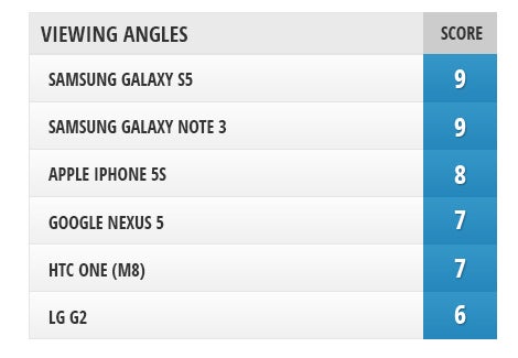
The numbers below represent the amount of deviation in the respective property,observed when a display is viewed from a 45-degree angle as opposed to direct viewing.
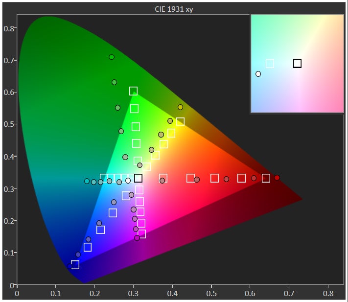
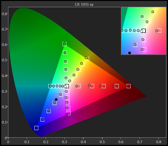
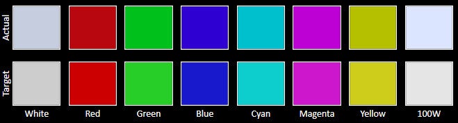
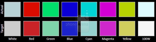
The CIE 1931 xy color gamut chart represents the set(area)of colors that a display can reproduce,with the sRGB colorspace(the highlighted triangle)serving as reference.The chart also provides a visual representation of a display's color accuracy. The small squares across the boundaries of the triangle are the reference points for the various colors, while the small dots are the actual measurements. Ideally, each dot should be positioned on top of its respective square. The 'x:CIE31' and 'y:CIE31' values in the table below the chart indicate the position of each measurement on the chart. 'Y' shows the luminance (in nits) of each measured color, while 'Target Y' is the desired luminance level for that color. Finally, 'ΔE 2000' is the Delta E value of the measured color. Delta E values of below 2 are ideal.
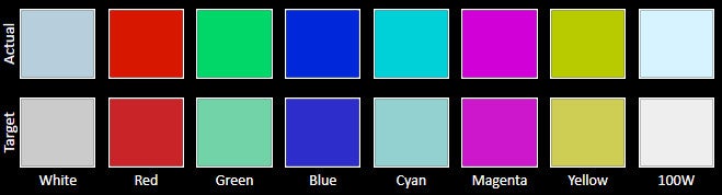
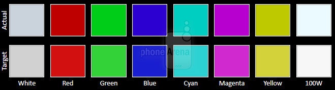
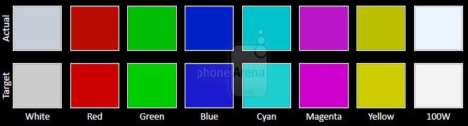
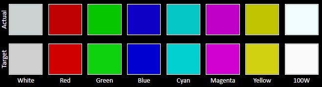
The Color accuracy chart gives an idea of how close a display's measured colors are to their referential values. The first line holds the measured (actual) colors, while the second line holds the reference (target) colors. The closer the actual colors are to the target ones, the better.
The Grayscale accuracy chart shows whether a display has a correct white balance(balance between red,green and blue)across different levels of grey(from dark to bright).The closer the Actual colors are to the Target ones,the better.
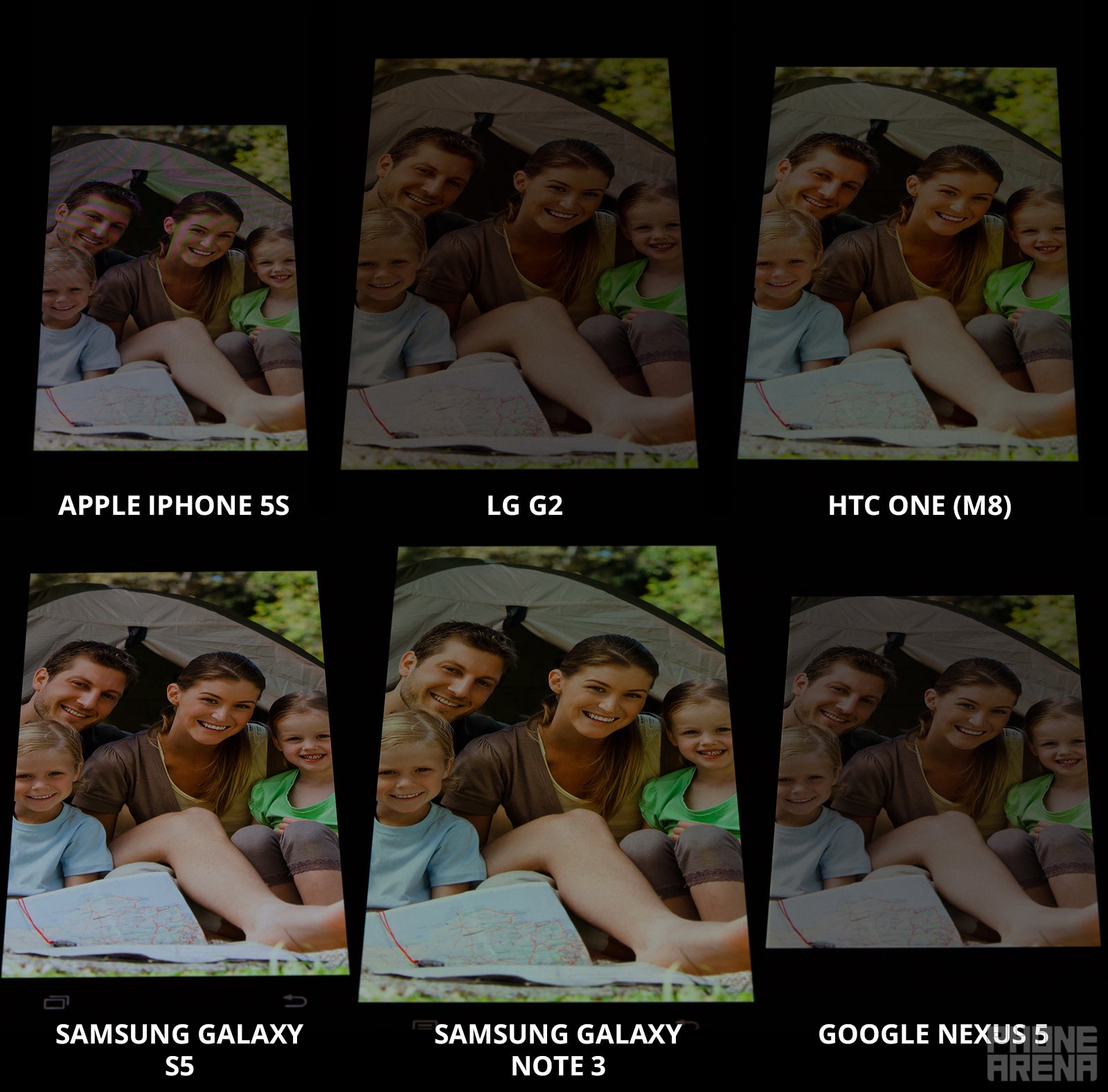
Seemingly not as important as the other aspects that we examine in a screen, viewing angles are still an important factor for the user experience with a smartphone. It's simply annoying when things get washed out at the slightest tilt of your phone! Well, that's one area where AMOLED screens, such as the one on the Galaxy S5, are traditionally strong. The thing about them is that they keep their brightness and contrast to a large extent, which is not the case with LCDs, which get very dim and uncontrasty even at angles smaller than 45 degrees. On the other hand, colors in AMOLED screens typically get more degraded when viewed at an angle, but that's not such a big deal, having in mind that you actually have a perfectly viewable screen, even when viewing them at more extreme angles.
The superior viewing angles of the AMOLED screens of the Galaxy S5 and Galaxy Note 3 can be seen in the following image.
Super AMOLED displays traditionally have the upper hand as far as viewing angles go
Overall
At the end of the day, we can conclude that while Samsung's Super AMOLED screens have come a long way since their debut, there's still much to ask for. If you simply love their extra-vivid and punchy nature - that's perfectly OK - no one can deny that they really look fancy and impressive. They also have the notable advantage of being able to display perfect black, which enables their attractive, contrasty look. On the other hand, though, the LCD tech's ability to replicate colors exactly as they are in reality is a whole other type of achievement, and one that should not be underestimated. It's the same with comparing a photograph that has some kind of an effect applied to it, versus a photo in its natural state. The effect will sometimes look cool, but not always, and definitely not when it's overdone.
So, when the Galaxy S5 came out, there was quite a bit of discussion about its screen and how much better it is than its previous generations. Sure, it's gotten better, but the improvement over the Note 3 isn't really that big. Most importantly, outdoor visibility is no longer such an issue, but yeah, the typical AMOLED problems continue to exist, namely the omnipresent oversaturation, out-of-control green, and lacking red. Hopefully, Samsung's going to keep enhancing AMOLED further and further, but until then, we just can't see it as a truly mature screen technology.
Meanwhile, the IPS LCD screens of the iPhone 5s and Nexus 5 are continue to be two of the very best displays to ever grace a phone.
Why you can trust PhoneArena
25+Years of Experience
4203Product Reviews
Every product we review or recommend is thoroughly tested by our in-house experts in real-world conditions, following our
review methodology
and
ethics statement
to ensure honest, independent, and data-driven results.
Rad Slavov is the Editor-in-Chief at PhoneArena. He joined the media in 2008, right on the cusp of the modern smartphone revolution. Through time and perseverance, he amassed a great deal of knowledge and industry know-how, allowing him to guide and organize the company's growing line-up of talented content creators and ever-expanding content portfolio.
A discussion is a place, where people can voice their opinion, no matter if it
is positive, neutral or negative. However, when posting, one must stay true to the topic, and not just share some
random thoughts, which are not directly related to the matter.
Things that are NOT allowed:
Off-topic talk - you must stick to the subject of discussion
Offensive, hate speech - if you want to say something, say it politely
Spam/Advertisements - these posts are deleted
Multiple accounts - one person can have only one account
Impersonations and offensive nicknames - these accounts get banned
To help keep our community safe and free from spam, we apply temporary limits to newly created accounts:
New accounts created within the last 24 hours may experience restrictions on how frequently they can
post or comment.
These limits are in place as a precaution and will automatically lift.
Moderation is done by humans. We try to be as objective as possible and moderate with zero bias. If you think a
post should be moderated - please, report it.
Have a question about the rules or why you have been moderated/limited/banned? Please,
contact us.


Things that are NOT allowed:
To help keep our community safe and free from spam, we apply temporary limits to newly created accounts: