Every product we review or recommend is thoroughly tested by our in-house experts in real-world conditions, following our
review methodology
and
ethics statement
to ensure honest, independent, and data-driven results.
Introduction:
Let’s take a step back two years. The cellular world was about to enter a transitional period, with the world anticipating the release of the iPhone and R&D departments at the major manufacturers working furiously to put out something that could hold its own. The iPhone has gone on to unprecedented success, and while there have been some formidable competitors (HTC and Samsung come to mind) no one has truly captured the ease of use and wow factor like Apple did. All the while Palm, a company that brought true innovation to the mobile space so many years ago, is on the brink of collapse.
Then came January 8, 2009, when Palm turned the industry on its ear. Out of seemingly nowhere they announced the Pre, which brings not only an amazing design but a revolutionary new OS into play. Their stock bottomed out at $1.42 just a month earlier, but in the time since it has increased nearly tenfold. Where once the iPhone was the darling of techies and hipsters alike, the Pre has become the “it” device and a media darling. Palm has embraced the shortcomings of Mobile OSX, most notably the closed nature. webOS is based off of simple web coding, making developing easier than ever and enticing to not only hardcore developers but casual web designers as well.
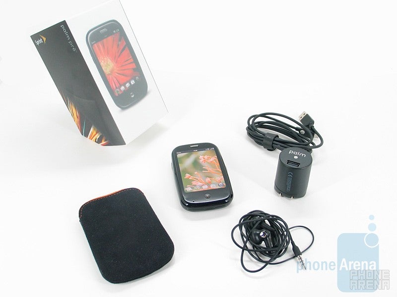
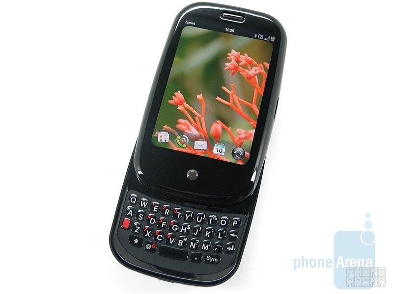
Software is not the only calling card of the Pre though; Palm has paid a lot of attention to the design of the Pre as well. In fact, inconspicuously placed in the packing material you’ll find “No detail is small.” It features a now common large, touchscreen display. Uncommon, however, is its multi-touch technology, and unprecedented is a multi-touch with a hardware keyboard (unofficial G1 hacking notwithstanding.) The portrait keyboard holds true to Palm’s long philosophy of one-handed use, and the touch gestures have been brought below the screen to enhance this philosophy. All in all Apple has never seen a competitor like this, and, though it took two years, the mighty iPhone may finally be dethroned.
Design:
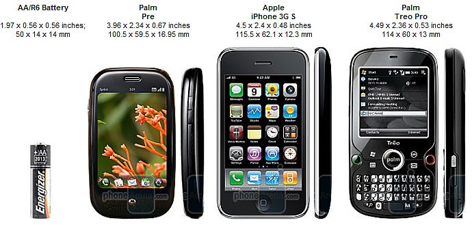
The Palm Pre feels wonderful in the hand; there are no two ways about it. Inspired by a polished river stone, the Pre is full of curves. It fits comfortably and ergonomically in your palm, which is in sharp contrast to the iPhone’s wide, boxy design. The Pre is much thicker, but doesn’t feel as thick as it is.
You can compare the Palm Pre with many other phones using our Size Visualization Tool.
The added thickness is of course the result of a sliding design, which reveals a full QWERTY keyboard. Much has been said/rumored about the keyboard, which is very similar to the one found on the Treo Pro. After much time with it we have to say it’s not bad at all, though not perfect. Those with bigger hands will probably have issues, but our above average hands got used to it after a day or two of use. The keys are shallower than the Centro and not as sticky. The former makes sense, as the display has to slide down over it, but we would have liked to see a bit more tackiness to the plastic keys. We will say, however, that the tackiness it has is different from the Centro, and after a few weeks it becomes less tacky which is a good thing. They are more on the hard then gel side, but nothing like the hard plastic keys of a Blackberry. All in all there could be a bit more spacing, and we’d have preferred if they would be shifted down just a smidge, but we have to say that we’re impressed with the balance Palm has stuck between form and function.
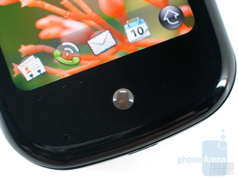
The gesture area bellow the screen
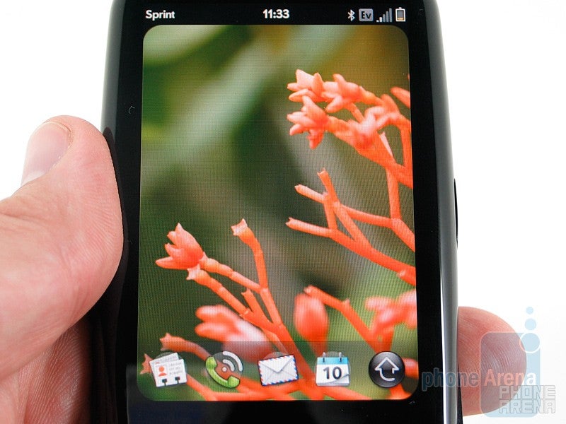
The 3.1” display is brilliant, featuring a 320x480 resolution with 16.7M colors. Unlike the iPhone, where the display falls short of the bezel and in direct sunlight you can see the dead space, the panel blends seamlessly into the housing. It’s so good, in fact, that as the display shrinks to show notifications (more on that later) you don’t really notice. The gesture area below this only enhances this blurred border. Not only is it amazing to look at, but it’s just as smooth to use. Multitouch is used in much the same way as the iPhone, and gestures such as pinching are just as simple and intuitive. Palm takes it one step further, however, by extending the capacitive area down below the display so you don’t have to cover the screen with many gestures. Again, we’ll go into more on this later.
The hardware buttons are very scarce. On the front you simply find a home button, on the left a volume rocker and in the top right corner a power button. A thankful carryover from the Treo is a vibrate switch on the top, next to the 3.5mm headset jack. The right side also houses a microUSB charging and data port, interestingly enough on the top half of the slide rather than the bottom. The back has a single, large speaker and the 3.2 megapixel camera with an LED flash.
The slide mechanism is hefty, but not too much so. While it feels great, we’re seeing some isolated reports of loose slides. One of the only gripes we have is that, when slid open, the now exposed edges of the Pre are a bit sharp. Not enough so that we wouldn’t use it, but we wouldn’t mind Palm grinding it down just a touch.
Palm has done an amazing job with the design of the Pre. It is arguably the most comfortable device we’ve ever held, much moreso than the iPhone. We wouldn’t mind seeing it slim down a bit and loose a small amount of weight, but we’re stretching to find things right now. As we’ve come to expect from high end devices it fingerprints like crazy, and the plastic screen and housing is a bit harder to wipe clean than the iPhone’s glass panel, but again we’re stretching here. We’re having a hard time thinking of a phone we’d rather carry than the Pre, and there certainly isn’t one that has a full QWERTY.
webOS:
webOS is a revolution. Many will look at is as an evolution of Mobile OSX, and it does a great job of picking up where Apple left off, but the thing is Apple left off so short and Palm filled in so much that it is a wholly new experience. While it may not be quite as intuitive as Mobile OSX out of the box, after a few minutes of exploring we felt perfectly comfortable with it and webOS undoubtedly allows both the user and developer to go deeper. It is all about connectivity, and Palm hits the nail on the head.
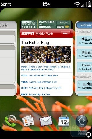
First off, when you touch the screen there is a very cool ripple effect. It’s small enough to be noticeable but not intrusive, which will become a theme of webOS. Of course it also lets you know where you’re touching, which turns out to be very useful. The bottom of the home screen has a five icon launcher. The far left is phone, the far right is menu and the middle three can be customized by holding an icon and dragging it in/out of the launcher. The launcher disappears when you enter an application, but can be pulled up within that app simply by sliding your finger from the button up the screen. This is incredibly functional, and while the wave effect it gives in this mode may just be eye candy, but it’s very cool eye candy.
Recommended For You
webOS is full of gestures like this, most of which are very intuitive. Some are familiar, such as swiping the screen to switch between pages and pictures, others are new such as use of the gesture area. In this are the user can flick back and forth to move between web pages, or simply to take a step back. Gestures make the Pre very easy to use and the gesture area below the screen makes the Pre unique.
To nitpick for a second, when launching an application there is a very slight lag, about a second, before it actually opens. It is noticeable if you’re impatient, but in our opinion it’s perfectly acceptable. The iPhone is no different in this regard, so again we’re just nitpicking here. When closing certain cards there is sometimes a very slight delay as well, but not always. We have a feeling this is because data is saved automatically when you close the card. Everything else on the Pre is virtually instant; animations are smooth and menu transitions are nearly flawless.
By now you’ve no doubt heard about Synergy, Palm’s solution to your cluttered assortment of personal data. Palm has taken a new approach to contact management, and in fact there is no desktop sync for webOS. On first use the user will be able to import data from Outlook, Palm Desktop and iCal, but after that it is all in the cloud. It doesn’t stop there though, the user can also import data wirelessly from Gmail and Facebook, and in the future any other service that takes advantage of this. This data is added throughout the device as well, for instance adding a Gmail email account also adds your Gmail contacts, Google calendar and GTalk. Again, very cool. For those looking for a traditional desktop experience PocketMirror and Mark/Space are available in the App Catalog.
Activity cards on Palm Pre
Another major feature of webOS is activity cards, which is how it handles multi-tasking. Multi-tasking isn’t new in the mobile space, Windows Mobile and BlackBerry OS have been doing it for years, but it is a glaring drawback of Mobile OSX. The way Palm handles them is unique however; instead of a traditional task manager applications are minimized into a card view, where the user can flip through them to quickly switch apps. They are easily closed by swiping them up and off of the screen, a move that is strangely satisfying. The TI OMAP 3430 processor shines here, and unlike WinMo and even BlackBerry, where too many apps bog the phone down, the Pre can handle 20 or so apps being open at the same time with no noticeable performance drain.
Notifications are wonderful and unobtrusive. As we said earlier, the display seamlessly blends into the housing. When a notification comes through, such as an IM or calendar appointment, the display shrinks and the notification dashboard comes up from the bottom. It gives enough of a preview and if the user wants to acknowledge it you simply tap, if not you can hide it and be left with just a tiny icon. Lastly, a simple flick of the finger and the notification disappears all together. If you want to ignore them they do not intrude on what you are doing, which is fantastic. Never have notifications been handled so well, though this can be said about much of webOS.
The innovation continues with universal search; according to Palm, “when in doubt, type.” By simply starting to type webOS will begin to match your input from phone features (like Bluetooth or Updates,) contacts, conversations and if what you want is not on the phone you can go out to the web with Google, Google Maps, Wikipedia or Twitter. No doubt more services will write themselves into this handy feature.
The OS has all kinds of cool caveats and we could talk about it for days, but in the interest of your time we’ll stop here. We really can’t overstate how much we love webOS, and how excited we are to see it grow and evolve. It is still very early in Android’s life, but so far it has not lived up to the hype and the debut was a bit underwhelming, arguably because of the buildup. Palm has quietly built even more hype however, and they really nailed it. It’s a wonderful starting point, but even Palm has acknowledged that it is just that and they want developers to help them perfect it. The SDK will become more widely available; Palm has kept distribution intentionally low to ensure quality early on, and with such an easy device to program for we expect to see even greater things.
Phonebook:
Synergy is infull effect here, as the Pre pulls contacts from your Gmail, Facebookand Exchange accounts. On first use it also allows for syncing withOutlook or Palm Desktop, making importing your existing contacts asnap. Of course you’re likely to have overlap between these accounts,but no worry as webOS recognizes these and merges them into one. Incase it misses a contact the user has the option of merging contactsmanually. As you might expect you can store pretty much anything youwant about a contact on your Pre.
Fully embracing cloudcomputing, the Pre does not have a desktop sync program. Allinformation is backed up to your Palm profile daily over the air. Whenadding contacts to your phone some services like Gmail sync these,whereas others like Facebook do not. This shows a fundamentalunderstanding by the designers, and we can’t tell you how slick it wasto create our profile and see all our contacts download in minutes. This cloud approach allows for remote wiping should you lose yourdevice, and easy OTA restoring if a reset is necessary.
One bigdrawback in our opinion is the lack of voice dialing. To be fair noPalm device has had this out of the box, and the iPhone took threegenerations to get such a simple feature. Still, we are amazed that inthis day and age a flagship phone does not have this basic featurewhile Sprint’s entry phone- the Samsung m220- does.
Organizer:
Synergy againplays a big role in the calendar. Like your contacts, the Pre bringsall of your calendars together and offers a layered view. If youprefer to see them separately the Pre allows for that as well. Thecalendar is as full featured as you would imagine, allowing forrecurrences, reminders and everything else. Like the contacts app, thecalendar is backed up daily OTA.
Apps can access the calendar aswell. For instance, Fandango will add an event when you purchase movietickets. This just drives home the connected nature of this device andwebOS. Very cool. Very, very cool.
Connectivity and Data:
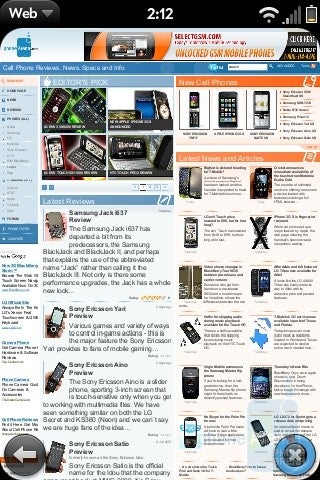
Thebrowser is built off of Webkit, and it shows. With full multitouchsupport the user can pinch until their hearts content, but Palm hasalso incorporated double tap zoom. Pinching is great for fine tuning,but the double tap is way more effective for larger increments, and infact we’d prefer if it zoomed further in at times. It is a full HTMLbrowser, and while it doesn’t support Flash just yet Adobe hasconfirmed that they will develop for the platform soon. We had noproblems opening any webpages, and quickly at that. With both EVDORev. A and Wi-Fi connectivity a fast internet connection should beavailable nearly all the time. Battery life tip: the Pre handles dataover Wi-Fi very efficiently so when possible use that option.
ThePre features Bluetooth 2.1 with EDR, and has support for the HSP, HFP,PBA, A2DP, AVRC and PAN profiles. As had been reported, the Pre doesnot support tethering, though this is a moot point as Sprint’sEverything plans do not allow for the phone as modem add-on anyway.
Messaging:
Palmhas taken a new approach to messaging as well, unifying all forms ofcommunication into one conversation style view. This allows you tostart a conversation over IM and continue over text when the userleaves their computer. Using Synergy, the Pre integrates with GoogleTalk and AIM, and we’d expect to see support from other major IMproviders soon. To view your discussion simply bring up messaging andchoose the contact you’re conversing with.
The Pre supports IMAPIDLE, allowing for nearly instant email notification from providers(such as Gmail) which support the technology. The user can of courseconfigure several email accounts, and like the calendar can choose aunified inbox or view each account separately.
Software:
Whathas propelled iPhone sales into the stratosphere is the App Store, andany modern smartphone must have an answer. Palm gives users the AppCatalog, an elegant solution that allows for easy searching, previewingand downloading of apps. A huge bonus that the App Catalog has overthe App Store is that every app is free for now, and Palm has said thatin the future every app will have a trial version. At launch therewere only about a dozen apps, but that number has already doubled andas Palm opens up the Mojo SDK that number will only grow.
Someof the more useful apps we’ve mentioned in the review already (or willshortly) but we have to give a shoutout to AccuWeather, Sporting NewsPro Baseball, Tweed, Flixster, FlightView, Express Stocks and manyothers. Classic is a Palm OS emulator that will allow users to runtheir old Palm apps on the Pre.
Thus far apps are very highquality, just as Palm wanted it. We’re sure that as it gets opened upmore we’ll see plenty of the pointless applications that now overrunthe App Store, but instead of wasting $0.99 to make a few fart sounds,the App Catalogue will allow you get your likely fill with a previewbefore you purchase.
The most important of the included softwareis the Google Maps we all know and love, complete with GPScapabilities. Sprint Navigation is also on board to provide audibleturn by turn directions. Another important one is Docs to Go, whichallows the user to read but not edit Office documents. Others includea .pdf viewer and Sprint’s NASCAR mobile app. Standard system toolssuch as a calculator and clock (for those who upgrade their firmware)are present as well.
Multimedia:
There is no Sprint Music Store support in the Pre, which kind of surprised us. In its place is the Amazon MP3 store, a very worthy replacement. Amazon, with two major mobile operating systems now on board, seems to be making a big push into the mobile space. The user can download tracks OTA, but only over Wi-Fi, which is also surprising to us. The only reason we could come up with is that Music Store tracks are highly compressed, whereas Amazon gives you real, and larger, mp3 files. Still, especially over Sprint’s impressive 3G network a 3-5MB file isn’t very big. Users can queue downloads using cellular data and the Pre will download them automatically when it connects to Wi-Fi.
The music player itself is very polished, though fairly cliché. You can sort by Artist, Album, Song, Genre, or Playlist. It is very reminiscent of the iPod and BlackBerry interface function-wise, but with its own visual uniqueness. The player can of course be sent to the background, and from the notification area the user can control playback.
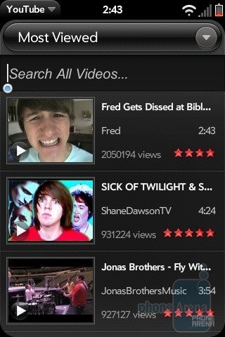
YouTube app
Pandora
Video playback is very similar to touchscreen interfaces we’ve seen in the past. Tapping the screen will toggle on-screen controls, otherwise the video plays at full screen. 640 pixels wide video clips in both H.264 and MPEG4 part2 format played flawlessly, delivering very good image quality. There is a YouTube app that brings the entire YouTube universe to the Pre. The interface is not as clean as the HTC program, or even the iPhone/iPod Touch interface, but it’s still easy enough to search for and view videos.
Pandora is an amazing app, bringing streaming internet radio to the Pre. Much like the music player, it can be sent to the background and controlled via the notification area, to an extent. The user can rate the song, and pause it, but not skip forward to the next track, but a thumbs down rating is in effect a track forward button. Pandora may indeed prove to both a landmark and measuring stick app for the Pre; not only is it awesome, but the developers made a point to note that it took them six weeks to develop their iPhone app. It took them four days to develop for the Pre.
Palm surprised us all by announcing iTunes syncing for the Pre, though it doesn’t support earlier DRM iTunes content. The user can not only sync music, video and pictures with iTunes, but can purchase and download songs via the service as well. When in this Media Sync mode the Pre shows up as an iPod to iTunes. The Pre also has a Mass Storage mode, and when plugged in it allows the user to simply drag and drop files to and from the phone to your PC or Mac. It took us a 1:30 minute to transfer 117MB of files, which is rather good speed.
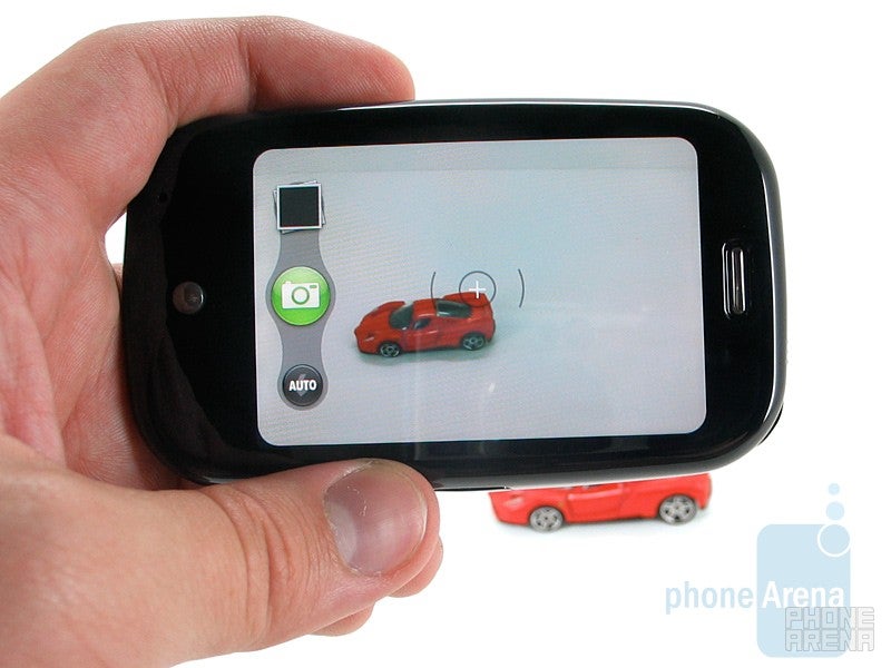
The camera interface of Palm Pre
The 3.2 megapixel camera is complimented by an LED flash. Unfortunately, like the iPhone and Android before it, the Pre does not offer video recording out of the box. Like Android before it, we expect to see an app that enables this very soon. The camera results were pretty good, all things considered. The camera interface is as simple as can be, the user simply has a flash option (Auto, On, Off,) the album icon and the shutter button. The picture album is simple; gestures like pinch, double tap and flick are in effect and it works just as you’d expect.
Camera samples
The picture album
Performance:
Callers were pleased with how we sounded on the Pre, rating us 8.5 out of 10. We felt they sounded about the same. On both ends there was no one thing, callers weren’t hollow or quiet or anything of the sort, but they just weren’t perfect. Still, the Pre grades out well above average on the call quality scale. Another cool feature of the Pre is simultaneous voice and data...with a catch. You'll have to be connected to Wi-Fi, but if so you'll be able to browse the web and IM while on a call.
Many have complained of poor battery life so far, but with a phone that advertises multi-tasking so heavily we are not surprised. As with any smartphone, the more you are doing the worse your battery life will be. Palm sent us some battery tips (such as the Wi-Fi tidbit we gave you earlier) which includes not keeping your IM account signed in all the time, since that requires a near constant data connection. The rest are fairly self-explanatory, such as low signal strength and higher backlight levels will result in more battery use. In our testing we got through the day just fine, though were definitely low by the end of the day. If we had gone out that night we would have needed to charge the phone.
Conclusion:
The Pre is the best phone we’ve ever used. That said, it’s still not perfect. Apps will bring it closer to perfection, and Palm/Sprint are targeting fall to be able to say “there’s an app for that.” Quite simply, it’s a brilliant phone and we appreciate the detail put into both the hardware and more importantly the software. It at least matches the iPhone, and often trumps it, in just about every aspect. We have of course not yet used the 3G S, but unless Apple has some serious tricks up their sleeve (they don’t) the Pre has it by the throat. We cannot stress how much we love this phone, it quite simply gets it and delivers on the experience. Palm, welcome back. We missed you.
Palm Pre Video Review:
Pros
Um, this thing is sexy.
Beautiful hardware design.
Beautiful software.
Wonderful integration of contacts, calendars and your life with Synergy.
Gorgeous, responsive multi-touch display.
QWERTY
Easy to develop platform.
Cons
Casing could be a bit higher quality.
We’d love to see voice dialing and an onscreen keyboard (T9 please) but this could come.
A discussion is a place, where people can voice their opinion, no matter if it
is positive, neutral or negative. However, when posting, one must stay true to the topic, and not just share some
random thoughts, which are not directly related to the matter.
Things that are NOT allowed:
Off-topic talk - you must stick to the subject of discussion
Offensive, hate speech - if you want to say something, say it politely
Spam/Advertisements - these posts are deleted
Multiple accounts - one person can have only one account
Impersonations and offensive nicknames - these accounts get banned
To help keep our community safe and free from spam, we apply temporary limits to newly created accounts:
New accounts created within the last 24 hours may experience restrictions on how frequently they can
post or comment.
These limits are in place as a precaution and will automatically lift.
Moderation is done by humans. We try to be as objective as possible and moderate with zero bias. If you think a
post should be moderated - please, report it.
Have a question about the rules or why you have been moderated/limited/banned? Please,
contact us.


Things that are NOT allowed:
To help keep our community safe and free from spam, we apply temporary limits to newly created accounts: