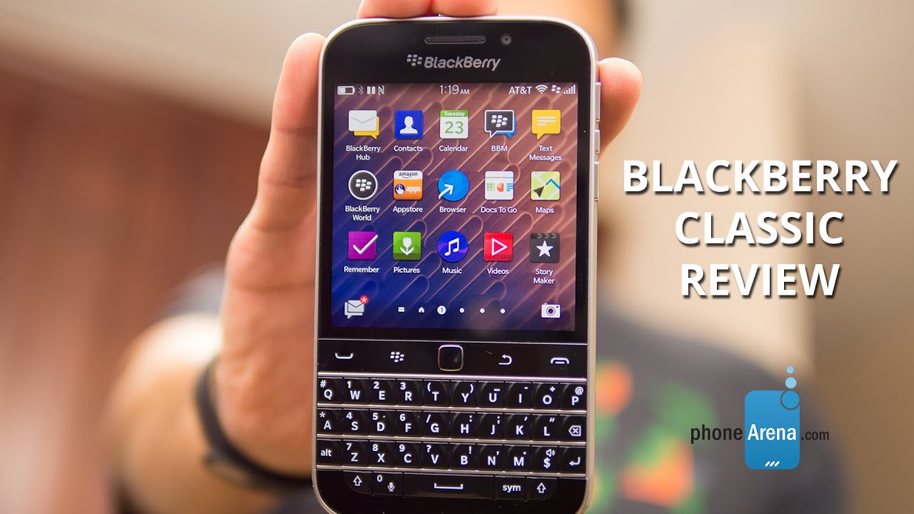
BlackBerry Classic Review

Introduction
BlackBerry is bleeding profusely, struggling to stay afloat amidst the competition. By now, it’s quite obvious that they’re no longer the trailblazing company they once were – so they’ve tried to reinvent themselves with devices and a new platform to keep up with the times. From the all-touchscreen Z10, to its redefined QWERTY in the Passport, there’s no arguing that BlackBerry has been experimenting a lot in order to find that “right” form factor. Unfortunately, none of them have been able to make a significant impact on consumers. Enter the BlackBerry Classic, an old-school ‘berry that employs an iconic design. Indeed, it’s a modern spin on a classic, but is it something that’ll really bring back consumers to BlackBerry’s circle?
The package contains:
- microUSB charging cable
- Wall charger
- Stereo headphones
- Owner’s manual
Design
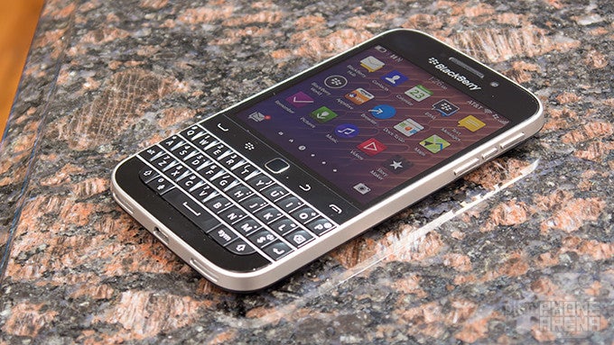
Nostalgia comes full circle with this one, as we’re reminded of the BlackBerry Bold 9900.
Frankly, the BlackBerry Classic looks almost identical to the 2011-made BlackBerry Bold 9900 – though, it’s slightly larger in size. On one hand, we love the classic design, but on the other, we would’ve liked to see a more profound, evolutionary design. In all honesty, the design is a stark contrast to the BlackBerry Passport, which sports a daring industrial design for the times. Instead, the BlackBerry Classic comes off as tepid, one that attempts to give the classic design some notoriety once again, but comes off as being nothing more than nostalgic.

5.16 x 2.85 x 0.4 inches
131.1 x 72.4 x 10.2 mm
6.28 oz (178 g)

5.04 x 3.56 x 0.37 inches
128 x 90.3 x 9.3 mm
6.91 oz (196 g)

4.53 x 2.6 x 0.41 inches
115 x 66 x 10.5 mm
4.59 oz (130 g)

4.71 x 2.63 x 0.41 inches
119.6 x 66.8 x 10.35 mm
4.90 oz (139 g)

5.16 x 2.85 x 0.4 inches
131.1 x 72.4 x 10.2 mm
6.28 oz (178 g)

5.04 x 3.56 x 0.37 inches
128 x 90.3 x 9.3 mm
6.91 oz (196 g)

4.53 x 2.6 x 0.41 inches
115 x 66 x 10.5 mm
4.59 oz (130 g)

4.71 x 2.63 x 0.41 inches
119.6 x 66.8 x 10.35 mm
4.90 oz (139 g)
Compare these and other phones using our Size Comparison tool.
Keyboard
Boy does it feel good to see this classic keyboard again! It’s a hundred times more useful than the Passport’s awkwardly arranged keyboard.
Thank goodness BlackBerry decided to use the classic Bold keyboard from yesteryear, as opposed to the newer layout and style of the Passport keyboard. No longer are we struggling to type on this QWERTY, as it features the same sculpted keys, stainless steel band separators, and tactile responses that made the old BlackBerry smartphones such a joy to type on. At the same time, the Classic brings back the optical trackpad and physical set of buttons beneath its display – providing another alternative to navigation and operating the platform.
Display
It’s not ground breaking in any sort of way, but its 1:1 aspect ratio is what gives it that “classic” BlackBerry look.
Gazing at the display of the BlackBerry Classic, it becomes clearer that this isn’t meant to be the most premium offering from the company, as it features a 3.5-inch 720 x 720 display with Corning Gorilla Glass 3. It’s smaller and lower resolution than the Passport display, but we find it more than detailed with its pixel density count of 294 ppi – that’s plenty enough to give fine details a fair amount of sharpness.
Impressively, the Classic’s display emits a potent 900 nit brightness, which not only makes it more than visible on the brightest of days, but it’s unequivocally the brightest display on a smartphone we’ve come across ever. Everything seems to be in good order with the display, since there are several great characteristics with it. However, our biggest complaint is actually is its size. Due to its square nature and smaller size, we’re constantly causing apps to “minimize” whenever we flick our finger from the bottom bezel towards the top – like the action needed to scroll vertically in the browser.


Interface and Functionality
Even with all the new features and refinements, BlackBerry OS 10.3.1 similarly embodies the antiquated operation of BlackBerry’s platform from yesterday.
Bringing back the trackpad, it offers us an alternative way of navigation around the platform – in addition to using the touchscreen, of course. Naturally, it proves its usefulness in several ways, like acting as a cursor in the web browser, allowing us to selecting a series of messages in our inbox, and carefully placing the cursor in a specific spot. On the productivity side, it’s preloaded with Docs To Go, which when paired with its QWERTY keyboard, offers us the perfect solution in getting work done on the road. Sure, it’s a swell little smartphone that proves its worth in the productivity side, but it’s far from being the perfect multimedia consuming device.
BlackBerry has been tweaking and optimizing its platform since it arrived a few years ago, but even now, it still pales in comparison to its rivals – it’s more apparent when we try to look for some popular third party apps. While BlackBerry 10 specific apps operate perfectly with the BlackBerry Classic, the Android ones we download through the Amazon Appstore still feel finicky. In fact, it’s a painful experience trying to use things like Pandora, which performs at a snail’s pace. Even with all of the work in enhancing the platform, it still bears this antiquated feel – one that reminds us of the heavy menu driven interface of BlackBerry yesterday.
Processor and Memory
Despite the outdated processor, it’s still an effective piece of silicone to power through most things.
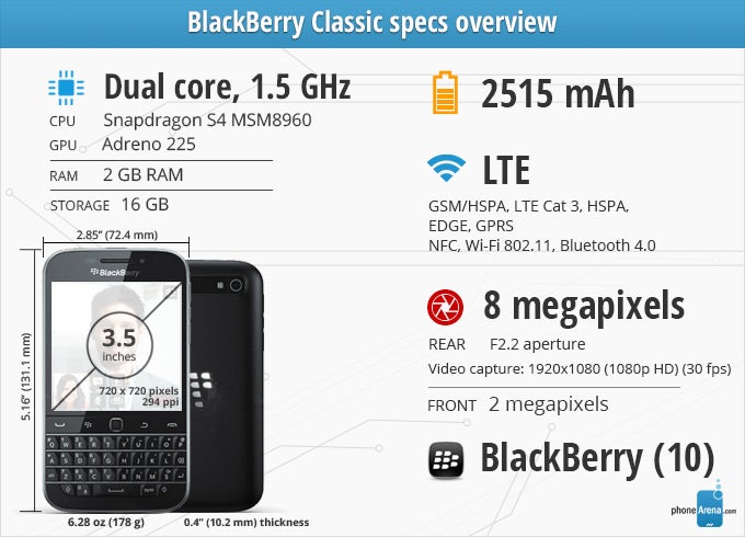
The BlackBerry Classic is a modern spin on a timeless classic, but it’s almost shocking to find it being powered by an outdated piece of silicon under the hood – a dual-core 1.5GHz Qualcomm Snapdragon S4 MSM8960 processor coupled with 2GB of RAM and the Adreno 225 GPU. Yes, it’s certainly behind the times, but we can’t complain about the decision because the phone, for the most part, operates in a responsive manner. From opening apps, switching between them, there’s very little we can complain about – though, don’t think about playing too many games with this one.
Internally, BlackBerry has outfitted the Classic with an ample 16GB of internal storage, which can be supplemented thanks to its microSD card slot.
Internet and Connectivity
The small size of the screen doesn’t make it the most practical thing for surfing the web.
Our particular unit, an unlocked GSM model, is enabled for 4G LTE connectivity – albeit, its band support isn’t quite as generous in comparison to the Passport. Despite that, it’s armed with all of today’s connectivity conveniences, such as aGPS with Glonass, Bluetooth 4.0 with EDR, dual-band 802.11 a/b/g/n Wi-Fi, and NFC.
Camera
Still image results are surprisingly good, but not so much with video recording.
Targeted for business and enterprise users, we’re pretty content with photos captured by the BlackBerry Classic’s 8-megapixel snapper. It’s not without its issues, that’s for sure, but generally speaking, it produces a strong degree of pleasing qualities to make it usable in a variety of occasions. When lighting is present, images exhibit sharp edges with good detail – though, colors sometimes appear a little subdued. Meanwhile, images under low light naturally get softer toned and it has a tougher time dealing with dynamic range, but in the grand scheme of things, it’s not a total wash.
BlackBerry Classic sample images
Sadly, though, the middle-of-the-road production doesn’t extend to the handset’s 1080p video quality. In addition to the indistinct details it captures, its quality is further diminished by some artifacting elements that pop up when panning quickly, its tough time adjusting focus for close ups, and its inability to cut down wind noise.
BlackBerry Classic Sample Videos
Multimedia
This isn’t our first, second, or third choice when it comes to multimedia consumption.
The music player with BlackBerry OS 10 is your standard fanfare, as it offers the most basic of functions with playback. Therefore, it’s pretty generic looking with its presentation. Sporting two speakers along its bottom edge, it musters up a thin and light audio production, which lacks any sort of substance with its punch.
Even though it’s capable of playing all sorts of 1080p videos, we wouldn’t say that the Classic is our first, second, or third choice when it comes to watching videos. And why’s that? Well, it’s mainly because its screen is tiny in comparison to today’s modern devices – plus, it’s sporting a squarish 1:1 ratio screen.
Call Quality
Dedicated call controls are a sight for sore eyes, they’re just rare to find nowadays.
Battery
No surprise here, its battery life is average at best.
Rather than being outfitted with the same monster sized battery in the Passport, the Classic is instead bearing a modest 2515 mAh one. The results, naturally, aren’t quite as long lasting as we’d want, but nevertheless, we can’t complain about the all-day usage we’re able to get out of it. In our experience, it comes off as being average – so it’s something that requires nightly charging.
Conclusion
After years of trying to reinvent itself through various formed smartphones meant to be up with the times, as well as a new start with a totally different platform, BlackBerry finds itself in an unpredictable position – one that’s unquestionably more unstable than not. Failing to capture interest amongst consumers, who have migrated to other opposing platforms, the Classic comes off as nothing more than nostalgia. For the diehard BlackBerry user, it’s that productivity-centric device that helps users to stay busy and active when they’re away from the office, but as a consumer-end product, it fails to spark interest.
Stickered with a $450 price tag here in the US ($500 in Canada), the BlackBerry Classic isn’t the kind of smartphone meant to draw consumers away from notable devices like the iPhone 6, Galaxy Note 4, LG G3, and Nexus 6. However, we can’t deny that the outright price alone undercuts many of its highly esteemed rivals. Pricing is favorable for this classic looking ‘Berry, but don’t sleep too tightly yet because it’s a throwback that modern smartphone owners who have never used a BlackBerry, might literally throw back to wherever they bought it from.
Popular stories


![T-Mobile is down for many users across the nation right now [UPDATED]](https://m-cdn.phonearena.com/images/article/181747-wide-two_350/T-Mobile-is-down-for-many-users-across-the-nation-right-now-UPDATED.webp)
Latest News


Things that are NOT allowed:
To help keep our community safe and free from spam, we apply temporary limits to newly created accounts: