This article may contain personal views and opinion from the author.
Recently, we talked about how companies approach the design of new smartphones. While there were some differences, it became obvious that countless hours are spent in perfecting the design of every smartphone that hits the market.
Why then, more often than not, when we get our hands on a phone, we’re quick to start pointing out things that we don’t like with it. Naturally, some of these are due to personal preferences that don’t align with that specific design. But other times, there are obvious flaws in the design that make us wonder how it even made it past multiple stages of approval and into production.
Trying to make a shoe that fits every foot
Let’s get this out of the way: designing a single handheld device that pleases everyone is impossible. Not only do we all have different hand sizes, but other factors influence how people feel about it as well: whether they use a case or not; if they primarily carry their phone in pockets, bags or purses; what the phone is mostly used for and so on.
Still, the display is the main element of every smartphone today and its size is what determines how the phone will look. Users want more real estate but as you stretch the diagonal of the screen, it quickly becomes too wide to comfortably hold. To counter that, companies started making phones taller, with displays having narrower aspect ratios, now reaching all the way to 21:9. But it doesn’t help that the thumb is the shortest finger, leaving much of the display out of reach when holding the phone normally.
Recommended For You
Manufacturers decided to let people choose what they want to sacrifice: screen or comfort, and started releasing multiple versions of the same device to accommodate as many users as possible with two or three differently sized phones. And while that solves one of the issues, it’s not the one we’re here to talk about. There are a few key features on the body of the phone that largely determine how comfortable it will be to use in your day-to-day life.
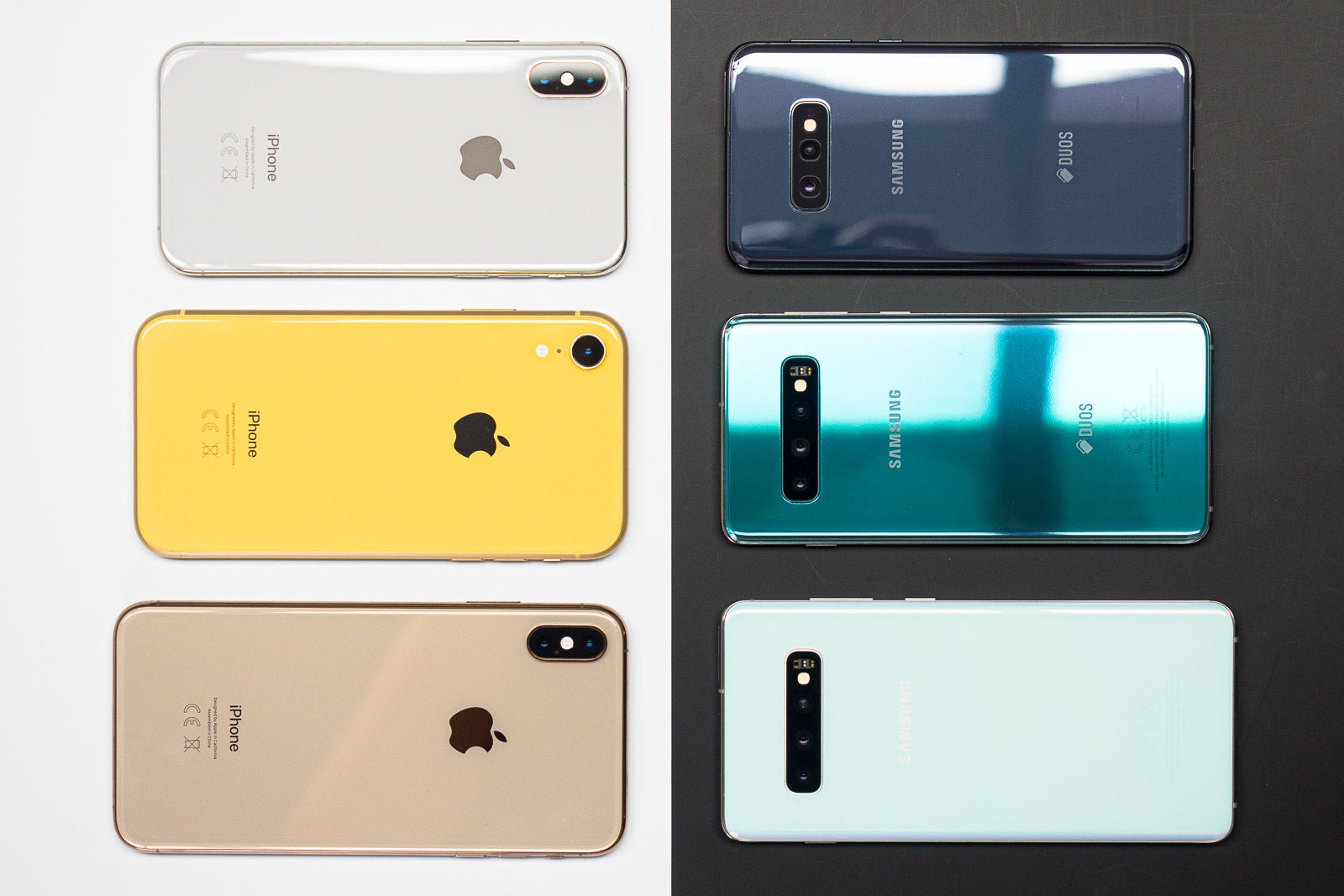
Both Apple and Samsung now have three flagships with different sizes
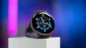
The smartphone ergonomics trifecta: volume, power, fingerprint
On most modern smartphones, there are usually three things you need to reach with your fingers, besides whatever is on your screen: the volume up/down and power buttons and the fingerprint reader. And while they may seem like a minor thing to worry about when you’re choosing your phone, after all, there are important parts like storage, display type and so on, you shouldn’t underestimate them. Because of their frequent use, if these elements aren’t conveniently placed, they will constantly irk you throughout the lifespan of the device, which can be years.
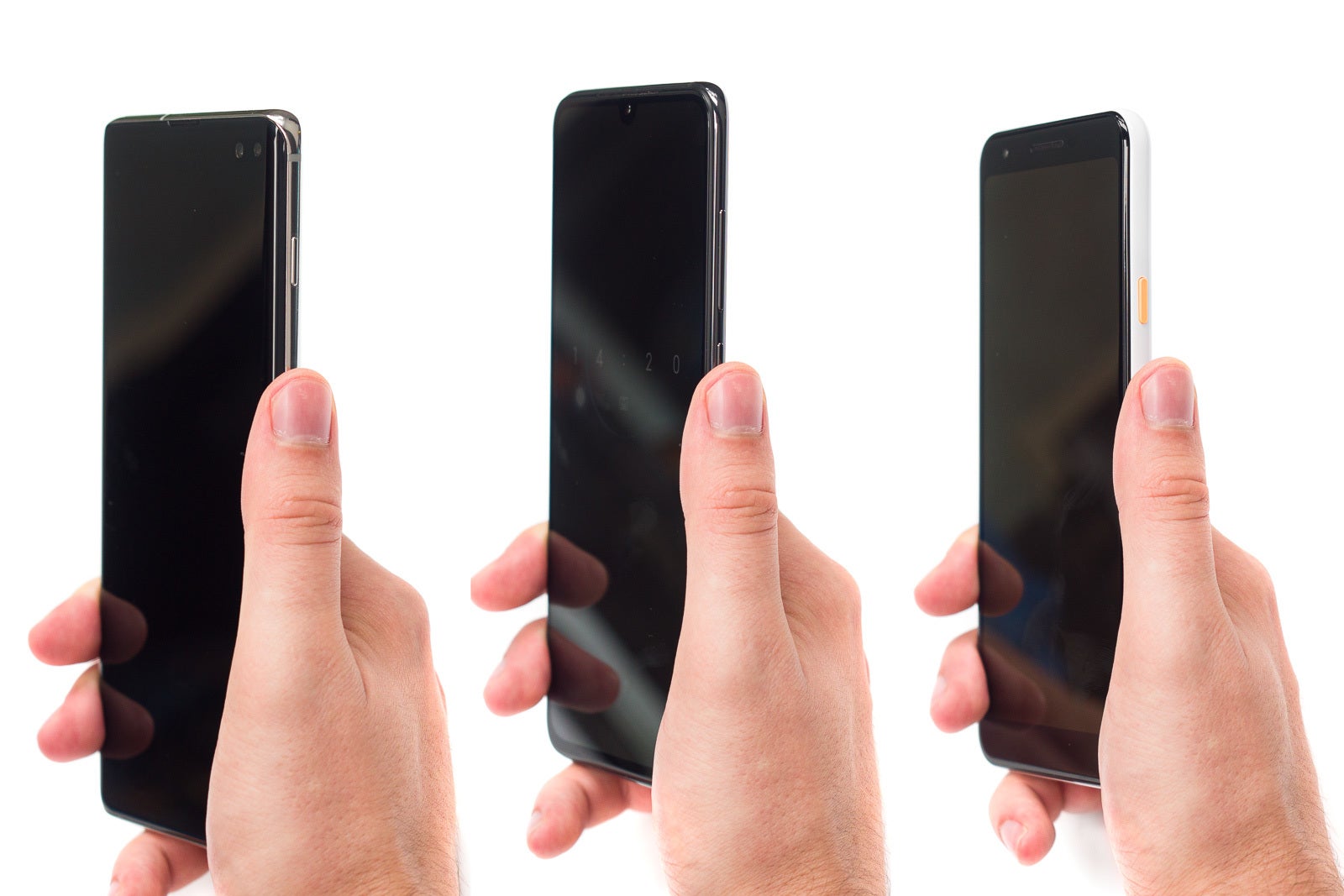
Position similar to the one in the middle is the way to go!
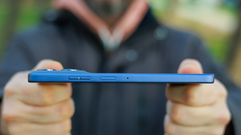
A good example of bad positioning is the power button on the Galaxy S10 and S10+. Compared to most other phones, it is placed too far up and you need to readjust your grip to reach it with your thumb, which increases the risk of dropping your phone. So while the overall design of the phones is close to perfect, unless you have giant hands or really long fingers, chances are the power button placement will cause you some annoyance. Sure, you can use “raise to wake” and “double tap to wake” to spare yourself some thumb reaching, but you still have to lock the phone by pressing the power button.
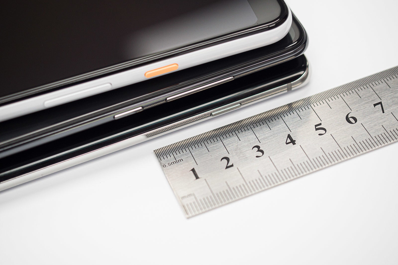
Power buttons can be all over the place
Another example of seemingly nonsensical design is Google’s decision to put the volume buttons under the power button on their Pixel phones. Sure, that makes volume adjustment easy, but in reality, it’s far more important to have the power button conveniently placed since it is the one you use most often.
And when it comes to fingerprint sensors, you can write a whole book about all the weird locations they can be found at. Plenty of manufacturers are guilty of placing it wrong on at least one model. A more notable example was Samsung’s decision to place the fingerprint sensor right next to the camera, causing people to inadvertently put their fingers on the camera lens all the time, smudging it in the process.
It’s safe to say that no company is releasing a phone knowing something about its design is wrong. After all, from designers to executives, the project has passed multiple evaluations and approvals, with each detail looked at under a magnifying glass. So, why do these “imperfections” still exist?
The limitations we cannot see
Without a clear statement from the specific phone maker, it’s impossible to say what the exact reason for a certain design “flaw” was, and the chances of getting one are close to zero, so we’re left with our own theories. Luckily, we have a couple of them!
Theory 1: The jigsaw puzzle that is the inside of a phone leaves no other choice
Designers have to consider not only how a phone looks, but how it works as well. This means there are certain limitations to the flexibility they have when it comes to placing the various features around the body of the device. Components need to be connected internally to the main circuit board and that’s not always an easy task. While on the outside our phones are getting sleeker, with ports and buttons being removed and fingerprint sensors hiding under displays, the inside is as busy as ever.
Manufacturers are trying to satisfy the users’ need for longer battery life by cramming larger and larger batteries into their phones, but that significantly reduces the available real estate within the phone. This forces designers to sometimes compromise in order to fit everything within the tiny amount of space they have to work with. If that means moving the power button up an inch or placing the fingerprint scanner at a slightly suboptimal position, then that’s a compromise that has to be made.
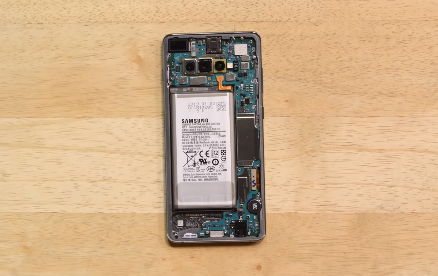
iFixit's teardown of the Galaxy S10+ shows the power button couldn't have been lower because of the battery
With chips and other vital parts constantly shrinking in size, designers should get more freedom to create devices that are as comfortable to use as possible.
But there might be another reason we see buttons shifting positions from one model to another...
Theory 2: Durability concerns
You’re probably thinking: what does the power button have to do with durability? Well, not much as long as it stays in its place, but the hole it sits in has something to do with the phone’s rigidity. The metal frame of the phone is its skeleton and not only holds all the components in place but also makes sure your device doesn’t bend in your pocket.
Naturally, the holes drilled for the different controls and ports weaken the frame. This is especially true when there are holes on both sides of the devices and at the same height. This creates a horizontal line at which the phone is most vulnerable to bending. Of course, you’ve probably seen many phones that have buttons positioned like that. That’s because it makes the most sense ergonomically to have them in such a way. To counter the inherited structural weakness, manufacturers usually strengthen those areas internally, which of course takes up valuable space.
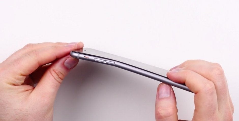
The infamous bending of the iPhone 6 Plus would usually occur at a weak spot in the frame, as demonstrated here by Unbox Therapy
So while you might have the urge to rage against stupid design decisions and message companies on Twitter about how they should fix things, give it a second thought first. There are people that have spent literal months looking at the design and brainstormed a wide range of solutions for each and every detail you see and even more so for those you can’t see. And the final result is the way it is for a good reason that probably goes beyond our fleeing observations.
Does that mean we won’t deduct points for parts of the design we don’t like? Of course not. We’re evaluating the final product and if the design team was forced to compromise with something then that will be reflected in the phone’s overall score. After that, it’s up to the individual user to decide how much that will impact their experience.
Six-month unlimited plan is now 57% off
$90
$210
$120 off (57%)
Mint Mobile is now allowing you to get whichever plan you like for either three, six, or 12 months for just $15/mo. If you go for the six-month unlimited service, for instance, you'll now have to pay just $90 upfront instead of $210.
A discussion is a place, where people can voice their opinion, no matter if it
is positive, neutral or negative. However, when posting, one must stay true to the topic, and not just share some
random thoughts, which are not directly related to the matter.
Things that are NOT allowed:
Off-topic talk - you must stick to the subject of discussion
Offensive, hate speech - if you want to say something, say it politely
Spam/Advertisements - these posts are deleted
Multiple accounts - one person can have only one account
Impersonations and offensive nicknames - these accounts get banned
To help keep our community safe and free from spam, we apply temporary limits to newly created accounts:
New accounts created within the last 24 hours may experience restrictions on how frequently they can
post or comment.
These limits are in place as a precaution and will automatically lift.
Moderation is done by humans. We try to be as objective as possible and moderate with zero bias. If you think a
post should be moderated - please, report it.
Have a question about the rules or why you have been moderated/limited/banned? Please,
contact us.


Things that are NOT allowed:
To help keep our community safe and free from spam, we apply temporary limits to newly created accounts: