You might not notice Google's upcoming change to Gmail
Google is making a change to Gmail, the company's extremely popular email service. But this change isn't adding a new feature or even taking one away. In fact, the effect of this news won't change the way you use Gmail at all. As it announced today, Google is about to change the name of its enterprise-focused G Suite offering. These are apps like Gmail, Calendar, Drive, Docs, Sheets, Slides, Meet, and many more that soon be under the Google Workspace umbrella. Google said today, "Whether you're returning to the office, working from home, on the frontlines with your mobile device, or connecting with customers, Google Workspace is the best way to create, communicate, and collaborate."
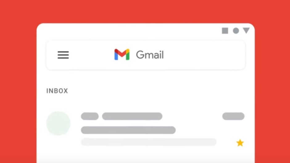
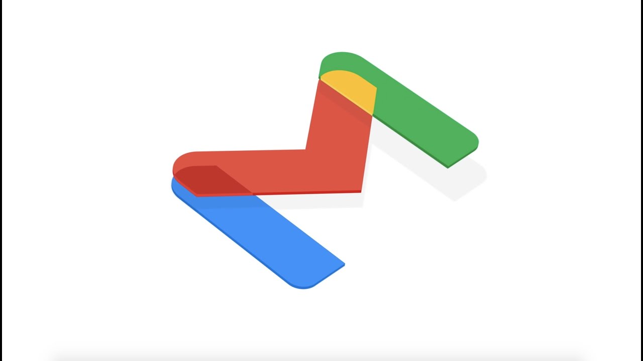
In July, Google integrated its video conferencing service Meet with the Gmail app calling it "your new home for work." Today, the company introduced a brand new logo for Gmail that will bring it more in line with Google's branding. Instead of the current logo, which uses red lines to create the letter "M" on the back of a white envelope, Google is removing the envelope and is replacing the colors of the four lines. The four colors used in the revised logo, blue, red, yellow, and green, are the colors used by Google for its icons and corporate logo.
Besides the new Gmail logo, the company is adding a touch of red to the Drive icon so that all four Google colors are included. Other apps, like Duo and Docs, are also getting an icon makeover. Currently, those two have a blue and white color scheme for their icons. But after undergoing their beauty treatment, the Duo and Docs icons will incorporate Google's colors only. You can also expect the Google Calendar icon to change from blue, white, and gray to blue, red. yellow and green. The accompanying video will show you the changes.
Google says, "Google Workspace embodies our vision for a future where work is more flexible, time is more precious, and enabling stronger human connections becomes even more important. It’s a vision we’ve been building toward for more than a decade, and one we’re excited to bring to life together with you." Keep an eye open for the logo and icon changes on your devices.

Popular stories

Latest News

Things that are NOT allowed:
To help keep our community safe and free from spam, we apply temporary limits to newly created accounts: