What's new in Control Center in iOS 11: design, functionality, customization

With its launch in 2013, iOS 7 brought more than just a radical visual redesign to Apple's mobile platform. It also added tons of functional, practical tweaks to iOS, Control Center being a prime example of that. With a simple swipe up from the bottom of the screen, it provided iPhone and iPad users with easy access to various settings and controls from any screen.
Fast-forward to 2017, and iOS 11 is now introducing the biggest Control Center overhaul we've seen yet. We're now about to walk you through it, but before we proceed, a disclaimer is due. The visuals below were made using an early preview of iOS 11 running on an iPhone 7 Plus. There's still a chance that Control Center might undergo slight changes, both in terms of how it looks and how it works, by the time iOS 11 is publicly released in the fall. With that out of the way, let us explore the new Control Center in iOS 11.
How is the new Control Center accessed?
Basically, Control Center works as it did before in this respect: you just swipe up from the bottom of the screen to access it and swipe back down to make it go away. It is accessible from any home screen, from the lock screen, from your widgets screen, and even while you have an app opened. As usual, you should be able to access Control Center even while playing a game, but you have to swipe up twice – a solution intended to prevent you from opening it unintentionally while gaming.
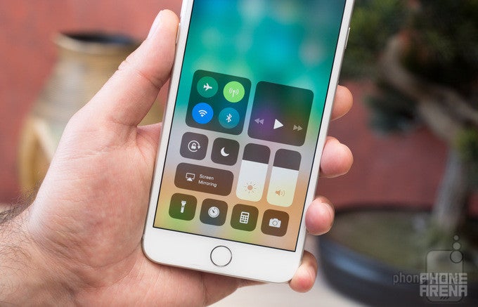
What has changed in Control Center?
In iOS 10, Control Center was a multi-screen experience – you had your toggles and shortcuts on a primary screen, and a swipe to the side brought up a second page dedicated to audio controls. This arrangement worked fine, but it wasn't perfect. For instance, it was not impossible to move the volume or display brightness sliders by accident when you only wanted to switch between screens.
With iOS 11, Apple is putting all of Control Center's functionality on a single screen. You have your music controls in the upper right corner, while the brightness and volume sliders are underneath. The connectivity toggles are on the upper left, and the familiar shortcuts are in their usual spots at the bottom. Yes, the new Control Center does look... different, but it is a change we can get used to.
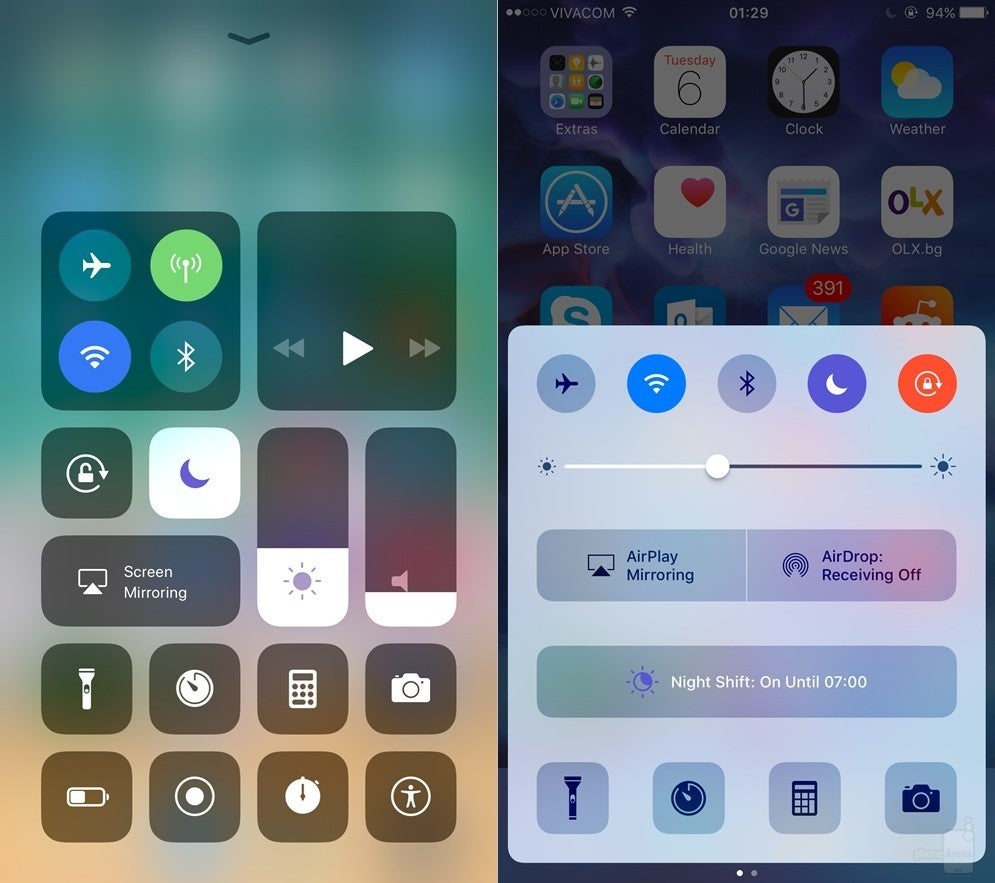
Control Center in the iOS 11 developer preview (left) vs Control Center in iOS 10
One thing worth noting is that the volume and brightness sliders are now controlled vertically, not horizontally. This might be intended to address the aforementioned issue with moving the sliders by accident. However, we can still see a slider being tweaked unintentionally when trying to close Control Center. Perhaps iOS 11's final release will address this.
Also of importance is the fact that Force Touch is heavily implemented. For example, hard-pressing on the panel with connectivity toggles displays more of them. Using Force Touch on the music panel displays song info and more controls. Below are some visual examples.
Using Force Touch in Control Center in iOS 11 – on the connectivity panel, the camera shortcut, the brightness slider, and the music controls
Can I customize Control Center in iOS 11?
Yes, you definitely can! Some of the elements, such as the connectivity and audio panels, as well as the volume and brightness sliders, are fixed in place, but you can rearrange the shortcuts at the bottom to your liking. By default, the shortcuts set are for accessing the flashlight, calculator, timer, and the camera. You're free to remove and rearrange these shortcuts, as well as to add many more to the list. You can add ones to your wallet, notes, alarm clock, stopwatch, and many, many more. That's a full list below.
The default look of Control Center (left), the list of shortcuts that can be added (middle), and what enabling all shortcuts looks like (right)
Popular stories


Latest News
Things that are NOT allowed:
To help keep our community safe and free from spam, we apply temporary limits to newly created accounts: