
Samsung Galaxy S7 Edge UX walkthrough
One of the coolest new features in the Samsung Galaxy S7 Edge is the brand new Edge UX.
First introduced back in the day with the Note Edge and S6 Edge, the Edge user interface was initially a single column of apps and shortcuts. In the S7 Edge (and also on the S6 Edge after the Android 6 Marshmallow update), the Edge is now much more useful and takes up more space: you now have two columns of apps, or you can use that space for custom widgets. You can check the latest news, for instance, right on the Edge UX via the CNN Edge panel application, or you can take a look at the weather information.
Sounds useful, doesn’t it?
The neat thing about the Edge UX is that you can access it anytime, from within any app to get a quick glance at apps and those widgets. Join us right below as we walk you through the full functionality of the new interface.
Edge UX walkthrough
1. Settings
First, let’s fine tune the Edge UX to our liking. In order to do so, you have to go into Settings > > Edge
You can customize the Edge UX
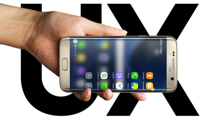
Here, you can first select which side the Edge UX appears on: the left or right, and since we're not lefties, we've picked the right side. In order to bring up the Edge panel, you have to swipe from the side at a particular place on the edge. The toggle you swipe from can be customized: you can have it small, medium or large. We've found that medium is about the right setting as it allows us to easily bring up the Edge UX, while the big one interferes with regular swipes and the small is a bit too small to easily and intuitively find. You can also customize the transparency of that little side toggle: you can make it fully transparent once you've gotten used to its position, or you can have it set to a certain percent of transparency.2. Functionality
First, you have your Contacts edge that shows you five contacts that you can quickly call or text. Unfortunately, we didn't seem to see full integration with third-party apps here, so you might not be able to use this panel to quickly Whatsapp your friends for instance.
Next, you have a two-column panel with customizable shortcuts to your favorite apps. This is actually one of the coolest features of the Edge UX, being able to access this quick multitasking panel from any app at any time has proven useful in our daily grind.
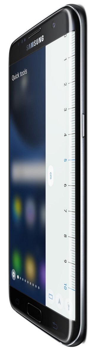
You also have another panel with tools: a ruler, a compass, and a flashlight are all handily within reach, and we can see them being useful, but quite honestly, we didn't make much use of them in our own daily routine.
Then, there are additional panels that you can download and buy from the Samsung Galaxy Apps store. The Weather panel is the most useful one and it comes pre-installed, showing the highs and lows, as well as the chance for precipitation that day.
Finally, there is the news panel with a scrollable strip of the latest and trending CNN news. It's quite cool, but we wish we could customize it more to our liking and interests.
When you've tinkered with all these enough, it's inevitable that you go to the Galaxy Apps store to look for more cool Edge panels, but they are nowhere to be found. There is only a few that don't seem particularly well made and we could not even find the advertized stocks and sports score panels that we imagined would be quite cool to have. What a disappointment! We're really hopeful that Samsung will give enough of an incentive to developers to make some cool edge panels, because without them the Edge UX - regretfully - cannot reach its full potential.
With all these considerations in mind, it's time to weigh in the pros and cons in a separate paragraph.
Edge UX
3. Conclusion: Advantages and Downsides
With all these considerations in mind, it's time to weigh in the pros and cons in a separate paragraph.
First, many would say that the Edge UX feels like a gimmick. To a certain extent yes, and true, a very similar functionality could be implemented on the non-Edge Galaxy S7 (with swipes from the side) with no technical difficulties, but Samsung has chosen to make this an exclusive feature for the Edge versions. We're okay with that.
What makes the Edge more useful than many similar hacks is that it is built by Samsung itself and works fairly fast and is very reliable. It is also accessible from any place, any time. To a certain extent, it reminds us of Apple's Control Center, however, rather than swiping from the bottom, you swipe from the side and the functionality is different.
Not a gamechanger, but nonetheless, a cool feature
It still feels like an idea that could be and will be made much better in the near future.The biggest downsides right now is that it's hard to find additional panels for the Edge: the existing collection is terribly limited and won't be of much use to all that many people.
If you like the ones that are included, though, we tend to think that it is a cool new option to have. Not truly a game-changer in anyway, but nonetheless cool.

Popular stories

Latest News


Things that are NOT allowed:
To help keep our community safe and free from spam, we apply temporary limits to newly created accounts: