Note 4 with Lollipop vs Note 4 with KitKat: UI comparison
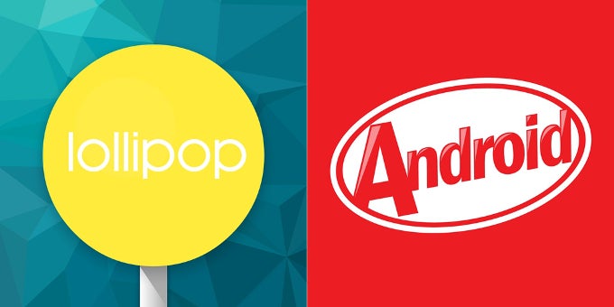
So what did change? The list is fairly long, as can be expected with Lollipop being such a major design update, but keep in mind that we're still talking about Samsung's proprietary TouchWiz launcher here. In other words, while quite a bit has changed, we're often talking about small tweaks and the addition of more profound animations. Of course, in areas such as the lock screen and the pull-down notification bar, along with basic apps such as the Dialer and Messenger, the changes are quite visible. Still, a lot of what's new is out-of-sight – we have the new ART runtime, for example, and we generally felt like the Note 4 was a tad snappier with its performance.
Enough talk, however. Let's explore!
Lockscreen and notifications drawer
Few other parts of the Lollipop system are as characteristic of the update as the re-designed notifications drawer. The design template is the same, but Samsung has obviously filled it with its TouchWiz-y goodness but in a brighter, less-gloomy shade of blue. What's different, however, is that with the Note 4 you don't have to swipe down twice in order to reveal the row of quick toggles like you do on stock Lollipop, and we've got to say that we prefer this approach. The rest of the visual updates are fairly small.
The lockscreen is another biggie, for Lollipop will not push notifications to it if you choose so. These are actionable even if you haven't unlocked your device, which is another step forward.
Lockscreen and notifications drawer
Dialer, Contacts, and Messaging
The essential Dialer, Contacts, and Messaging apps also received a visual refresh and are now far more joyful-looking. What's more, instead of a singular shade of blue for all of them, under Lollipop, each of the three has its own distinct color, which could make it a tad easier to navigate yourself when paying little attention to what exactly is going on on the screen.
Dialer, Contacts, and Messaging
Settings menus
We took a few shots of several distinct sub-menus in Settings to showcase some of the changes, including in the Sound and Power Saving menus. Samsung has also updated the Application manager tab, and even the sound bar that appears when you tweak the volume has seen a few strokes of brushwork. As for the Settings menu's design, changes are mostly limited to a newly-styled header.
Settings menus
Recent and active apps
Whether you like the card-like Lollipop Recents app menu is a question of taste, but seeing as the equivalent menu on the Note 4 under KitKat had a similar design, most people won't feel like much has changed. Regardless, functionally, the Lollipop version is a tad different, for it now allows apps (like Chrome) to open up new cards for every tab you have running.
Recent and active apps
Gallery, Music, and Video
A fresh coat of paint has also been applied to the multimedia trio of apps – the Gallery, Music, and Video. Unfortunately, that's about it – so far we haven't spotted anything new in terms of functionality, though considering how powerful Samsung's default solutions are, that's probably moot.
Gallery, Music, and Video apps
S Planner, Clock, and My Files
The situation with organizational apps such as S Planner, the Clock, and My Files is very similar to that of the aforementioned trio of multimedia apps. All three have received some visual updates in order to bring them up to speed with the rest of the interface, but functionally, they're the same – just more attractive.
S Planner, Clock, and My Files
What didn't change?
Not everything changed with the move to Lollipop, however. The apps below are an example, and those include the song playback pane, the camera interface. The browser, on the other hand, saw some really tiny changes, and that's about it.
We remember when we thought that TouchWiz has never looked quite so good all those months ago when the Galaxy S5 was released and showcased the latest design of the custom interface. We dare say that the Lollipop-based TouchWiz UI moves things even farther, however, and though it doesn't solve some of the age-old problems with it, the visual refresh is most welcome.
Apps that didn't change

Popular stories

Latest News

Things that are NOT allowed:
To help keep our community safe and free from spam, we apply temporary limits to newly created accounts: