
Here is a surprisingly low tech look at Material Design for Android L
Google is the epitome of high-tech. At the developers’ conference last week we were introduced to the latest in tech wizardry in what will be the next generation of the Android operating system.
Among all the announcements, a considerable amount of time was spent talking about the design elements in the new user experience. Called Material Design, the colors and layers that developers can now take advantage of will give Android an aptly timed makeover.
When it comes to design, especially design that is utilized by various agents (or developers in this case), there is a standard that needs to be followed to ensure a uniform experience. To that end, Google has a site which explains all the guidelines that need to be followed across the board.
From Android on the smartphone to Google Glass, Material Design will bring a new look to how we interact with our devices. Whether it is how transitions are animated, or the style of the typography, Material Design follows a set of principles of uniform spacing rules, visual consistency, and app behavior.
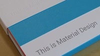
Is there a tangible angle to Material Design? Indeed there is. Actual design reference kits were made available at Google I/O, good old fashioned sets of colored paper and graph pages for doodling new designs.
So as your Android device gets updated in the future, and the apps you enjoy receive similar updates, it is possible that some of the action you experience may have been crafted with some graph paper and a pencil. If you want to see more of what Material Design is all about, check out the reference link below.
reference: Google Design
Among all the announcements, a considerable amount of time was spent talking about the design elements in the new user experience. Called Material Design, the colors and layers that developers can now take advantage of will give Android an aptly timed makeover.
When it comes to design, especially design that is utilized by various agents (or developers in this case), there is a standard that needs to be followed to ensure a uniform experience. To that end, Google has a site which explains all the guidelines that need to be followed across the board.
From Android on the smartphone to Google Glass, Material Design will bring a new look to how we interact with our devices. Whether it is how transitions are animated, or the style of the typography, Material Design follows a set of principles of uniform spacing rules, visual consistency, and app behavior.
Is there a tangible angle to Material Design? Indeed there is. Actual design reference kits were made available at Google I/O, good old fashioned sets of colored paper and graph pages for doodling new designs.
So as your Android device gets updated in the future, and the apps you enjoy receive similar updates, it is possible that some of the action you experience may have been crafted with some graph paper and a pencil. If you want to see more of what Material Design is all about, check out the reference link below.
Material Design
reference: Google Design

Popular stories

Latest News


Things that are NOT allowed:
To help keep our community safe and free from spam, we apply temporary limits to newly created accounts: