HTC Sense 6 UI vs Sense 5.5 UI: a visual walk through the changes
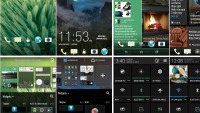
Ah, the ever-changing nature of Android! For better or worse, it seems like each year manufacturers are basically forced to reiterate on details ranging from hardware down to software. The result is a sense of constant advancement, but also confusion, as older device are increasingly looking more and more different from their contemporary counterparts. This can be a hurdle to your average Joe, who doesn't spend his night satiating his tech thirst.
With the HTC One 2014, the Taiwan-based company has taken the opportunity to try and delight potential buyers with a refreshed UI. Dubbed Sense 6, we wanted to see just how big of a difference it introduces when compared with the now older Sense 5.5 interface. We always call it as we see it, though in this particular instance we do have to admit that design is an inherently subjective matter. That said, we'd argue that HTC went down the path most traversed. As a result, it has updated its UI to be more in touch with currently trending, modernistically-flat design language.
Now, don't get us wrong -- we actually appreciate the looks of the new Sense UI -- but we do have to note that it now blends in with the crowd instead of making a statement like it used to. Sure, structurally -- the interface takes the same shape -- though we did like and easily recognize the sleek, semi-flat look of old. Whether this will work in HTC's favor on the whole is impossible to tell, but you could surely take a look and decide for yourself.
Note: Sense 6 is always on the left (portrait) or top (landscape).
HTC Sense 6 UI (left) vs Sense 5.5 UI (right)





Things that are NOT allowed:
To help keep our community safe and free from spam, we apply temporary limits to newly created accounts: