Google will finally replace the terrible blob emoji with not-so-terrible ones in Android O
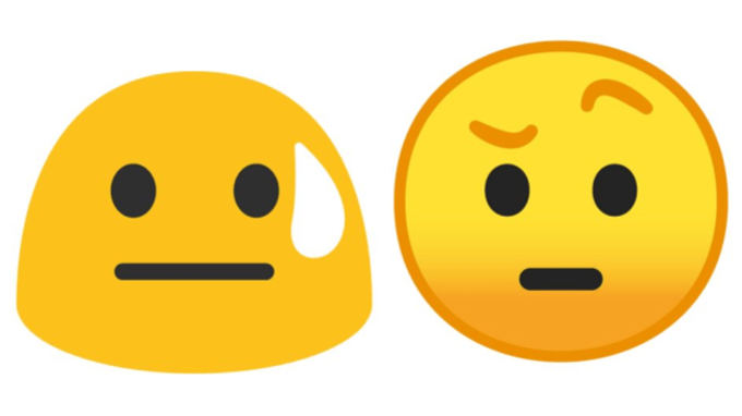
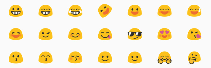
Old vs new emoji in Android
There are different styles of emoji, but none look as freaky and weird as Google's blobs. The Android emoji shaped like strange, thumb-people evoke the opposite of the cheerful feeling one gets when looking at other emoji. Not just that, they are completely misguiding: emojis sent from other platforms convey one feeling, and when you receive them on an Android device and see a completely different melted blob, you may simply fail to understand the message. The Android emoji are simply wrong.
And finally, Google has realized this too: it is finally fixing emoji in Android O with much more sane, round-shaped ones that actually look like people and not melted down shapes. Here is how the new emoji looks and how they compare to the old style:
Old (left) vs new (right) emoji
Better? Yes! Good? We're not so convinced, especially in comparison with the joyful, colorful emoji that come in Android's biggest rival, iPhones, and most other emoji in the world.
Fastcodesign has got the detailed story on the new emoji, and what's particularly striking is that it took Google a whopping 18 months to figure out this new style that looks marginally better. It all started with Android N when Google introduced female professions and those came in a set of emoji with torsos that looked like real people. This brought chaos in the Android emoji world, that then consisted of both the blobs and the realistic-looking ones, all in a single set.
The new Android emoji
To craft these new emoji Google had to create a brand new emoji logic, not just new pictures. It had to make the new emoji style cohesive with Material Design guide-lines and the company used a grid system to get consistent expressions across emoji. The company also tried to move away from stereotypes:
“We purposely moved away from just putting the girls in pink. We needed for legibility purposes to tell the difference of men and women, but why did she need to be in a stereotypical color? And we put women in pants,” says Rachel Been, Creative Director on Google’s Material Design.
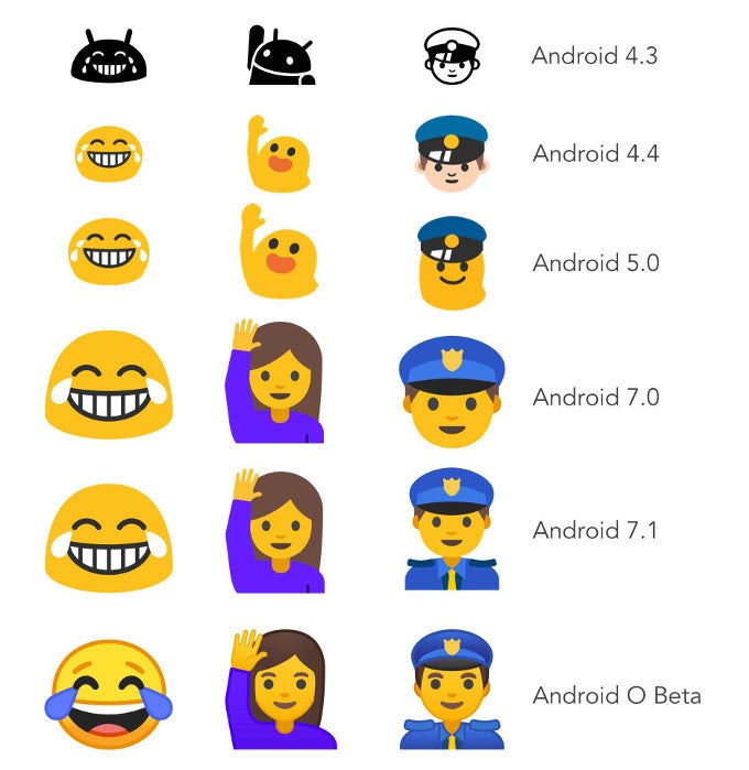
The evolution of Android emoji
Parting ways is the sweetest part of dealing with Android's blob-style emoji
source: Fastcodesign

Popular stories

![T-Mobile is down for many users across the nation right now [UPDATED]](https://m-cdn.phonearena.com/images/article/181747-wide-two_350/T-Mobile-is-down-for-many-users-across-the-nation-right-now-UPDATED.webp)

Latest News

Things that are NOT allowed:
To help keep our community safe and free from spam, we apply temporary limits to newly created accounts: